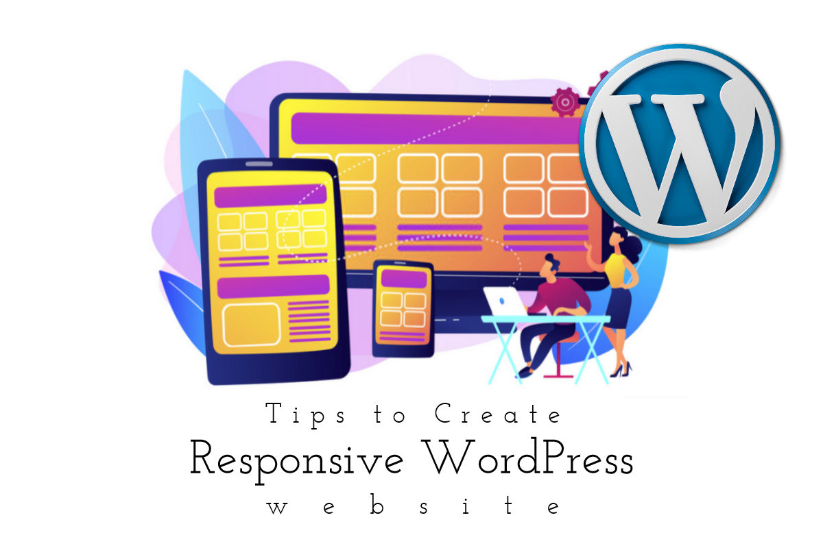
Tips on How to Create Responsive Wordpress Website
Mobile is the future!
The smartphones have replaced desktop immensely in online searches.
It is because of the prompt rise in Google mobile-friendly updates and, of course, the mobile audience. Now, most of the companies have initiated and put their steps ahead to adopt the responsive design on their websites.
 Be creative and make marvelous images for your Wordpress website
with PixTeller graphic maker
Getting a responsive WordPresss website has become a need these days to be accessible on scalable, and compatible devices, such as iPad, Android phones, iPhones, tabs, etc.
The businesses cannot afford to have a non-responsive website. We cannot deny the fact Google only gives ranking to those websites that hold the mobile responsiveness in their search algorithms. This aspect clearly shows that Responsive design is here for long and is not going to fade away anytime soon.
The businesses cannot afford to have a non-responsive website. We cannot deny the fact Google only gives ranking to those websites that hold the mobile responsiveness in their search algorithms. This aspect clearly shows that Responsive design is here for long and is not going to fade away anytime soon.
It is required that you should understand that when it is about the responsive web design, only resizable images and flexible screen resolution are not included, but it also changes the way the users acknowledge your website.
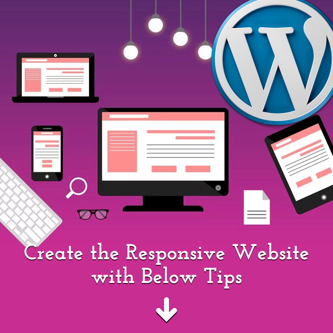
We are here to present you with the guide on the points that you should consider while making your WordPress website responsive.
1 Prioritize Mobile-Friendly Themes
To make your website look best in the mobile and desktop version, it is crucial to choose the best mobile theme. Accordingly, you do not need to make one for yourself and hire the designer to do it for you. With the regular use in mobile devices, there comes a rise in mobile themes.
You can also easily build your own mobile friendly theme with the help of a web development company that offers custom WordPress theme development services. This will help you to easily configure your site with the help of a customizer. We have gathered some for you. Check out below:
-
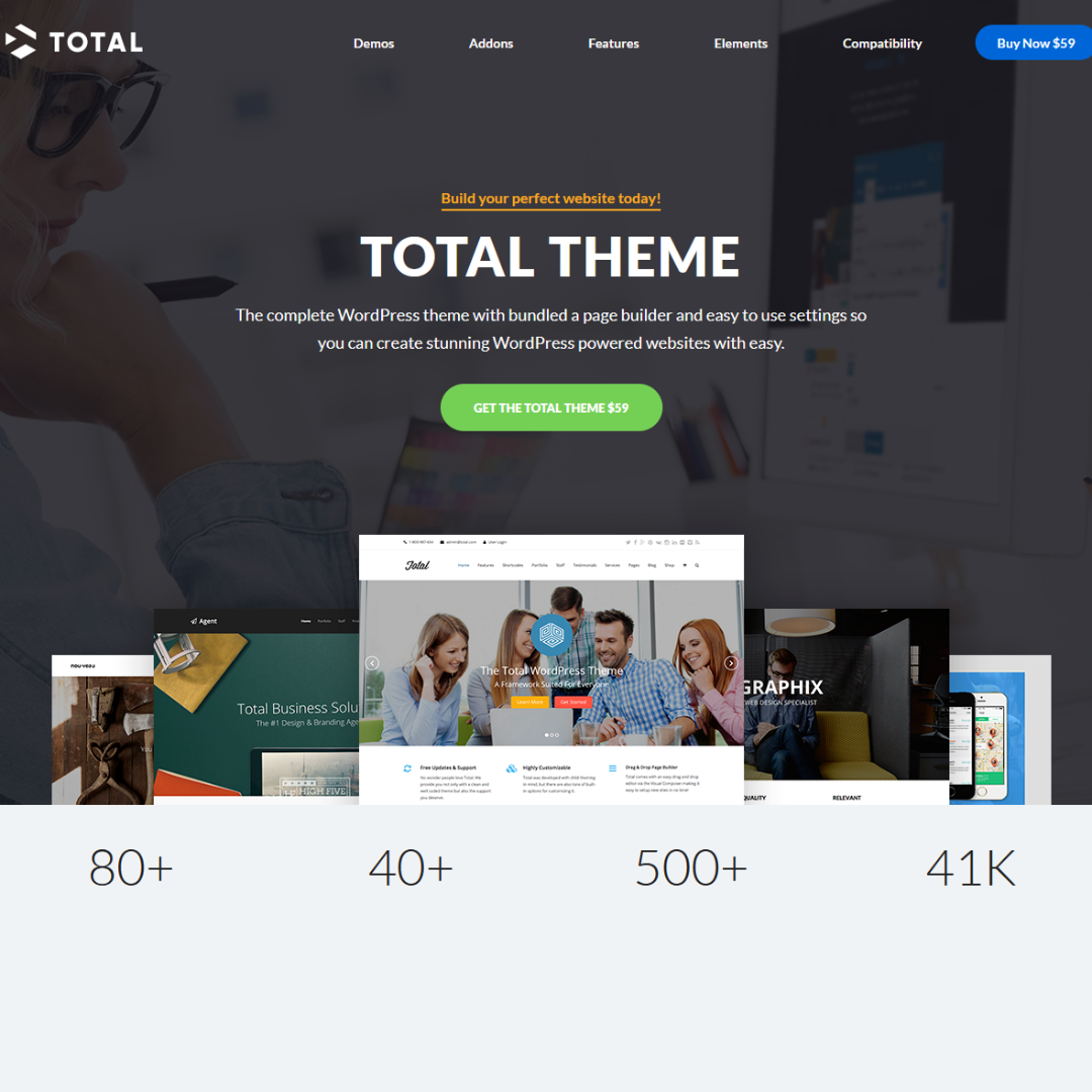
Total theme
It is a prominent theme that shows your website in almost every mobile device. Easily adaptable total theme adjusts itself to the browser window automatically. This theme also has custom mobile options. -
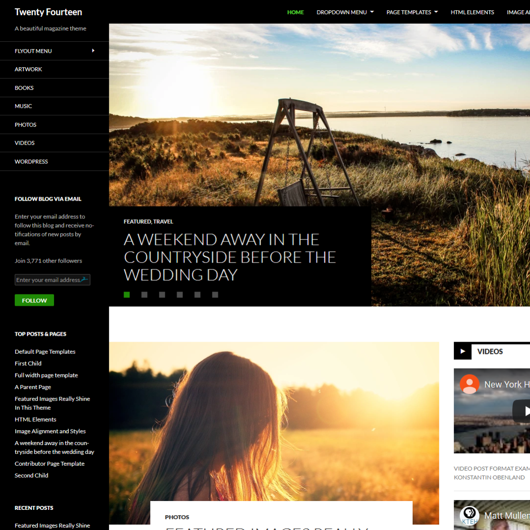
Twenty Fourteen
This theme can be adapted to every WordPress website. It is attractive, menu configurations and is appealing as well. -
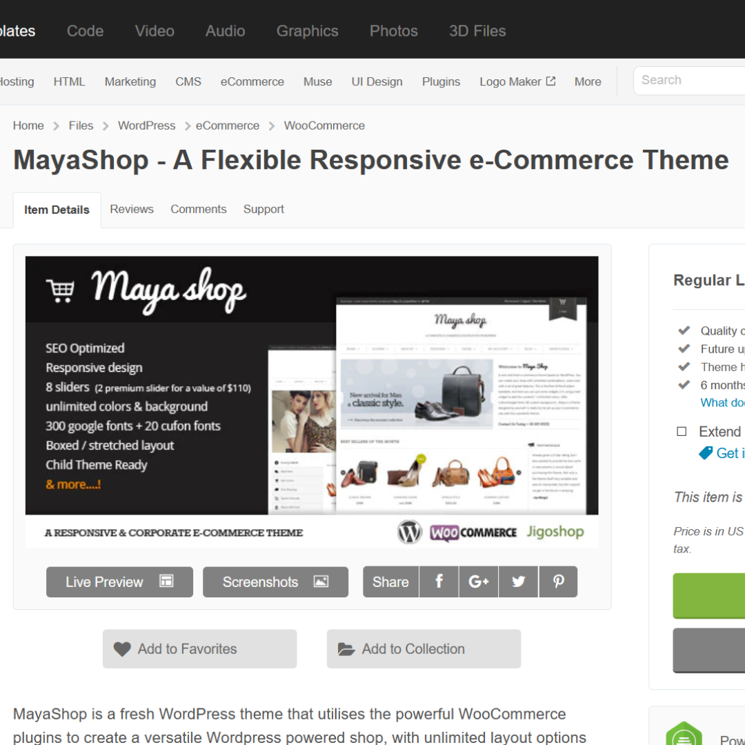
Mayashop
For running the eCommerce website, the Jigoshop plugin is the best choice that you can go with. It works excellently with the Mayashop theme. This theme can easily adjust to your WordPress design. -
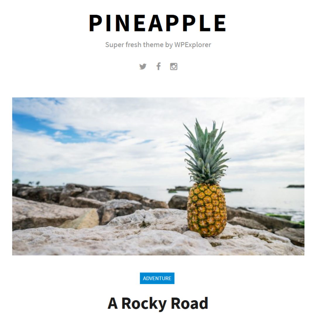
Pineapple
This essential WordPress theme is fantastic as a theme, that use of the mobile responsive design.
2 Plan The Layout
It is vital to outline the website designing. In most cases, the web designers prefer creating the wireframe, and then they move to the visual website design. Later, the coding part starts. This process makes your work easy and helps to create the specific look you wanted. Practising this, you can customize the template and blend it effortlessly on your website.
Assure that you are making many prototypes of your WordPress website and is testing that on different screen sizes to assure the website responsiveness. You can use many design tools to build responsive prototypes. Some of them are:
● InVision
● Adobe Edge Reflow
● Wirefy
3 Take Advantage of PHP
WordPress CMS is PHP supportive. So why not take its leverage. Like, in case, when there is a need to align the website navigation and brand logo, then the below piece of code can be integrated into the functions.php file:
@media only screen and (min-width: 768px) {
       #header {
              float: left !important;
              max-width: 20%;
              position: absolute !important;
       }
       #navigation {
              max-width: 70%;
              float: right !important;
              top: 2.5em;
              margin-bottom:53em !important;
       }
}
4 Dominate the Power of CSS & HTML
Use CSS and HTML and beautify your WordPress website. These give the soul to your website, and without them, you cannot create a responsive design.
CSS is known as the foundation, which helps create responsive layouts. The layout of CSS codes is in HTML elements that obviously you require for every designing element.
With the mixture of HTML5 and CSS3, the developers can make an excellent WordPress website. Hence, it can be concluded that the developers and designers have enough scope in showing their innovation and creativity in the designs.
5 Image Optimization
We cannot ignore the images. These are a vital component of every website. The fundamental thing here is image optimization, which is the helping hand in lessening the scaling and bandwidth issues.
The image format, such as PNG-8, GIF, and JPEG are used. At PixTeller we also use the WEBP format that has a lower file size and good quality. Do not use the PNG format as it does not hold the tendency to fit into every resolution. You can use the below code to make the images responsive.
img  {
       max-width: 100%;
}
6 Use Suitable Plugins
WordPress has many elements in its pocket that do not fail to impress the users. The other best thing about it is that it has the plugins that are known for making the job of the user easier. These are supportive and can assist in the number of purposes, also in making the website responsive.
Being the owner of the website, you spend a lot of your effort and time on the authentic content than on another insignificant measure that surely is helpful in making your website fully-featured and functional.
With just a plugin, you can convert your content into a readable format without even zooming in several times or scrolling from left to right to read on the phone.
WordPress has many plugins in its repository, and you can find it here: WordPress Mobile Pack. The curated plugins will give the users access to the website mobile version. Using the domain mapping, you can find conventional devices using a single theme from the four diverse colour palettes.
With the mobile detector, you can have an easy way for mobile optimization for your website. WP mobile detector operates well with every portable device, such as web-enabled phones, tablets, smartphones, etc. Please your visitors with the best experience.
7 Eradicate the Flashy Graphics
When it is about the mobile screen - they are getting larger day by day, but are smaller than the average desktop size. Do not use flashy graphics because using them in more amount will increase the website loading time, and that should not be entertained at any cost.
It is basically for the eCommerce websites. The buyers are not there to experience the fancy graphics. They are there to make a purchase effectively and quickly. Therefore, bid farewell to excess graphics and let the simple design speak.
You can always use PixTeller photo maker to optimize your images you use on your Wordpress website in minutes. ZERO tech or design skills needed!
8 Use jQuery and JavaScript
Make your webpages more active with JavaScript and jQuery. Using these approaches, you can integrate the effects, like, hide/show, slide up/down, fade in/out, and many other animation effects on the web pages.
JavaScript and jQuery both enable WordPress developers to improve the user experience of WordPress website development.
Concluding Remarks
This is all from our side!!!
We hope you liked this article.
If there are any queries and suggestions, then let us know in the comment section below.
Thank you for reading!!
Until next time, Be creative! - Pix'sTory made by Marie Thomas
Marie Thomas is a Senior WordPress developer and IT consultant at WordSuccor, providing WordPress development services to global clients. She has dived through the open-source code for over a decade and shares everything about WordPress and new Web design technologies. You can find her on Twitter and LinkedIn.