How IoT and SaaS Startups Should Visually Pitch a Connected Product
Pitching a connected product is harder than pitching a regular SaaS tool. You're not selling software. You're not selling hardware. You're selling something that lives in both worlds, plus a cloud platform, plus a mobile app, plus the data layer that ties everything together. Try explaining all that in a deck slide or a homepage hero section and watch eyes glaze over within ten seconds.
The startups that raise faster and close deals quicker aren't necessarily the ones with the most advanced technology. They're the ones who figured out how to make a complex connected system feel simple, visual, and obvious. That's a design problem, not a technology problem.
This article breaks down what that looks like in practice, the visual choices that work, the common mistakes that kill pitches, and how to think about your product imagery as a strategic asset from day one.
Before going further, one thing to keep in mind. The pitch deck and the product itself shouldn't be designed by different brains in different rooms. Founders who treat the device, the app, and the brand identity as a single coherent system from the prototyping stage end up with cleaner pitches almost automatically, which is why thoughtful IoT product design starts paying off long before the deck is written. With that out of the way, here's what actually works visually.
Why Connected Products Need a Different Visual Strategy
A pure SaaS startup pitches with screenshots. Dashboards, settings panels, beautiful charts. The product is the screen, and the screen tells the story.
Hardware startups pitch with product photography. The device on a clean background, in someone's hand, in context, glowing softly.
Connected product startups have to do both at once, and that's where most decks and websites fall apart. They show a beautiful device on slide three, a screenshot of the app on slide four, and a confusing architecture diagram on slide five. The viewer is left to mentally assemble what the product actually is.
The fix isn't fancier graphics. It's a clear visual hierarchy that answers four questions in order: What is the thing? Where does it live? What does it do for the user? How does it talk to the cloud?
The Five-Visual Framework for Pitching a Connected Product
If you're working on a deck, a landing page, or a pitch video, the following five visuals will carry more weight than any amount of copy. Get these right and the rest of the pitch writes itself.
1. The hero shot. The product itself, photographed or rendered cleanly, in a way that communicates what kind of object it is at first glance. A wearable looks different from a sensor module which looks different from a hub. The hero's only job is to answer "what is this thing?" within two seconds.
2. The product-in-context shot. The same device, now in its actual environment. On someone's wrist. Mounted on a wall. Plugged into factory equipment. Context tells the viewer who uses this and where, which is usually the missing piece in early-stage pitches.
3. The app-and-device pairing. A composite image showing the device alongside the mobile or web app it pairs with. Done well, this single visual collapses the entire "connected" story into one frame.
4. The user-flow visual. Not a wireframe and not a screenshot, but a simple visual narrative: user does X, device captures Y, app shows Z. Three or four frames, almost like a comic strip, walking the viewer through the actual experience. Most pitches under-invest here, and it's where investors spend the most time looking.
5. The system diagram, simplified. The architecture slide is unavoidable when pitching a connected product, but it shouldn't look like an enterprise IT chart. The best ones use clean icons, two or three colours, and group elements into three layers (device, cloud, user). If a non-technical investor can follow it in fifteen seconds, it's working.
The Common Visual Mistakes That Kill Connected Product Pitches
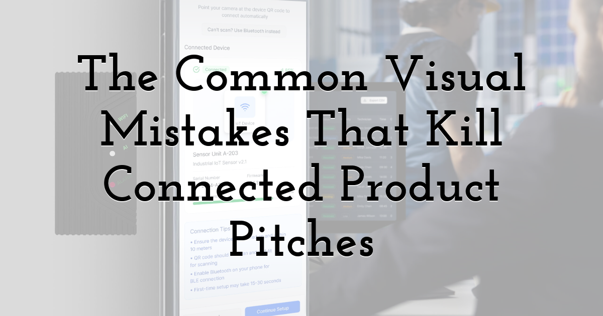
A few mistakes show up constantly in decks and homepages from connected product startups.
Showing the device without showing what it does. A glamour shot of beautiful hardware is meaningless if the viewer can't tell what the device measures, controls, or enables. Always pair the device shot with at least one visual showing its function or output.
Using stock photography of "smart" anything. That blue glowing brain image. The IoT diagram with floating icons. The shadowy hand touching a holographic interface. These visuals signal "we didn't bother making our own assets," which signals "we cut corners elsewhere too." First impressions matter, and clean, consistent visual design builds trust faster than any tagline ever will.
Architecture diagrams that look like enterprise IT documentation. Boxes connected by arrows in seven colours, with acronyms only insiders understand. Investors don't need to see your full system topology. They need to see that the data flows from somewhere to somewhere, and that the whole thing holds together.
Inconsistent design language across hardware, app, and marketing. When product photography uses warm tones, app screenshots use cold blues, and the website uses neon gradients, the brand feels fragmented. Connected products especially need visual consistency because they ARE multiple things at once.
Overloading the homepage with explanation. The temptation is to explain everything above the fold. Resist it. The job of the hero is to make the visitor want to scroll. The rest of the page does the explaining.
Visual Storytelling Through the Funnel
The same five core visuals can be adapted across the entire customer journey.
Top of funnel: short, motion-heavy social clips showing the device in action. Animated GIFs of the app responding to a real-world event. A founder demo filmed where the product actually lives.
Middle of funnel: longer explainer videos, comparison visuals, before-and-after diagrams. This is where product photography meets data visualisation, and where most prospects decide whether the product is real.
Bottom of funnel: case studies with rich visual evidence. A customer's actual setup. Real dashboard screenshots. Numbers presented as graphics, not just text.
The principles behind visual storytelling apply equally whether you're selling lifestyle apparel or industrial IoT. The format changes by stage, the underlying discipline doesn't.
Where Visual Design Meets Product Design
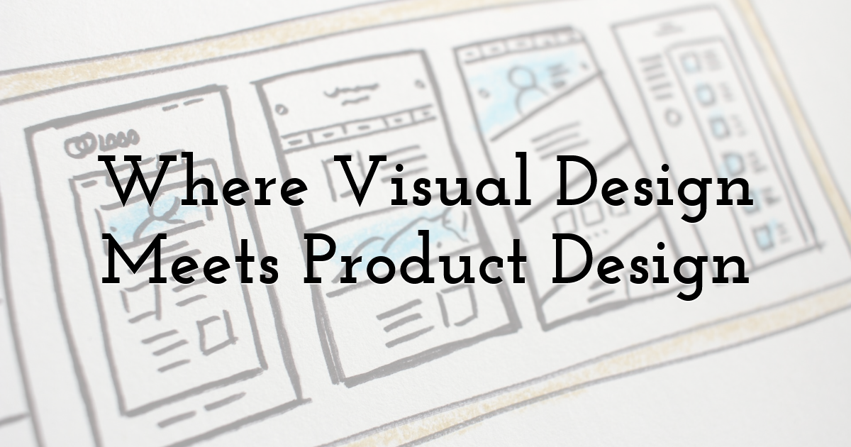
The visual pitch can only carry a connected product so far if the underlying product itself wasn't designed with the pitch in mind. The most photogenic connected products are usually the ones where industrial design, app UI, and brand identity were considered together from early prototyping, not bolted on at the end.
When the hardware silhouette, the app's primary screen, and the marketing imagery share a design language, the pitch becomes dramatically easier. Investors and customers pick up on coherence the same way they pick up on incoherence, instantly and without being able to articulate why.
For founders building a connected product right now, the practical implication is simple. Start thinking about the visual pitch before the product ships, not after. The look of the device, the screens of the app, the brand palette, and the architecture diagram should be developed in parallel. The companies that do this raise their next round on the strength of a single deck. The ones that don't spend the next six months rewriting it.
The difference isn't in the technology. It's in whether anyone can see what the technology actually does.
Until next time, Be creative! - Pix'sTory