Poster Maker for Students: Design A+ Class Posters
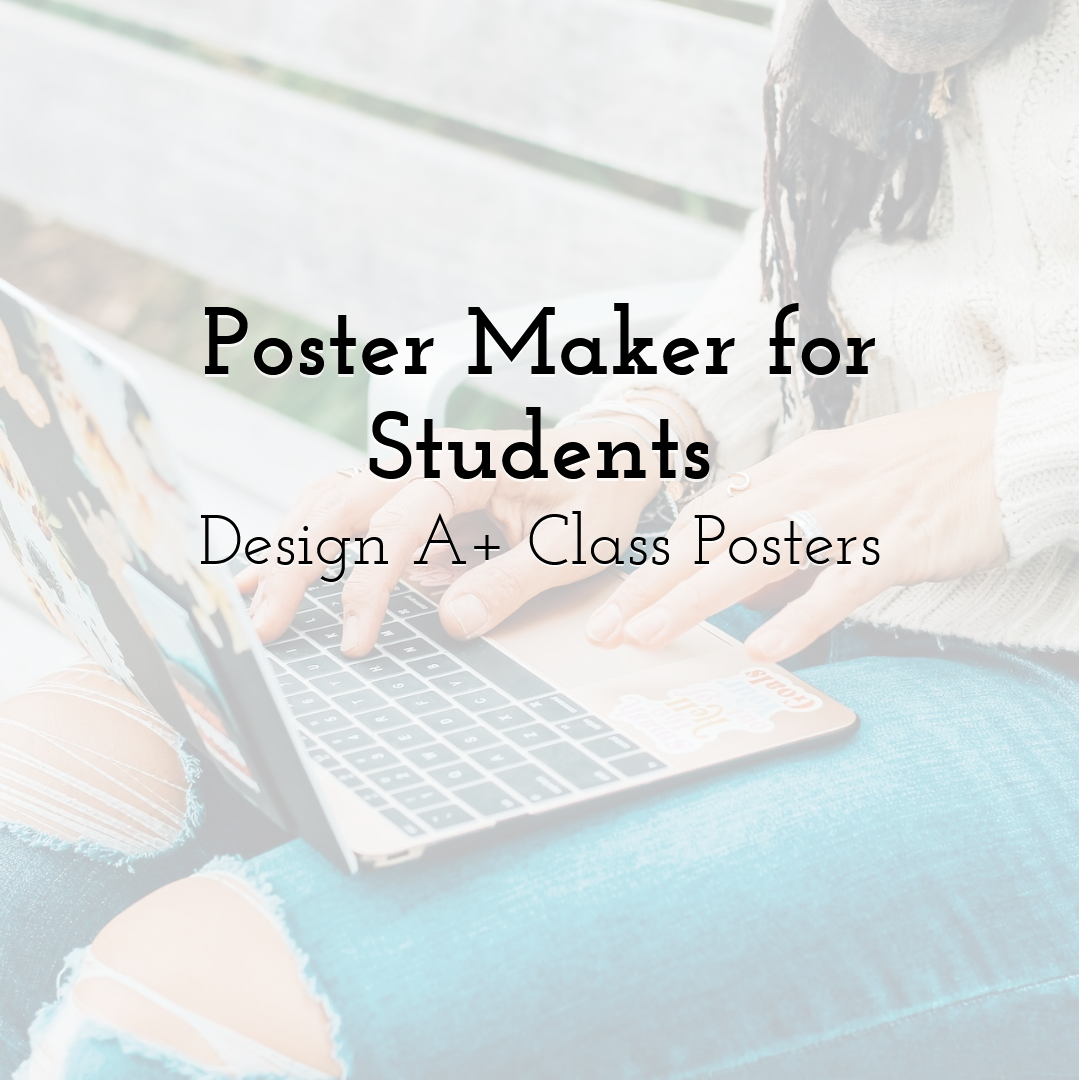
Creating a classroom poster can feel like real magic for many learners. In minutes, bright art and clear words turn a plain notice into a bold display. The first thought often echoes a shared worry about difficulty and time pressure. Algebra sometimes sparks that feeling during homework, quizzes, and long study nights. If algebra ever made you think, maybe I should just do my math homework later, remember that designing a poster does not need to feel the same way. This guide walks through every step, from color picks to final sharing, so any student can reach an A+. Along the way, readers gather skills that also help with flyers, infographics, and slide decks — and even WritePaper can help with Excel homework, thanks to the clear explanations of layout, data visualization, and presentation design. By the end, a small idea can stand tall on a wall and spark action. Most tips use free tools that run in a browser, so no special software is needed. Let us move through the creative process and see how a smart poster maker turns classroom stories into strong, eye-catching art.
Step 1: Define the Purpose and Audience
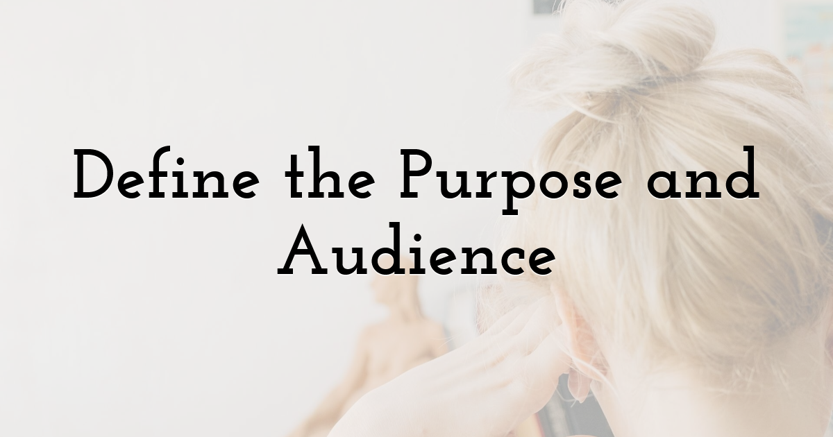
Before opening any design page, pause and write two short guiding lines. State who will see this poster and what action should follow after reading. Clear responses shape each choice that comes next in layout, size, and type. A science fair notice for sixth graders may use big images and a playful title. A college club sheet may prefer neat borders and formal type for a calm tone. Write a single sentence goal, like convince classmates to visit the recycling booth during lunch. Another aim might be to explain Newton’s laws at a glance with clean visuals. Jot ideas in a notebook and circle key facts that must fit on the page. Doodle icons, test phrases, and list items that deserve top billing. This fast planning stage also shows whether a poster is the best format for the task. A flyer maker or quick slide might suit limited space or strict word counts. Ten minutes here can save an hour later and point the way to an A-ready layout.
Step 2: Collect Images, Text, and Data
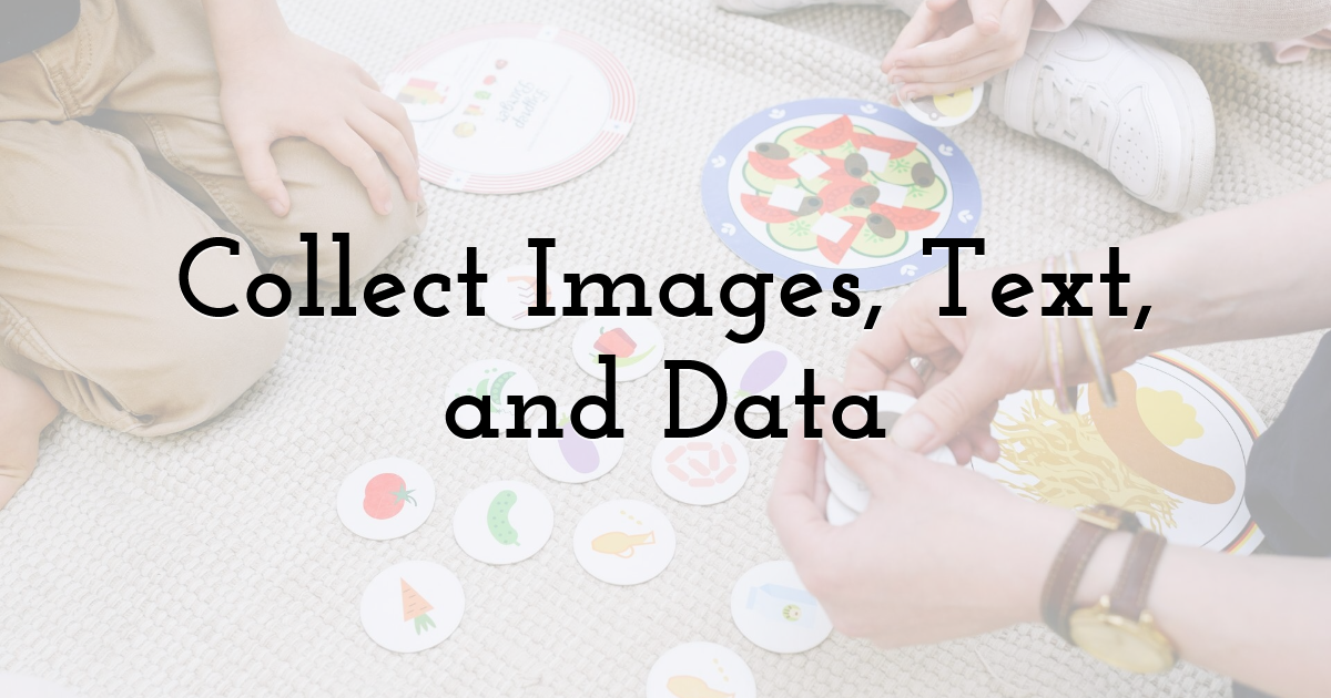
Gather all parts before entering the canvas to keep the creative flow smooth. Start with high-quality photos that match the theme you plan to present. For an environmental poster, pick leaves, the planet, water drops, or clear recycling marks. Add charts or graphs if numbers will support the message or call to action. Dropping them in later works best when files are ready and sized for the page. When the project needs personal details, like a promotion board for student council, borrow the tidy flow of a resume template for students. Those layouts show where to place a name, role, and key wins in a clean column. Draft a headline, one subhead, and short body copy that stays tight and direct. Keep paragraphs lean so viewers can scan fast from a hallway distance. Note sources for facts and quotes so credit is simple when the design is done. Store everything in one folder to speed up work inside a poster maker or flyer creator.
That habit prevents lost files and protects time when the deadline draws near.
Step 3: Plan the Layout with Visual Hierarchy
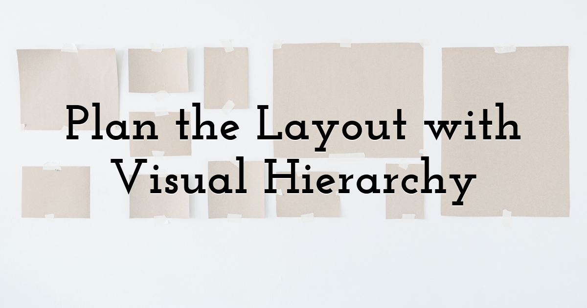
A strong layout guides eyes from the main message to the small print with clarity. Designers call this flow the visual hierarchy and rely on it to direct attention. Begin by sketching rectangles to mark where each element will sit on the page. Place the title at the top, a large image across the middle, and details near the bottom. Use bigger shapes for items that deserve attention and smaller ones for background notes. White space gives breathing room and steers focus toward the most important parts. While sketching, imagine classmates viewing the poster from down the hall. The title should read in three seconds while they keep walking past the boards. A clear call to action should pop before they reach the next display. Number each box to lock the reading order you want later inside the editor. Erasing a pencil mark is faster than redoing a crowded digital layout. When the blueprint feels balanced and sharp, start choosing a color palette.
Step 4: Choose Colors with Confidence
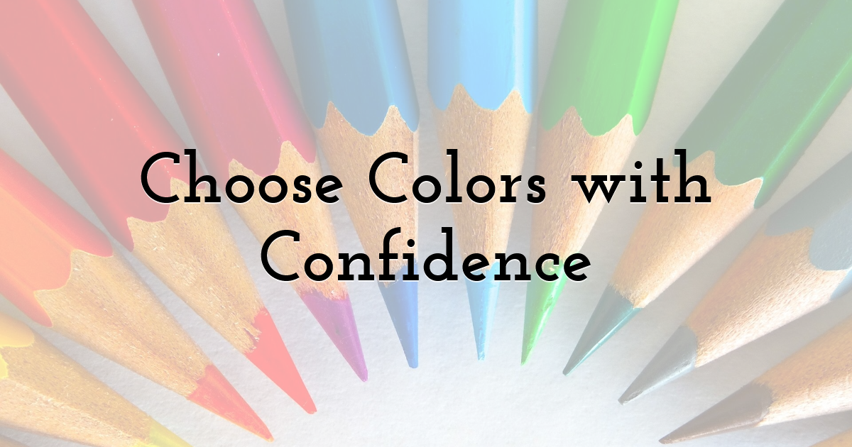
Color picks can lift the message or bury it under noise and glare. Learn a few color basics in minutes and gain value on every project after. The color wheel shows warm hues like reds, oranges, and yellows that feel energetic. It also shows cool hues like blues, greens, and purples that feel calm and steady. For most school posters, two main colors and one accent work best for control. A bright accent used on headings or icons acts like a highlighter, pulling eyes. Avoid placing green text on red backgrounds because the pairing strains vision. That mix also blocks access for many classmates who live with color blindness. Free palette tools help test contrast so text stands out from background shades. Nature offers strong guides when choices feel hard or rushed near a deadline. Forests pair deep greens with browns, while sunsets blend warm tones into soft blues. Print a small test or project to a screen and check swatches before locking picks. Smart color use supports the hierarchy you planned during the sketch stage.
Step 5: Pick the Right Digital Tool
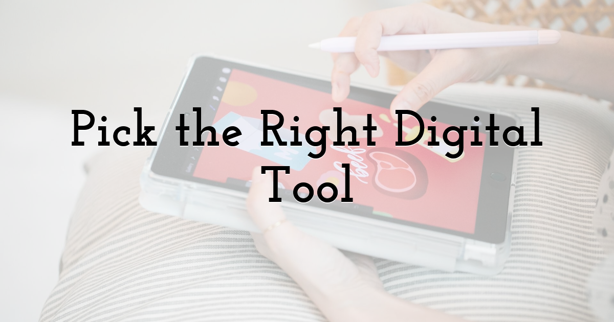
Modern classrooms offer a full toolbox without installs or long, slow updates. Open a browser and pick a poster maker that runs smoothly on school devices. Many sites provide useful templates, drag-and-drop editors, and cloud storage for teams. If the task leans toward handouts, choose a flyer maker with smaller page sizes. When you need to present survey data, an infographic maker turns numbers into visuals. Students presenting research can build slides with a presentation maker online. Reuse the same graphics across slides and posters to keep branding consistent. Check export choices like PDF for print and PNG for digital posting on feeds. Look for rulers, grids, and snap alignment so edges stay straight during edits. Those small aids keep layouts tidy even when a mouse slips or a touchpad jumps. Try two platforms on tiny mockups to learn which tool matches your workflow. A good choice lets ideas flow instead of hiding options behind long menus.
Step 6: Write Words That Pop
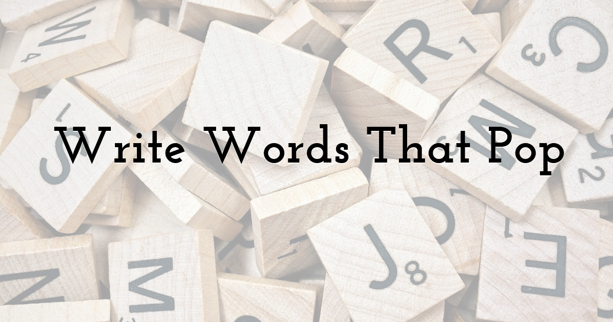
Even the brightest picture will fail if the words feel dull or crowded. When planning how to make a poster for school, start with a tight headline. Keep it under seven words so readers get the point at a glance. Use a strong verb to catch attention, like join the robotics club today. Explore Mars tonight sets a fun tone for science and sparks curiosity. Donating gently used books gives a kind and focused call to action. Add a short subhead that delivers one clear extra detail for context. In the body, short lines help skim readers grasp the gist without delay. Keep font choices simple and friendly for eyes across different displays. Use one bold display face for the headline and a clean sans serif for text. Mixing more than two fonts risks visual clutter that hurts fast reading. Check spelling twice since one typo can weaken trust in the message. Adjust line spacing until sentences breathe and shapes feel even on the page. Read the copy aloud from several steps away to test pacing and clarity.
Step 7: Add Images, Icons, and Final Polish
With words and colors set, place images and icons where the sketch reserved space. Drag the main photo into position and crop any busy edges that distract. Apply a soft filter only when it supports the mood and chosen palette. Small icons can replace long labels like a clock for time and a map pin for a place. Align edges against the grid so shapes do not drift during small changes. Squint at the screen to run a quick contrast test after placing elements. The headline should still jump forward when details blur at a glance. If it falls back, raise the weight, enlarge the size, or switch the accent. Ask a friend to view the poster for ten seconds, then share the takeaway. Their summary will expose gaps, weak wording, or confusing reading order. Export print and web files and name versions with clear labels and dates. That habit prevents sending a low-resolution image to a printer or forum. Save a working copy with layers intact for later tweaks or new assignments.
Step 8: Present and Share Like a Pro
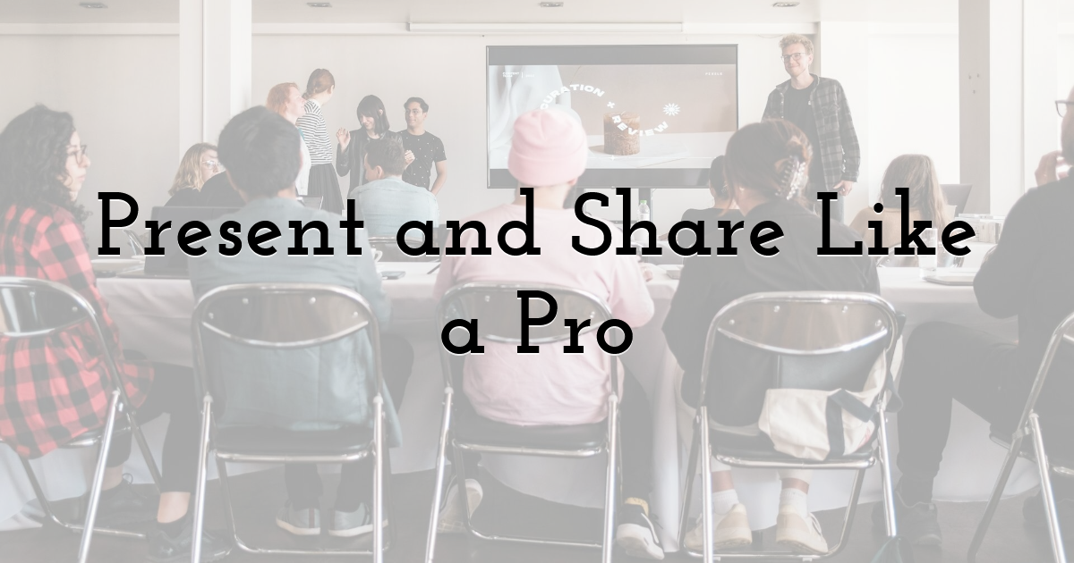
A finished poster earns its grade once it meets and holds a real audience. Print a test copy and check that margins remain intact on every edge. Mount the final page on stiff backing so it does not curl on display. For science fairs or history nights, practice a short talk that guides viewers. Walk through the headline, the main image, the key data, and the action. These simple poster presentation tips prevent pauses and keep focus on your message. When sharing online, export a JPG and post it to the class forum. Add a short description so classmates using screen readers can follow the image. If the poster belongs to a larger unit, link it to a slide deck. Keep the look aligned so the set reads like one clear, careful project. After posting, answer comments and thank classmates who share useful notes. That practice builds trust and raises interest before the next display appears. Record what you changed so future projects start with better habits in place.
Step 9: Reflect and Iterate for Future Projects

Great designers treat every poster as a lesson for the next assignment. After the event ends, snap a photo of the poster in its real setting. Judge whether colors stood out under hallway lighting during busy passing periods. Consider whether classmates read the headline from ten feet away with ease. Gather comments from teachers and peers, then write improvements in a design journal. Next time, the class might need small handouts handled by a flyer maker. A chart-heavy science piece may live better inside an infographic maker. Return to the original goal and check how well the poster met the aim. Keep files in clear folders so assets can be reused or updated quickly. Over time, that archive grows into a personal library of fonts and icons. Add color palettes that worked and note where each one performed best. Save links to sources, credits, and export settings that printed cleanly on school devices. With steady review and simple tweaks, one poster becomes a strong, growing skill. That skill supports future resume templates for students and polished talks in college.
Until next time, Be creative! - Pix'sTory
Recommended posts
-

Top 10 Party Decoration Ideas
Read More › -

Your Guide to Starting a Photography Career
Read More › -
Upscaling Images for Instagram Without Losing Quality
Read More › -

Krea.ai or Midjourney? Full Platform Comparison
Read More › -
Poster Maker for Students: Design A+ Class Posters
Read More › -
How to Style Flat-Lay Product Photos Professionally
Read More ›
