The Nostalgia Sweet Spot: How to Use Retro Stock Photography Without Making Your Brand Look Outdated
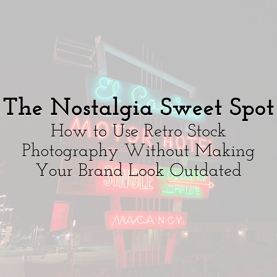
A sun-faded photograph of a roadside motel can suggest adventure. A close-up of a cassette player might recall the pleasure of choosing what to listen to. An image of a handwritten recipe card can make food feel connected to family, practice, and time.
Retro photography brings associations into a design before the headline has finished explaining the offer. That gives it considerable creative potential.
It also creates a challenge. The same photograph that makes a brand feel warm and familiar can leave visitors wondering whether the business has kept up with their needs. A nostalgic atmosphere may be appealing; an outdated-looking booking process is less useful.
The sweet spot lies in connecting something meaningful from the past with an experience that works in the present. When selected thoughtfully, retro stock photography can give a brand character while helping it communicate a current, relevant offer.
Decide What You Want People to Remember
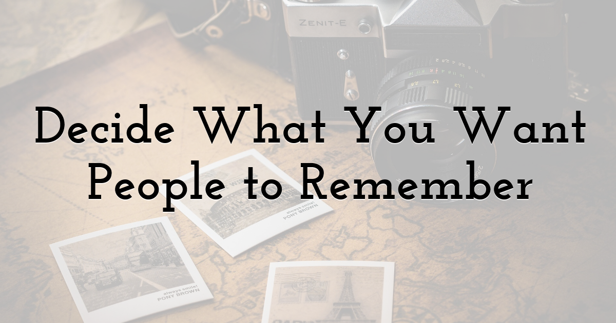
“Make it retro” gives a creative project a look without necessarily giving it a purpose.
Start by identifying the experience or quality you want to bring forward. It might be the anticipation of a road trip, the pleasure of making something by hand, or the familiarity of a shared family routine.
Those ideas lead to more useful image choices than a broad search for anything old.
A music school might use a photograph of records or handwritten song notes to suggest the personal enjoyment of discovering music. A repair business could draw on the visible care associated with a well-used workbench. A holiday campaign might explore the ritual of writing and sending a message.
The photograph should support something the brand can offer now. If the connection ends at “this looks vintage,” the campaign may feel decorative rather than distinctive.
Write a sentence describing the memory or association you want to evoke. Use it to guide the selection.
Understand Whose Nostalgia You Are Inviting
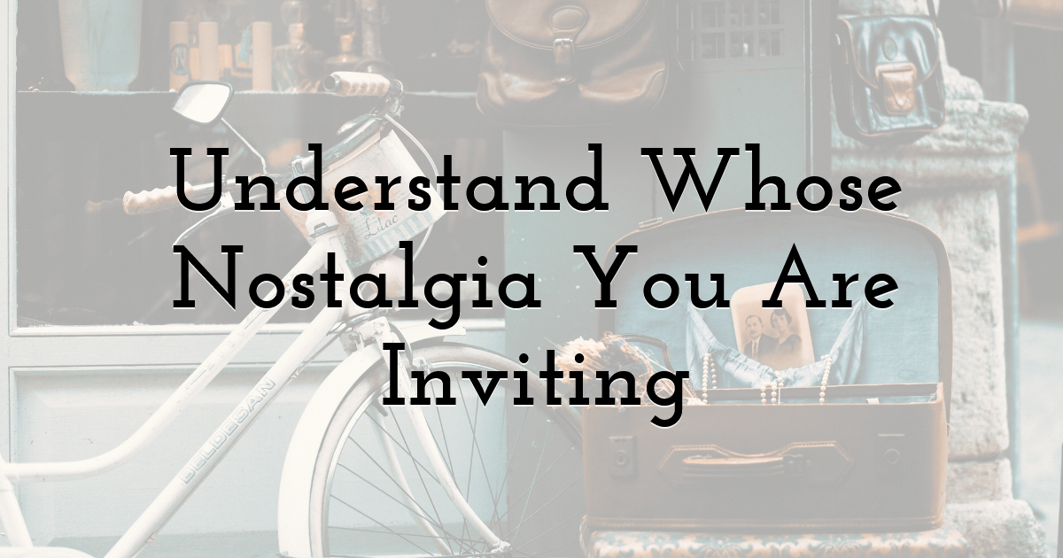
An object can mean different things to different viewers.
A rotary telephone may be an everyday memory for one person, a childhood detail for another, and an unfamiliar design object for someone else. An image of an old game console might suggest friendship and school holidays to one audience while communicating little beyond obsolete equipment to another.
Consider what your intended customers are likely to recognize and how the image connects with their experience.
Personal memory is only one route. People can appreciate the atmosphere of an earlier period through films, family photographs, music, or objects they have encountered later. However, that appreciation may differ from the feeling of remembering something firsthand.
Choose a connection that does not depend entirely on viewers having lived through a particular decade. A carefully made object, a shared meal, or the excitement of leaving on a trip can provide a recognizable human experience beneath the period details.
That gives the image a broader way to communicate.
Choose a Coherent Direction
Retro imagery covers many different styles. Combining them casually can make a campaign feel confused.
A faded family snapshot, a polished studio advertisement, and a sharply lit photograph of an old object each approach the past differently. Even when the subjects belong to a similar period, their visual language may not fit together.
Decide which qualities matter to your campaign. Perhaps you want the informality of personal photographs, the graphic simplicity of a printed advertisement, or the tactile detail of familiar materials.
Then look for images that share those qualities.
You do not need to reproduce an entire decade with historical precision for every conceptual campaign. You do need to make deliberate choices. If the photography suggests one atmosphere while the type, colors, and layout point in several other directions, viewers may struggle to understand the brand’s intention.
A small, coherent set of references can help establish the boundaries.
Keep the Nostalgia Close to the Subject
Retro photography tends to feel more purposeful when its subject has a clear relationship with the offer.
A travel business might explore older travel rituals, luggage, maps, or roadside settings. A craft workshop could use photographs of tools, materials, and hands at work. A service built around restoring possessions might find a natural connection in well-maintained objects with visible history.
The relationship should be apparent through the image and accompanying words.
An unrelated vintage car may look appealing, but it can become a distraction if the audience cannot connect it with the message. A simpler image of someone caring for a valued possession could be more useful.
When searching stock photos, begin with the relevant activity or object, then refine the style. This helps you avoid selecting an image for its treatment alone.
The photograph needs to belong to the story as well as the palette.
Pair an Older Atmosphere With a Clear Present-Day Offer
A brand can draw on the past while making its current usefulness unmistakable.
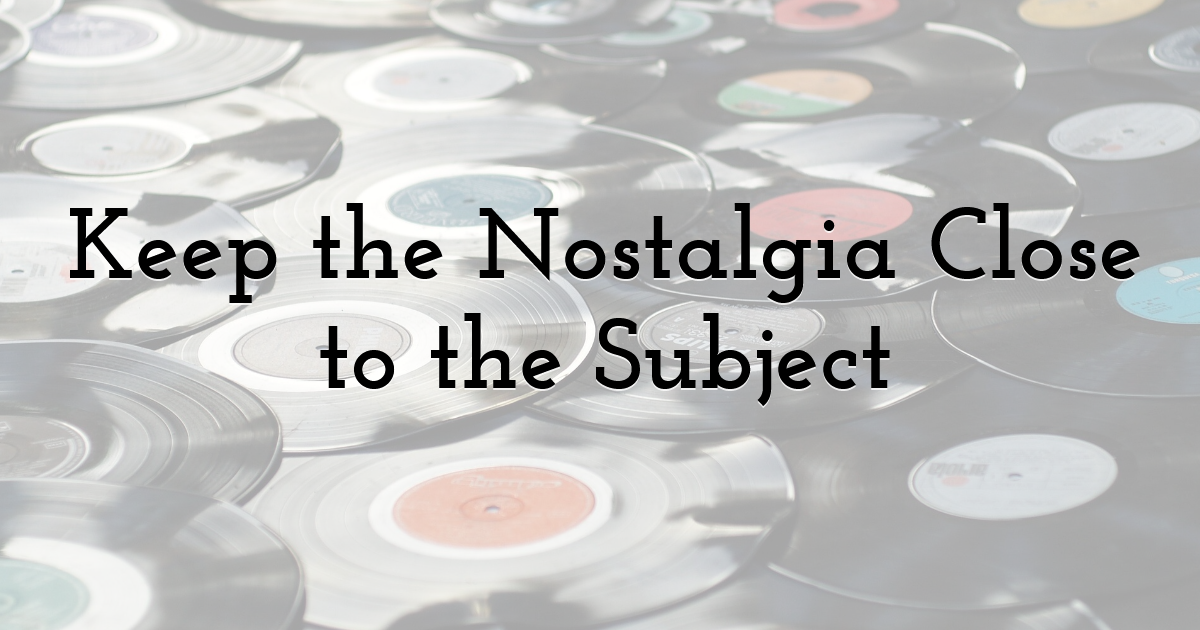
Imagine a music school using a warm photograph of vinyl records and handwritten notes. The headline might celebrate the pleasure of learning a favorite song, while the supporting copy explains lesson options, scheduling, and how to begin.
The image supplies character. The information makes the offer practical.
This balance matters because nostalgia can introduce ambiguity. Is the business celebrating a particular aesthetic? Selling vintage products? Presenting its actual history? Offering a modern service with a familiar atmosphere?
Answer the relevant question through clear copy.
Make the next step easy to understand, too. A visitor should be able to find the price, service details, booking process, or product information without having to interpret decorative language.
A nostalgic introduction works best when it leads comfortably into an experience designed for today.
Use Retro Cues Selectively
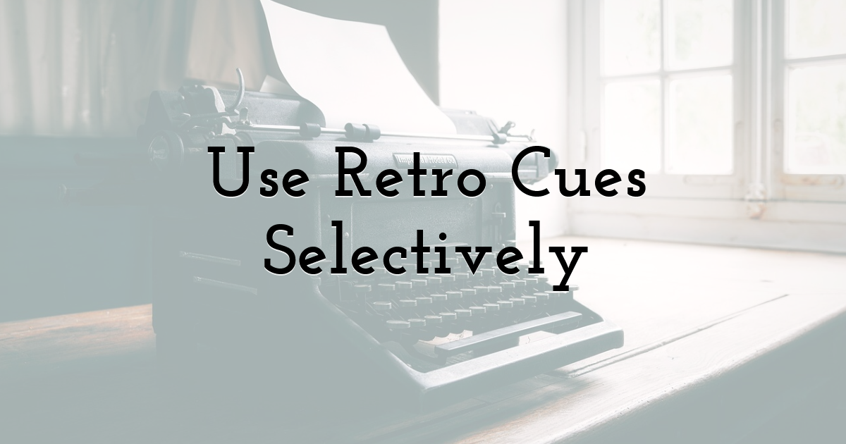
It is tempting to reinforce a vintage photograph with every available effect: grain, faded colors, distressed borders, script lettering, paper textures, and ornamental graphics.
Together, these elements can overwhelm the message.
Choose the cues that contribute most. If the photograph already contains strong period details, the layout may need very little additional styling. A simple headline and generous spacing can give the image room to establish the atmosphere.
Alternatively, a relatively straightforward photograph of an old object might work within a more expressive graphic treatment.
Consider where the nostalgia should be concentrated. It might live mainly in the image, the palette, or a small recurring detail. Keeping some parts of the design restrained can make the distinctive elements easier to appreciate.
Review the piece at its intended size. Fine texture and decorative lettering can behave very differently in a small advertisement than in a large presentation.
Preserve Clarity When Editing Photographs
Color treatment can help a collection feel related, but a retro effect should preserve the information the audience needs.
Watch what happens to skin tones, product colors, and important details. Heavy fading may make a scene feel atmospheric while hiding the action. Strong grain can become distracting. Darkened edges may draw attention away from something useful.
Start with an image whose composition and subject already support the project. Then make adjustments according to the intended mood.
If you are using professional stock photos from different sources, aim for a compatible overall treatment rather than forcing every image through an identical preset. Different lighting conditions and subjects may require different adjustments.
Compare the edited photographs together and within the layout. The treatment should help the collection feel coherent while leaving each image readable.
A convincing atmosphere depends on the whole design, not the strength of the filter.
Distinguish Style From Actual History
A vintage-looking photograph can suggest that a business has a long history, especially when paired with language about tradition or heritage.
Be clear about what the image represents.
If you are telling the story of your actual company, original photographs, records, and verified details provide a specific foundation. Retro stock imagery can support broader subjects such as craftsmanship, familiar routines, or the atmosphere of an earlier period.
Choose captions and headlines that preserve that distinction. A photograph illustrating a general love of handmade objects should not accidentally become evidence of your workshop’s past.
You can create a rich nostalgic identity without inventing a founding story. Focus on the qualities you value and the experience you provide.
That approach gives the brand room to be expressive while keeping its claims grounded.
Make the Familiar Experience Relevant to More People
The most useful element of a nostalgic image may be the relationship or activity beneath its styling.
Friends choosing music together, someone learning a practical skill, or a family preparing food can communicate recognizable experiences. The clothes, objects, and photographic treatment establish the period, while the human situation carries the message.
Look for photographs that give your audience a way into the scene.
A campaign can also combine retro details with contemporary photography. An older object, familiar ritual, or carefully chosen surface may establish the atmosphere while the people and setting reflect the customers you serve now.
This can make nostalgia feel like an ongoing influence rather than a closed historical scene.
Ask which part of the image deserves to travel forward: the care, the curiosity, the shared experience, or the attention given to a task. Build around that quality.
Check What the Audience Thinks You Are Offering
Before publishing, show the draft to someone unfamiliar with the project.
Ask what kind of business they think it represents, what they believe is being offered, and which words they would use to describe its personality. Let them answer before explaining the intended direction.
If they see warmth, character, and a clear service, the balance may be working. If they assume the business sells only secondhand goods, lacks current options, or belongs to a different category, examine which cues created that impression.
You may need clearer copy, a different photograph, or fewer competing effects.
The nostalgia sweet spot is a relationship between memory and present usefulness. A well-chosen image can bring texture, affection, and a sense of continuity to a brand. Clear information and thoughtful design give those associations somewhere relevant to lead.
Let the photograph remind people of something worth keeping, then show them how that quality belongs in their lives today.
Until next time, Be creative! - Pix'sTory
Recommended posts
-

How Visual Branding Can Make Promotional Products More Memorable
Read More › -

Why Custom Printing is the Smartest Marketing Investment You Can Make
Read More › -
The Timeless Beauty of Black and White Photography
Read More › -

The Role of Brand in Building High-Converting Content Strategies
Read More › -

How to Deliver HubSpot Onboarding Under Your Own Brand (Without Building...
Read More › -

5 Ways to Improve Your Brand Presence at Industry Events
Read More ›