5 Benefits of Mobile App Animation for User Experience

Create custom trending animated visuals for personal or commercial use with PixTeller animation creator tool.
Animation is one of the top design trends. No wonder, benefits of mobile app animation for users are apparent to the naked eye. They bring dynamic and life to an app, and with it comes an emotional response from a user.
So how exactly can animation benefit your business?
What Types of Mobile App Animation Are Out There and Why They Matter?
88% of users will leave your app that has poor user interface. Good news, different animations can solve this issue.
Types of animation can vary depending on your app's goals, the app, business, and technical possibilities of your app. However, we tried to gather the most common, yet effective animations that improve UX, digest complex ideas eloquently, and simply boost brand awareness of your app.
Preloaders, Progress Bars, and Loading Animations
A preloader is a type of animation that can be seen while the actual content of an app is being loaded. Typically, these animations are your progress bars that ensure the waiting process is fun and bearable.
Why Are Preloaders Important?
Loading times can be frustrating. In today's reality users seek quick and accessible information. According to recent studies, the longer loading time not only increases the frustration of your users, but also the bounce rate.
5 seconds will suffice for 90% of users to jump off and leave your app or website before they see anything.
Navigation Elements Animation
Navigation Elements Animation Navigation elements are intuitive directions for the user. They are irreplaceable elements of any successful business app and are critical to user experience.
Navigation animation shouldn't be underestimated, especially when it comes to minimalistic applications with complex hierarchies.
The navigation bar should be implicitly hidden but become visible in a crucial moment. The animation brightens up this moment perfectly. Apart from the purely aesthetic aspects of such:
- • Navigation animation simplifies things and brings clarity to your users.
- • Menu animation allows you to further structure your content. Depending on the interests, your users can delve into information without losing the hierarchy of an app.
- • It is much easier to find your content at different levels.
- • Your visitors need less time to find data and content that is relevant to them.
- • Animated navigation bars show that your app is professionally designed.
- • Your visitors will be more interested in interacting with your app.
- • A pleasant design enhances the overall user experience offering faster orientation and therefore more actionable options, and engaging animations.
Animations of Numbers, Data, and Facts
Data animation is designed to display numbers, big data, or facts that can be presented visually. Such animations can engage the soberest facts and figures into a visual highlight of your app.
Intuitive animation that is in harmony with your business model will enhance your app interaction and tell the exciting story behind the numbers.
Animation of Visual Feedback
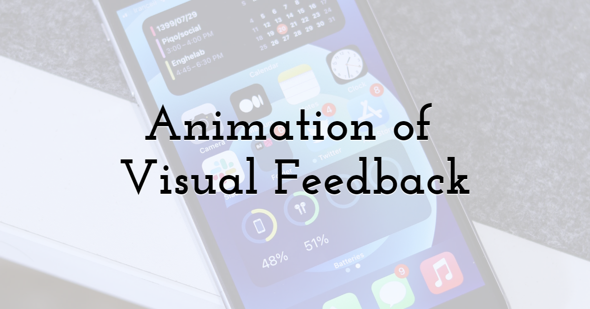
Nobody's insured against mistakes. You just need the right animation to point them out. It should display relevant additional information and interaction options at the right time.
Benefits of Visual Feedback Animation

Ideally, a feedback animation should pop up when your users NEED it. It should offer relevant additional information and interaction options at the right time.
You may know those "meh" pop-ups that interrupt the users on the app. This is very annoying, which is why many pop-ups are usually negative.
Times have changed. New pop-ups are usually a must-have for many retail and e-commerce platforms. When users make mistakes or need instructions, visual feedback animation comes in to help.
- • "Have I pressed the right button?"
- • "Have I filled in all the fields?"
- • "Is my transaction completed?"
Visual animation answers all these questions.When used correctly, such animations can guarantee very good UI features.
Page Transitions
Page animations are animated transitions between two pages of an app. Each transition should be memorable, create a flowing, gentle page change. At the same time, such animations help to bridge the loading times of the target page.
Animated page transitions offer short latency and smooth transitions between two different pages or a list of products. Page jumps or jumps between URLs are minimized.
A case in point could be e-commerce apps. We often lose track and connection between different elements. Transition animation helps to manage our orientation in an app easily.
As a result, your users can enjoy a smoother user experience and easily navigate through different products, increasing your conversions.
Final Thoughts
Sure thing, wasting most of your budget on stellar animations wouldn't be a wise thing to do. The animation should be integrated harmoniously with the target audience of your app. It's better to have few simple and practical animations rather than heaping your app with complicated options.
The list above gives you an idea of what animations make sense and when.
Until next time, Be creative! - Pix'sTory made by Louis Sawyer
Louis Sawyer is a professional writer, editor, and web design expert. She loves writing about technology trends, web development, mobile games, and business issues. Also, Louis works as a proofreader at Computools. Follow Louis on Twitter.
Recommended posts
-

7 Interesting Facts About Graphic Design Careers
Read More › -
How to Drive Traffic to Your Website: 7 Tactics That Make a Perfect Strat...
Read More › -

How to Improve User Experience and Get More Conversions
Read More › -
How Advancements in Technology Impact the Graphic Design Industry
Read More › -

Web Design Trends 2021: Designers Should Know
Read More › -

12 Principles of Design to Help You Create Effective Graphics
Read More ›
