10 Easy Design Hacks to Create Stunning Visuals Without Being a Pro
When it comes to creating stunning visuals, many people seem to think that one would need years of design training at least that fancy piece of paper. Fortunately, that's just not true. With the right tools, mindset, and a few clever hacks, anyone can create eye-catching designs that stand out-even if your artistic skills stop at stick figures.
Be it trying out a free text-to-voice tool for adding audio to your visuals, an AI website builder for seamless integration in design, or learning how to draw inspiration and extract data with web scraping software -the world is your oyster for making your life much easier. Let's get into ten easy design hacks that will make you look like a design wizard, whether you're a total newbie or an old hat.
1. Start with Templates
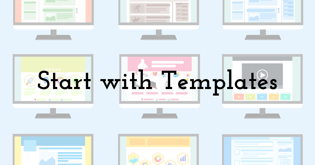
If you’re feeling overwhelmed by a blank canvas, don’t sweat it. Templates are your best friend. Platforms like Pixteller offer a treasure trove of ready-made templates for everything from social media posts to flyers and posters. Simply pick one that suits your purpose, tweak the text, swap out colors, and voilà—you’ve got a polished design in minutes.
Pro Tip: Use only those templates that resonate with your brand's personality or messaging. As much as a tech company can get away with sleek and modern templates, bright colors and playfulness can work for an event poster. You can also enhance your designs by incorporating tools like free text-to-voice, adding a dynamic layer to your visuals.
2. Keep It Simple
Less is more. Too much information, such as a lot of text, graphics, or color, will make your design appear cluttered and unprofessional. Instead, use one or two main elements that clearly state the message.
Example: If designing an Instagram post for a sale, highlight the discount percentage and a product image. Omit unnecessary information that may divert the viewer's attention.
3. Leverage the Power of Contrast

Contrast makes your design 'pop'. Combining light text on a dark background or large fonts with dull graphics creates visual interest and draws all attention toward key areas.
Try This: Employ contrasting colors for the call-to-action buttons, like bright yellow against a navy background, to make them unmissable.
4. Stick to a Color Palette
Consistency in color makes your designs look cohesive and professional. Before you start, pick a color palette of 3-5 colors that complement each other. Tools like Coolors or the built-in color suggestions in Pixteller can help you find the perfect combo.
Hack: Use your brand colors or draw inspiration from your favorite photo. Many tools allow you to extract a color palette directly from an image.
5. Use High-Quality Images
No pixelated, blurry images, please. Use only high-resolution photos or illustrations so that your visuals are clear and professional. Websites like Unsplash and Pexels offer free, high-quality stock images for all types of projects.
Quick Tip: Always crop images strategically to focus attention on the most compelling part-whether it's a smiling face or a product detail.
6. Master the Art of Fonts
Fonts can make or break your design. The idea is to use one for headlines and another for body text. Using too many fonts irritates the viewer and makes your design look messy.
Go-To Font Pairings:
- • Roboto Bold - headline; Roboto Light - body text.
- • Playfair Display - headline; Open Sans - body text.
Bonus Hack: Never use a hard-to-read decorative font for anything important; save those fonts for accents or flourishes. If you want to add a unique touch without compromising readability, consider using a glitch text generator to create eye-catching effects while keeping the main content clear and legible.
7. Use Icons for Added Visual Interest
Icons are super helpful in breaking up text and adding context to your design. They are versatile, have visual appeal, and help to guide the viewer's eye.
Where to Find Them: Pre-set icon libraries within Pixteller and other tools. Look for what you want - a shopping cart, a heart, a lightbulb-then drag them in.
8. Play With Layers and Transparency

Set elements on top of each other and adjust their transparency for added depth in your design. For example, you can set a colored box to be semi-transparent and set it behind the text so the text pops but doesn't overwhelm your background image.
Example: A soft white overlay on a busy photo will instantly make your text more readable and look so much better.
9. Align Everything

Alignment may sound dull, but it is essential for a finished look. Off-centered text and uneven spacing give your design that amateurish touch. Most of the design tools, including Pixteller, have alignment guides and I use them religiously.
Pro Tip: The center alignment functions for minimal designs, while the left or right alignment gives the structured, editorial feel.
10. Testing of Design before Publishing
Just before hitting that publish button, take a step back. Go and take a look at your design on another device or other screens to check whether it actually looks good and is read-friendly.
Quick Checklist:
- • Can you see the text?
- • Are the colors blending well?
- • Is the message clear at a glance?
Show your design to a friend or colleague for feedback. Sometimes, a fresh pair of eyes can catch things you might miss.
Final Thoughts
You don't need a fancy degree or some pricey software to create stunning visuals. Apply these simple hacks, and your designs will be both catchy and effective. Of course, tools like Pixteller make it easier with their ease of use and features that help bring your creative ideas to life.
Until next time, Be creative! - Pix'sTory
Recommended posts
-
Editing Without Borders: How Remote Access Supercharges Modern Image and...
Read More › -
PixTeller Roadmap
Read More › -
12 Principles of Design to Help You Create Effective Graphics
Read More › -

What Are the Top Game Design Trends to Watch in 2025?
Read More › -
What is the Top 2D Animation Software for Video Making in 2020?
Read More › -
Difference Between UX, UI and Graphic Design
Read More ›
