How Do Professionally Designed Badges Elevate The Feel Of Any Event?
Little things can mean a lot in a professional event, in terms of what people notice, expect, and remember. Before they sit down or talk to anyone at the registration desk, attendees form impressions of the event, environment, and the people around them.
An event badge is one of those early details. The purpose of a badge is to identify the wearer, and a good badge can convey thought and organization in the event. Attendees know who to look for, can easily use the roles, the layout is balanced and easy to understand, and the materials are usable. These details help make the experience organized and welcoming, not rushed or thrown together.
The reverse is also the case. If the fine print is too small or the amount of information on the badge is too overwhelming, it's not a welcome addition.
Here is how thoughtful badge design can shape an event's overall feel.
1. Create a Stronger First Impression
An event badge might be small, but attendees look at it again and again throughout the day. A clean layout, fitting typography, and organized information can make that badge feel deliberate from the moment it gets handed over.
That first impression really stands out during registration. When a badge looks clear and carefully prepared, it backs up the sense that someone thought this event through. Custom badges for events can also be tailored to the specific occasion, so the format, information, and appearance all work together instead of looking like some generic ID card.
Balance matters most here. A badge doesn't need elaborate graphics to look professional. Good spacing, readable text, and a logical layout often do more than heavy decoration ever could.
2. Make Attendee Identification Easier
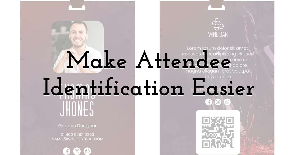
The most basic job of an event badge is helping people quickly figure out who is in the room. Names, job titles, organizations, and attendee categories give useful context before anyone even speaks up.
That's especially helpful at conferences, trade shows, and professional gatherings where people meet dozens of strangers. Someone's name should be easy to spot, and secondary details should stay readable without fighting the name for attention.
Clear identification also helps staff when they need to tell groups apart. Speakers, exhibitors, staff members, and general attendees often have different responsibilities or access levels. Simple visual cues can make those distinctions quicker to notice without overcomplicating the badge.
3. Support Networking and Conversation
Walking up to someone you've never met and starting a conversation can feel awkward, especially in a crowded professional setting. A well-designed name badge clears one small hurdle by giving people something real to work with.
Spotting someone's name and organization, for instance, can open an obvious path into conversation. A role or professional category might hint at shared interests too. The badge isn't forging the connection on its own, but it can make that first exchange feel a bit more natural.
4. Make the Event Feel More Organized
Consistency strongly affects how an event comes across. When badges follow a clear design system, the whole event feels more structured and easier to follow.
You can sometimes distinguish different attendee categories through restrained use of color, labels, icons, or other visual cues. Staff can then recognize speakers, exhibitors, or other groups with less effort, which is particularly useful where certain areas carry restricted access.
The point isn't to load every badge with symbols and colors. Too many visual differences actually make identification harder. A simple, consistent system usually works better for attendees and staff alike.
5. Reinforce the Event's Visual Identity
Badges provide another opportunity to continue an event's graphic theme. The typography, logos, colors, imagery, and spacing can all match the event's overall style without making the badge an advertisement.
It's important because people see their badges every day. Different physical elements should feel like parts of a single experience, with a consistent visual treatment.
But there's a practical limit. Branding shouldn't overwhelm the information attendees actually need. Logos or decorative elements that obscure the name do not fulfill the badge's primary function. A good event badge reinforces visual identity and usability.
6. Enhance Readability and Usefulness
A badge may look terrific on a computer screen, but it may totally fall apart in an event environment. People are walking around, the lights change, and people are looking at badges from a few feet away. This is why readability is important to professional badge design.
The information hierarchy should be clear to everyone. A name should be the largest, and an organization, role, or access category can be smaller, but still comfortable. If something isn't required, it shouldn't take up space.
Final Thoughts:
Event badges aren't the only component of a successful event. However, they can make a big difference to the look, feel, and usability of an event if they are designed well. Identification, information, build, and presentation all play their part in making it a better experience for attendees.
These components make badges a valuable asset for easing introductions, leading attendees through the event, enhancing the event's identity, and reducing needless confusion. A small detail like a badge can fit in seamlessly into a larger, well-structured event experience and be part of the overall sense of organization and purpose.
Until next time, Be creative! - Pix'sTory
Recommended posts
-
Why User-Centered Web Design Matters For NYC Audiences
Read More › -
How to Improve Visual Content as Your Most Important Marketing Strategy
Read More › -

The Best UX Design Books for Beginners
Read More › -
Why You Need a Graphic Designer for Your Dropshipping Business
Read More › -

The Art of Presentation: Selling Your Business Visually
Read More › -
4 Benefits of Using a Proxy in Animation Tools
Read More ›