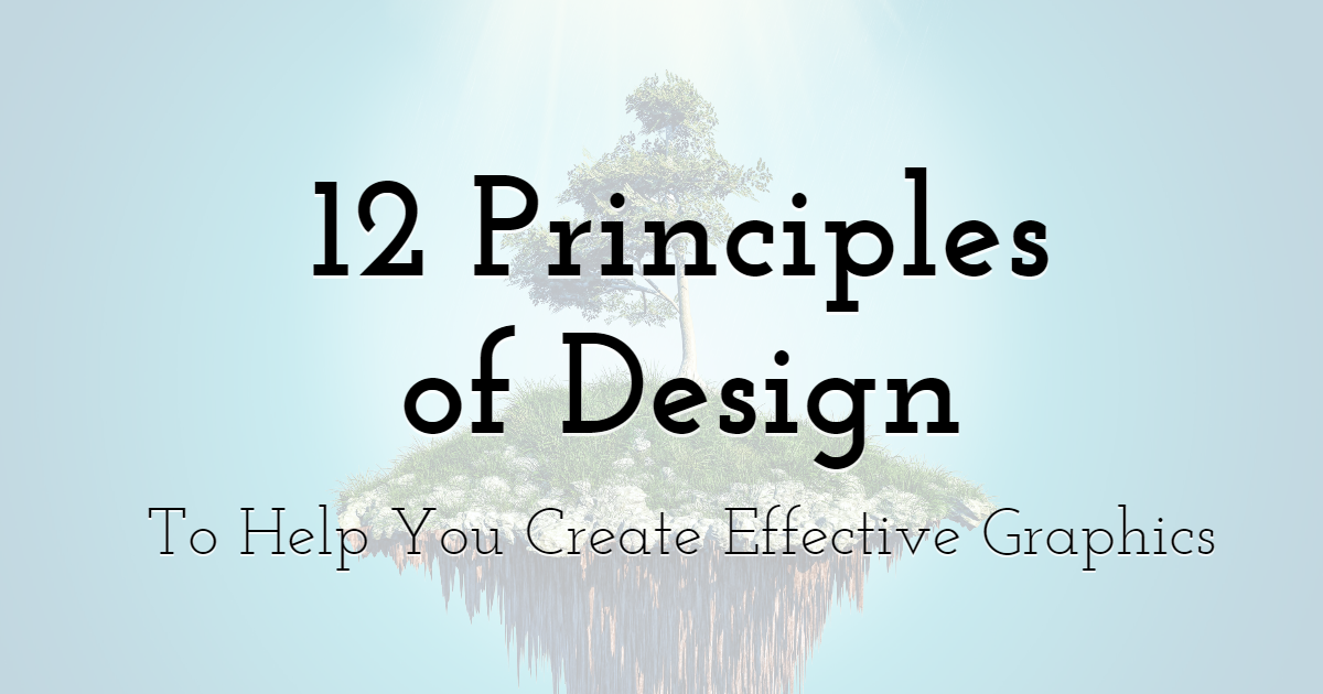
12 Principles of Design to Help You Create Effective Graphics
Easily design astonishing visuals for personal or commercial use
with PixTeller
photo editor software & online animation maker.
We are governed by laws and rules. Everything that exists follows a set of laws that make them what they are, from the philosophies to the tiniest objects in the known universe. Laws and principles are what make things work, make them what they are. In modern times, these principles were created to make things better, which also applies to design.
Design is defined as the marriage of function and art, and as such, has a set of principles. If you've ever wondered why a particular design works, it's because the designer followed the principles that govern it. If you're just starting out in the world of design, here are 12 things you shouldn't take for granted if you wish to become a great designer.
Principles of Design
The principles of design are the indispensable rules that make the design work. They seem basic at first, but over time, one will realize that understanding their individual functions will result in designs that serve their purpose, which is to be appreciated aesthetically and communicate to its viewers.
1. Balance
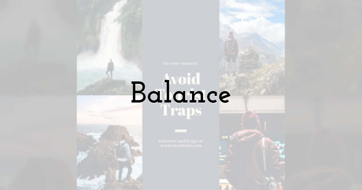
Balance works by joining multiple contradicting ideas together and blending them harmoniously. The ingredients of visuals are set in a way that spreads the weight accordingly. Viewers are then forced to explore the surface or area of the whole design. There are symmetrical and asymmetrical types of balance.
Symmetrical balance is when the elements are evenly distributed around the central focus of the visuals. Some web designers integrate asymmetrical design by placing a focus in the middle of a logo, a vital button, or the company's name.
Asymmetrical balance is when the elements are not evenly spread and might possibly lean on one area more than the others. Yet, balance is still achieved despite the unequal distribution.
2. Contrast
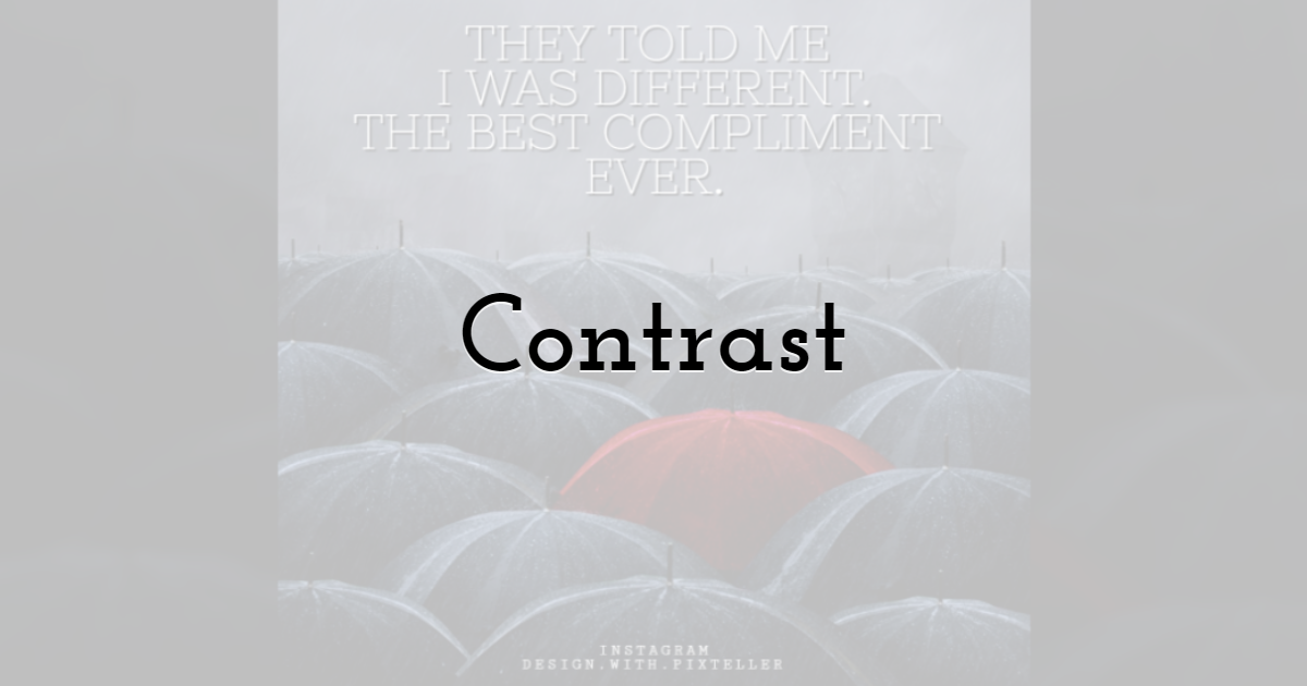
Contrast is the opposite of balance, where it emphasizes the differences between elements. Designs like these are often eye-catching and create a way to focus on a certain area. Contrasts make for an exciting dynamic that captures the attention of the viewer.
This template is a good example of a design that uses contrasts of colors. The playful design and the use of red and contrasting dark colors work well together. Despite the clash in colors, they never feel vulgar or ugly but instead create a feeling of excitement.
3. Emphasis
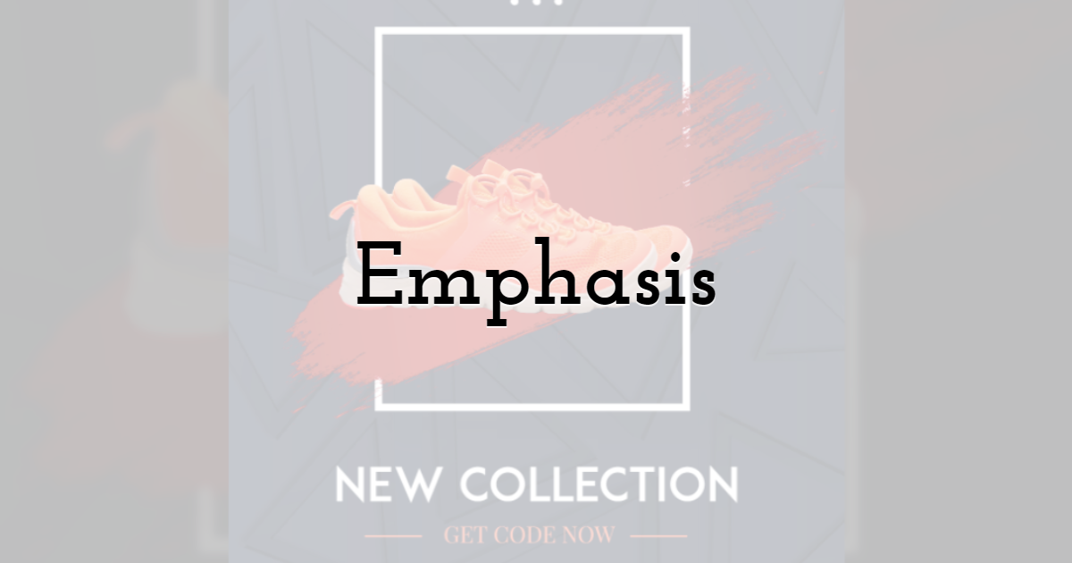
Emphasis is the more straightforward of the principles. It points out the main topic or subject of the design. Three things to take note of when conceptualizing the focal point: dominance, sub-dominant, and subordinate.
Dominance is the very object you should be focusing on, otherwise known as the "focal point." The sub-dominant is the secondary object of the visuals, and the subordinate is the one with the least "weight" (usually, this refers to the background).
4. Movement
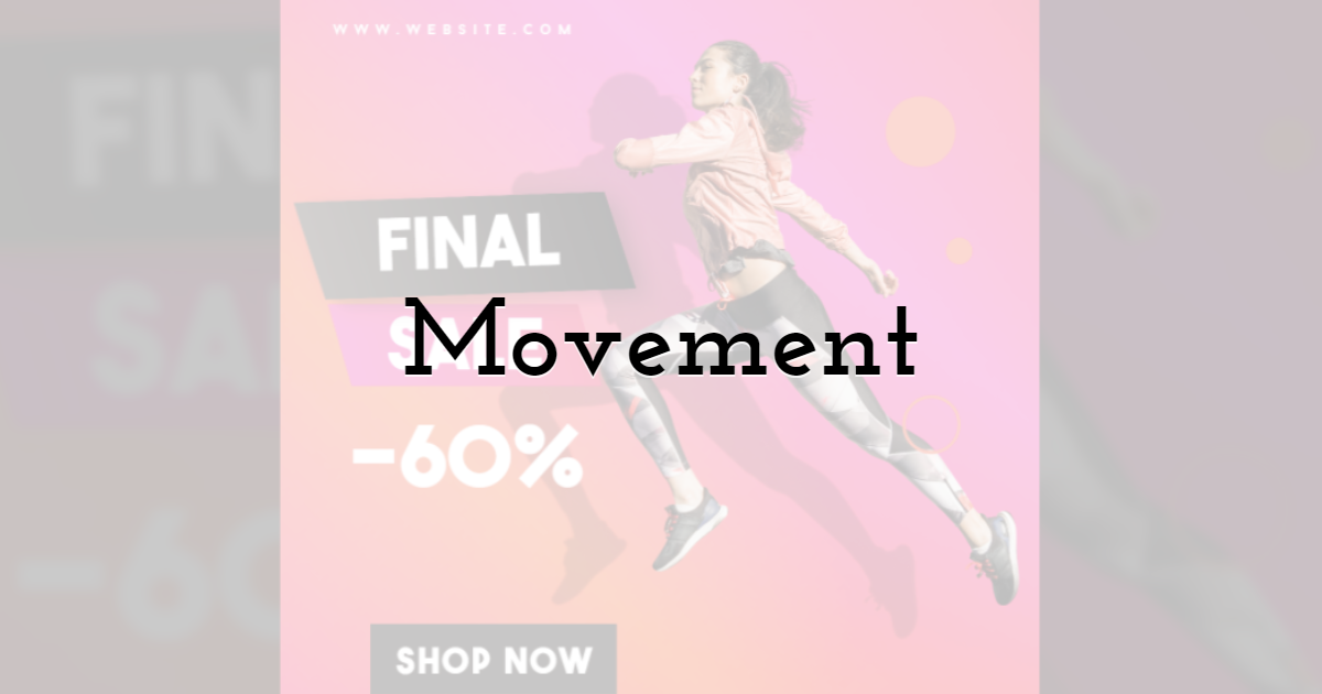
Movement is the flow in design. Your eyes follow the direction that the artist chooses to map out. Elements like lines, shapes, colors, or light, among other things are used to create a sense of direction that will embark the viewer on a short journey.
In some way, the design is a story that was written by the designer.
5. Hierarchy
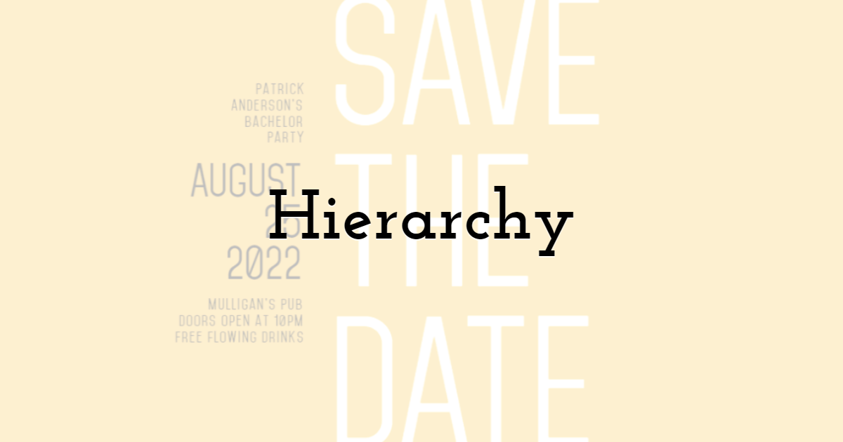
As a royalty, hierarchy knows who rules, and who follows the governing powers. Simply put, hierarchy is the arrangement of visual elements by their degree of importance. It usually appears in the form of a pyramid, with the top featuring an essential element. At the same time, the bottom holds lesser details that may not be as important in the current project you may be working on.
One good practice of hierarchy is setting important information in larger font sizes. You are directed to read them first, then to set the other lines in smaller font sizes so as not to get the attention and distract from the important information and visuals.
6. Pattern
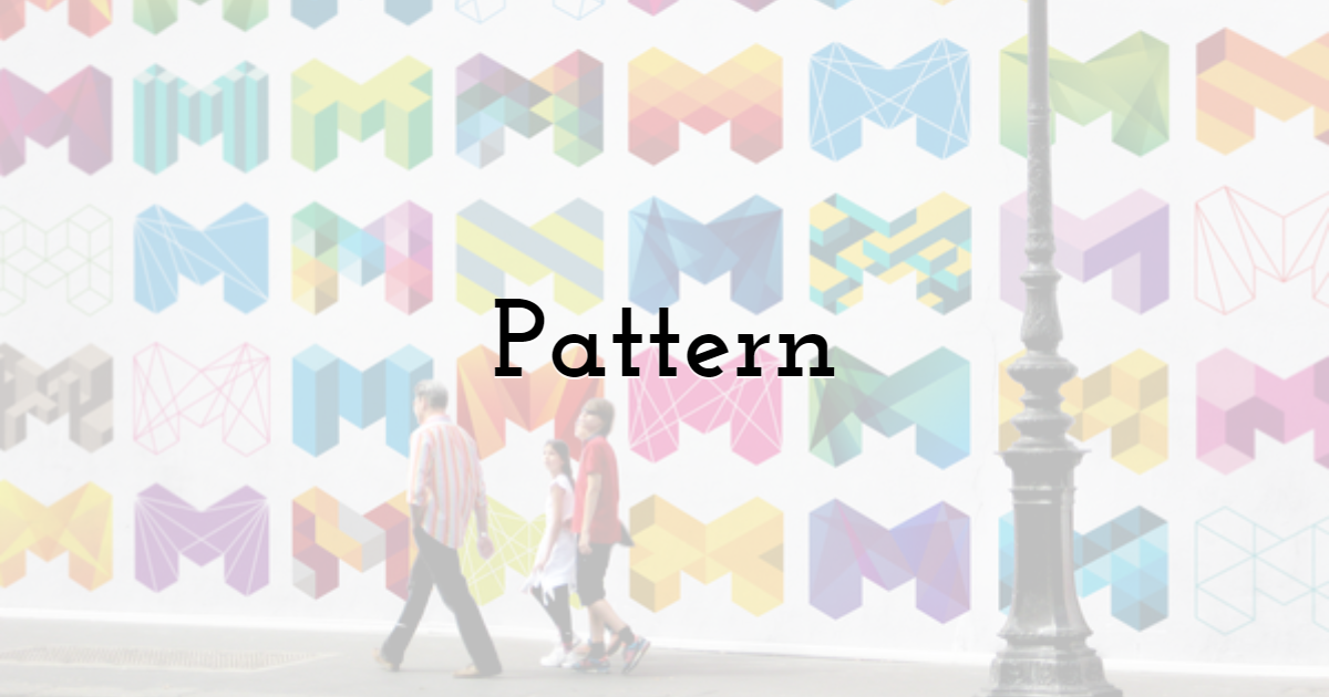
Patterns are visuals elements that are arranged accordingly to achieve the "whole." The visuals can come in the form of colors, lines, or shapes just as long as they create a cohesive structure.
Good examples of pattern designs are usually found in carpets, textile, and wallpaper. It is not simply repeating something over and over again.
7. Repetition
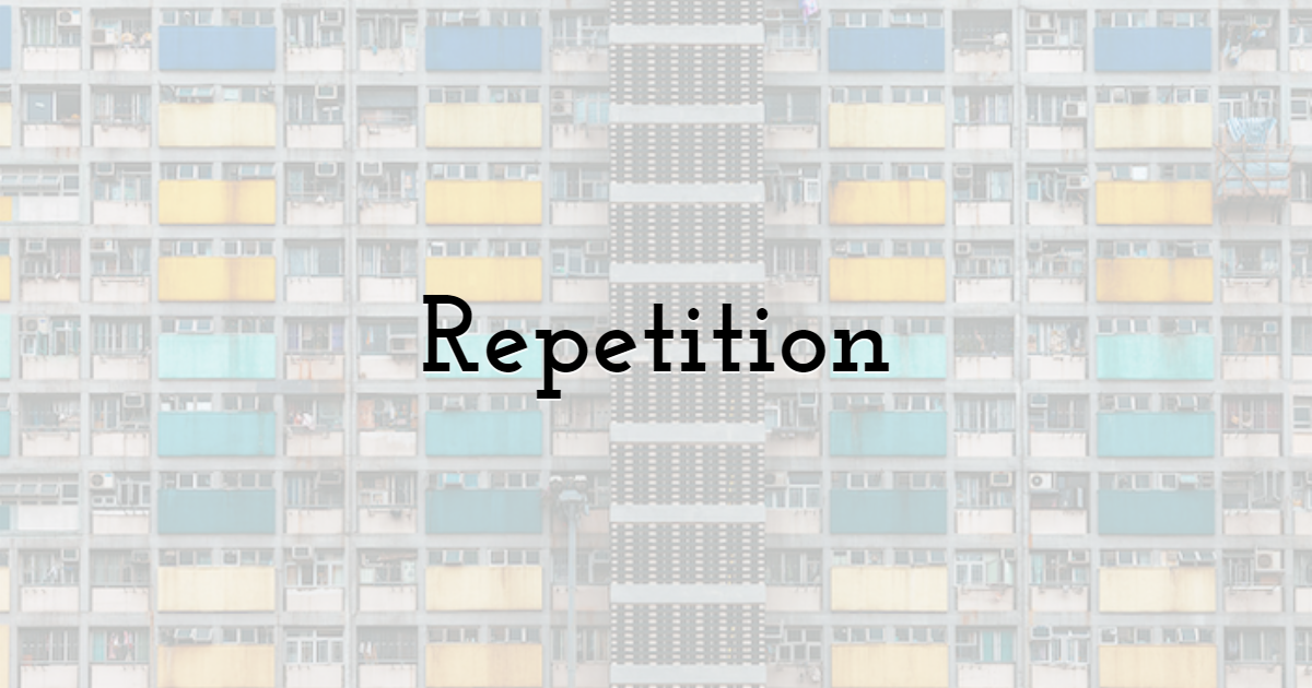
We've talked about the repetition in a pattern, so what is the difference between repetition and pattern? In patterns, the repeated imagery would usually result in the form of a cohesive piece, however, with repetition.
However, with repetition, you are only repeating an object over and over again. It doesn't necessarily produce a design. It can be dull or ugly. Nonetheless, repetition serves an important albeit subtle function: making it unforgettable.
Certain companies apply repetition by using the logo as a background or using a floating menu that travels with you as you navigate your way around a website. You're constantly looking at the name of the company and eventually have it embedded in your subconscious.
8. Proportion
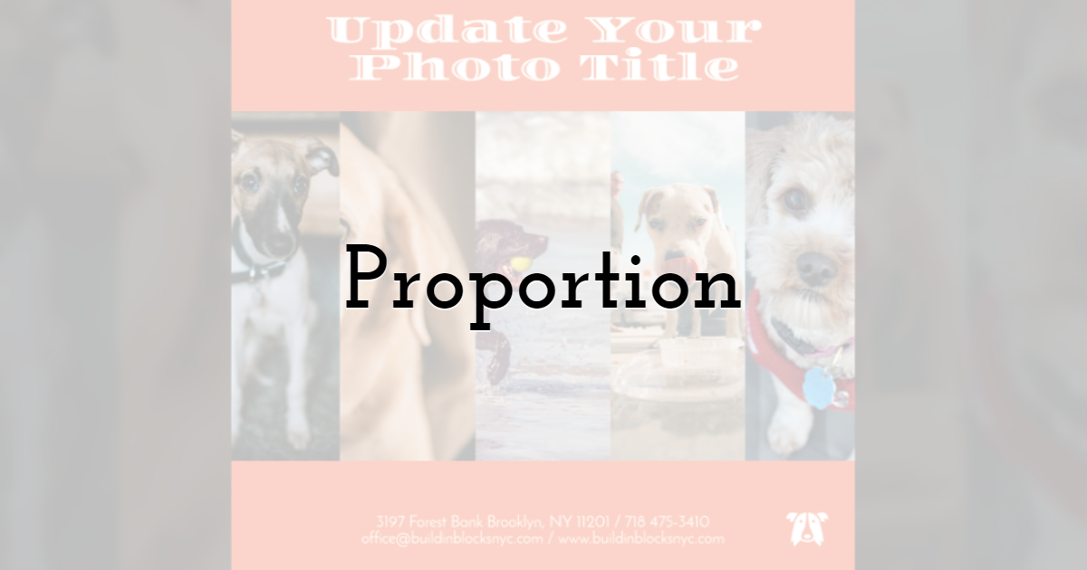
Proportion is the parallel relationship among the elements in a piece or composition depending on the function, colors, etc. Unlike hierarchy that prioritizes the essential element, proportion creates the feeling that there is an order among the details and that it has visual structure.
Proportion can be split into two, harmonious and unbalanced proportions. Harmonious proportion happens when the elements are in order and in symmetry. Unbalanced proportion, on the other hand, happens when disarray or disproportion is either present or forced.
9. Rhythm
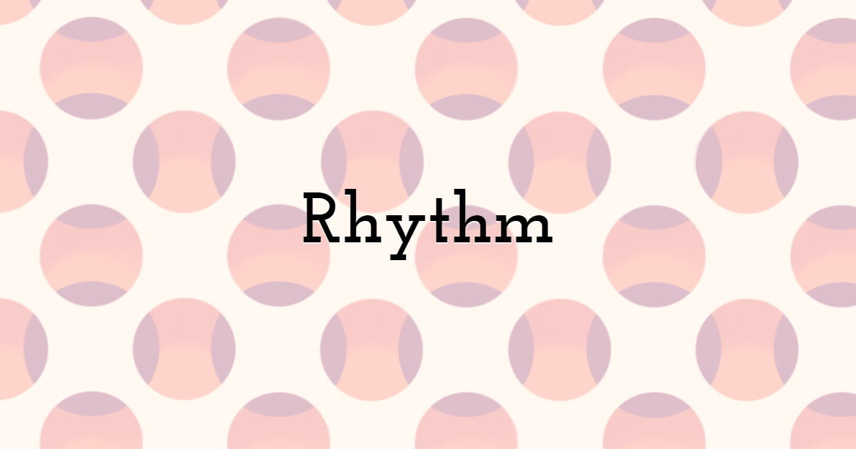
Visual rhythm can be sharp, flowing, regular, random, progressive, and alternating like in music. Rhythm can be divided into five, regular, flowing, progressive, random, and alternating. Regular rhythm is as if the space between elements is equal. The flowing rhythm gives off the feeling that you're moving through bends and curves.
Progressive rhythm is constantly changing as well as repeating. Random rhythm does not have anything that is constant and is entirely aimless, and alternating rhythm has a whole topic to itself as it utilizes a set of patterns.
10. Variety
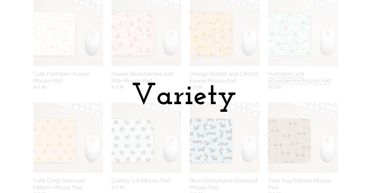
Variety is that which makes up the blend of the diverse elements in an elaborate or sophisticated relationship through the use of tools like lines, values, texture, hue, etc. Variety works well with unity, despite their differences, and is often used to make certain elements or areas within a piece alluring, using contrast and proximity to its advantage.
An artist can then position these different elements either near or far from each other, adding all kinds of shapes, geometric and organic, to create variety.
11. Unity/Proximity

As its name suggests, Unity is what brings the different elements of your piece together, creating a dynamic relationship with each other. It is imperative to know the outcome of the piece to select the elements to work with, helping to deliver your message better.
The concept of proximity is so that it works on the distance that these visual elements should have between them, and/or how they are put together if they are unrelated. The closer two objects in a piece are means that they have a kind relationship and often become one unit. This helps you give organization and structure to a piece.
12. Alignment
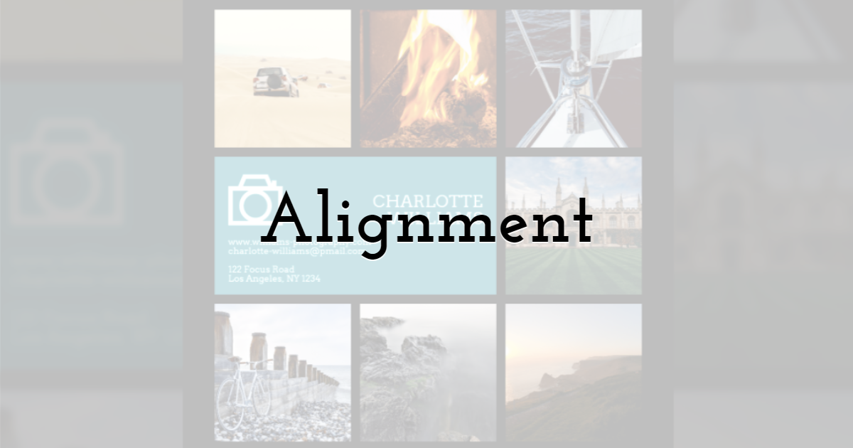
Alignment is the allocation of visual elements so that they can align or straighten up a piece. Think of it as the braces that fix the teeth of design. Alignment is used in design to gather and organize the elements of art, so they form structure, balance relations, dishing out a clear outcome.
Alignment is the unseen line that keeps the visual elements adequate to achieve the look and feel of a piece the artist intended for it to convey, instead of being in discord.
Beyond individual graphics, these design principles also apply to everyday formats such as slide presentations, social media visuals, marketing banners, infographics, and decorative displays like Wallpics. Applying balance, contrast, hierarchy, and alignment across these designs helps communicate ideas more clearly and keeps visuals easy to follow, whether you’re preparing a presentation, sharing content online, or creating materials for work or study.
Final Thoughts
Order and peace are something that works on almost everything that exists and applies to design as well. Design is something that needs order, especially ones that are made for professional use. A good design is simple, unassuming, practical, and timeless. All this can be achieved if you understand the elements of art and principles of design. Just keep practicing, you'll be surprised to know how far you'll get in a short amount of time.
If you want to try out your skills at design, you can try your hand at something easy and free. There are hundreds of online design tools out there that can help you on your journey. Tools like PixTeller, Removal.AI, and Photoshop can help you create professional-looking and effective visual content. Remember, nobody starts out as a professional, and it doesn't matter if you're a beginner. You just have to start somewhere.
Until next time, Be creative! - Pix'sTory made by Jenn Pereira
Jenn is an experienced web and UI/UX designer. She loves to write and share her ideas about design trends and tips to inspire and motivate other designers. You can find some of her work at Dribbble.
She is a Marketing Head of an AI technology company, her team develops innovative platforms for creatives and eCommerce. Removal.AI - free online image editor and transparent background maker are one of the AI tools they recently launched - a great & useful tool to start creating graphic images and art.
Recommended posts
-
Top 5 Stunning Banner Design Software Providers of 2021 to Consider For B...
Read More › -
Top 10 Logo Design Tips and Trends in 2021
Read More › -
What is the Best NonProfit Website Design for the year 2021?
Read More › -
5 Proven Ways to Create Eye-Catching Video for Social Media
Read More › -

Before You Sign Anything: What Every Designer Should Know About Clients a...
Read More › -
The Best UX Design Books for Beginners
Read More ›
