YouTube Thumbnail Mistakes That Reduce Views
You can spend days scripting, filming, editing, and optimizing a YouTube video, but if the thumbnail fails to attract attention, most viewers will never click. On YouTube, thumbnails are not just visual decorations they directly influence click-through rate (CTR), impressions, and recommendations. A weak thumbnail can quietly destroy a video’s potential even when the content itself is excellent. That’s why many creators use a YouTube thumbnail preview tool before publishing to see how thumbnails appear across different devices and placements.
Modern YouTube audiences make decisions extremely fast. While scrolling through the homepage or suggested videos feed, viewers evaluate content within seconds. In most cases, they react to the thumbnail first and only then look at the title. If the thumbnail appears confusing, low quality, cluttered, or visually boring, users continue scrolling immediately.
The competition on YouTube has also become much more aggressive over the last few years. Nearly every niche is saturated with creators fighting for attention, which means thumbnails now play a larger role than ever before. Effective thumbnails combine psychology, branding, curiosity, and visual storytelling into a single image. Even small improvements can lead to dramatic performance increases and noticeably higher CTR over time.
In this article, we’ll break down the most common YouTube thumbnail mistakes that reduce views, explain why they hurt performance, and show how creators can improve their thumbnails to increase CTR and grow faster.
Using Too Much Text
One of the most common thumbnail mistakes is trying to explain the entire video directly inside the image. Many creators overload thumbnails with long phrases, multiple sentences, and excessive visual information because they believe viewers need full context before clicking.
In reality, the opposite is usually true.
YouTube viewers scroll quickly, especially on mobile devices where thumbnails appear relatively small. If the text is difficult to read or requires too much effort to process, people simply move on to another video. Strong thumbnails communicate ideas instantly rather than forcing viewers to analyze information.
This doesn’t mean thumbnails should never contain text. Text can be extremely effective when used strategically. However, it should support curiosity rather than fully explain the video.
In most cases, high-performing thumbnails use:
- • Short phrases
- • Large bold fonts
- • High contrast colors
- • Minimal wording
For example, instead of writing: “How I Grew My YouTube Channel From 0 to 100,000 Subscribers in 6 Months”
A stronger thumbnail might simply say:
- • “0 → 100K”
- • “Big Mistake”
- • “I Was Wrong”
- • “This Changed Everything”
Shorter text creates faster understanding and leaves room for curiosity, which is often what drives clicks.
Ignoring Mobile Optimization
A huge percentage of YouTube traffic now comes from mobile devices, yet many creators still design thumbnails exclusively on desktop screens. This creates a major problem because thumbnails that look detailed and attractive on a large monitor may become unreadable on a smartphone.
Small text, thin outlines, crowded layouts, and complex graphics usually perform poorly on mobile. If viewers cannot instantly understand the image while scrolling quickly, the thumbnail loses effectiveness.
Mobile optimization should be part of every thumbnail workflow. Before uploading, creators should always test how the thumbnail appears at smaller sizes. Many professional creators intentionally simplify their designs because simplicity tends to perform better on mobile devices.
When optimizing for mobile, creators should focus on:
- • Large readable elements
- • Strong contrast
- • Minimal clutter
- • Clear focal points
- • Simple composition
One useful trick is zooming out dramatically while editing the thumbnail. If the main message becomes unclear, the design is probably too complicated.
Using Low-Quality Images
Thumbnail quality heavily influences how viewers perceive the video itself. Even if the content is valuable, blurry or poorly edited thumbnails immediately reduce trust and professionalism.
This issue is especially common among beginner creators who use random screenshots from videos without considering lighting, framing, or image sharpness. Dark frames, motion blur, or low-resolution exports make videos look lower quality before viewers even click.
Strong thumbnails usually feature:
- • High-resolution images
- • Sharp details
- • Bright lighting
- • Clean editing
- • Strong visual separation
The goal isn’t necessarily making thumbnails look overly polished or expensive. Instead, creators should aim for clarity and intentional design.
Many successful YouTubers spend more time choosing the right thumbnail frame than editing the thumbnail itself because composition matters enormously. A strong expression, clear subject, or emotionally engaging moment can outperform complicated graphic design.
Overcrowding the Thumbnail
Another common mistake is trying to include too many visual elements in a single image. Some creators add multiple faces, arrows, screenshots, text blocks, emojis, effects, and objects simultaneously in an attempt to maximize attention.
Unfortunately, crowded thumbnails often create confusion instead of curiosity.
When viewers look at a thumbnail, their brains search for hierarchy. They want to understand immediately:
- • What the video is about
- • Where to look first
- • What emotion the thumbnail communicates
If too many elements compete for attention, the image becomes difficult to process quickly.
Strong thumbnails usually focus on one primary subject supported by a few secondary elements. Simplicity improves clarity, and clarity improves click-through rate.
Many modern YouTube thumbnails are becoming more cinematic and minimalistic because clean visual storytelling tends to perform better than chaotic designs filled with unnecessary graphics.
Using Misleading Clickbait
Clickbait remains one of the most controversial topics on YouTube. Some creators believe exaggerated thumbnails automatically increase views, while others avoid any form of curiosity entirely.
The reality is more nuanced.
Curiosity is essential for strong thumbnails, but misleading viewers usually damages long-term performance. If people click because the thumbnail promises something shocking and the video fails to deliver, audience retention drops quickly. This sends negative signals to YouTube’s algorithm.
Misleading thumbnails often include fake reactions, exaggerated outcomes, unrealistic claims or edited images that never appear in the video. These tactics may occasionally increase short-term clicks, but they often reduce trust and viewer loyalty over time.
Effective thumbnails create “ethical curiosity.” They make viewers interested without deceiving them. The thumbnail should amplify the most interesting aspect of the video while still accurately representing the content.
Today’s audiences are also much more aware of manipulative thumbnail tactics than they were years ago. Excessive clickbait often feels outdated and untrustworthy.
Weak Color Contrast
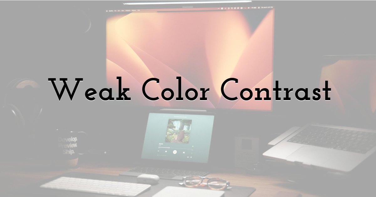
Color plays a major role in visibility, especially inside crowded recommendation feeds. Poor color choices can make thumbnails blend into YouTube’s interface and become almost invisible during scrolling.
Low-contrast thumbnails usually suffer from:
- • Dark backgrounds
- • Similar color tones
- • Washed-out visuals
- • Hard-to-read text
On the other hand, thumbnails with too many aggressive colors may feel overwhelming and visually exhausting.
Strong thumbnails create intentional contrast that guides viewer attention naturally. Bright focal points against darker backgrounds often work well because they immediately stand out.
Professional creators also use color strategically to support emotional tone. For example:
- • Red and orange tones often create urgency or excitement
- • Blue tones can feel professional or calm
- • Green is frequently associated with money, growth, or success
- • Darker palettes can create drama or tension
Good color usage isn’t about randomness — it’s about directing attention intentionally.
Overusing Arrows, Circles, and Effects
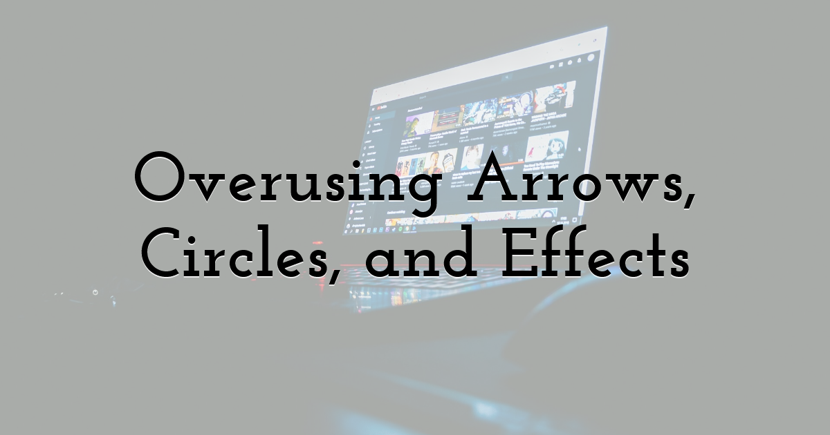
For years, YouTube was filled with thumbnails using giant arrows, red circles, explosions, and exaggerated editing effects. While these tactics once performed well, audiences have become increasingly resistant to them.
Many viewers now associate excessive graphic effects with low-quality clickbait content.
This doesn’t mean creators should completely avoid visual indicators. Strategic highlights can still help direct attention. The problem appears when thumbnails become overloaded with unnecessary visual noise.
Modern thumbnail trends are moving toward:
- • Cleaner layouts
- • Better composition
- • Strong emotional framing
- • Cinematic lighting
- • Simpler storytelling
A clean thumbnail often appears more professional and trustworthy than one filled with distracting effects.
Creators should ask themselves whether every design element genuinely improves communication or simply adds clutter.
Using Generic Thumbnail Designs
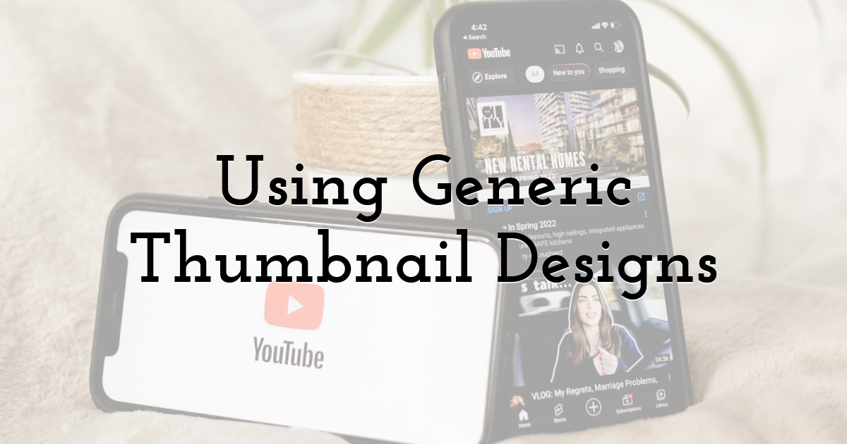
One of the fastest ways to disappear in the YouTube feed is looking identical to everyone else. Many creators unintentionally use generic thumbnails because they copy popular trends too closely. While inspiration is useful, cloning common styles can make channels feel forgettable.
Generic thumbnails often include:
- • Random screenshots
- • Predictable layouts
- • Overused templates
- • Identical editing styles
- • Recycled visual trends
Viewers naturally pay attention to novelty. When thumbnails feel unique or visually recognizable, they stand out more effectively among competing videos. This is why branding matters.
Successful channels often develop recognizable visual identities through:
- • Consistent fonts
- • Similar editing techniques
- • Specific framing styles
- • Repeated color palettes
- • Unique composition approaches
Over time, audiences begin recognizing the channel visually before even reading the title.
Failing to Use Emotion
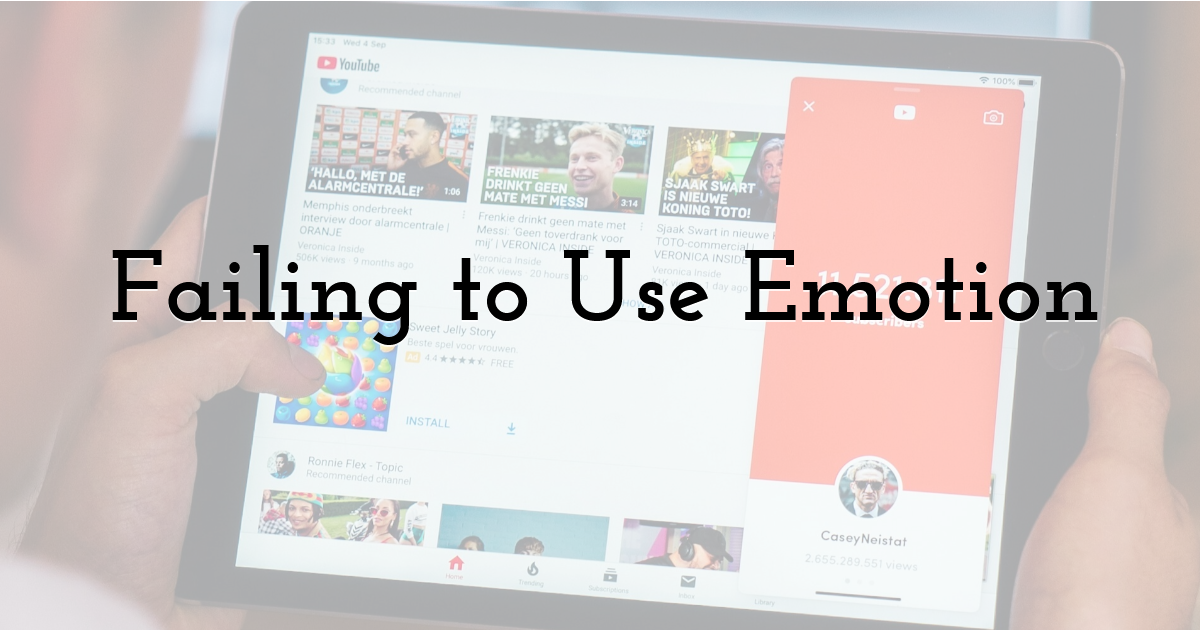
Human emotions are one of the strongest psychological triggers in marketing and entertainment. Faces naturally attract attention, especially when they communicate recognizable emotional signals.
Many weak thumbnails fail because they feel emotionally flat. Without emotional tension, curiosity, or excitement, viewers have less motivation to click.
Effective thumbnails often use emotions such as:
- • Surprise
- • Shock
- • Curiosity
- • Fear
- • Excitement
- • Satisfaction
However, authenticity matters.
Modern audiences are becoming increasingly skeptical of exaggerated “YouTube face” expressions that feel fake or forced. Overacting can sometimes reduce trust instead of improving CTR.
The most effective emotional thumbnails usually feel believable and connected to the actual content of the video.
Even subtle emotional reactions can dramatically improve viewer engagement when paired with strong composition and storytelling.
Making the Thumbnail and Title Say the Same Thing
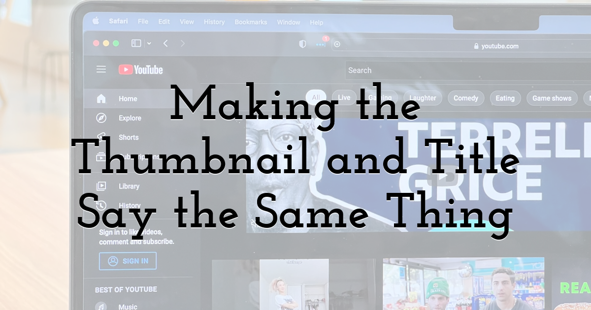
Another surprisingly common mistake is repeating identical information in both the title and thumbnail.
For example:
Title: “How I Grew My YouTube Channel”
Thumbnail: “HOW I GREW MY YOUTUBE CHANNEL”
This wastes valuable attention space because the viewer learns nothing new from the thumbnail.
Strong YouTube packaging works differently. The title and thumbnail should complement each other rather than duplicate information. One element should provide context while the other creates curiosity.
For example:
Title: “How I Gained 100K Subscribers in 30 Days”
Thumbnail: “I Almost Quit”
Now the viewer becomes emotionally invested in discovering the full story.
This relationship between title and thumbnail is extremely important because successful YouTube videos usually create information gaps that encourage clicks.
Never Testing Thumbnail Variations
Many creators upload one thumbnail and never revisit it again, even when the video performs poorly. This is a missed opportunity because small thumbnail changes can significantly affect CTR.
Professional creators frequently test:
- • Different expressions
- • Alternative colors
- • Text placement
- • Cropping
- • Brightness
- • Backgrounds
- • Object size
Sometimes even a small change can improve performance dramatically.
Thumbnail testing is becoming increasingly important because YouTube competition continues growing every year. Channels that consistently analyze and improve visual packaging usually outperform creators who rely purely on instinct.
Using a YouTube thumbnail preview tool can also help identify weaknesses before publishing. Previewing thumbnails in realistic feed environments often reveals readability problems or visual clutter that creators miss during editing.
Final Thoughts:
Thumbnail optimization is no longer optional for creators who want sustainable growth on YouTube. In many cases, thumbnails influence performance more than editing quality, camera equipment, or even SEO optimization because viewers cannot watch videos they never click.
The best thumbnails are not necessarily the most complicated or visually extreme. Instead, they are usually the clearest, most emotionally engaging, and easiest to understand within seconds.
As YouTube becomes more competitive, thumbnails will continue playing a larger role in content discovery. Treating thumbnails as a strategic growth tool rather than an afterthought can significantly improve long-term channel performance.
On YouTube, first impressions matter — and your thumbnail is often the first impression viewers ever see.
Until next time, Be creative! - Pix'sTory
Recommended posts
-
Transparency & Opacity: How To Use Them
Read More › -
How AI Video Tools Are Changing A/B Testing in Marketing
Read More › -

How to Set or Change Design Properties
Read More › -

Video Optimization Guide For Your Website
Read More › -

How to USE an Animation Template to Create Your Own Video or GIF
Read More › -
Breaking the Creative Bottleneck: How We Scaled Our Ad Output Without Bur...
Read More ›
