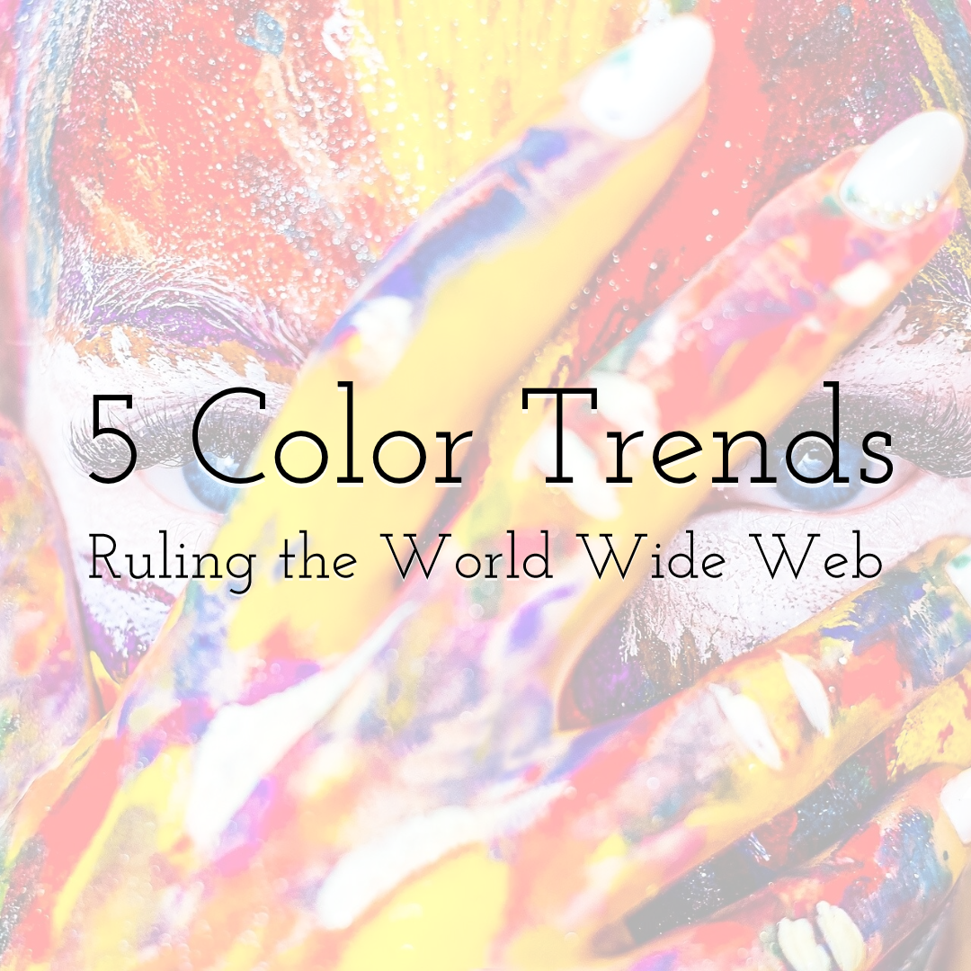
5 Color Trends Ruling the World Wide Web
Colors are an authoritative influence when it comes to impression formation and purchase decisions. In consumerism, especially, colors emerge as the most important player influencing people's thoughts, emotions, and decisions. And it isn't even happening consciously.
 Desgn colorful graphic images with PixTeller graphic maker
According to research, a lot of judgment based on colors influences audience because takes place on a subconscious level. People only take 90 seconds to form their initial impressions about a person, environment, or product, and 62-90% of that assessment is based on colors alone.
This judgment affects brand recognition (can improve it by up to 80%), purchase intent, and the deciding factor when choosing between two very similar products. This psychology of colors transcends genders, cultures, and industries.
 Design amazing colorful visuals with PixTeller photo editor
But are there any colors that are more powerful than others?
That's what we are going to talk about today. We'll cover 5 color trends that are ruling the World Wide Web in 2020. So, without further ado, let's dive straight in.
-
1. Blue – The Universal Favorite
Blue is the safest, most popular choice for web and logo design. Since it's a color that's universally loved, with no cultural, age, or gender specifications, businesses feel confident using blue as their primary brand color.
It especially suits brands that want to send a general feeling of calm, order, tranquility and reliability to their audience.
Depending on the saturation level of blue you choose and the specific shade and tint you pick, blue can be used for a variety of industry sections.
The versatility of blue is the reason that the world's largest social media platform uses it as its primary color palette for its website design, the world's favorite snack uses it for its logo color, and one of the biggest automobile companies in the world incorporates it as its web color theme.
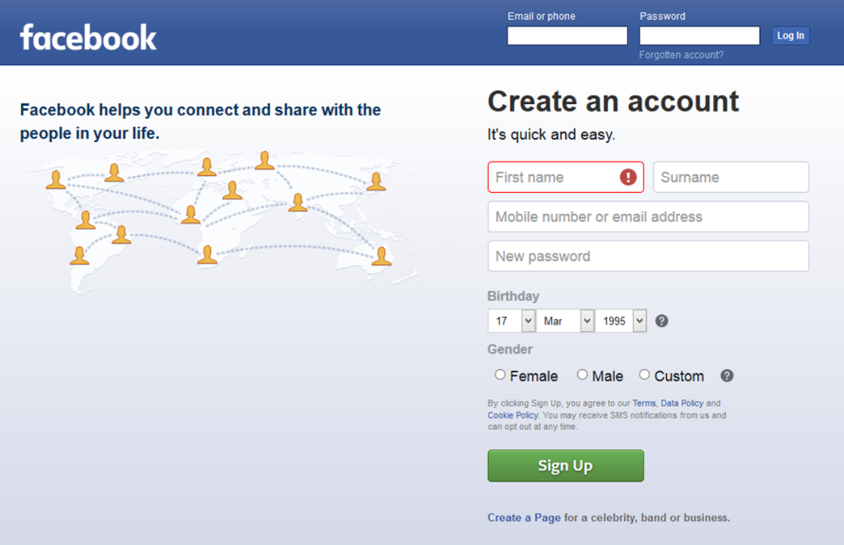 Image: Facebook.com
 Image: Oreo Logo
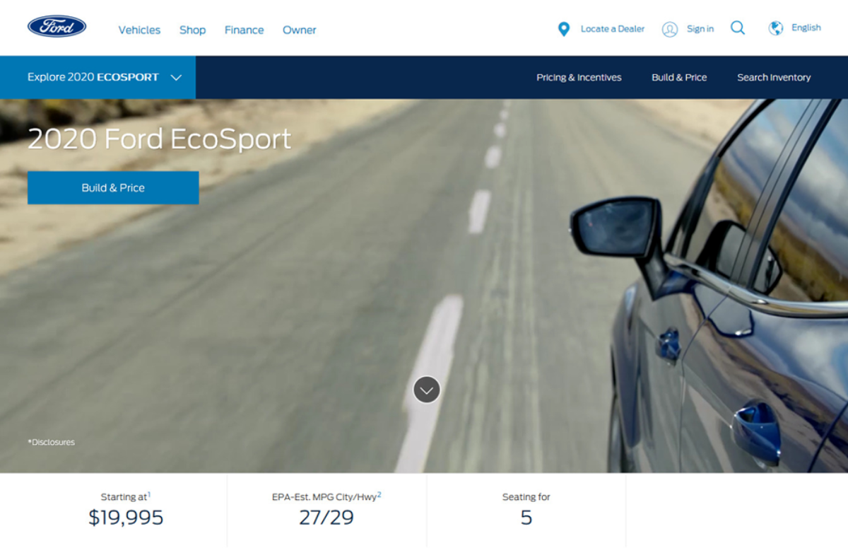 Image: Ford
While Facebook uses a single block of blue on its website, Ford's website uses shades of blue throughout its web design.
The contrast of light and dark blue is used to highlight important buttons, black and grey also appear as accent colors, and you can also see a pop of red for the bit of most important information.
-
2. High-End Fashion Highlighted In Pastels
High-end fashion is still very much about minimalism. Neutral colors and pastel shades are used to highlight luxury products, fine fabrics, and limited-edition accessories. For background, you'd see all the brands featured below using white. It's aesthetic as well as a practical choice.
The wall of white not only looks like an attractive canvas against which fine products can shine, but it also appears neutral and doesn't distract the attention of the consumer.
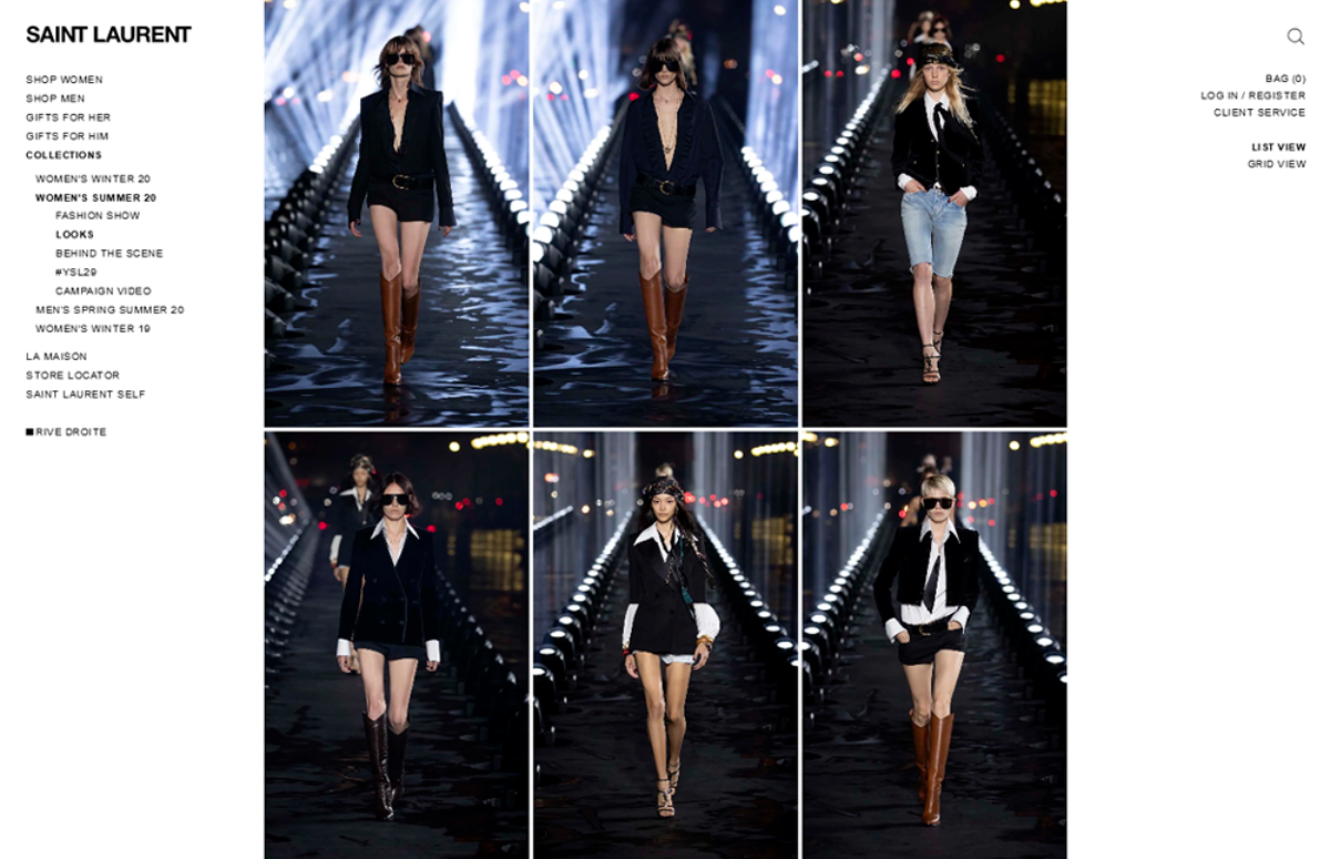 Image: Saint Laurent
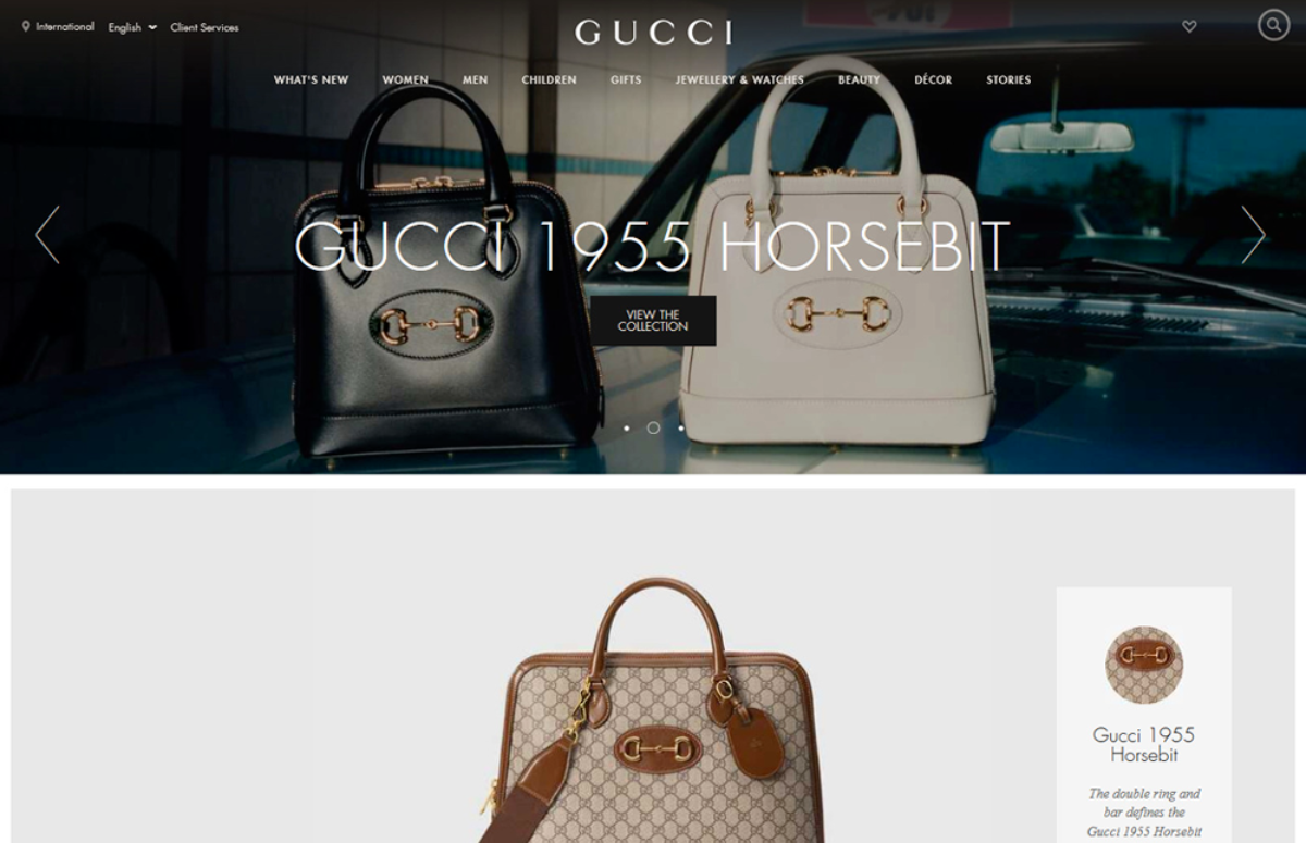 Image: Gucci
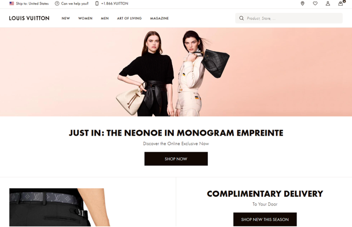 Image: Louis Vuitton
If you don't want to use white, grey can be used as the second-best choice. Another pastel shade, it gives a richer background to your products and adds some depth to a background that otherwise would have been quite stark.
-
3. Retail Loves Primary Colors
The three primary colors, red, yellow, and blue are exponentially used by retailers more than any other color in their web designs. Since primary colors are really good at capturing attention and stimulating emotions, retailers rely on these colors to make higher sales and drive bigger conversions.
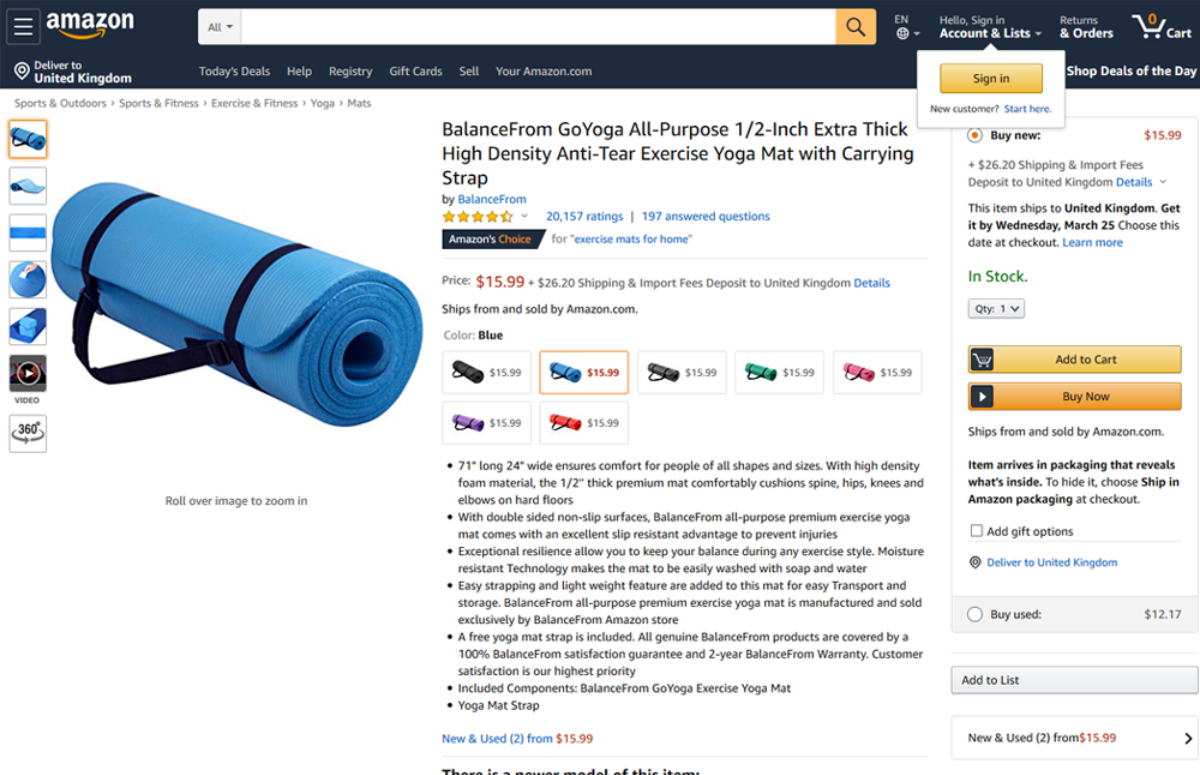 Image: Amazon
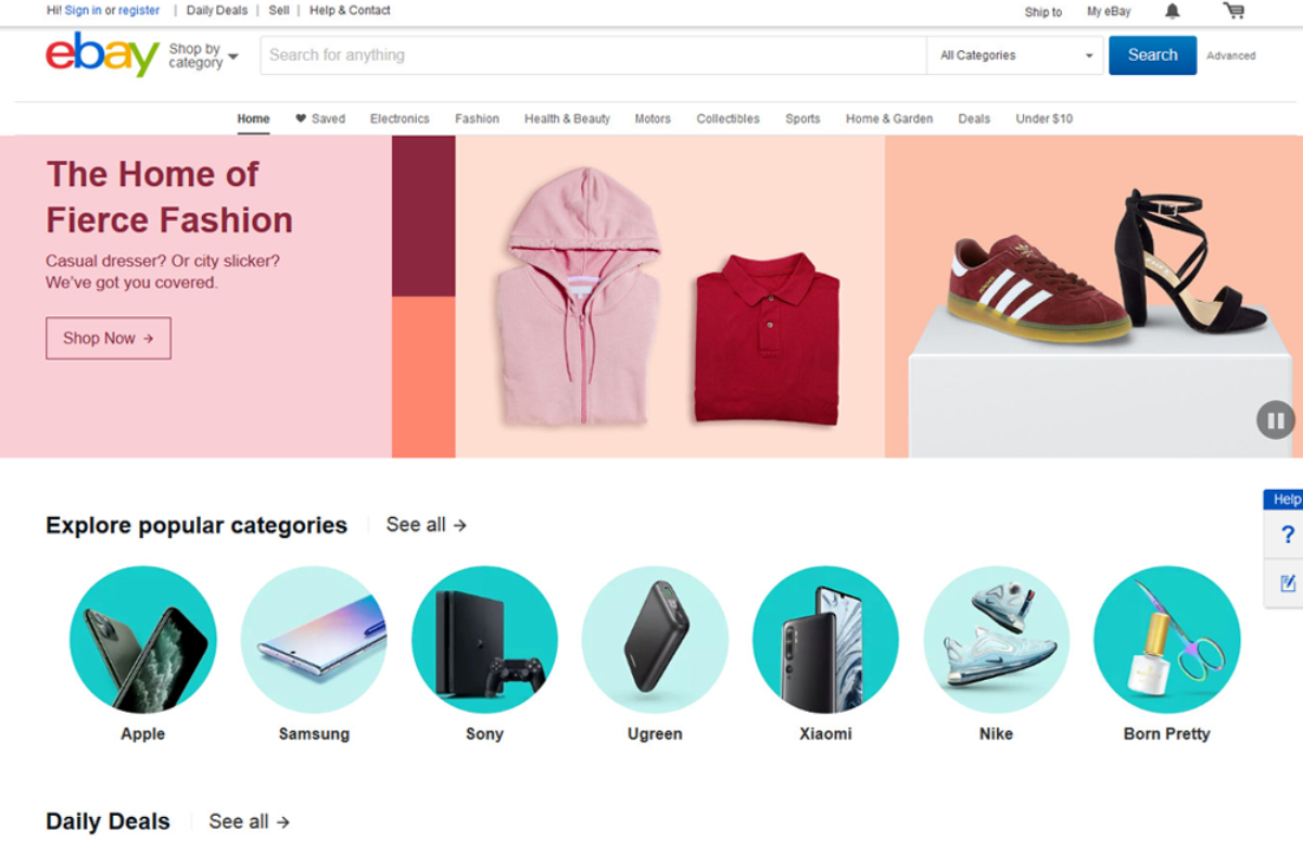 Image: eBay
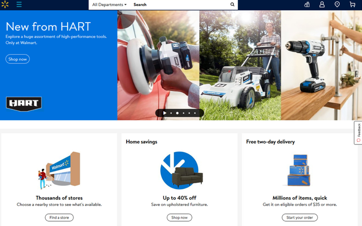 Image: Walmart
The three major retail brands that we've shared here, all use red, blue and yellow prominently in their web design schemes. Amazon uses a more subdued shade of yellow while Walmart and eBay take the full advantage of this attention-grabbing and cheery color.
Blue is also used extensively by all these three giants to inject a bit of calm, order, and serenity to a design that could have been overwhelming, if not for the presence of blue.
-
4. Gray, White, and Bright
Another trend that's making rounds this season for web design is using a splash of bright color in a website dominated with grays and whites. You'll see this trend more readily in portfolio websites, tech industry sites, and other websites that normally host a stock of black and white images.
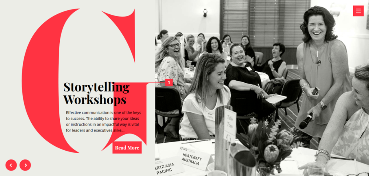 Image: Gabrielle Dolan
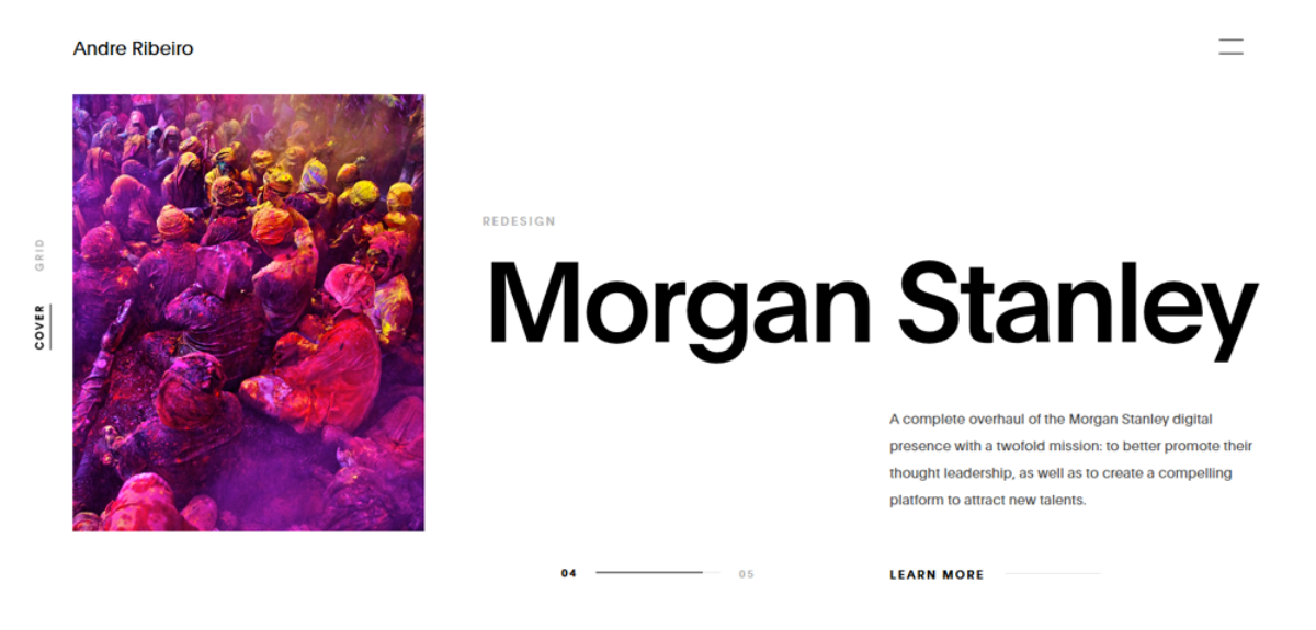 Image: Andre Ribeiro
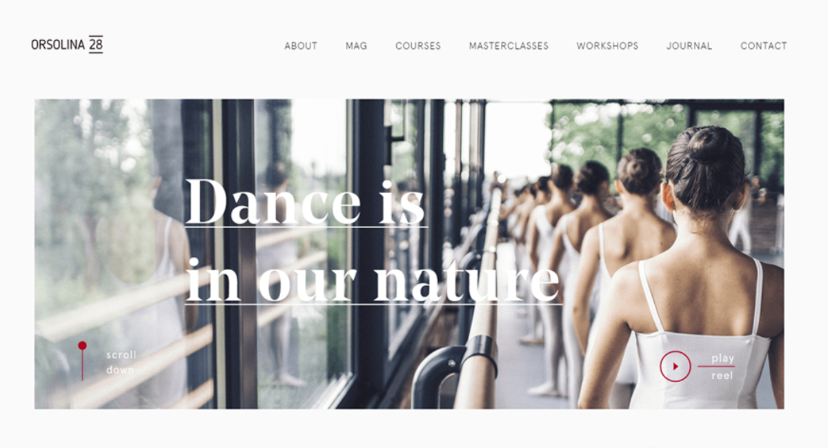 Image: Orsolina 28
The very clever strategy behind using these bright pops of colors among an otherwise neutral palette is to make the images shine.
Another thing that this strategic use of colors achieve is the bright colors attract your attention and make you take notice of the CTA and other important buttons and messages that have been highlighted in reds, pinks, and purples in the sea of beige, white, and gray.
-
5. Green Is For Planet Earth
Even if your brand is not about organic food and natural products, the color green will still make a big attendance in your brand color palette if you have anything to do with outdoors.
People are naturally wired to associate green color for everything organic, natural, and away from the noise of urban life. If you are selling hiking shoes, chances are you are using green in some part of your branding.
And no, we're not judging you for it. What you are doing is smart. You're using the associations people have with green color and encouraging them to visit your shop as it has something to do with being outdoorsy.
Let's take a look at some of the brands using green to appeal to the nature lovers.
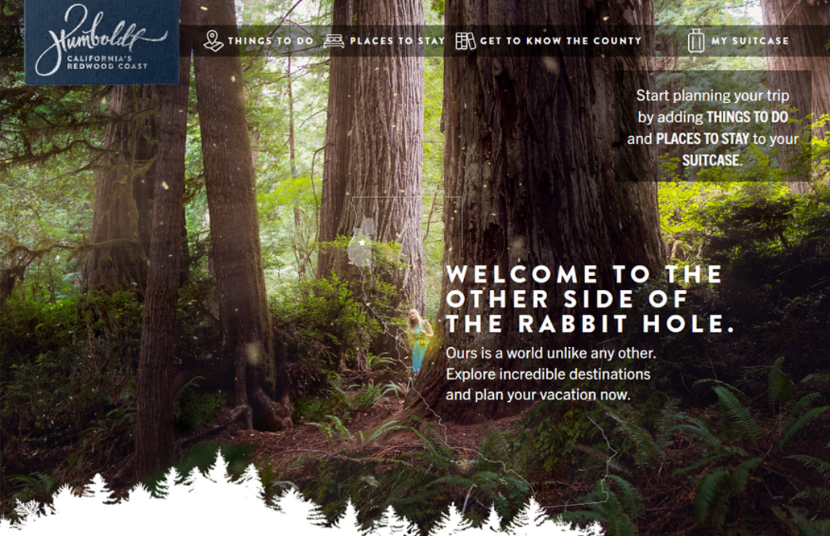 Image: Visit Humboldt
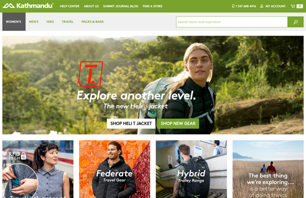 Image: Kathmandu Outdoor
 Image: Chris Dimond Architect
All these three brands belong to different sections of industry but their connection to nature allows them the use of green to appeal to their targeted audience.
To complement green in your web color palette, try brown, another earthy color, as well as blue, to make the palette look more natural. You can also go another way and adopt a monotone look for your site using varying shades of green. It all depends on the message you want to send as well as how you want to be perceived by your audience.
So, What Do You Say?
So here are the five color trends that are currently ruling the website design market. A bit of practice with different shades and hues will help you refine your color palette more.
Before you finalize your brand colors, though, sit with your design team and arrive at a cohesive design strategy that helps you make these decisions with some clear purpose in mind.
Until next time, Be creative! - Pix'sTory made by Ayesha Ambreen
Ayesha is a creative content strategist, graphic designer, and featured Quora author. Best known for her creative visuals and viral content ideas, Ayesha's work has been featured on blogs such as Smashing Magazine, HubSpot, Icons8, Lifehacker, and more. You can find her on Twitter.
Recommended posts
-

Make Your Own Animations Start From an Image Template
Read More › -

6 Photoshop Alternative Tools to Edit Photos
Read More › -

Top Tips to Build Your Film's Branding on Instagram
Read More › -

Review of Simple Video Editors for Newbies
Read More › -

Best Ways to Use Interactive Content to Attract Necessary Audiences
Read More › -

Procure Best Ever Funding for Your All New Startup Venture
Read More ›
