9 Tips for Ecommerce Website Optimization and How It Can Grow Your Business

The next time you go search for something on Google, check to see how many results there are. While the number may vary, results are often in the millions. With millions of results, you're not going to be scrolling through each and every one to find what you're looking for but your eyes and attention likely aren't going to make it past the top five.
Many consider the second page of Google to be as useless as a SCUBA suit in the middle of the Sahara and it's not a place any business would like to find themselves.
When it comes to improving your ranking, there are plenty of tips, tricks and methods out there. Proper and efficient web design can be a great way to boost your SEO rankings, but it's far from being the be-all, end-all. There are plenty of other steps that need to be taken in order to ensure your website isn't cast to a secondary page.
Web design is incredibly important, but there are also plenty of physical elements that should be on your page to help drive up traffic, improve sales, and eventually grow your business.
Keep it Simple
Any fans of The Office may remember some advice that regional manager Michael Scott gave to salesman, Dwight Schrute. The advice was K-I-S-S, which stood for “keep it simple, stupid”. While the advice is a bit harsh and upfront, it's surprisingly solid advice from one of TV's most bumbling characters.
It all starts with the domain name. Making your domain name short, sweet, and simple is not only a way for consumers to read and remember it, but it's a way for Google to find your website faster as well.
After the domain name, Google will be crawling through your website, reading headlines, meta descriptions, and pages.
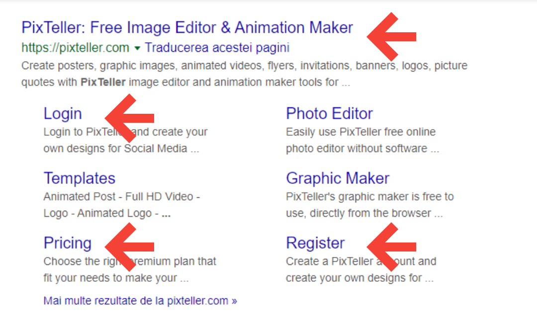
Have a look at the above image. The vertical arrow is pointing to this website's meta description, where we get a brief overview of the what Pixteller actually is and what we do. It's short, sweet, uses basic words, and is easy to read.
Those headers are also nothing flashy. You're likely to find register, pricing, login, etc. on thousands of other websites.
Google likes easy, common language. So when you're filling out your website's copy and descriptions, think more like the Sunday paper and less like Charles Dickens.
Use Engaging Content
When you're publishing content or writing copy for your website, you obviously don't want to sound overly boring or bland. But, you want to be sure you're writing copy that calls the reader to action and encourages them to make a choice.
If you're offering a promotion on electronics, you'd rather use language that attracts the reader's attention, such as “great discount cameras” instead of simply “cameras”. You can show visitors that there lies a bit of urgency for your website and what you are offering.
Making it easy to read and precise will show any visitor what they should be focusing on, instead of being caught up in long-winded paragraphs or blobs of text. Make it clear what you want them to know and see.
Personal Information
No, don't put your social security number and personal address on the web page, but you should be adding some personal information.
One of the best areas any ecommerce website can have is a short "about us" section. This part of your website allows you to tell your story and how the business got started. It's always nice to see where the business started and how it has grown.
If you have a family business, then people are more likely to trust you and your business, so be sure to add that in your biography.
It always helps to have a picture as well, as just a simple headshot will do. You can go full Vogue magazine cover if you want, but that might look a bit weird.
Reviews
Along with adding some personal information, it's necessary to have reviews and testimonials on your home page. Studies show that over 90% of millennials are just as likely to trust an online review as they would from a family member or friend.

Reviews boost customer acquisition, as visitors that are just browsing through will be able to read about real experiences from real people. If you can include more lengthy testimonials, the better. People are more likely to trust other people than they would a random ad they may see.
Contact Information
While this is fifth on our list, it is one of the most important. Put simply, people like easy things. In today's day and age where you can pull up just about whatever you want on your phone, actions that take too long or are too difficult may get left behind.
One of the ways to lose customer interest and traffic is by making your contact information incredibly difficult to find. When you're looking for a restaurant, you immediately want to know where they are, what their hours are, and what number you need to possibly make a reservation. If you can't find that, then it's on to the next one.
Put your contact information in an easy-to-find spot and make it obvious. Provide hours of service (if you have a brick-and-mortar front), email, social media links, phone numbers, and anything else that you think a customer would like to know.
Make Sure You're Mobile
We all know that smartphones are an integral part of our daily lives, but it can be staggering to see just how much they have become ingrained in what we do.
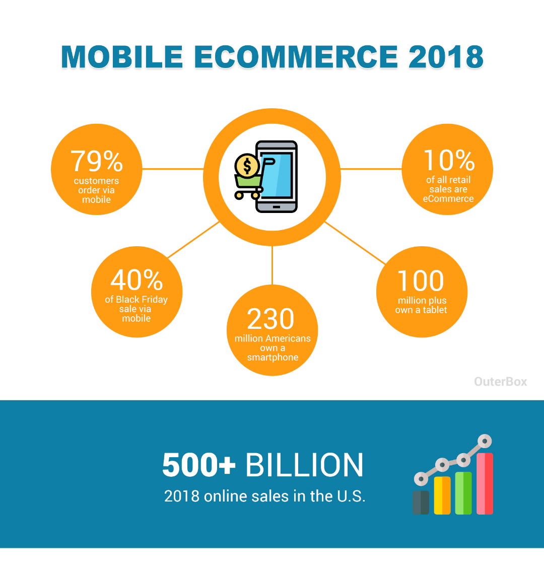
More and more customers are turning to their mobile devices to order every year, meaning that if your site isn't mobile, then it may be left in the dust.
Having a functioning mobile site is another way to ensure site trustworthiness, boosting up your rankings. With so many searches coming via mobile phones, the more clicks and visits you receive will ultimately translate into a higher ranking on Google due to your site's trustworthiness.
With your mobile site, it's very important that the site is fast-loading. Loading times are another factor with rankings and slow loading means a higher bounce rate, ultimately resulting in a loss of traffic and potential customers.
Customer Appreciation Messages
Just like your parents taught you, eye contact, a solid handshake, and a thank you message can go a long way. In the digital world, you may lose out on that physical connection but there's no reason you can't show your customers appreciation.
Many customers end of leaving a business if they don't feel valued. If the business doesn't value the, why would they make it a habit to keep returning?
One of these ways is by adding a "thank you" message after any transaction is complete. Not only does it show appreciation, but it will help you track the buyer's progress for your ad analytics.
You can also offer loyalty programs for new and returning customers. Customers like to see that their continued effort and money into your business is going to make them eligible for some kind of reward in the future.
Solid Images
Your website can't just be words and people love being able to grab a visual image for your services and products. You can either create a custom image route or go through stock photos, but the images can be vital to a website's look and attractiveness.
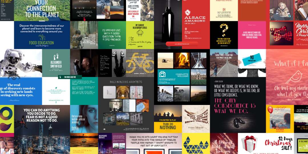
Besides images, you can also add videos to your website. Video marketing is on the rise and it's a way to raise customer interest and adds something to share. The more people are sharing images or videos across different platforms, the more traffic you will start to see filtering through your website.
You can also use your images to boost your SEO, through proper image descriptions and tags. Strong images ultimately result in a more optimized webpage.
Streamline the Sales Process
The sales process, like the rest of your website's functions, should be simple and streamlined. Customers shouldn't have to feel like they're bouncing among different pages in order to complete a transaction, but should be one, smooth process.
Part of streamlining the process is being upfront about prices. Websites that "hide" prices generally frustrate customers as you'd never like to be surprised with what you're spending. Hiding the prices decrease overall trust, making it more difficult for customers to become conversions and ultimately dropping your retention rate.
Make boxes clear, payment information a breeze, and limit the number of total steps it takes to go from clicking on a product to have the order confirmed.
If you're waiting to display your prices to once customers reach the cart, that will likely result in a high cart abandonment rate. Nothing is more frustrating than leading the customer to water, only to have them tell you they're not thirsty anymore.
Until next time, Be creative! - Pix'sTory by Sarah Saker
Recommended posts
-
Explore Smart SEO Tips to Boost Your Video Marketing in 2020
Read More › -

5 AI Tools Every Digital Marketer Should Use in 2026
Read More › -

The 5 Best Graphic Design Tips for Social Media Marketing
Read More › -
Video Marketing Statistics You Need to Know for 2021
Read More › -

Five Useful Ways of Successful Art Marketing
Read More › -
The Invisible Search Layer Most Brands Are Missing (And How Smart Markete...
Read More ›
