Artlist vs Recraft vs Ideogram: Which Is Better When Text Has to Be Part of the Design?
For most of the generative image era, typing words into a prompt and expecting readable words in the output was a losing bet. You got glyph soup: letters that had the rhythm of language without being language. That has changed enough that the question is now worth asking seriously, and the three platforms in this comparison arrived at legible text by noticeably different routes.
Why text was the hard part
Diffusion models learn what pixels tend to sit near other pixels. That works beautifully for a face or a landscape, where being approximately right is indistinguishable from being right. Text does not tolerate approximation. A letterform that is 95 percent correct is a letterform that is wrong, and a human reader spots it instantly, which is why early outputs looked uncanny in a way that a slightly odd tree never did.
There is a second difficulty that gets less attention. Words in a design are rarely just words. They carry a typeface, a weight, a tracking value and a position in a hierarchy, and all four of those are design decisions that a text prompt describes only crudely. Solving legibility and solving typography are separate problems, and only the first one has made real progress.
Recraft: built for people who ship vector
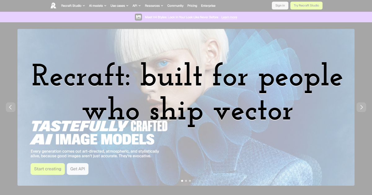
Recraft's distinguishing move is treating design output as design output. Its emphasis on vector generation and brand-consistent style sets addresses the actual failure point in most workflows, which is not producing an image but producing an image somebody can edit afterwards.
For text-heavy work this is the single most useful property on offer anywhere in the category. A raster headline that is nearly right is a dead end. A vector headline that is nearly right is a five-minute fix in a proper editor. If your output is destined for print, for large-format, or for anything where the type will be re-set at another size, this consideration outranks raw prompt fidelity. The trade-off is that Recraft asks more of you: it rewards people who already think in styles, palettes and reusable systems, and it is less immediately gratifying for someone who wants one good image now.
Artlist: the graphic as one asset among several
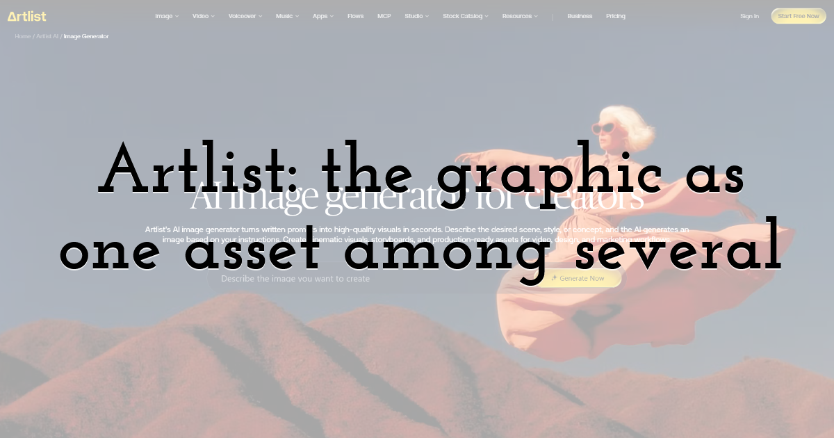
Artlist approaches this from the asset-library side rather than the model-research side. Because image generator AI sits alongside its licensed stock, video and music catalogue, a generated graphic is typically one element in a larger campaign rather than the whole deliverable, and text-bearing output is expected to be handed onward into a designer's file rather than shipped untouched. That framing changes what "good enough" means. If the headline is going to be re-set anyway, near-miss glyphs cost you nothing, and the rights position on the surrounding footage and music is worth more than a marginal gain in letterform accuracy.
Ideogram: the specialist that made text its headline claim
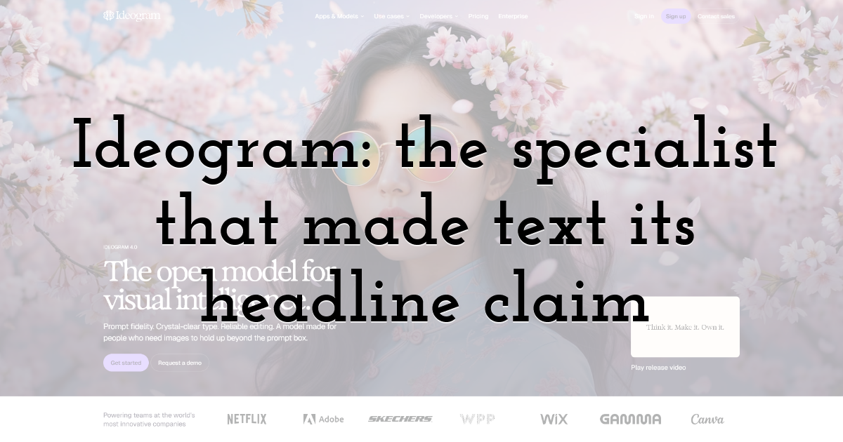
Ideogram built its early reputation almost entirely on rendering readable words, and among general-purpose generators it remains among the most reliable at getting short strings of English text correct on the first or second attempt. For quick social graphics, poster mockups and concept work where the text runs to a few words, it frequently wins on hit rate alone.
Where it gets harder is control. Getting the right words is a different problem from getting the right typeface, tracking and hierarchy, and a model that produces a handsome but unspecified display face has not answered a design brief. You cannot yet say "set this in a grotesque at 92 point with tight tracking" and be understood.
The script problem nobody benchmarks
English is the easy case, and almost every published comparison quietly assumes it.
The Unicode Consortium, which publishes the standard underpinning digital text everywhere, released Version 17.0 in September 2025: 4,803 new characters, bringing the total to 159,801 across 172 supported scripts, with the count of encoded CJK ideographs passing 100,000. A model that renders English headline type convincingly may fall apart on Arabic, on Devanagari, or on anything requiring contextual letterforms that change shape depending on their neighbours. If your work is multilingual, test the specific script rather than trusting a general claim that a tool "does text now."
The rules that no model has internalised
This is the gap worth naming precisely, because it explains why none of the three replaces a designer on text-led work.
The AIGA, whose design archives hold more than 20,000 selections dating back to 1924, exists partly because communication design accumulates conventions that are learned rather than inferred from pixels. Some of those conventions are strict enough to be checked mechanically, and a generator that ignores them produces work that looks plausible and fails on contact with real readers.
PixTeller's guidance on choosing typography states several of them plainly: keep to a minimum number of fonts, hold line length to roughly 60 characters, and meet a contrast ratio of at least 4.5:1 for small text and 3:1 for large. No generator applies those constraints on your behalf. All three will happily produce a headline in four competing typefaces at a contrast ratio that fails accessibility outright, and none will warn you. That check remains yours.
Picking by output destination
The useful decision rule is not which model renders text best in a benchmark. It is what happens to the file afterwards.
If the type will be edited, resized or re-set, Recraft's vector output is the deciding factor and everything else is secondary. If you need a small number of correct words quickly for a social post or a pitch mockup, Ideogram's hit rate saves the most time. If the graphic is one asset inside a campaign that also needs footage, music and an unambiguous rights position, Artlist's consolidation is worth more than a marginal gain in glyph accuracy.
One habit serves all three. Generate the composition without text, then set the type yourself in a real editor. It sounds like a retreat, but it is faster than fighting a model for a specific typeface, and it is the only approach that gives you exact control over the one element a viewer will actually stop and read.
What Legible Is Not the Same As
Getting the letters right was the visible problem, and it is now largely solved for short English strings. The invisible problem is everything typography actually does: signalling hierarchy, carrying a brand, staying readable at the size and contrast the viewer encounters. A model that spells a word correctly in a typeface nobody chose, at a weight nobody specified, has cleared the low bar and left the high one untouched. Until you can name the face and the tracking and be obeyed, the honest description of all three tools is that they generate images containing text, not that they set type.
Until next time, Be creative! - Pix'sTory
Recommended posts
-
From MIDI to Raw Waveforms: The Technology Behind Modern AI-Generated Mus...
Read More › -
5 Best Alternatives for Email
Read More › -
Image Quality Problems That Can Ruin an Otherwise Great Design
Read More › -

AI Video Generators Ranked: 7 Best Platforms for 2026
Read More › -
When Image Editing Moves Online, Who Controls Access to the Original File...
Read More › -
Mastering Visual Storytelling with AI-Driven Fashion Photos and Animated...
Read More ›