PixTeller Design Editor - Here Are the Features Explained
Yes, it is finally time to show you most of PixTeller graphic maker - functionality and features. Why? Because I think you are ready to take your creativity to the next level. Alex (PixTeller chief troublemaker), and I am back again with a new video that will tell you exactly how to boost and better your designs by experiencing and properly using our features and functionality. You're going to love it!
First things first, just open the photo editor in blank format, and from here on, we will take things step by step, to show you how it's done. You want to make the most of it and we know how.
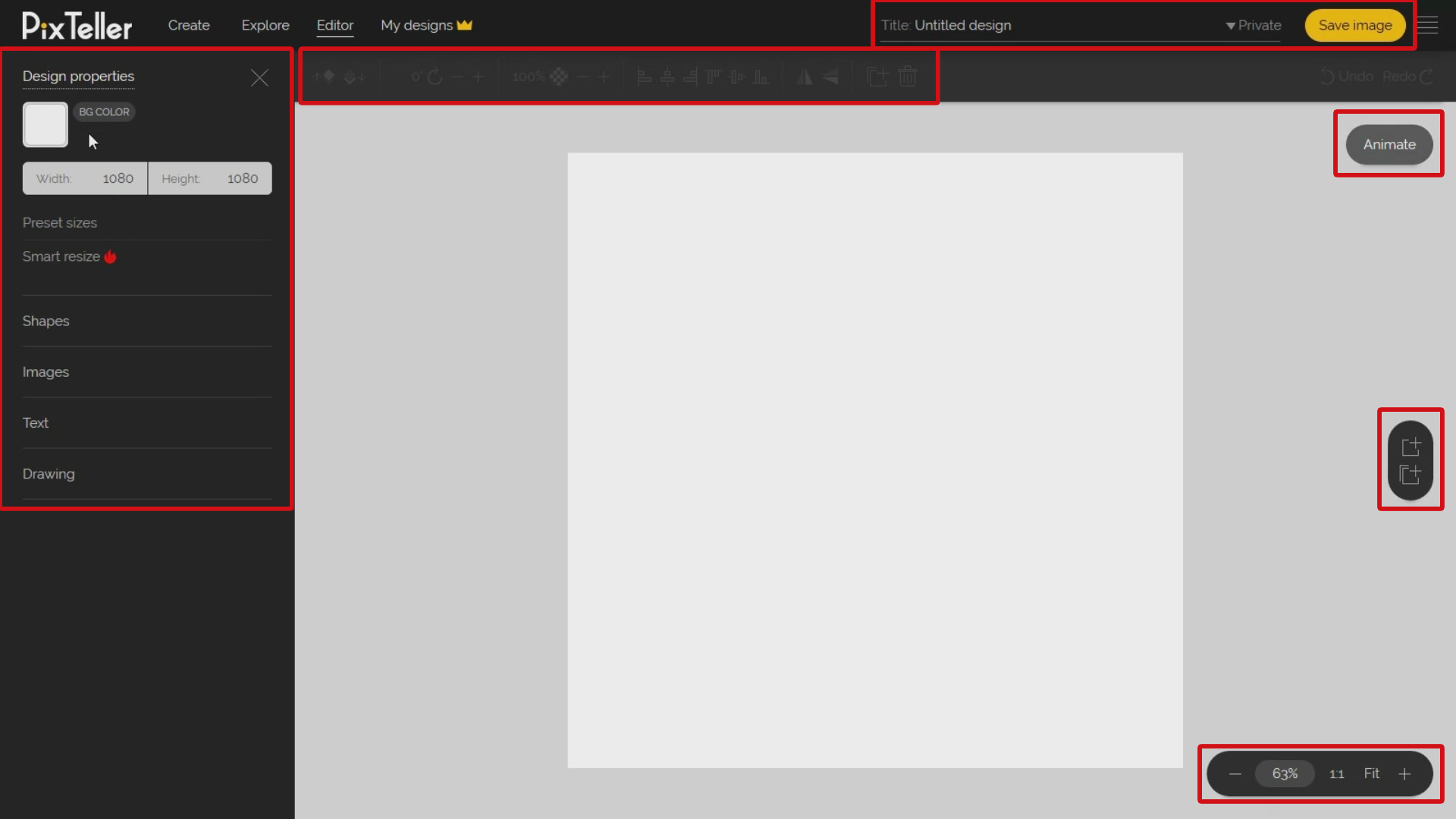
Look on the left side to find the main menu and features. Here you can set up your design properties to shapes, images, text, and drawing. Yes, just let your imagination run wild with the right design tools to choose from.
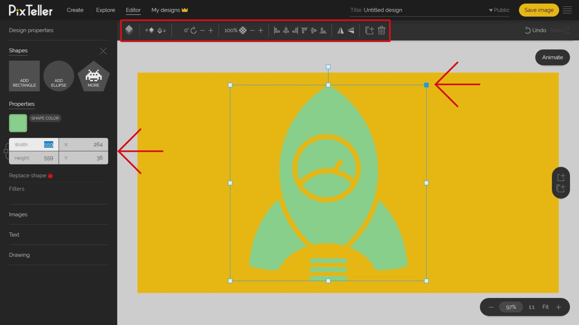
Look at the top of the page, below 'Editor' and 'My designs'. There you'll find an extra menu where your super powers await. You can order, rotate, set opacity, set alignment, flip, clone, delete any element selected for your design. Plus, on the top right, you may find the 'History ' 'Undo' and 'Redo' buttons. (Because no one is perfect)
On the right corner of the header, you have two options: setting or changing the design title and setting the privacy to public or private. Keep in mind that any private design will be visible only to you, under your PixTeller account. The 'Save' button is on the header of the page but you can also execute it from the keyboard command with "CTRL + S".
Look at the middle-right side of the page. There are located the much-needed multi-page options. By using this function, you have the flexibility to create multiple design pages by adding new ones or, even clone existing ones. Additionally, this feature is also useful if you want to make animations using PixTeller editor.
Looking for the animation mode switch button? It is located in the right-top corner of the editor canvas area. Once you click it, you will switch the editor from design to animation mode, and here is where you can create animated gifs by adding motions between instances for any element you have in design mode.
Next you will need the zoom menu to adjust your design preview the way you like it. Just look for it on the bottom-right corner of the page.
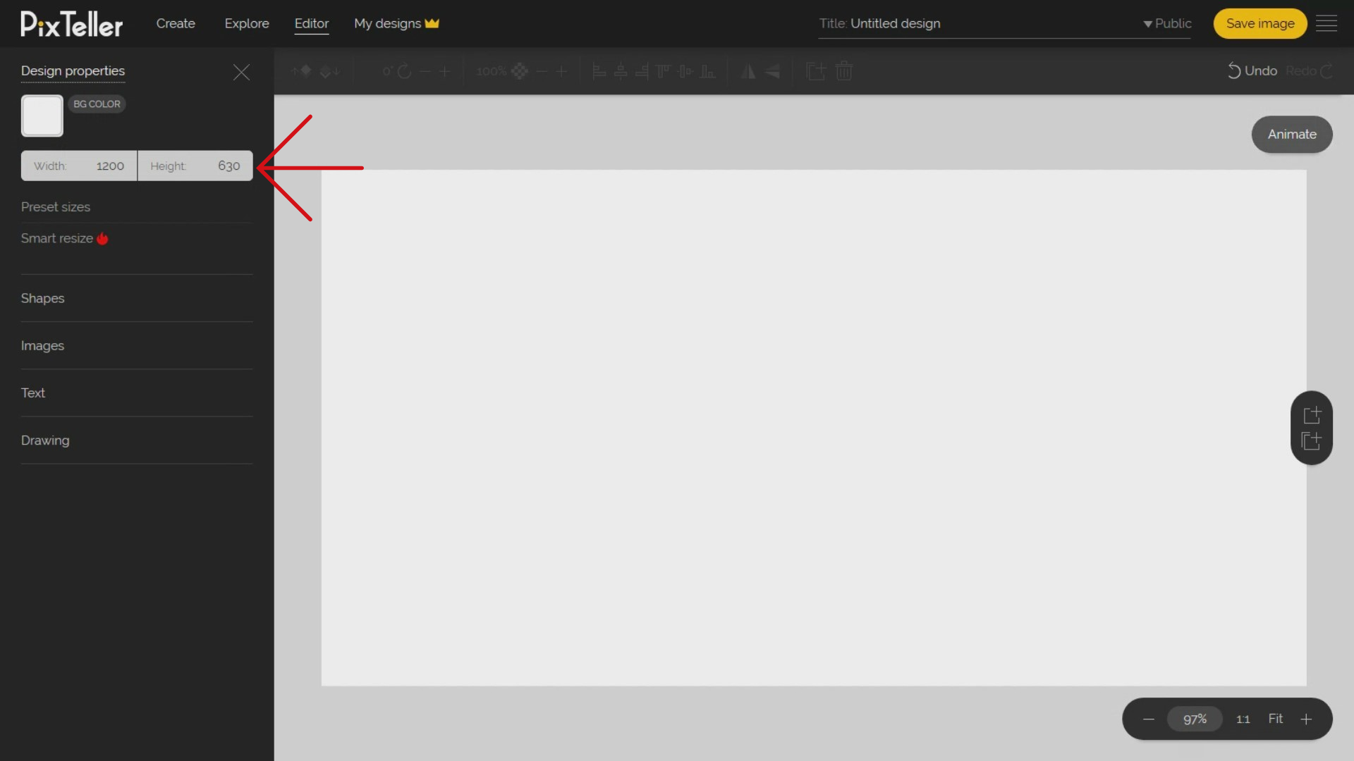
So that's about it regarding where the main menus of PixTeller poster maker are located. Now let's roll up our sleeves and move to deep functionality. Yes, and don't worry, you're doing great so far. It's very important to decide on the right size of your design. To do that, you must go on the left panel under 'Design Properties' menu. There you can use the preset sizes added by us, or you may simply type in the design width and height inputs of your choice.
Let's say you want to make a greeting card for a Facebook post. To do this, click on 'Preset size' button and choose 1200x630 pixels dimensions. Once you do this, the canvas design will adjust according to the new dimensions.
But wait, there is another great way to change the canvas size by using the 'Smart resize' options. T his comes in handy when you use premade layouts and you want to automatically adjust all the elements to new dimensions. Even if it's not perfect, it has helped me and the users a lot! And I've saved tones of time especially when I convert a size to a new one.
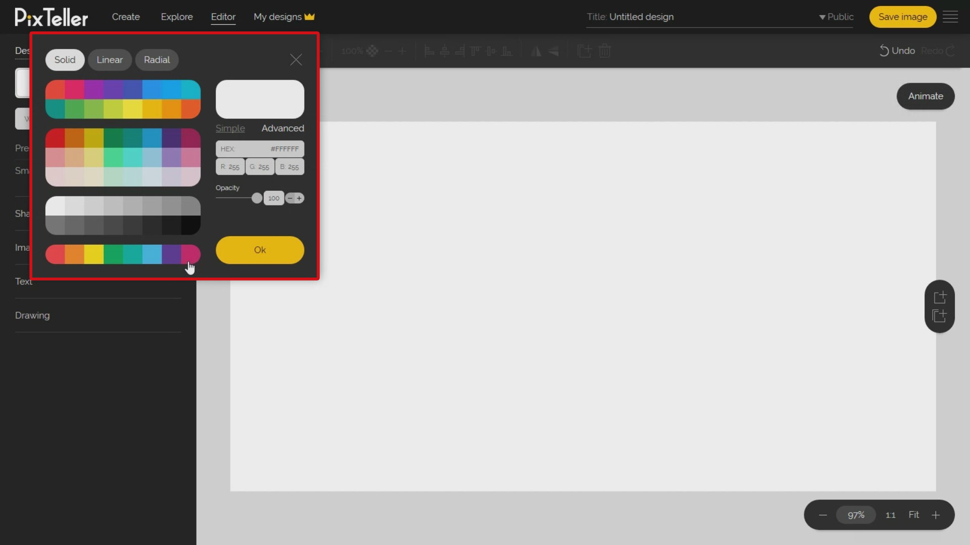
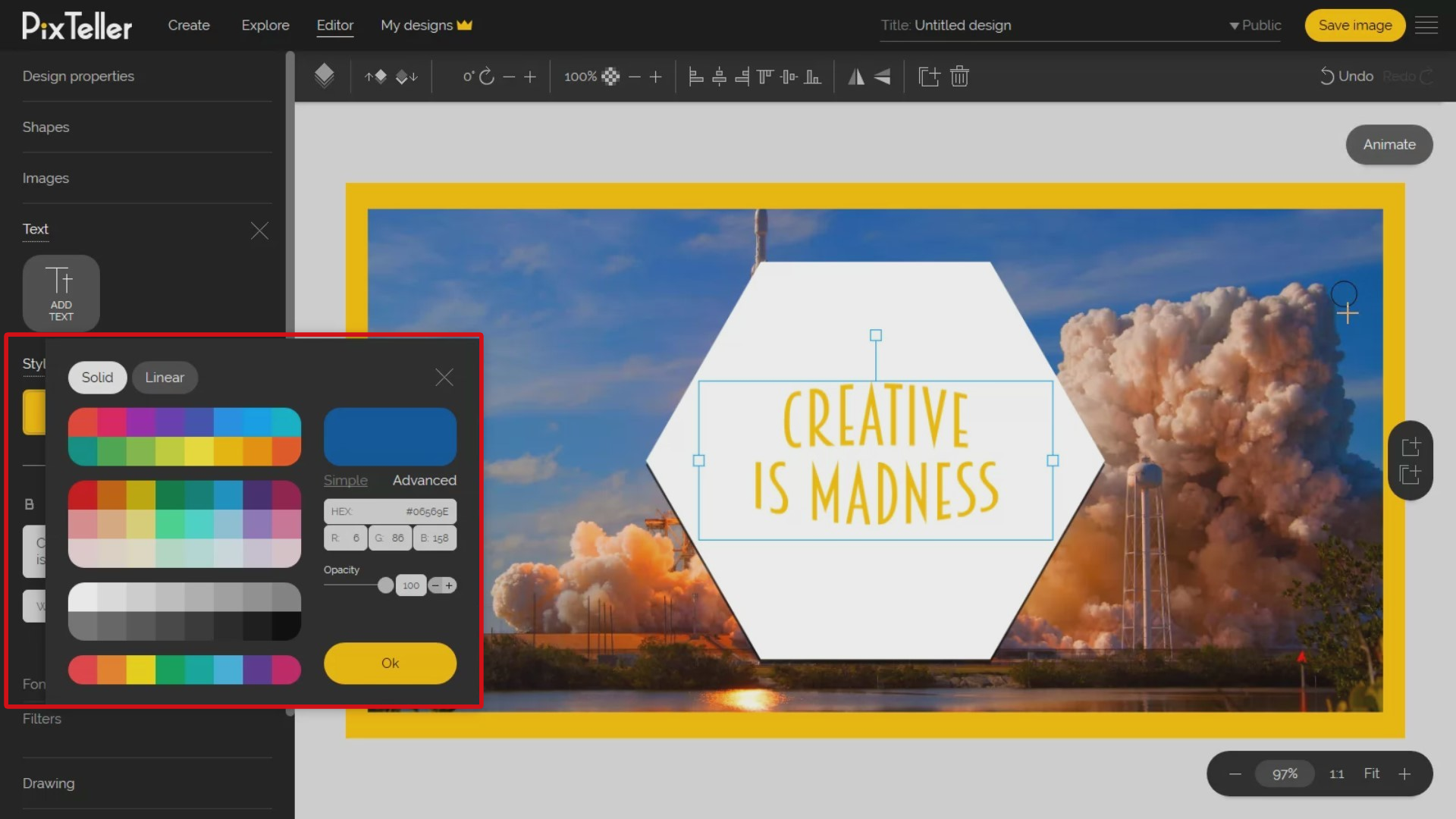
For a transparent background that works great on PNG files, you must change the opacity to zero from the color menu. Also, you have other color options: you can choose between a solid color, linear gradient or radial gradient. To choose the right color you have choices to pick from: You can select them from our default palette that I think is really great, you can use advanced mode or you can just roll over your mouse cursor over the canvas and pick a color from there.
For more experienced users who know the exact HEX or RGB of the color, you can paste the exact color code in the related inputs. Now, for the following example, I will choose one of my favorite colors: yellow.
Once the design size and background are settled, let's go to the next menu from the left section, that is Shapes. You can choose from the two most common shapes like rectangle and ellipse, or I can just click the 'More Shapes' button and choose from thousands and thousands of different shapes.
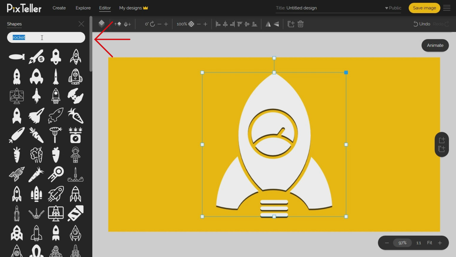
For example, let's add a rocket shape. To do this, I will search for a rocket, choose one and click on it. The rocket shape selected will be added on the left-top part of my design area, with a default size of one hundred pixels width and one hundred pixels height.
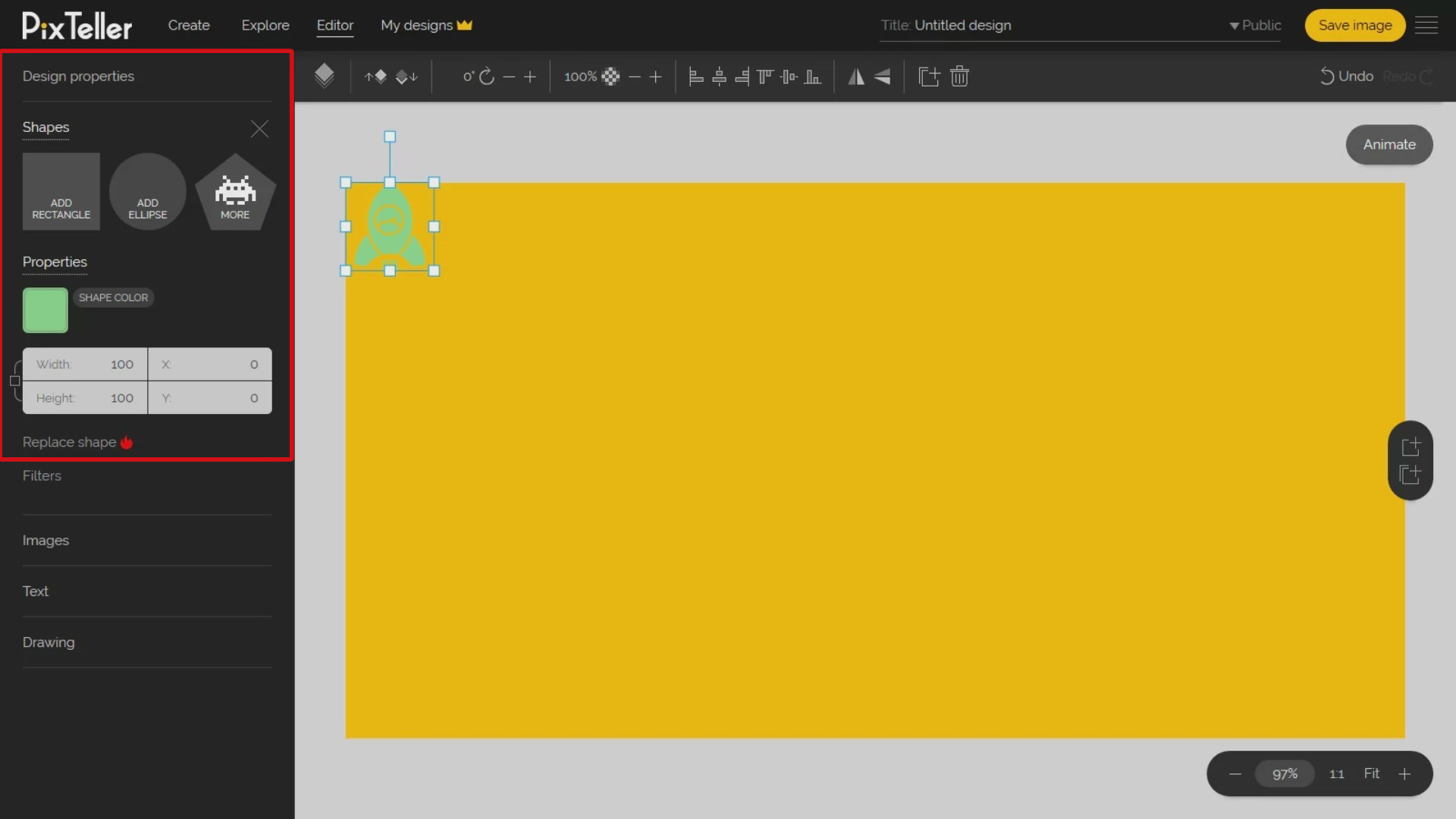
Yes, you are free to do whatever you want with the shape. You can:
- scale and keep the aspect ratio by dragging the shape from any corner of the selection area;
- move it to any place of the design area.
Now, look at the left 'Shapes' menu. There you can manually set the width, height, horizontal and vertical positions by inserting the right values in the related inputs. Keep in mind that all these input values are in pixels. For the selected shape you may change the order, rotation value, opacity, alignment, flip property, from the top menu.
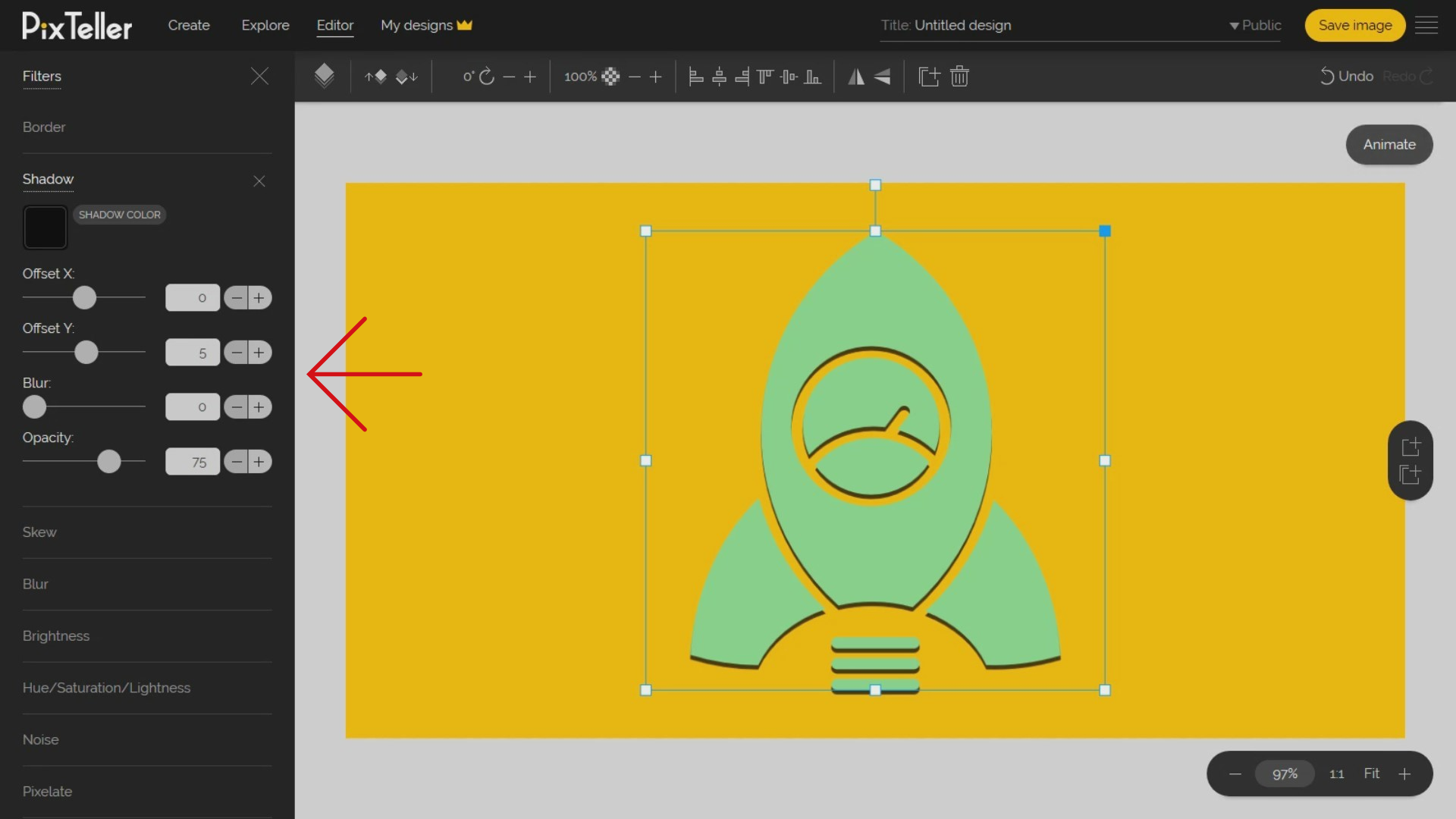
Here's what I want to do for my rocket shape: apply a bunch of filters! How? By clicking on the filters button on the left and opening the shape filters menu. You can change the Border, Shadow or Skew values. You may also adjust the shape Brightness, Hue, Saturation, Lightness, and RGB. What is awesome is that you can add a Blur, Noise or Pixelate effect on your design shapes. That'll make it so cool!
In my case, I will just add a simple shadow filter.
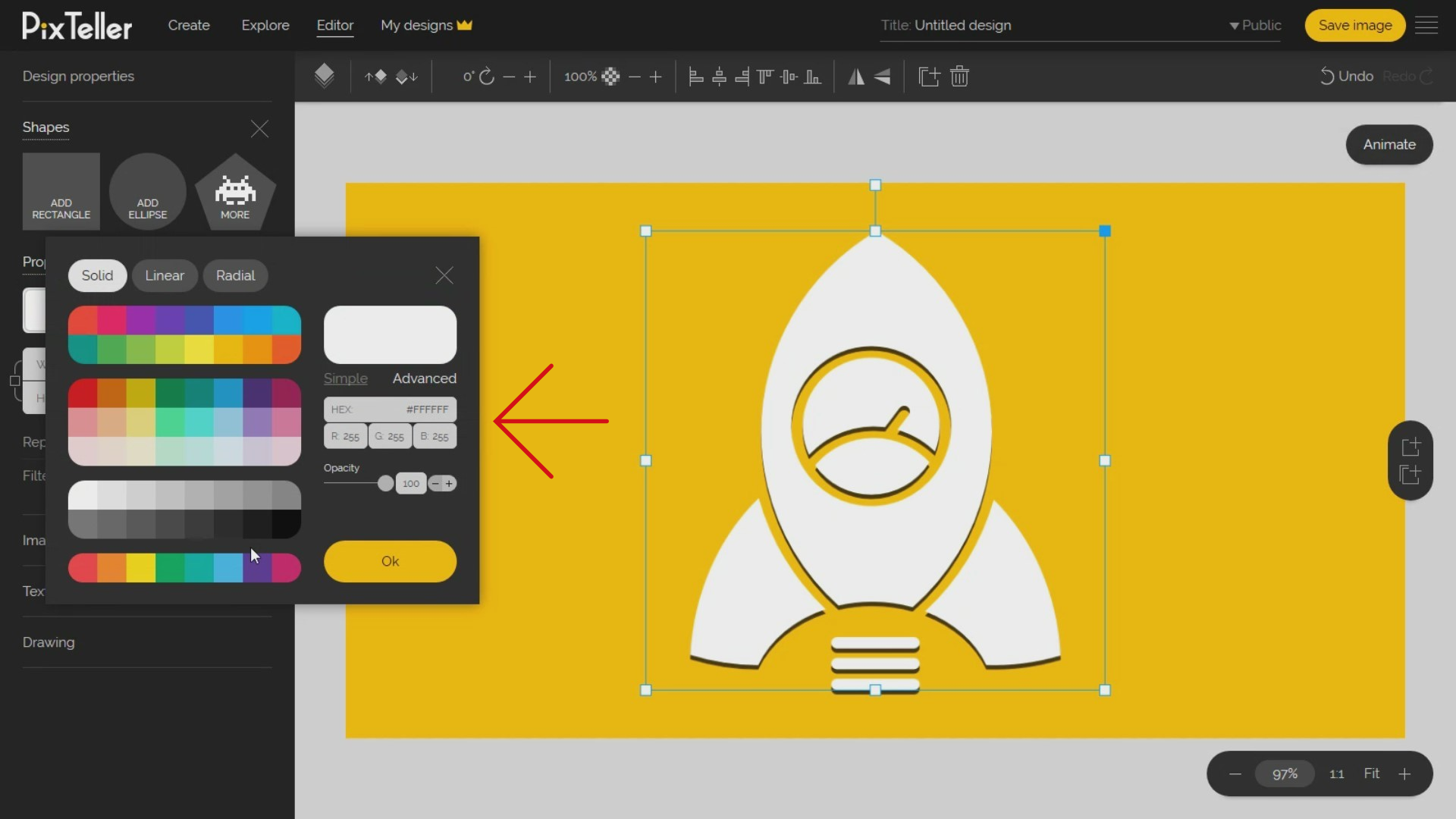
Want to change the shape color? Simply click on the 'Color' button from the left 'Shapes menu'. You may choose between Solid, Linear gradient, Radial gradient by using the same steps as we did on the design background color. And for my shape, I will select the white color.
What is truly awesome about the graphic editor is that you can always replace any shape with another, by keeping all the initial properties like size, position, color or any other filters. No more headaches here!
Now, to use the replace function, select the shape and click the 'Replace' shape button. Once you do that, select the new shape you want to be added. In my example, I will replace my space rocket with a different one. As soon as I do that, the new shape will keep the rocket shape properties. Very useful is that this whole operation of ours saves a lot of time because you don't need to repeat the process to add new properties and so on. And what's more important than time?!
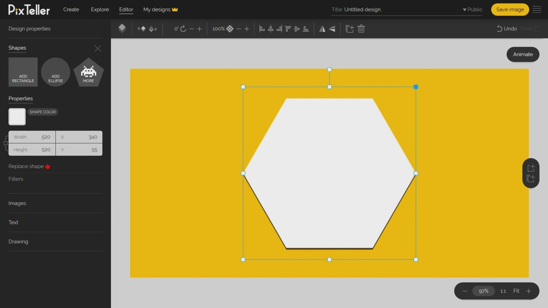
That's about it regarding the basics of handling a shape. I hope it was easy to follow. But now, let's move on to the next big menu - the images menu. Ready? Once you open it, you can click on the 'Add Image' button to add any Photo or Illustration on your design.
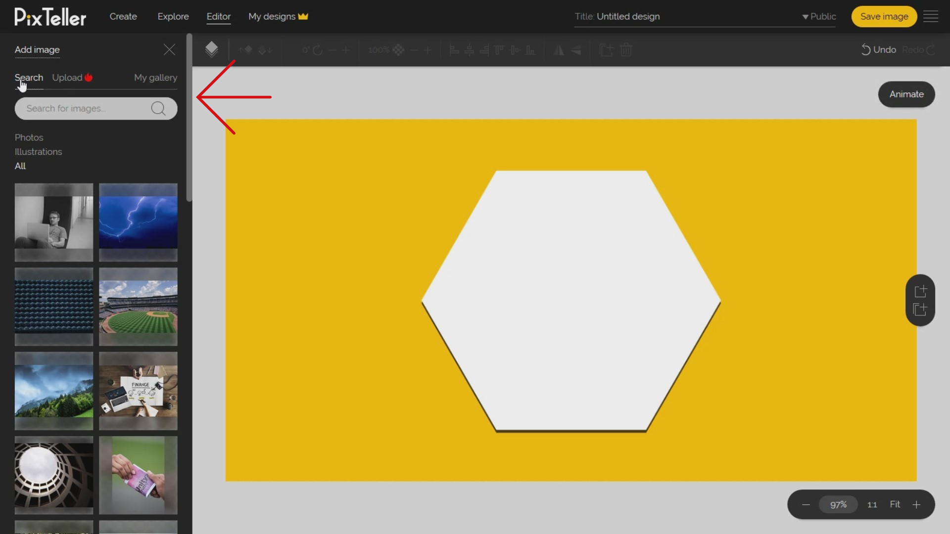
On the Add Image panel, you basically have three possibilities. First, search in our database of millions of photos and illustrations the one that is fit for your design.
Second, to upload your own images, switch the Add Image panel in 'Upload' mode, click on the 'Upload images' button, then identify the images you want to add and upload them on PixTeller.
Third, adding any visual asset from 'My gallery' section. So, you can add any photo you find in the 'Search' or 'Upload' menu to 'My gallery' by rolling over the image you want to add, and clicking on the 'Save to gallery' button. Once you've saved your favorite photos in 'My gallery', you will always find them there. Rest assured. For instance, I always keep my company identity in 'My gallery' section.
Now, let's add a rocket photo from the search section. To do this, I will search for "rocket". I can also filter the results by Photos or Illustrations. Choose the image you want to add, roll over it and click it so it is added to the canvas.
An important mention I'd like to make here: you can add images into your design in other two ways that I'm certain many of you had no idea up until now:
The first way: you can search on the Internet for any images, right click on it, click save image button, then come back on the editor and paste it on the canvas using "Control + V" keyboard command or right click over the editor canvas and click the on the "Paste" option.
The second way: you can drag images from your computer directly over the photo editor canvas area. The images will automatically be uploaded and added to your design. Are you with me? Yeah? Let's continue!
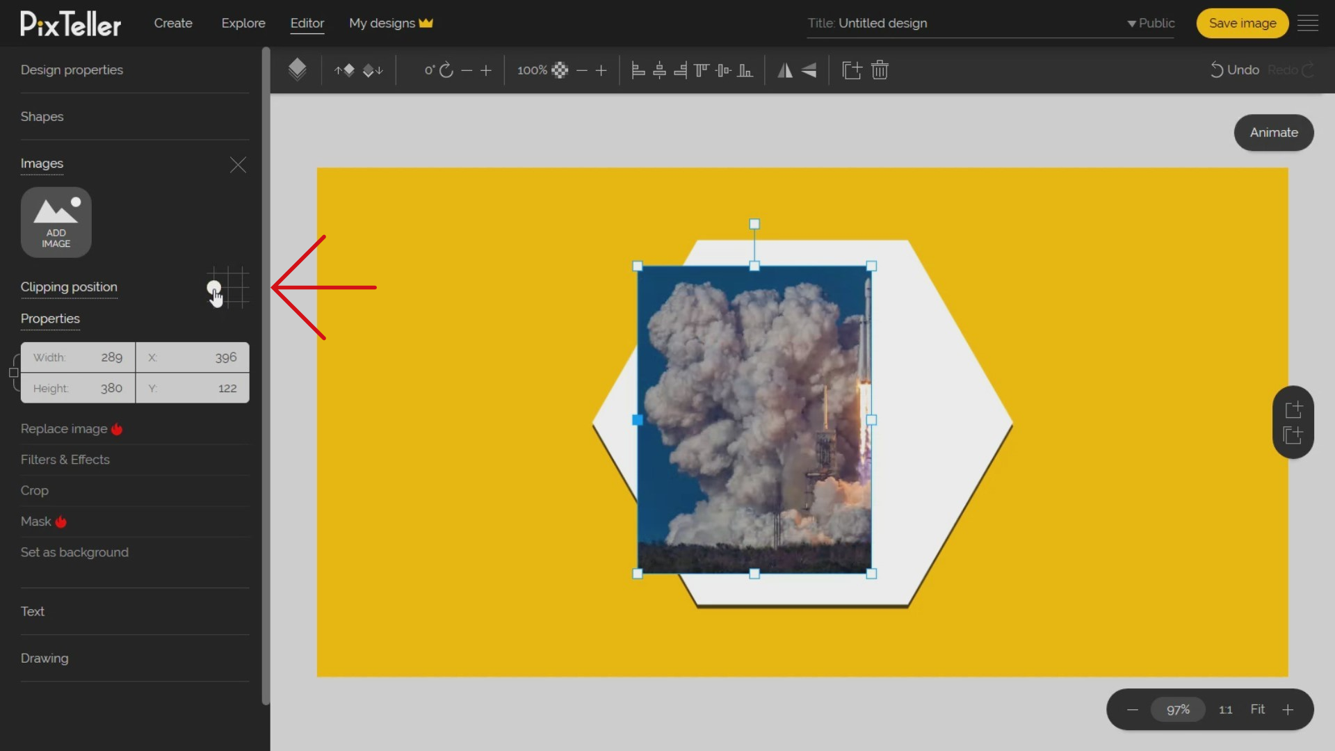
Now, after I've explained how to insert your image into your PixTeller design, let's have a bit of fun and play with my Rocket photo. I can scale it by keeping the aspect ratio, and by clicking and dragging any corner from the image selection. Also, I can move it to any place in the design. I think you'll find the guidelines very helpful.
An option that is sometimes misunderstood, but Pixteller's photo editor tool got it covered, is that you can resize the image at any size without destroying the aspect ratio. We called this the clipping-crop function. I can change the clipping position by selecting one of nine points. And the default clipping position point is on the middle-center.
Don't forget that for my rocket photo, I can change the order, rotation value, opacity, alignment, flip property, all from the top menu.
In this example, I will set the image as background by clicking on the 'Set as background' button from the left-side menu. Once I do that, the image will be resized to the design size, and in our case a Facebook post - 1200 pixels width and 630 pixels height. I also want to have a border around, so I will manually resize the image from the width and height inputs by decreasing the width and height with 100 pixels and 60 pixels respectively, and by setting the alignment to center and middle.
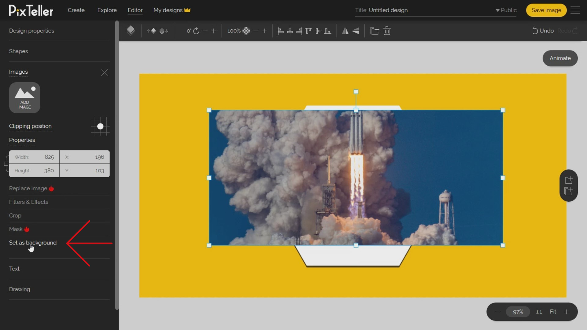
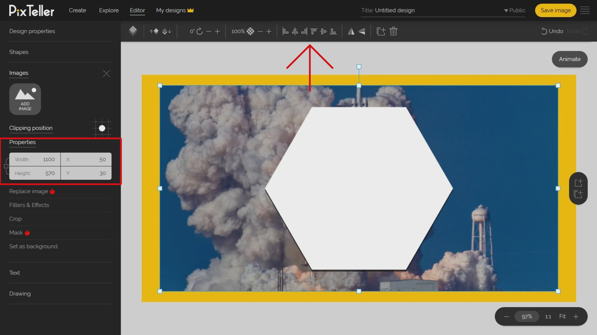
Side-note: by clicking on the "Crop" button, I can easily crop any photo area I want, without destroying my photo properties like size or position from the editor.
We want to keep things simple, so we have introduced another feature for your pictures on the editor: your images can be masked with any shape available. You can choose from thousands and thousands of shapes, even geometrical ones, that you didn't even know existed. In our case here, the best mask is the rectangle that is the default mask for all the images you add into the editor. Remember! You can update the mask at any moment.
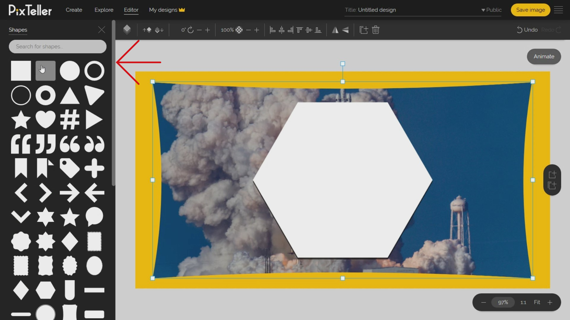
The true power of PixTeller comes from the various filters and effects that you can apply to your photos and illustrations.
How? Simply by clicking on the 'Filters' button on the left and opening the Image Filters menu. You can apply image effects like Vintage to Sin City, from Clarity to Glowing Sun and give to your photos used on your design a stunning new look. Yes, you can kick-ass with these!
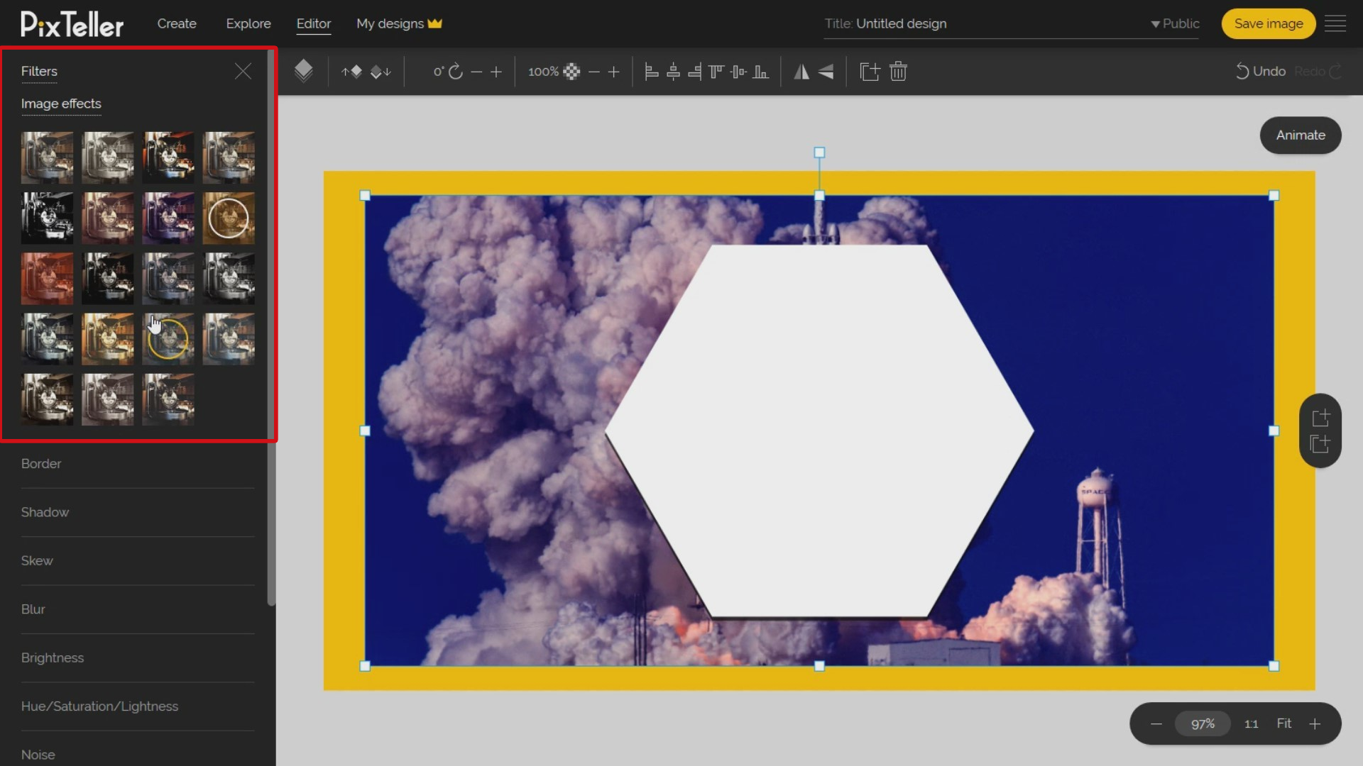
Again, what we've learned from the 'Shape' is that you can change the Border, Shadow or Skew values. You may also adjust the shape Brightness, Hue, Saturation, Lightness, and RGB. What is awesome is that you can add a Blur, Noise or Pixelate effect on your design photos.
I just want to remind you that if you are looking for these filters elsewhere, you'll not be able to find them on any other online editor because it's a feature we designed. Most importantly, is that you can use all of these filters to create your own short animations from a single image. You will learn how to by viewing this tutorial.
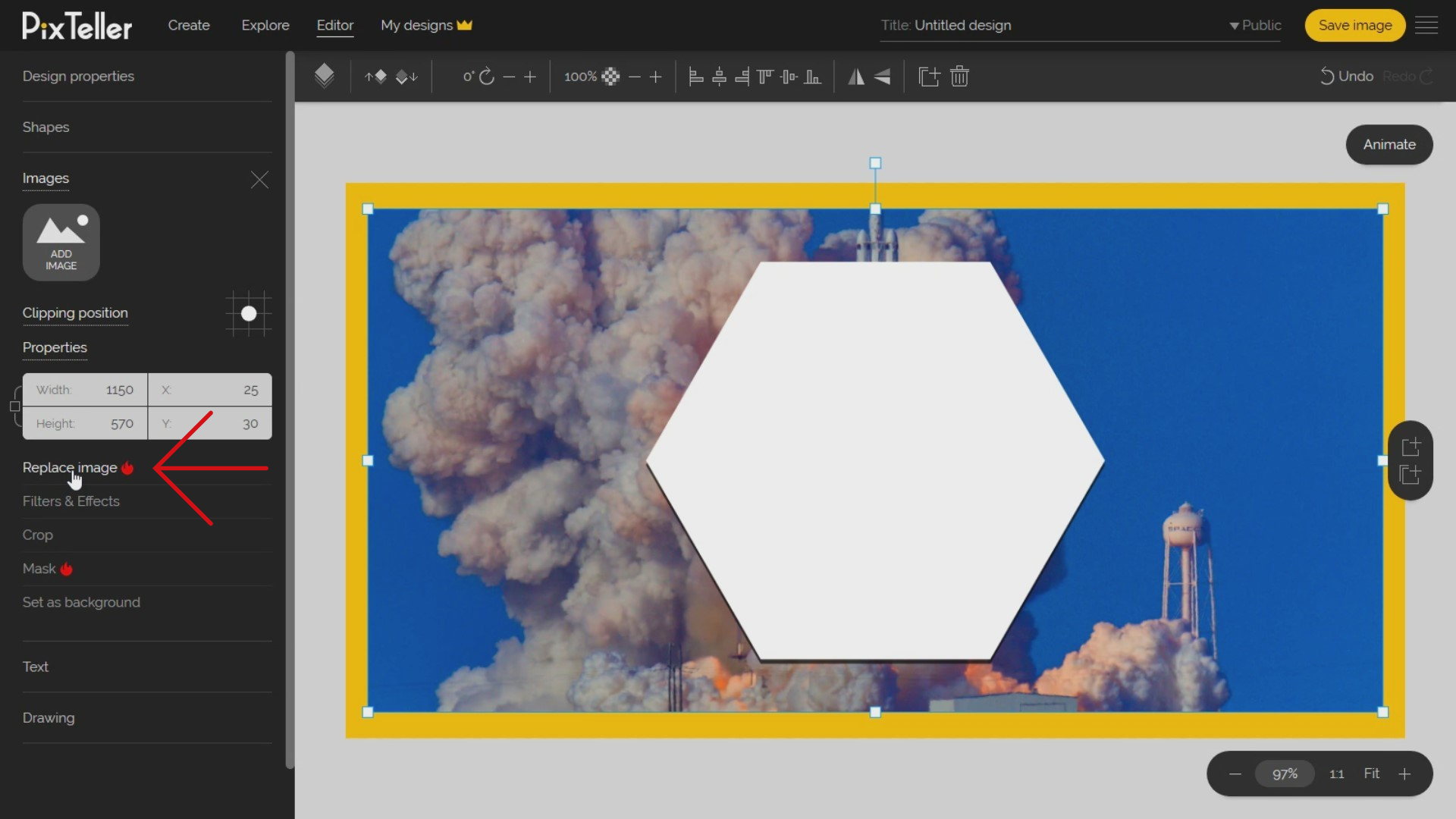
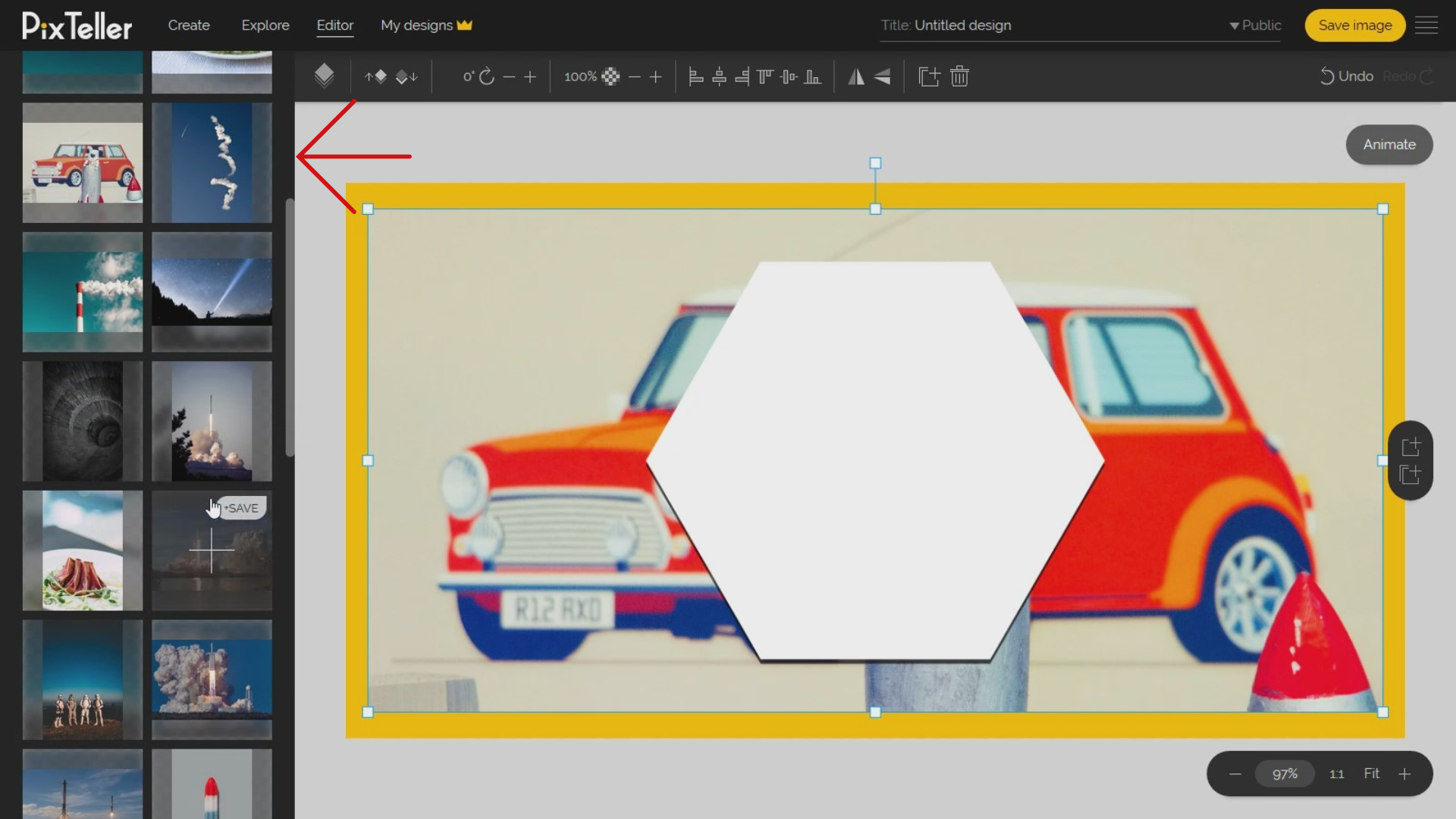
Coming back to our design, let's adjust the image size and position a little, so it's top-notch. What is really helpful and nice is that you can always replace the image with another one and keep all the initial properties, from size and position to any effect or filter. You can do this by clicking the 'Replace' image button and choosing another photo that will replace the old one. This function is really time-saving!
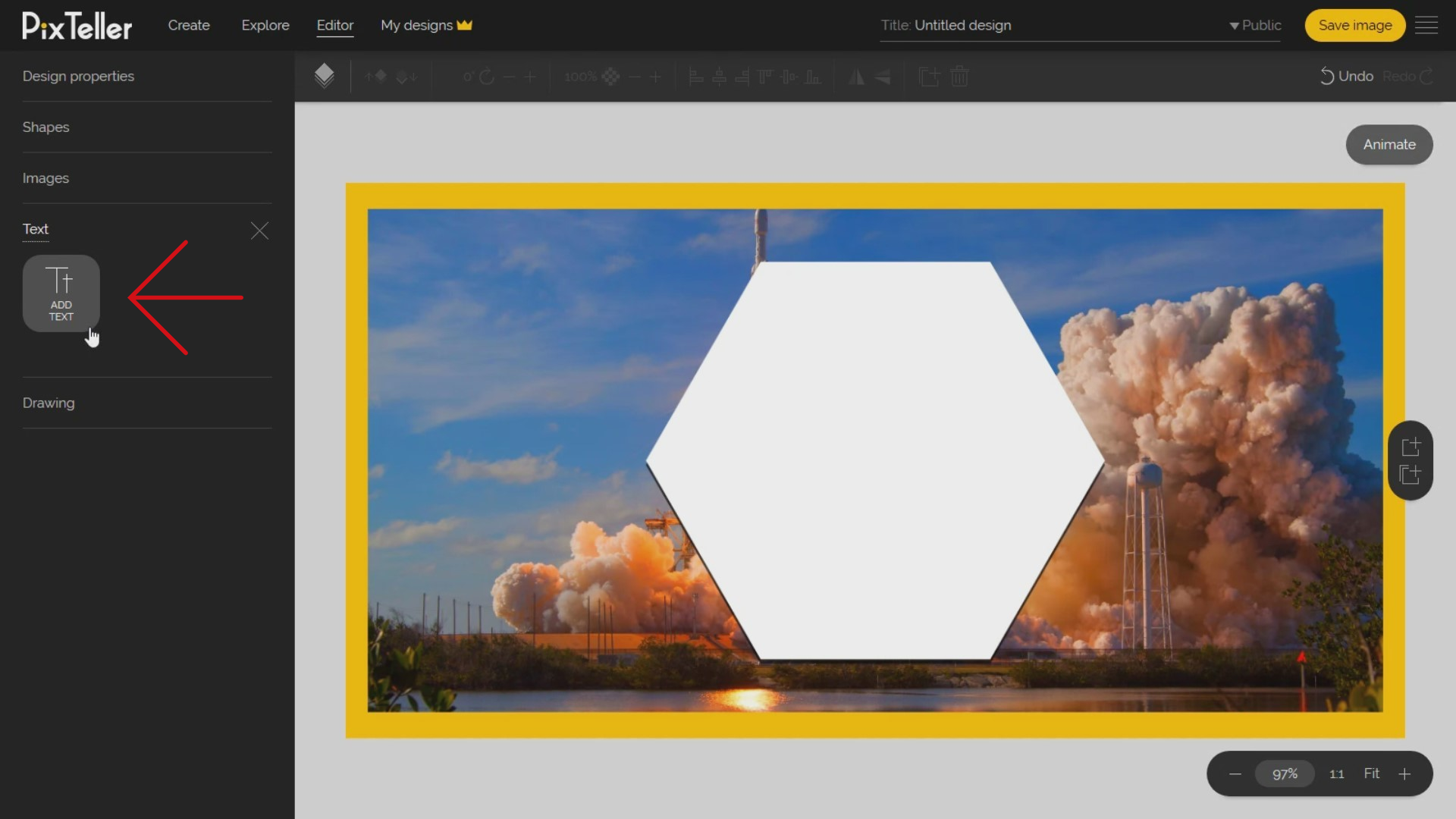
Now, let's move forward and see how to add a text element to your design. To do this, just click the 'Text' button to open the text panel. Once the panel is opened, click on the 'Add text' button.
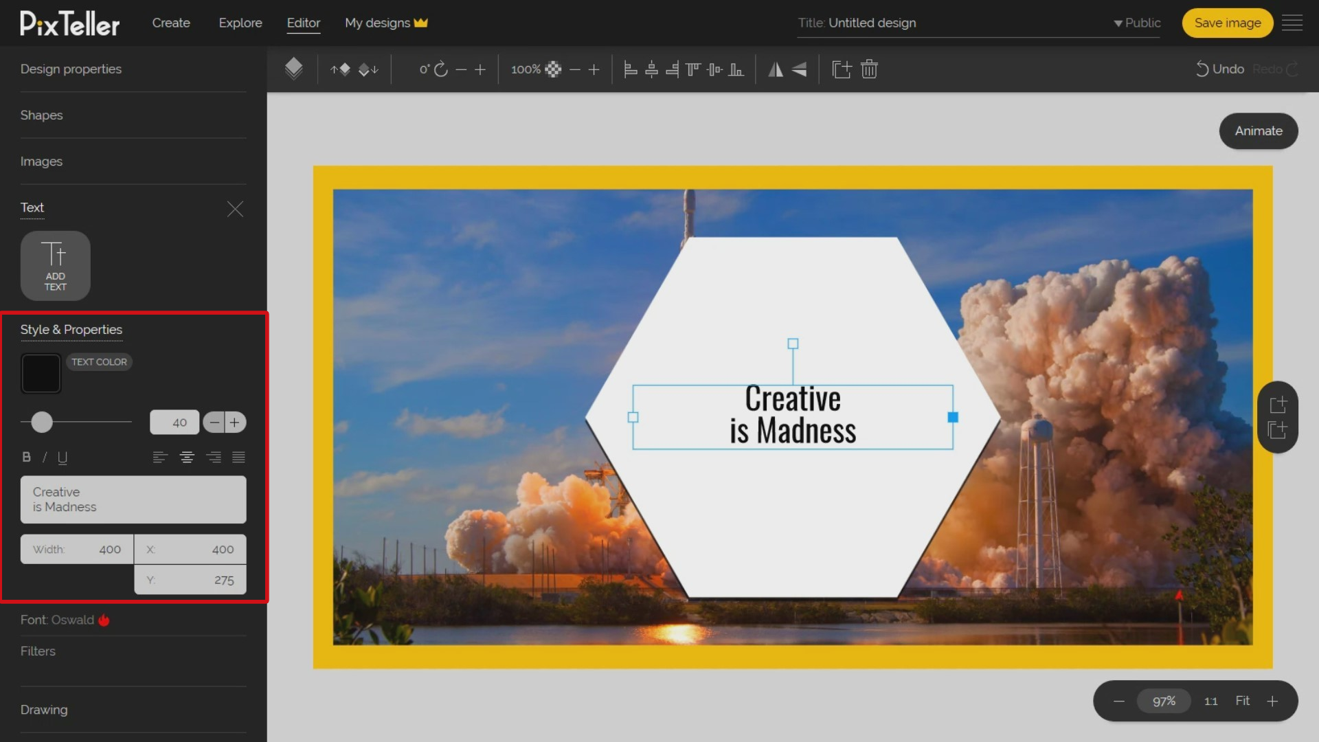
Next, a default text element with a black color will be added on the top-left corner of your design. Let's move it to a more visible area. Did you do that? Good, now, double click on the text input in order to change the text.
I will choose a title from a Jason Silva's video that I personally love. It's called "Creativity is Madness". So, now I replaced the default text with this. And remember that you can always replace any text at any moment. No worries!
Once the text has been added, let's adjust the text element container width. I am all about the numbers, so I will write the exact size I want in pixels in the input container by adding 400 pixels. I am aware that it might be hard to do, so for a quick fix, resize the text container using your mouse. However, it will be harder to get exact values with this technique.
The default font that is used on PixTeller design tool is Oswald. Let's pick up a new font by clicking on the 'Font Family' button from the left menu. Once I do that, the 'Font family' panel is opened. And now, we're left with two possibilities:
The first one is choosing a font from PixTeller default list that you can easily filter by type: Serif, SansSerif, Monospace, Handwriting, and Display. You have over one hundred and fifty fonts available on PixTeller, and I think what you'll love is that you can do it for free.
The second option is to click on 'My fonts' button and from there you can upload your own fonts. Once the font is uploaded, click on the font name and the font family, and your text will be updated instantly
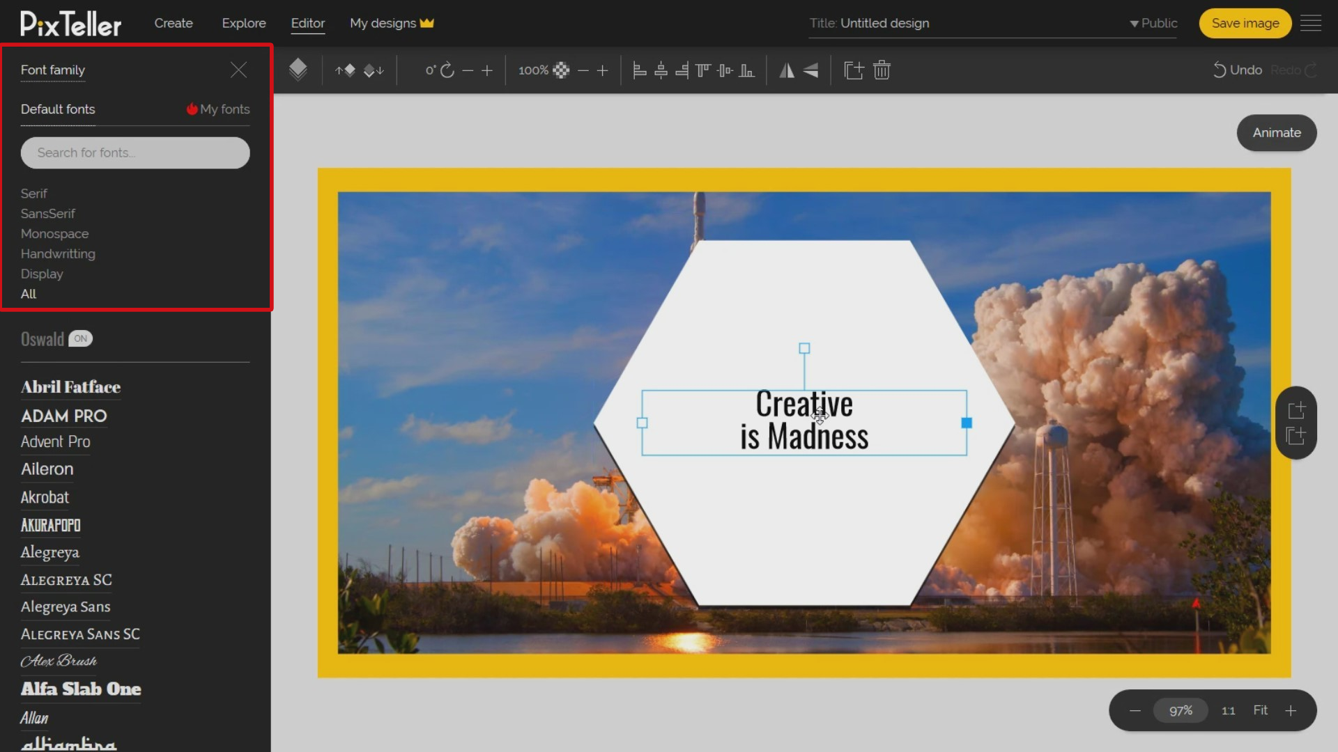
In our case, I will choose a font that is in the default list. So, now I'll go and apply the "Display" filter. I will search for a font family that I think best fits this example, and I will click on it in order to update my "Creativity is Madness" text element. Also, "Breamcather" is the font I chose.
Now, let's align the text to the center, and update the font size. You may write the size directly on the size input or you can play with the slider and make fine adjustments by clicking on the plus or minus buttons.
Perfect! My text looks great at 90 pixels font size. Maybe you want to change the text element order, rotation value, opacity, alignment or flip property. Select that from the top menu, and you can easily change them. I will set the text element in the middle-center of my design using the top menu alignment buttons.
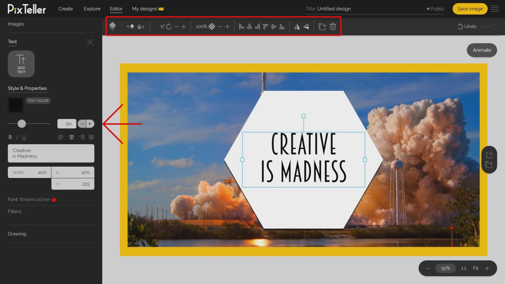
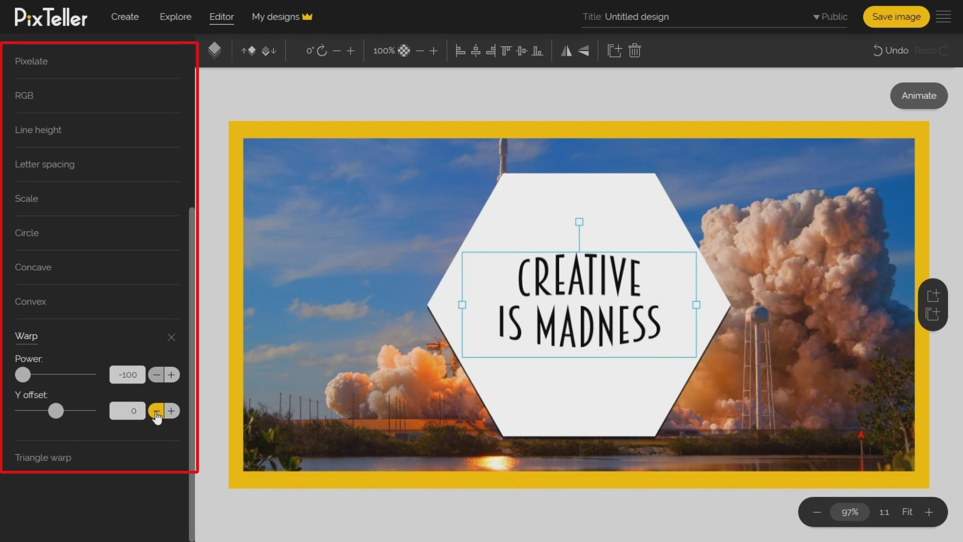
Do you want to change the text style? Just check the text filters option. From the text filters panel, you can change your text Line Height and Letter Spacing. Also, you can modify the Border, Shadow, Skew and Scale values. You may also adjust the shape Brightness, Hue, Saturation, Lightness, and RGB. What I love is that you can add a Blur, Noise or Pixelate effect on your design text elements. All these options are a gold mine when it comes to creating video motion between instances in the animate mode. But we'll talk more about this in a different tutorial.
Another great thing that works ideally for single line text elements is that you can add filters like Circle, Concave, Convex, Warp, and Triangle Warp. This kind of text element styles you will not be able to find anywhere else. Combining these effects values between instances in video mode will result in some awesome videos or GIFs that include text elements. For my example, I will apply a warp effect.
Let's change the text color by clicking on the 'Color' button from the left panel. What is great is that you can use any color from the image I have in the background by moving the mouse cursor over it and picking any color you want from the photo.
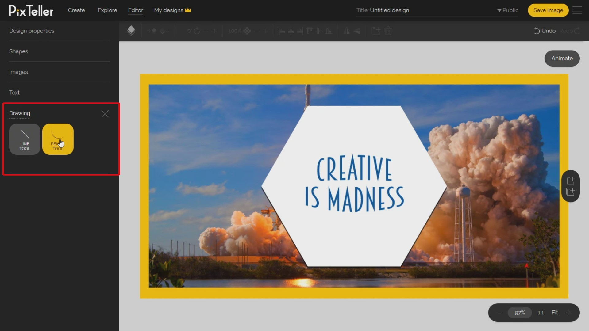
Even if I will not use drawings for my example, I can easily explain the functionality. To start drawing, click on the 'Drawing' button from the left section. Once you do that, you may choose between the 'Line tool' or 'Pencil tool'.
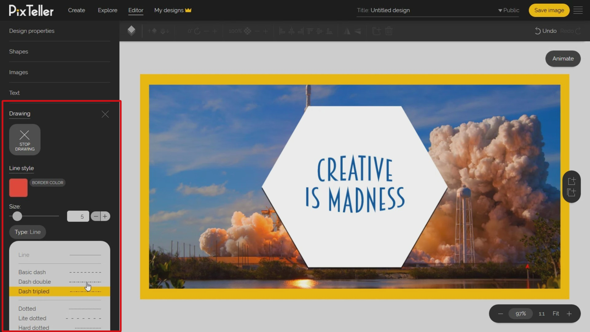
For each drawing tool you decide to use, you can change the color, the line size in pixels and the line type. You can exit the drawing mode by checking the "Stop Drawing" button from the left. Keep in mind that each drawing will be interpreted as a shape once you exit the drawing mode.
Do you want to delete unwanted elements? Simply select them. Also, you may select multiple elements by keeping pressed the Shift or Control key from your keyboard and clicking on the elements. Once the element or elements you want to delete are selected, you can press the 'Delete' button or press on the right click of your mouse and select the 'Delete element' button from the list that opened.
Moving on, I will make a button using three shapes that I will later group into one element - this feature is great in case if you want to design banners. I know many of you don't know this, but you can group at least two shapes in just one element, making it much easier to handle. To do this, I will open the 'Shapes panel' from the left and I will add 2 circles and one rectangle element.
Next, I will move them, and I will increase the rectangle width. I will position the circles on the left and right side of the rectangle. The line-guides will help me a lot to position the circles exactly in the right place. Also, advanced users may use the inputs to accurately position the elements.
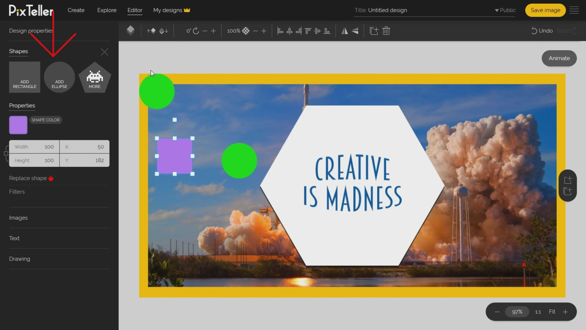
So if you look closely, you'll see that the shapes seem to look like a big button. I will select them all by holding the 'Shift' or 'Control' key, and then I will nominate them with the mouse cursor by clicking on each of them. Once all the three shapes are selected, I can use the 'Group' keyboard command 'Control + G' or just click on the 'Group elements' button from the left section.
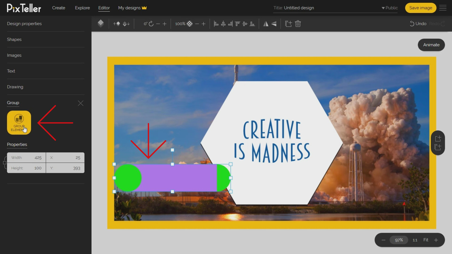
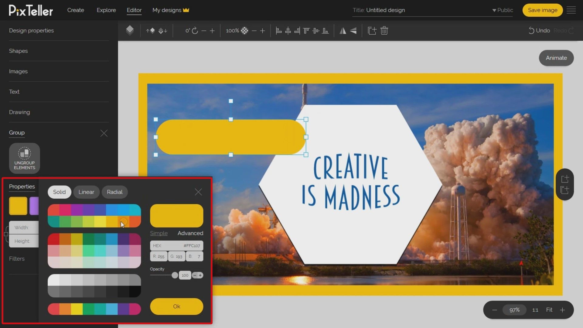
From the Group panel in the left section, I will change the colors to a common one. You can resize the group by keeping the aspect ratio using the mouse and dragging one of the group selection corners. I will move the group to the place I want. Now, let's add the text for this button.
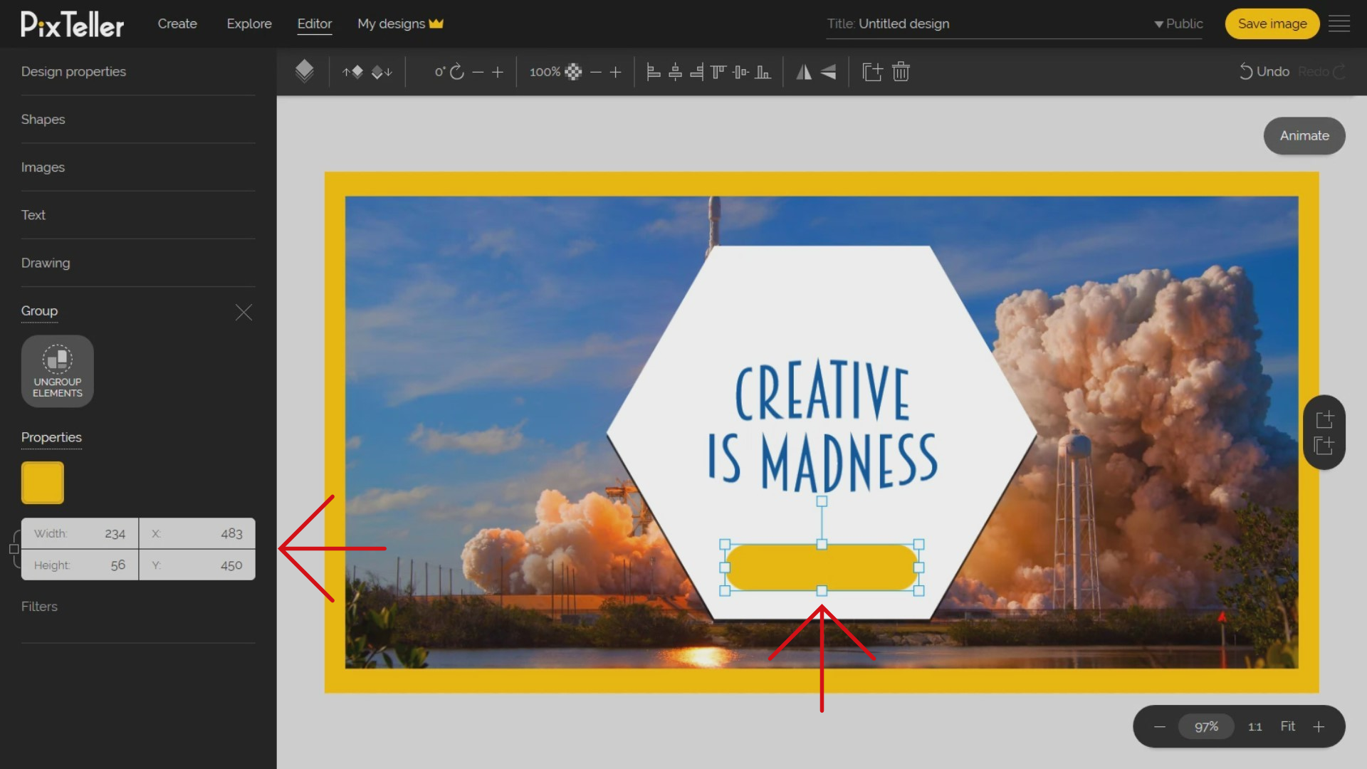
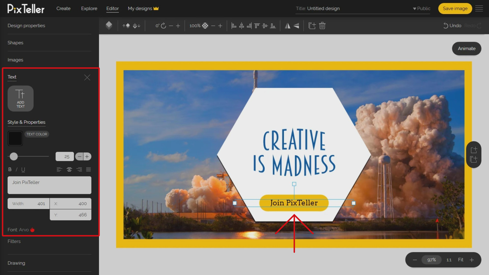
Next, I will open the text panel and I will add a new text element by clicking on the 'Add text' button. I will update the text content, change the font family and font size, change the text alignment on center, resize the text container width, and move it over my button.
Perfect! We've just created a 'Call to Action' button, and it looks great! You're doing so well!
Before I exit and save my image, I would like to show you how the multipage menu works. You can find the menu in the middle-right part of the PixTeller design tool. The first button will add a new blank page and the second one will duplicate my current design page. I will create a clone and a blank one.
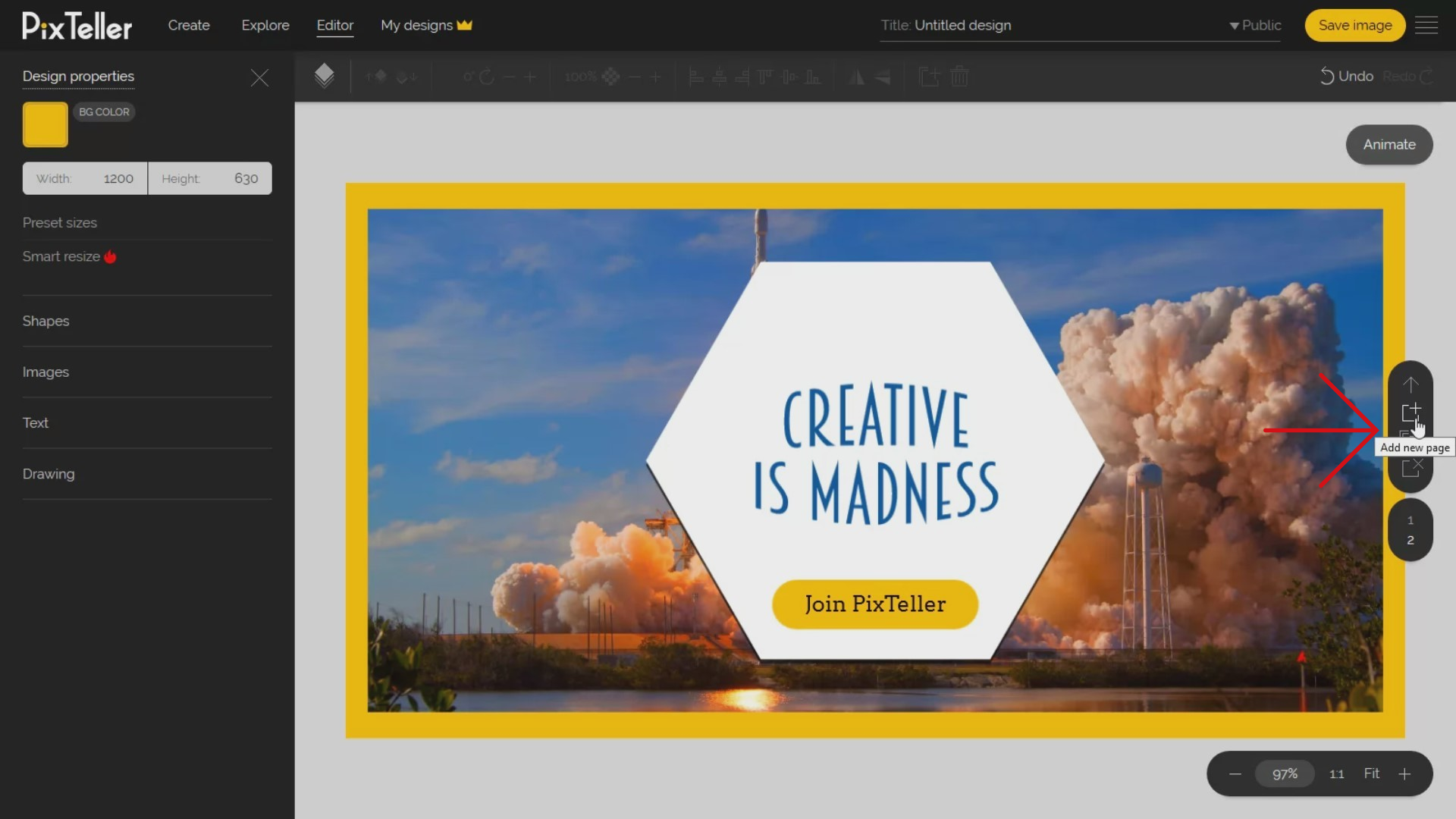
You can easily switch between pages using the scroll of your mouse or by clicking on the desired page number. Additionally, you can use the arrow buttons to change the order of your pages. Make use of all the functions described above to edit your design pages.
Also, if you decide to delete a page, you must have the page active, and click the 'Delete' page button located on the multipage menu, exactly how it's shown in my example. As you can imagine, the multipage option in PixTeller editor is a great asset to make complex animations or create animated gifs frame by frame using the PixTeller editor "animation mode". Don't worry, I will give you all the details in a different tutorial.
Last but not least, I want to save my image design. Before I do this, let's update my design title from the top-right input in the header. I will call it "Image Design Example". I can also change my design privacy to "Public" or "Private". I really recommend Saving it in Private mode. Especially if you use your images created on PixTeller for commercial purposes or even on elements like photos and fonts that have copyright licenses. The Private mode is available for all Pro & Diamond accounts. Any private design is available only for you to 'Use' or 'Edit'.
If your design is for personal use or you don't have anything to hide, you can set your privacy to Public, as I will do in this example. Any public design can be used by any other PixTeller user, by sharing the URL of the end result.
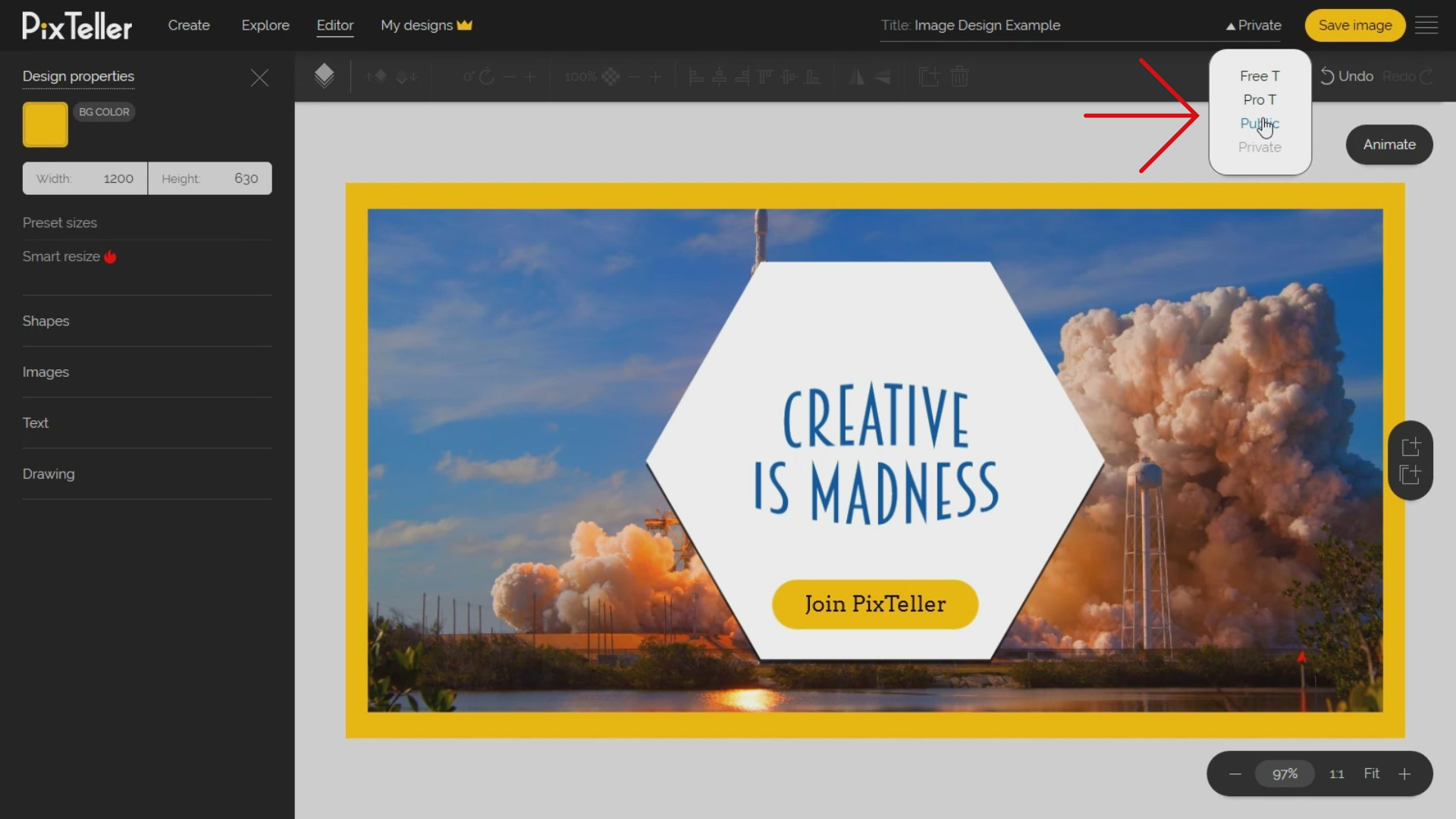
Once I set my creation 'Title' and 'Privacy', I can save my image in order to Download, Share, Print or any action you wish to make. The 'Save' button is located on the top-right corner of the page. You can click on the 'Save image' button, or if you'd like to be faster, use the combination of 'Control + S' keyboard command.
The image saving process may last a few seconds depending on your design resolution, the number of pages, and most importantly, your internet connection. Once the image design is saved, you will see the 'Download button' on the right-top corner. Yes, we are getting closer to the finish line!
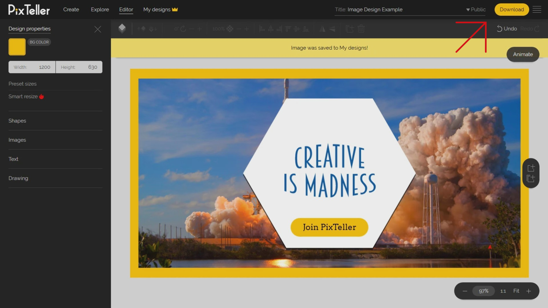
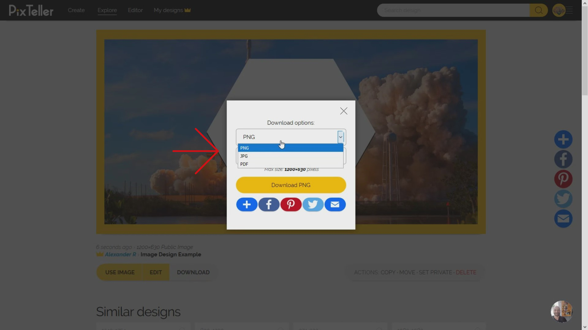
If you click on it, you will be redirected to My Designs page. Here, you can preview your resulted image and you can download it in PNG, JPG or PDF format. Another advantage that PixTeller download offers, is that you can specify the width or height of your design before downloading it. This option is ideal if you need a thumb for your image, or maybe you need a smaller size, you've got options, for sure. Afterwards, from the image design preview page, you can take other actions like Copy or Move the file to any of your folders. So, rest assured because I have over one hundred folders created under my PixTeller account, and it is safe. Do you want to update your design privacy? You can! Just update or delete your image at any moment.
So what happens when you click on 'Edit image' button? Well, the design will be opened on PixTeller editor to allow you to make any changes and then save them. By doing this, your image will be rewritten.
Curious about one of the most popular PixTeller actions after Download? The answer is the "Use" button. By clicking on the "Use" button, a copy of the starting premade design will be made, and you can customize it to create a new visual asset, even if it's a new Image, Video or Gif.
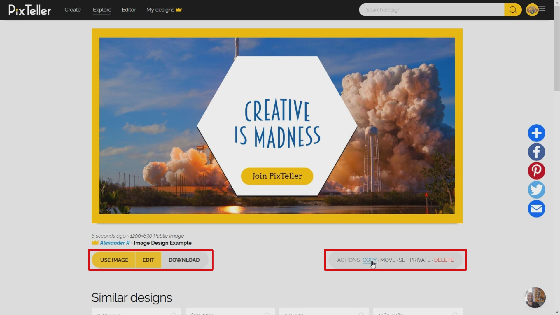
That's it! I think we got it and you've made it! This is the final result we made in this graphic design tutorial. Well done! I really hope you've enjoyed it. If you have any questions regarding the designs and what we did here today, don't hesitate to contact us. We truly want to make this whole experience an easy one, and most importantly, useful to you.
If you've found this tutorial practical and you want more, follow our blog for many tricks and tips that will make your visuals the best out there. Join PixTeller and create images, animated GIFs and short video animations for your websites, advertising campaigns, social media posts, mobile apps, print, business and more.
Have a great day and stay tuned for more!
