Better Design through Mathematical Principles
The division of art and science into two distinct worlds stretches back hundreds of years. Indeed, these two disciplines are often positioned in conflict with one another - creatives sometimes perceive a disregard for the sciences as a positive attribute, as if failing in math somehow makes you better at art and other creative pursuits.
The brain's conventional model further reinforces this opposition as two-sided. If your right-brain is dominant, you'll flourish at artistic pursuits at the cost of analytic thinking and mathematical understanding.
 Use your mathematical skills to design your visuals with
PixTeller Image & Animation Maker
This split between art and science, or as we'll explore more specifically in this article between design and mathematics, is a false dichotomy. Superficially appealing, this division hides a deep relationship between the two. Well understood by the ancient Greeks and creative geniuses in our own time, such as Jackson Pollock, mathematical principles often guide art and design.
You may discover that these principles in your work have subtly guided you. "Becoming explicitly acquainted with mathematical principles can have a huge impact on your own design work," says Sara Nicolson, design blogger at Draftbeyond and Researchpapersuk. So, let's take a look.
-
Fractals
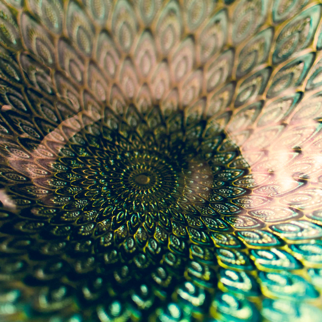
One of the most obvious examples of great design in the natural world comes from fractals. Fractals are visually repeating geometric patterns, with infinite depth. This creates a spectacular design that can be zoomed in on, where you'll witness the design infinitely repeating itself no matter how deep you go.
Fractals can be created by mathematical formulae and computer programs but are also implicit in nature - they can be discovered in snowflakes, blood cells, and leaves.

Probably precisely because of their existence in nature, the human aesthetic finds fractals alluring. In the high art world, computer analysis of Jackson Pollock's splatter masterpieces has revealed the presence of fractals.
Incorporating the repetitious refrain of fractals in your design work is sure to improve its visual appeal, and all across the web, you'll discover fractals in background images. Fractals are a vital component of high-quality design work.
-
Fibonacci
The hidden quality of fractals that makes them visually and aesthetically appealing is their hint of a pattern. Patterns are, as you know, essential in good design. And patterns are also found and expressed in mathematics. The Fibonacci sequence is a pattern that features heavily in nature and is inseparable from good design.
Bear with me while we take a look at some math, the sequence of numbers 0, 1, 1, 2, 3, 5, 8, 13, 21, 34. This sequence appears abstract at first but is ruled by a simple formula. The next number on the list is generated by adding the previous two. So after 2, 3, we get 5. And after 21, 34, we would get 55.
The application of the Fibonacci sequence to design comes from generating a series of squares through these numbers and tiling them. The rectangles that emerge from these tiles are in accordance with "the golden ratio" and tracing a curve from the central square ("1" in the sequence) through the edges of the squares generates a perfect spiral. Elements in logos from Apple to BP have been created in accordance with the golden ratio - the Fibonacci sequence is everywhere if you look closely!
-
More Math
Further mathematical concepts appear in many aspects of graphic design. Joseph Alford, a graphic designer at Writinity and Last Minute Writing suggests that "the principle that black text needs white space to function can be understood as a conceptual alignment between positive and negative space." Therefore, even page layout - what's readable and aesthetic on the page - can be understood in mathematical principles!
Principles of symmetry are equally important in good design work, and symmetry's application to art and design have their roots in the classical Greek sculptor Polykleitos's canon on the ratios of the human form.
Final thoughts
For many designers, math was the subject to sleep through at school, and there's no doubt that the mathematics of the classroom is often dry and disconnected from the world around us.
However, many of the mathematical principles that rule graphic design are understood implicitly by designers working today. Endeavoring to unlock the mysteries of mathematics will benefit any designer's work.

Until next time, Be creative! - Pix'sTory made by Ashley Halsey
Ashley Halsey is a professional writer at Coursework Writing Services UK, and Gum Essays. She's not a natural mathematician but is a keen learner and appreciates the visual arts.
Recommended posts
-

Make Your Own Animations Start From an Image Template
Read More › -

Rebranding Proposals for Emotions That Want a New Look
Read More › -

6 Essentials Reasons You Should Include Images in Your Web Design
Read More › -

Design Systems Don’t Stop at Icons — Ouch Proves It
Read More › -

How to Merge Duplicate Photos on iPhone
Read More › -

7 Ideas on What to Shoot if You're New to Photography
Read More ›
