Everything You Need to Know About the Helvetica Font Family
Easily create faboulous test to images visual with PixTeller free online quote image maker.
Helvetica is a sans-serif font that was founded in 1957 by Max Miedinger. He was a typeface designer who belonged to the Swiss. The font was created as Neue Haas Grotesk, but later after three years, the name changed to Helvetica font.
The font has received vast approval since it was released. The designer decided to design this font after getting influenced by another Sans-serif font, Akzidenz-Grotesk.
In the mid-century, this typeface became one of the most prominent and highly used fonts for all valid reasons. Do you want to know about this amazing and readable typeface? Let's talk about it in detail to get a clear idea of how it was founded and why it is acknowledged everywhere.
Facts About Helvetica Font
Helvetica is a popular choice for branded packaging, thanks to its readability and sleek, neutral style.
There are many facts about Helvetica font that you might don't know before. The most significant fact about this typeface is, it was designed after being impressed by Akzidenz-Grotesk, as mentioned above, so this font is not original. In the start, it was considered one of the dull fonts without any personality.
However, with time, the changes occurred that made this font worth considering for numerous designs. Let's move ahead and know other details about this typeface.
Designer of Helvetica Font
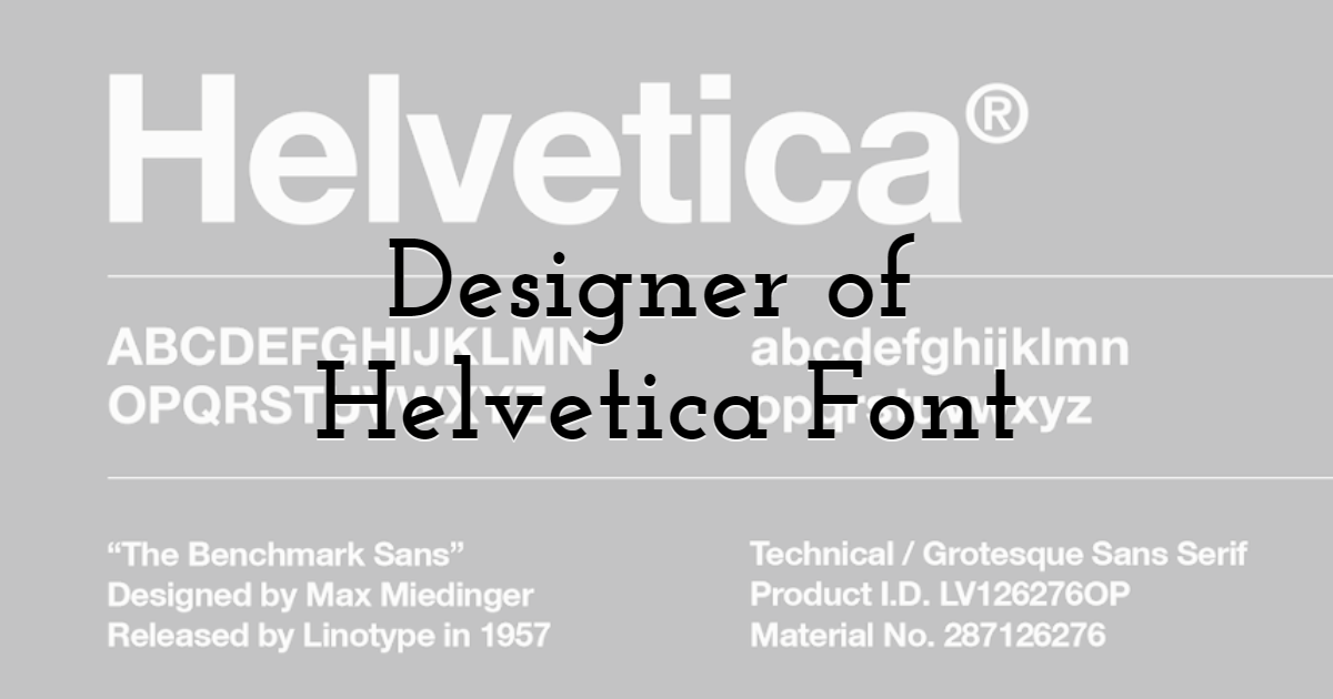
It all started with the downfall of Grotesk fonts when they were facing a tough time in the market. The sales of these fonts suddenly stopped, and Haas-type foundry was concerned about their typefaces. The president of this foundry, Hoff Mann, authorized Max Miedinger to come with a new font.
As a result, Max Miedinger designed a font that had x-height and horizontal styles, making it readable and understandable. It was named Neue Haas Grotesk. Everyone was amazed by the instant popularity of this font. However, the name of this font didn't impress many, so it was given the name of Helvetica font.
The font did well in a global market, and it gave the biggest competition to other typefaces. Hoffman thought to make this font accessible for machine composition, for which he agreed with D. Stempel AG to originate this font for machine Linotype. It is how its popularity began, and it started being used everywhere.
The Popularity of Helvetica Font
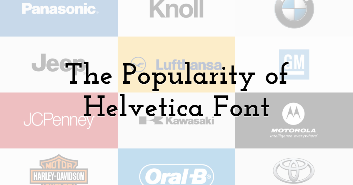
Have you ever thought about why this font earned massive acclaim despite being a dull font? One of the most significant reasons for its popularity is that many international transport systems used this font on their logos, making it more famous and acknowledged. The neutrality of this typeface is the other reason for its fame.
It got famous in so many projects that many other beautiful fonts actually went unnoticed because of the Helvetica font. It was featured in many award-winning documentaries. The US Government also didn't miss a chance to use this font in different income tax documents. In many New York Billboards, this font was highlighted to a great extent.
Other than that, it made a huge appearance in different National and International brands. The media is another platform where this font was widely seen being used. In different documentary films, the directors made this font their priority. In 2011, Google preferred to use this font for different April Fool jokes. There is not a single platform where this font didn't make an aspect.
For the first iPhone, this font was picked as a system font till 2015. Later, Apple replaced this font with their own created font. In different campaigns and advertising purposes, you surely have seen this typeface.
In short, it dominated the world with its tall x-height and many strokes. As an ordinary man, you surely have used this font in your Assignments or office-related work.
Alternatives of Helvetica Font
Aren't you tired of seeing this typeface everywhere, and now you want to get rid of it? It is quite obvious because excess of everything is bad. For many designers, it is irritating to keep using the Helvetica font everywhere, so what should be the solution? There are many alternatives that you can consider instead of this font. If you want to experiment with Helvetica-inspired layouts in practice, design platforms like VistaCreate also offer customizable graphic design templates for posters, social media, invitations, and brand visuals where minimalist fonts work especially well.
However, in 1983 to give a little change to Helvetica font, 4 designers came forward and re-designed this font with the name Helvetica Neue font. Do you want to know the best alternatives to Helvetica? Let's discuss them.
Noirden Sans Font
It is one of the best Sans-serif alternatives that you can use if you are sick of using the Helvetica font. It has a round shape that gives contemporary vibes. It will be a great choice if you use this font in different Logos and designs.Solo Font
It is another fresh sans-serif font that is also the best alternative for all those who don't want to use the Helvetica font. The best thing about this font is, it makes the text or design easy to acknowledge and read, which made it more popular. You can easily get your hands on this typeface and download it in many formats.Exensa Grotesk
Though this typeface was also designed with inspiration from another font yet, it is the best alternative you can get. It is a big font family having many styles and weights. It is also known for being an easy-to-read typeface.Noveltica Nova Pro
This sans-serif font is an elegant typeface that can also be used instead of Helvetica font. If you mix bold and regular weights of this font, you can use them for headlines and title purposes.
Final Thoughts
The popularity of the Helvetica font is not unknown to anyone. It is one of the highly adored typefaces despite many years have passed. Though you can keep using this font in your designs yet if you want to go for the alternatives, you have the options mentioned in this guide if you want to go for the alternatives.
It has been more than 6 decades since this font was being used by numerous corporations and industries, which means it is always right to use it in designs. The choice is yours either you want to skip the font or go along with it in the future. I hope this guide will be helpful for everyone.
Until next time, Be creative! - Pix'sTory made by Sofia David
Recommended posts
-
The History of Flat Design: How Efficiency and Minimalism made the Digita...
Read More › -

How to Leverage YouTube for Your Brand's Marketing - 11 Creative Ways
Read More › -

The Business Value of Streamlined Knowledge Sharing
Read More › -

12 Tips To Become A Better UX Designer
Read More › -

5 Reasons to Study Graphic Design at the University
Read More › -
Everything You Need to Know About the Helvetica Font Family
Read More ›
