Hidden Messages in Logos
A logo defines your company, they can give your brand a sense of professionalism and authority. To make a name for your brand, you need to have a killer logo, to attract the attention to the audience that you target - why you need the best logo maker.
They are much more than a name. Some of the most recognized logos in the world don't have their name on them. But, even more, many of them have a secret meaning hidden in them. Here are some examples of logos that have all sorts of hidden meanings that are representative of their brand:
-
1. Apple Logo
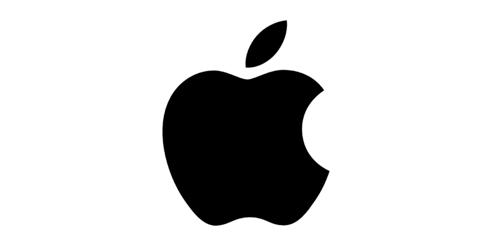
Probably the most recognized in the world, a logo that is found on the majority of the devices that we use, from mobile phones to personal computers.
The story around the logo is that represents none other than the story from Adam and Eve. It has the shape of the apple that was bitten by Eve from the Tree of Knowledge.
-
2. Amazon Logo
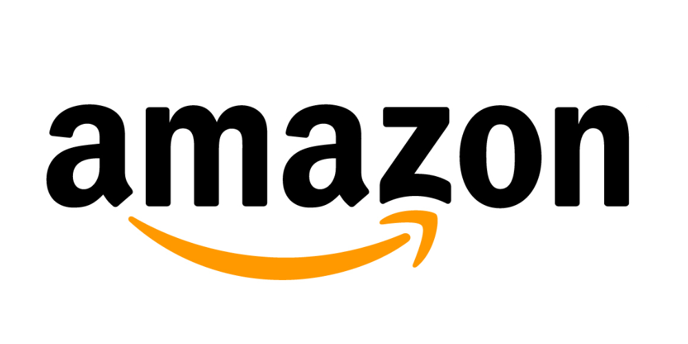
Amazon is the largest online shop in the world, and it has a logo to represent it. First of all, you can see right away that the arrow resembles with a smile, due to the millions of packages delivered to happy customers.
The arrow has another meaning, it starts from the letter "a" and ends at the letter "z", meaning that you can buy absolutely anything from them.
-
3. FedEx Logo
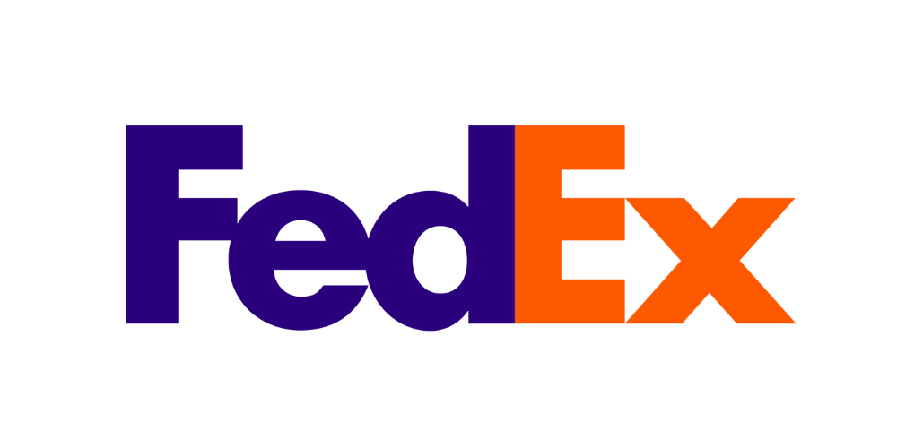
FedEx has a very popular logo, being one of the largest shipping companies that there are. They have a pretty simple logo, with simple colors, but that stands out. But, there is something hidden in there.
You can see an arrow between the letters "E" and "X". The arrow represents the idea of going forward with precision, just like the service that they offer.
-
4. Sony Vaio Logo
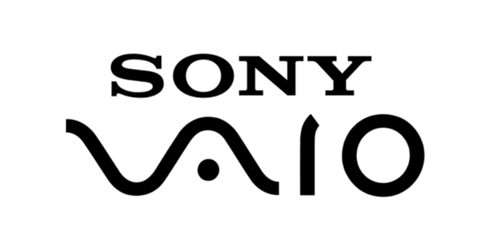
Vaio stands for Visual Audio Intelligence Organizer and has a logo with a story behind the name.
It is split in two: the "VA" represents the basic analog signal, while the "IO" letters represent 1 and 0, representing the digital signal in binary code. The logo shows us the integration of analog and digital technology in a modern age.
-
5. Cisco Logo
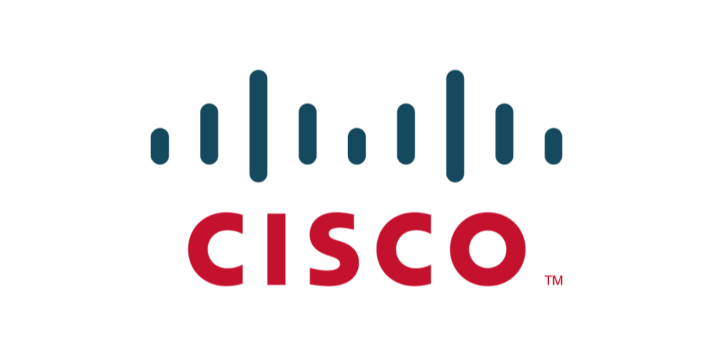
Cisco Systems is a company known for its communication equipment, so it is obvious that they choose a logo that represents an electromagnetic field. But not very much people know the other meaning of their logo.
The company is was started in San Francisco, meaning that the logo also represents the Golden Gate Bridge, an emblematic monument for the place of birth.
-
6. Beats by Dre Logo
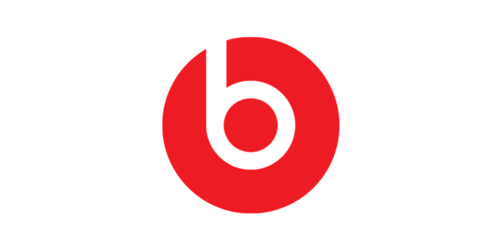
The company was started by the music legend Dr. Dre, and it is recognized and is worn by celebrities to common people all around the world. The logo is a very simple one, but the letter "b" inside the red circle represents the headphones being worn by someone.
-
7. LG Logo
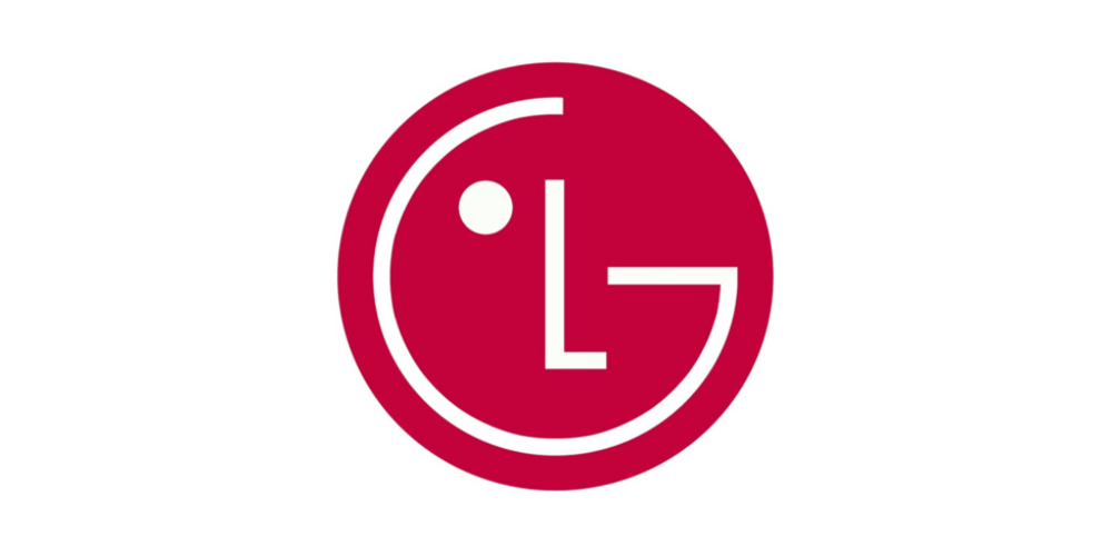
The LG company is known for a variety of products, and the logo is there to boost success. The logo has the letters "L" and "G", and some designers say that it resembles with a human face, making the logo more user-friendly.
Other designers say that there is a resemblance between the LG logo and the known Pacman.
-
8. Pinterest Logo
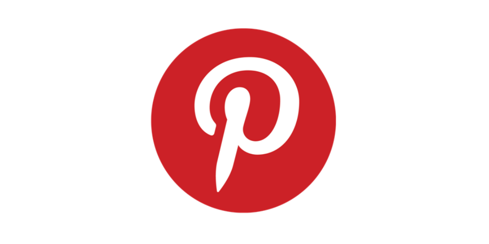
In a social media era, a digital board is a need to have, so that users can pin things that they are interested in onto a board. The letter "P" from Pinterest actually symbolizes a pin, so you can pin all the things that you want and are interested into a board.
The co-designer of the logo said: "For most of the project, I had avoided making visual reference to the image of a pin because it seemed too literal. But the "P" started to lend itself too well to the shape of a map pin."
Saying that he wanted to make a subtle impact.
-
9. BMW Logo
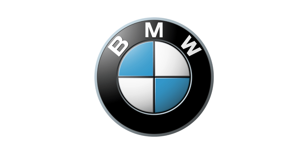
BMW is an emblematic name in the car industry, and its logo comes with a history.
The colors from the logo come from the Bavarian flag, which is white and blue, and it represents the blades of a spinning propeller, being that they started as an aviation company and the logo first appeared in 1920 in an ad.
-
10. Le Tour de France Logo
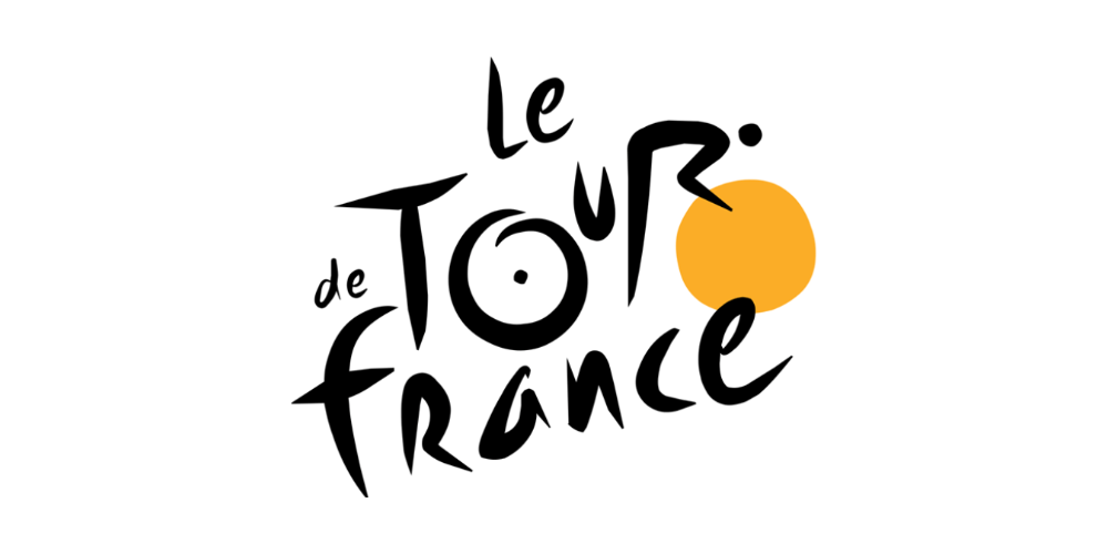
The logo from the well known Tour de France has actually two hidden messages inside of it. The first is a little more obvious, meaning that you can spot a cyclist formed at the letter "r".
The second one is a little more subtle, the yellow circle that is the front wheel of the bike is also a sun, indicating that the competition takes place only during the day.
-
11. Continental Logo

Hidden in the Continental logo is obviously a tire hidden. If you take a look at the logo, you will notice that the letters "C" and "o" are closely placed together, and the "C" is wrapping around, creating the tire.
-
12. NBC Logo
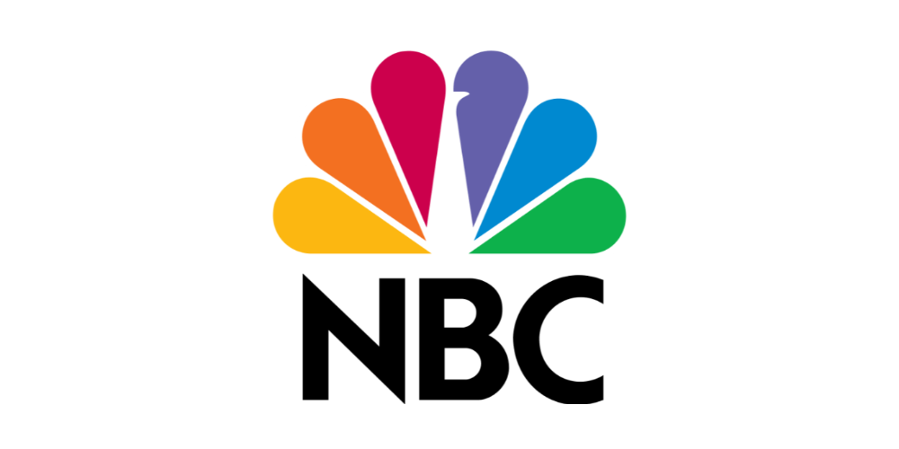
NBC has also a unique and with a hidden meaning logo.
If you look closely, you will notice that the logo is a peacock that is looking to the right, meaning that it always looking forward. It is divided into six colors, representing the six different divisions that are in NBC.
-
13. Firefox Logo
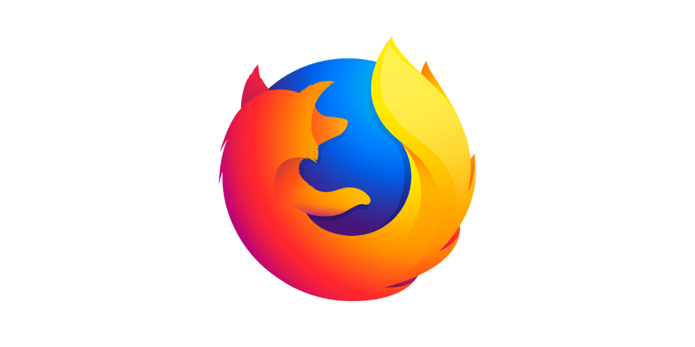
Firefox is a well-known browser, used by people all around the world. In the logo, you can see a fox that is wrapped around the globe.
This represents the browsers global reach, and also the "blazing" speed that you can get using the browser.
We hope this article has helped you! You can find similar logo templates easy to edit with PixTeller logo editor. Also if you don't already know, with PixTeller animated logo maker you can easily animate your brand, render, save and download it as an animated GIF or Video.
Until next time, Be creative! - Pix'sTory made by Alex
Recommended posts
-

Inside the New PixTeller
Read More › -
What Makes the New PixTeller Platform so Special?
Read More › -

What We Have Learned by Joining a Startup Accelerator Program
Read More › -

Legal Information
Read More › -
Upgrade Stock Photos to Transform Any Visual Content
Read More › -

Hidden Messages in Logos
Read More ›
