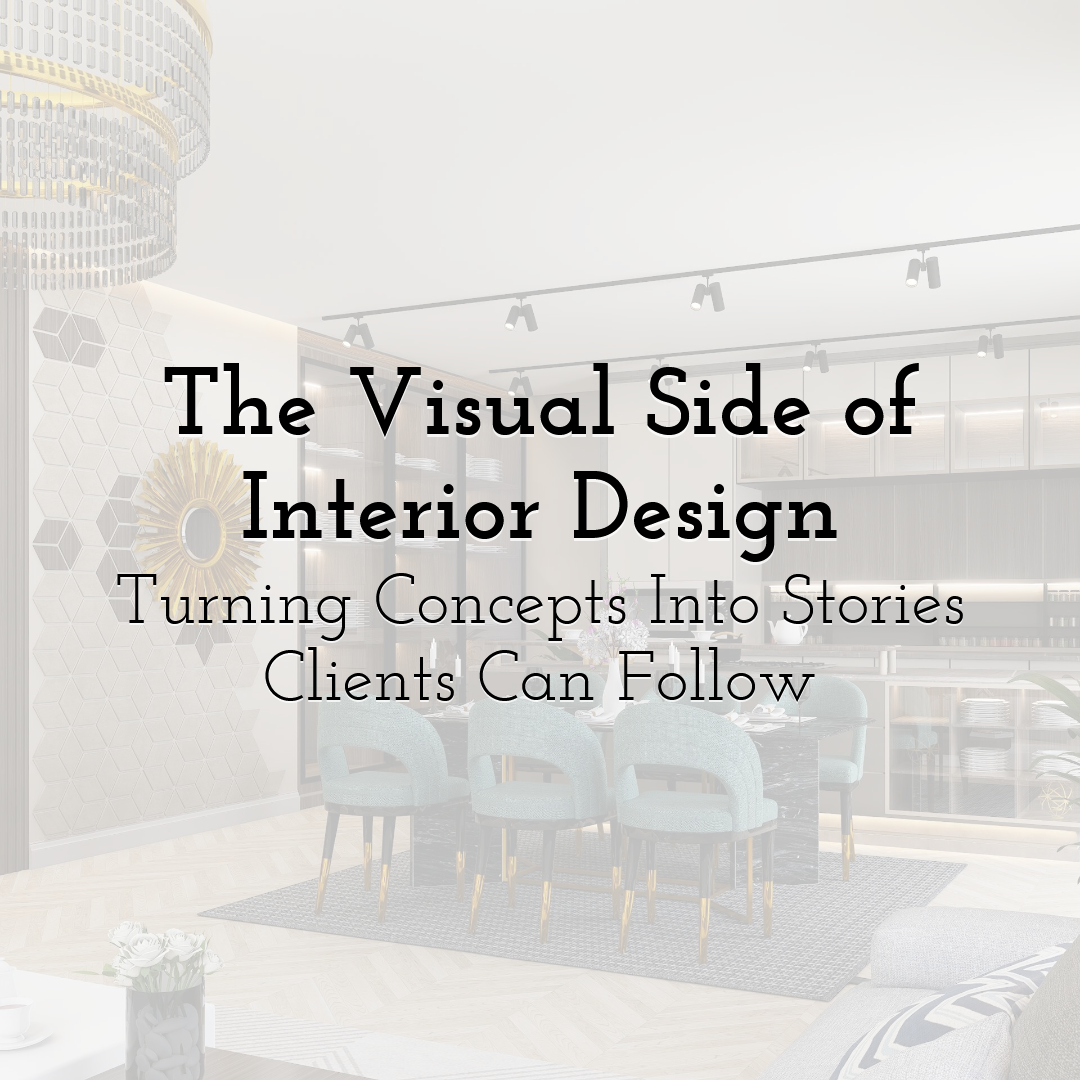
The Visual Side of Interior Design: Turning Concepts Into Stories Clients Can Follow
The mood board has twenty images on it. There's a palette. A floor plan. Three slides about lighting. And the client still asks: "But what will it actually look like?"
This happens constantly in interior design. The information is all there. The thinking is solid. But it's scattered across different formats that don't add up to a story the viewer can actually follow. The problem isn't the concept — it's that nobody assembled it into something readable.
Why Interior Ideas Are Hard to Follow Even When They're Good
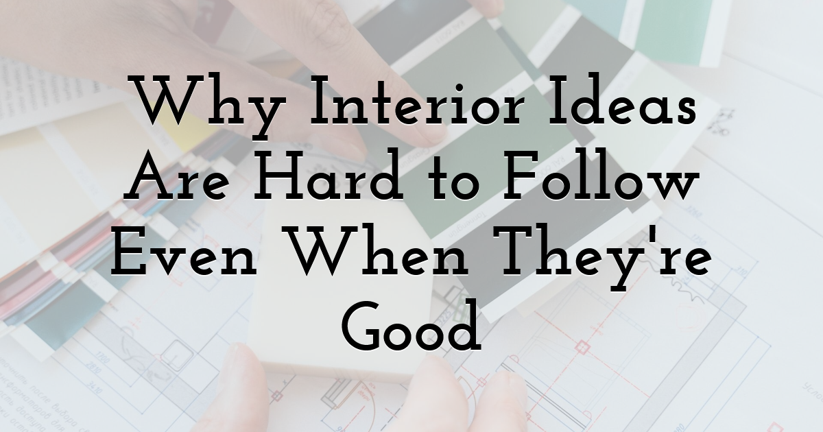
Mood boards show direction. They don't explain how you get there.
The images on a mood board typically come from different rooms, different contexts, different scales. The viewer is supposed to synthesize these into a mental image of a space that doesn't exist yet. Designers do this automatically — it's a trained skill. Most clients don't, which is why "what will it actually look like" is such a persistent question regardless of how many references are in the deck.
Floor plans are the other side of the same problem. They're spatially accurate but experientially opaque. You can see that the café seating connects to the courtyard and sits adjacent to the kitchen. You can't feel whether the result will be warm or clinical, whether the flow will work or create friction. A number on a plan is not an atmosphere.
Material swatches have their own limitation: an isolated sample doesn't show how a material reads at wall scale, or how it interacts with the specific lighting, or how it sits against the floor and furniture in that particular scheme. Each of these tools is genuinely useful. None of them alone closes the gap between what the designer imagines and what the client can picture.
Turning References Into Something More Complete
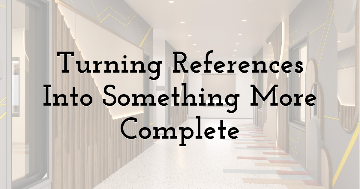
Organizing scattered references into a coherent presentation is itself a design task, and it's one that gets underestimated.
Mood boards and material swatches help establish direction, but larger interior projects often need a more complete visual language. For designers working with complex rooms, hospitality spaces, or client presentations, 3D interior design services can help turn a collection of references into a clearer picture of how the finished concept is intended to feel. Rather than asking the client to imagine the translation from reference to reality, a rendered view does that work — materials in context, lighting in effect, furniture at scale, the room as a composed whole.
The other part of this is curation. A presentation works harder when every visual element is there for a specific reason. A mood board organized around a single central idea rather than assembled from everything that seemed relevant. Materials shown in relationship to each other, not as a list. References that explain what quality of atmosphere the scheme is working toward, not just what it might borrow from.
The Story Needs a Central Idea First
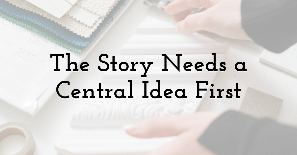
Before structuring visuals, it's worth being specific about what the presentation is arguing.
A café concept that's meant to feel like a warm late-morning pause needs imagery that makes the viewer feel that — and then imagery that shows how the material and lighting choices produce it. A boutique hotel lobby meant to convey quiet quality needs to communicate both the emotional proposition and the design logic behind it.
Without clarity about what the viewer should understand by the end, different people in the same presentation will take different things from it. Which means the concept means different things to different people in the room, which is generally where approvals get complicated.
Image Order Is Part of the Argument
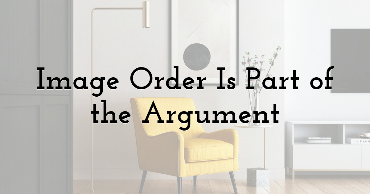
A single hero image of the finished space, dropped without context, asks the viewer to evaluate a conclusion before they understand the reasoning.
A more persuasive structure usually moves from the central design idea through material and atmosphere decisions and arrives at the final space as a demonstration of everything that came before. Wide view, detail shots, a moment of comparison or before-and-after — something that makes the journey legible rather than just the destination.
The specific sequence varies by project. The principle is consistent: visuals that follow a logic are easier to understand than visuals that arrive as a gallery.
Why Process Is More Convincing Than Results Alone
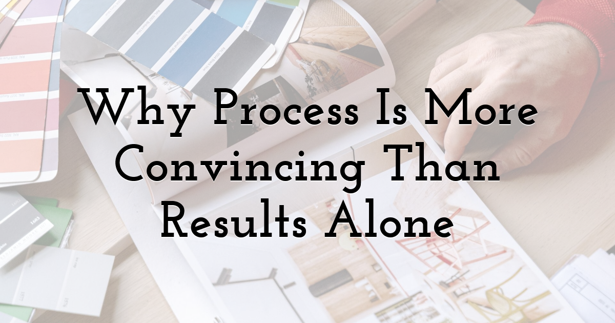
A polished final image is attractive. A documented process is convincing.
When a presentation shows the brief, the references that were considered, what changed across revisions, how the final palette emerged — the audience understands the decisions, not just the outcome. That understanding builds trust in a way that finished images don't accomplish on their own.
A strong project story does not stop at polished final images. It shows the brief, references, visual decisions, revisions, and the reasoning behind the outcome. A detailed cafe case study, for example, can make the design process far easier to grasp than a simple gallery of finished visuals. When viewers can follow the logic from brief to result, the final image feels like a conclusion. Without that context, it's just an assertion.
This is the difference between showing design work and explaining it. Both serve different purposes — but in client presentations and portfolio work, the explained version tends to be more persuasive.
Both Mood and Evidence
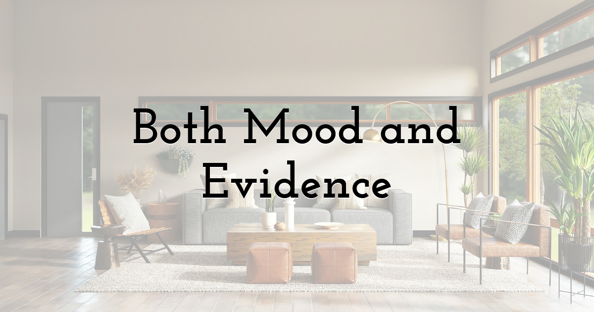
Interior design presentations often pull in two directions. The visuals need to be evocative enough to make someone feel something about the space. They also need to be legible enough to communicate specific decisions.
The most effective presentations do both. They create an emotional impression and then support it with visual evidence of how the impression was achieved. Without the emotional layer, a presentation is a document. Without the evidence, it's just a mood. The combination is what makes design work feel considered rather than arbitrary.
One Project, Multiple Versions
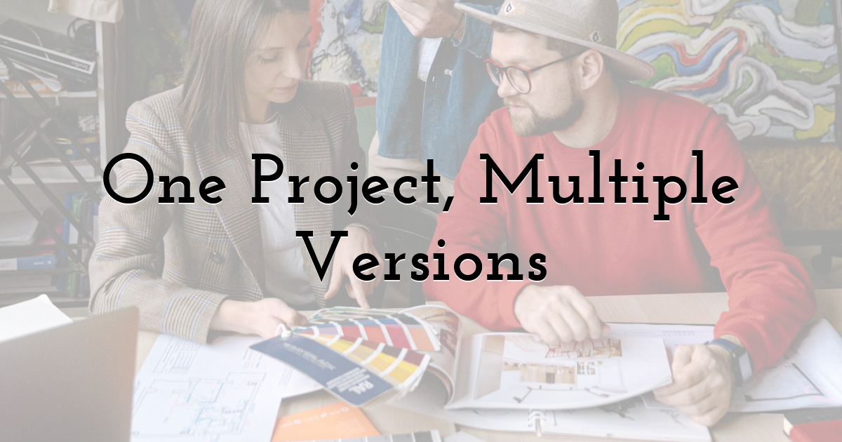
The same design story usually needs to be told differently depending on who's receiving it and where.
A client presentation might run to twenty slides with process context and explanatory notes. A portfolio entry for the same project might be three images and a short paragraph. A social post might be one detail shot with minimal caption. An editorial feature might lead with the written narrative as much as the imagery.
Designing for multiple outputs isn't about making more content. It's about structuring the original assets so they can be adapted — which is much easier when the project has been well-documented with wide views, detail shots, process imagery, and a clear through-line, rather than existing only as a final hero image.
What Clarity Actually Does
When an interior concept is communicated clearly, practical things change. Clients give specific feedback instead of expressing general uncertainty. Approvals happen faster. Portfolio viewers engage rather than scroll. Collaborators understand the direction immediately.
The goal isn't to simplify complex ideas. It's to make complex ideas followable. Interior design involves a lot of interdependent decisions — materials, light, furniture, spatial flow, atmosphere — and the challenge of presentation is to make that complexity legible without flattening what makes it interesting.
The concept doesn't need to be simpler. The story around it does.
Until next time, Be creative! - Pix'sTory
Recommended posts
-
6 Best Website Design Trends for 2021
Read More › -
How to Improve Visual Content as Your Most Important Marketing Strategy
Read More › -
7 Questions to Ask Yourself when Choosing a UX Research Methodology
Read More › -
Significance of Target Audience in Designing a Strategic Webpage
Read More › -
How to Find Your Personal Drawing Style?
Read More › -

Why You Should Use the Right Tools for Hassle-Free Document Transfers
Read More ›
