Design a Professional Looking Web Logo with these Five Tips
Suppose you are reading this article you most likely aren't a seasoned graphic designer. Even if you have lots of experience designing logos, it doesn't hurt to revisit best practices. The five tips covered in this article will ensure that you end up with a professional logo design for your web business.
-
1. Simple Icons Over Intricate Ones
There are different ways to go about your logo. You can go the brand mark route, text-based, or a combination. Including an icon in your logo is a nice stylistic touch and also gives you the branding opportunity of just using your icon instead of the full logo where appropriate.
As a rule of thumb, it's better to go with a simple icon than a complicated one. It's not to say that one is better than the other, but simple icons are more memorable. Look at some of the most popular websites, and you'll notice how they keep their images and overall logo designs simple.
Try a logo maker to see whether your business name looks best paired with an icon or without.
-
2. Messaging Over Personal Color Preferences
Don't let your ego get in the way when choosing the right colors for your logo. This isn't about your personal color preference, but what resonates with your core demographic. Find out what each color means and choose one that's best aligned with your business message. This is an excellent time to do some direct surveying to find out your customers' color preferences.
Once you have a core color in place, you can then find additional colors that work well for accent touches across your brand assets, from website to business cards and banner ads. Of course, don't go with a color scheme that you hate but find a happy medium. In the end, it's your logo, and you have to live with it every day.
-
3. Font Pairing is Important
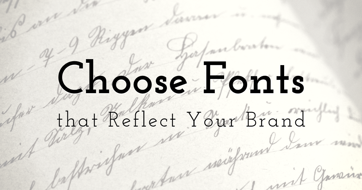
Entrepreneurs often put most of their effort into choosing an icon and color palette. Their font choice generally gets very little consideration. Don't make the mistake of merely trying 2-3 different fonts and then settling for one. Each font is unique and tells a different story.
Find out which font is best perceived by your target audience and use that for your business name. If you are going to visually break up your business name, you can use two fonts to achieve this effect. In that case, you need to find the perfect font pairing. This is no easy feat and requires some trial and error to see which combination works best.
If you are going to incorporate a slogan, you are adding another layer of complexity. You can either use one of those two fonts or find a third one that pairs well with the other two.
-
4. Find the Right Layout
Choosing the right animated layout for your logo will also impact how it is perceived and, of course, how it looks visually. Don't just settle for the "icon on the left, text on the right' layout. Try your icon on top, to the right, in a circular format, etc. with a tool like logo creator.
You don't just have to settle for one layout option. Depending on where you showcase your logo, specific layouts may work better. Whether you create your own logo or hire a designer, make sure to save your logo in different layout versions for easy access.
-
-
5. Implementation Makes All of the Difference
A mediocre logo implemented correctly and consistently will look more professional than a beautiful logo with poor implementation. If you don't get the file format and sizing right, your logo will look blurry and or skewed. You want to avoid this at all costs.
Ask your web designer what the requirements are before just sharing a standard size JPG file. The same goes for when you upload your logo to your social media accounts or incorporate it as an animated logo.
A Quick Summary
Creating a memorable logo and brand doesn't have to be complicated. If you follow the guidelines set out in this article, you're already moving in the right direction. Of course, with any creative process, there are ways to break the rules. Unless you are an experienced designer, you want to shy away from that as it can quickly go wrong.
If you keep your graphic simple, limit your color and font choices, and implement it correctly and consistently, you'll be confident you'll end up with professional branding.
Until next time, Be creative! - Pix'sTory made by Aleksander Walker
Recommended posts
-

Best Ways to Increase Subscribers and Views on YouTube
Read More › -
10 Reasons why Flyer Printing is Important for Your Business
Read More › -
How to Leverage YouTube for Your Brand's Marketing - 11 Creative Ways
Read More › -

10 Key Stats Why Design Plays an Important Role in Marketing Your Busines...
Read More › -

8 Steps to Creating Your First Profitable Product
Read More › -

Why UX Design Strategy Is Important in Reducing User Frustration and Boun...
Read More ›
