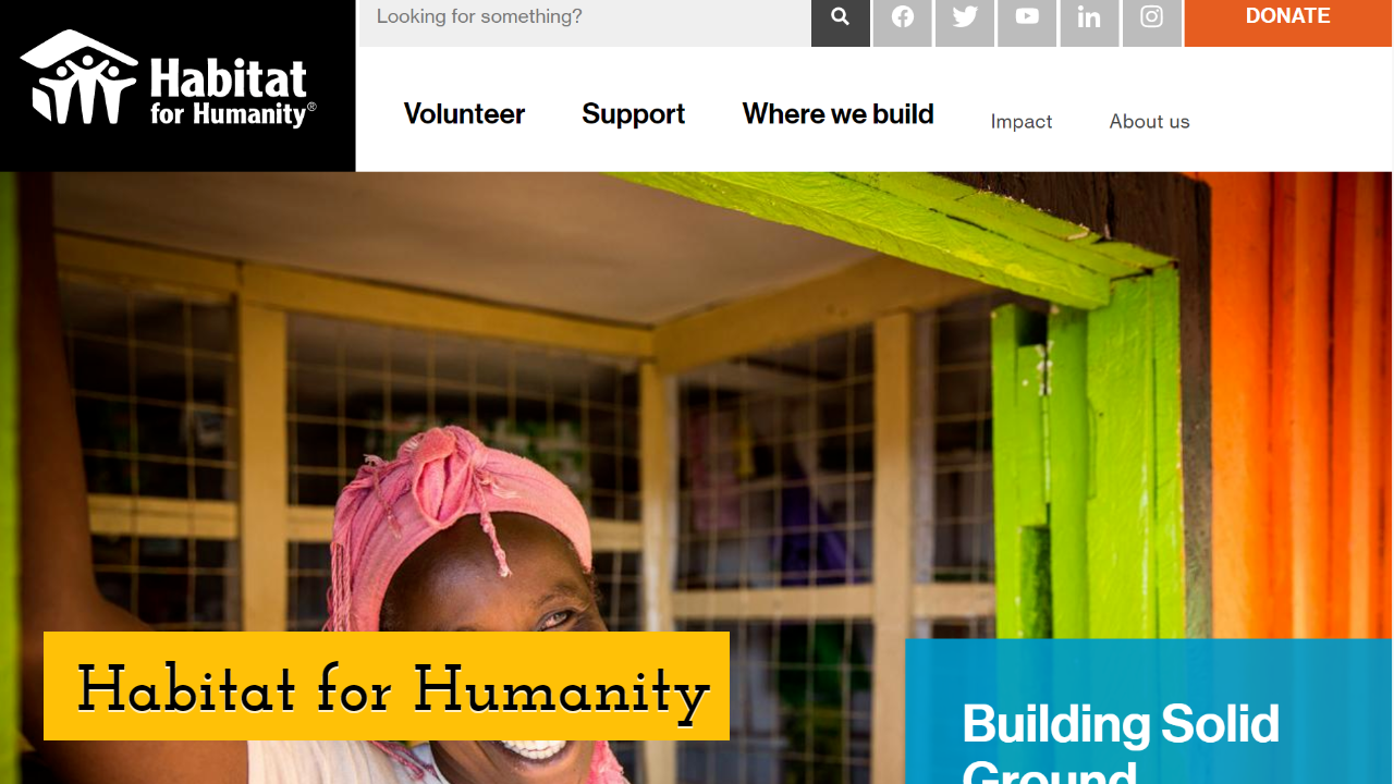
What is the Best NonProfit Website Design for the year 2021?
Easily design your own fabulous visual graphics with PixTeller free online image maker & short videos creator.
As a nonprofit, your website is significant to the organization's long-term success. Websites are the ones that build up connections between the charity organizations and relate with their potential patrons.
A well-built online presence can result in the following:
- • Raising money;
- • Connect with the new and existing donors;
- • Draw the attention of supporters;
- • Generate prospects with media;
- • Word of mout.
Your best nonprofit website design should have some distinctive objectives. So, you must keep a check on the following points:
- • The main aim of your website is to have donors, potential partners, and the media which would be inspired and take action and get connected.
- • A website should be user-friendly and can easily navigate.
- • Make proper use of fonts, colors, and other design elements.
When all user-friendly strategies and practices are implemented, your best nonprofit website design gets sure enough to get the attention of online visitors and to build up the best foundation design for a lasting relationship.
Many ways would develop the user experience design of your website, but there are certain keys for nonprofit website design:
Make Your Site Donor-Friendly
The main element for every nonprofit organization is donations. One of the best ways to request donations is through your websites, especially when we talk about new donors. It gets simple for donors who make frequent donations. The process of donation should be simple and straightforward for the people to understand.
One should keep a check mainly on two things when creating a site:
[1] Your donation page should significantly be linked to your home page. You can do this with the help of a special banner, button or make it prominent in standard navigation, as donors have to check before they donate.
[2] Try to make the entire process as simple as possible. Don't ask your visitors to make a new set-up of account before making donations. The process of donation should be straightforward compared to any other online transaction.
Try to make use of a single-page donation form, along with single page confirmation. Only essential information is required in the process of payment through credit cards or echecks. There are very few possibilities for any connectivity issues if they have to deal with only one page.
Make Your Site Media-Friendly

Getting the attention of the media has a massive impact on nonprofit organizations. Media attention results in bringing up more donations as it raises the profile of the organization, attracts attention from journalists, bloggers, and any other audiences that play a great role.
Makes sure you make things easy for journalists to find out information about your nonprofit organization in the following ways:
- • Include profiles of your board of directors, founder(s), and other key personnel.
- • Make sure you include contact information (email and phone) for each of these key people.
- • Have a downloadable media kit that includes everything your print media kit does.
- • Offer downloadable images from your site, so journalists and bloggers don't have to contact you and wait for a response.
- • And include press-ready quotes, both from members and directors as well as outsiders.
- • Make it clear that journalists and other organizations may use these items in news coverage without contacting the organization for prior permission.
Communicate the Organization's Purpose
Don't take your website for granted; think as if your visitor doesn't know what your organization is all about. Prospects will be able to find you with the help of organic search, referral links, and social media.
You should state your mission right through the website. Also, you can provide a prominent link where the visitor can view the history of your organization.
That must comprise problems that need a solution, whom you help, and why visitors should get involved or donate to you. Try to make your visitors get deep into your website to take active action by providing clear calls-to-action, by simply relating it to the organization's core purpose.
Inspire Visitors to Volunteer their Time

Although many prospects cannot contribute financially, they might be interested in volunteering their time to the organization's cause.
Let them participate in featuring different volunteer opportunities you would like to offer, providing appropriate contact information and the next steps.
Use a Subscription Box
To get in contact with the current and would-be donors, you must try to persuade them to offer them through different levels all through the year. You should capture their email address by using a subscription box.
To initiate, we suggest the visitors sign up for your newsletter to receive unique content, invitations for events, and also provide the organization's growth report. Or, you can also provide them with a special piece of finest content, such as mailing eBooks through mail when the viewer subscribes with an email address.
Embrace a Relevant Content Strategy

It's highly recommended to implement a content strategy and post timely blogs, articles, and recently updated news on your nonprofit's website. This will increase an organization's visibility, encourage visitors to stay connected, and make it simple for prospects to get connected with the website through organic search (SEO).
Always try to post articles with photos through events and fieldwork, data and facts about your cause, share stories about volunteers who made donations, educational articles on how to start volunteering, and news updates about your organization.
Make User Engagement a Priority
Nonprofit websites should make sure that they not only take into consideration what your site visitors can see and what they can work together with as well. This is the beauty of web design: you can easily make connections and relations with your donors faster and moreover, efficient than ever before.
So, you should start-up with the virtual conversation by simply showcasing the following engagement opportunities on your main home page:
- • Social media icons for mobile engagement.
- • Sign-up areas for email newsletters.
- • Donation buttons and forms.
- • Information and opportunities for joining a peer-to-peer fundraising campaign.
- • A searchable resource center for downloadable content.
- • A calendar featuring upcoming fundraising events and volunteer opportunities.
- • Gamification tools like a leaderboard or a fundraising thermometer.
Highlight CTAs in Site Navigation

Visually highlight your most significant call to action within your navigation menu. On any page, that goal will be prominent and easily accessible. Secondary CTAs can be a more muted color but still be visually prominent.
Examples of best nonprofit website design:
Charity Water
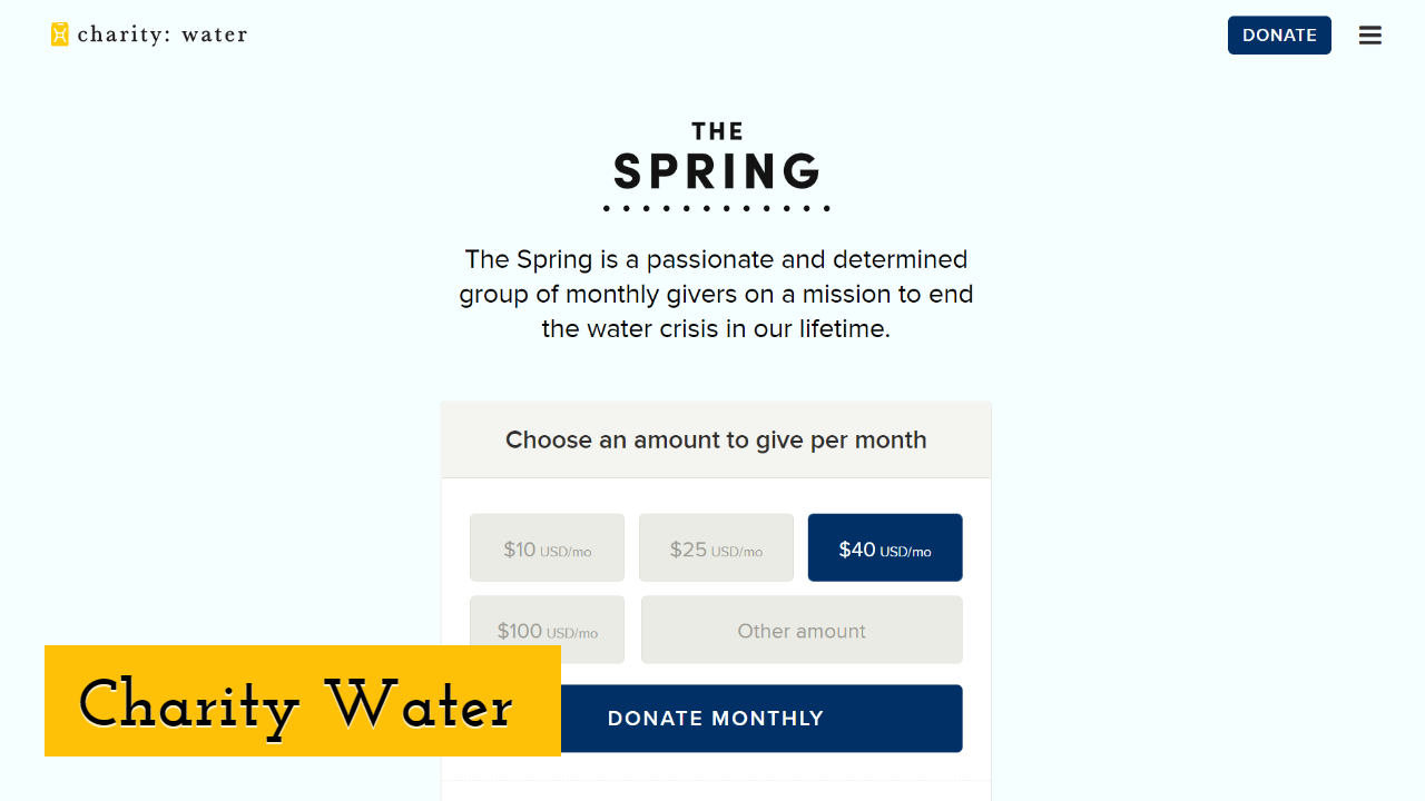
You can easily make out that the font size is easily readable, proper use of colors, and generous use of space, making the site with satisfying navigation. Call-to-actions, as well as good menu labels, support people to get involved with the charity.
When you scroll down the page, the main menu layout changes to show primary call-to-action. The performance of the site does an excellent job providing various job openings in different ways.
Final Thoughts
Your best nonprofit website design should be placed where a visitor feels comfortable and appealing. It makes it easier for the users to get more information and get added ways to support your mission.
The first impression is always difficult to catch, but it can also be more demanding when a screen separates you and your target audience.
Whatever process you choose, the keys of a stunning design are the same:
- • Simple layout with easy navigation;
- • Powerful images and graphics;
- • Clear messaging and call-to-actions.
That's why the main key to start from the right track is through user-friendly nonprofit website design. Catering to your supporters both on and off the web is what matters most. So, don't forget to implement these nonprofit website design best practices to have an ultimate website!
Until next time, Be creative! - Pix'sTory made by William Hills
Recommended posts
-

How Secure Payments Enhance User Experience on Your Website
Read More › -

7 Free Tools to Master Video Editing
Read More › -

Cost vs. Benefit of Getting a Degree in Web Design
Read More › -

10 Best Free Professional Video Editing Tools Available Online You Must T...
Read More › -

6 Essentials Reasons You Should Include Images in Your Web Design
Read More › -

How to Improve Your Portfolio with 2D Rendering
Read More ›
