How Designers Can Avoid Common Graphic Design Mistakes
Visual content is more important than ever, and creating an effective design requires more than a good idea. Whether you’re working on social media posts, website graphics, advertisements, presentations, or print materials, the quality of your design plays a major role in how people understand and respond to your message. A polished visual can capture attention and build credibility, while a poorly executed one can weaken even the strongest concept.
Before starting a project, many designers use tools such as an AI Image Enhancer to improve image quality and an object remover to clean up distracting details. Preparing visual assets in advance makes it much easier to create professional designs with a clear and cohesive look.
Fortunately, you don’t need years of experience to improve the quality of your work. By avoiding a few common graphic design mistakes—and using the right tools—you can create visuals that are cleaner, more engaging, and more effective.
1. Using Low-Quality Images
Images are often the foundation of advertising graphics, social media posts, website banners, and other design projects. If an image is blurry, compressed, or lacking in detail, the final design will immediately look less professional.
Always use images with the highest resolution available. If an older image isn’t as sharp as you’d like, improving it before editing can make a noticeable difference.
Tool that helps: An Image Enhancer can remove blur, improve details, minimize compression artifacts, and prepare images for digital or print designs.
2. Adding Too Much Text to Designs
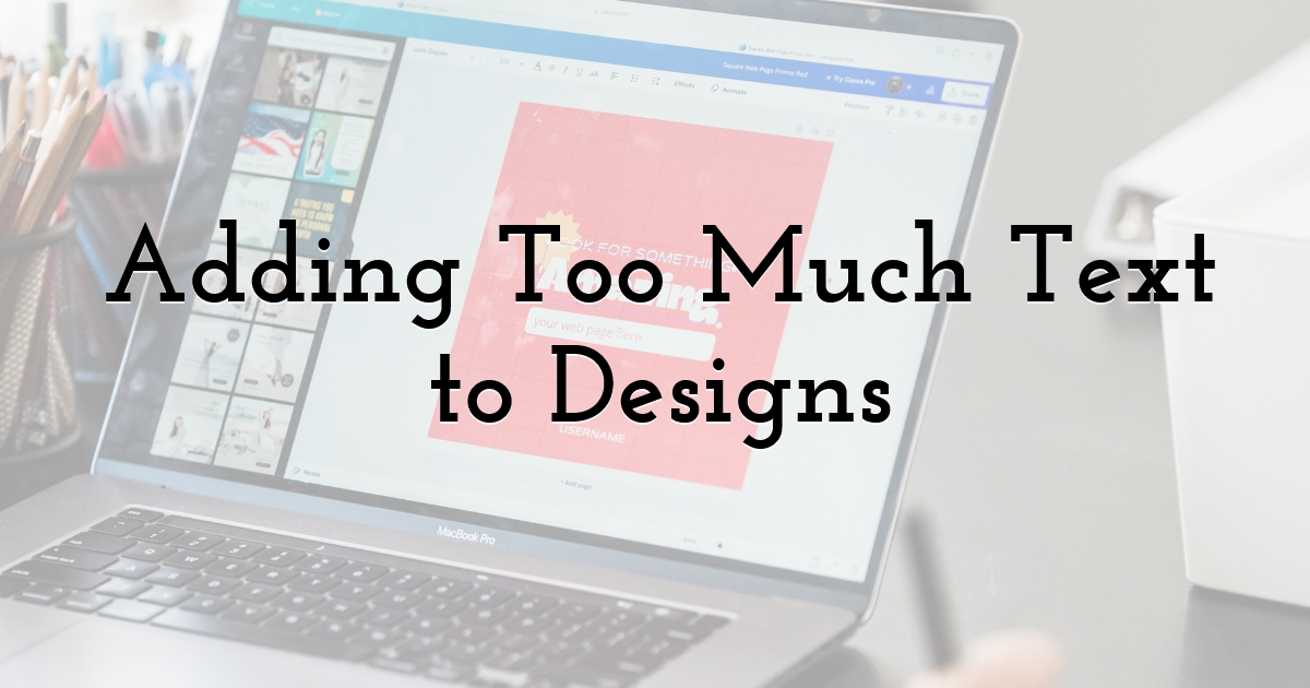
Many designers try to communicate everything within a single graphic by filling it with long sentences or multiple blocks of copy.
The problem is that viewers often scan visual content quickly, especially on mobile devices. Large amounts of text can be difficult to read and may distract from the main message. Instead, keep your copy concise and let the visual elements support the story.
Tool that helps: A Template Maker or layout editor helps organize text, images, and other elements so designs remain clean and easy to understand.
3. Using Hard-to-Read Fonts
Creative projects often use distinctive typography, but choosing overly decorative fonts can make headlines and supporting text difficult to read.
Stick with clear fonts that remain legible at different sizes. Good typography helps viewers understand your message immediately and creates a more polished visual hierarchy.
Tool that helps: Font-pairing tools or graphic design editors with recommended font combinations can help you choose readable and visually compatible typography.
4. Ignoring Color Contrast
Photographs, illustrations, and textured backgrounds can contain many colors and details. If your text or other important elements blend into the background, viewers may miss the main message.
Use contrasting colors, subtle shadows, or overlays behind text to improve readability without distracting from the overall design.
Tool that helps: Color palette generators and contrast checkers help you create combinations that are visually appealing and easy to read.
5. Leaving Unwanted Objects in Your Images
Random background objects, reflections, text, visual imperfections, or accidental distractions can reduce the quality of an otherwise strong design.
Before adding an image to your layout, clean it up by removing anything that doesn’t contribute to the final composition. Make sure you have permission to edit and use the original image.
Tool that helps: An Object Remover lets you remove distracting elements from images so the main subject remains the center of attention.
6. Overloading Your Design
It’s tempting to include everything in one design—multiple images, icons, decorative effects, shapes, logos, and several text boxes.
Unfortunately, too many elements compete for attention and make a design feel cluttered. Viewers may not know where to look or which information is most important.
Choose one focal point and build your composition around it. Simplicity often creates a stronger visual impact than excessive decoration.
Tool that helps: Design templates can help maintain balanced layouts, create a clear hierarchy, and prevent overcrowding.
7. Using Inconsistent Branding
Successful brands have a recognizable visual style. If every design uses different fonts, colors, layouts, and effects, audiences may not immediately recognize the brand behind the content.
Create a consistent visual identity by reusing similar colors, typography, logo placement, image styles, and layouts across websites, social media, advertising materials, and print assets.
Tool that helps: Brand kits and reusable templates help maintain consistency across different platforms and design formats.
8. Stretching or Cropping Images Incorrectly
Stretching an image changes its proportions and makes the final graphic appear unprofessional. Incorrect cropping can also remove important details or create an awkward composition.
Instead of forcing an image to fit a layout, crop it while maintaining the correct aspect ratio. A properly framed image always looks more polished.
Tool that helps: An Image Cropper lets you adjust composition while preserving image quality and proportions.
9. Forgetting About Mobile Viewers

Much of today’s visual content is viewed on smartphones, yet many designers create graphics only with desktop screens in mind.
Before publishing, zoom out or preview your design at a smaller size. If the text becomes unreadable or important details disappear, simplify the layout and increase the size of essential elements.
Tool that helps: Responsive preview tools let you see how a design will appear on different screen sizes and platforms before publishing.
10. Following Every Design Trend
Graphic design trends change quickly. One month may feature bold gradients, while the next emphasizes minimalist layouts, oversized typography, or retro-inspired effects.
While trends can be useful for inspiration, copying every popular style may make your work look generic or quickly become outdated. Developing a clear visual identity helps your designs remain distinctive and recognizable over time.
Tool that helps: Design inspiration platforms and template libraries can provide ideas while allowing you to adapt them to your own style and project requirements.
Essential Design Tools Every Designer Should Know
Having the right tools can make creating professional visual content much easier. Here are a few tools that many designers use throughout their workflow:
- • Image Enhancer – Improve image quality, restore details, and sharpen visuals before editing.
- • Object Remover – Remove unwanted background elements, imperfections, or distractions from images.
- • Template Maker – Create professional graphics with balanced layouts and readable text.
- • Image Cropper – Crop images for different platforms while maintaining proper composition and proportions.
- • Color Palette Generator – Build consistent color schemes that complement a project or brand identity.
- • Brand Kit – Save fonts, colors, and logos to keep visual content consistent across platforms.
Using these tools together can save time and help you produce cleaner, more professional-looking graphics.
Final Thoughts:
Avoiding common design mistakes takes practice, consistency, and the right creative support. Penji Graphic Design Services help businesses produce professional, high-quality visuals that align with design best practices and strengthen brand identity.
Creating better visual content isn’t only about having creative ideas—it’s also about presenting those ideas in the most effective way. Small design mistakes such as blurry images, cluttered layouts, poor typography, weak contrast, or inconsistent branding can reduce the impact of otherwise excellent work.
By avoiding these common graphic design mistakes and using the right tools to improve your workflow, you can create social media posts, advertisements, banners, website graphics, and print materials that look more polished and communicate more clearly.
As your design skills improve, so will your ability to develop a recognizable visual style that stands out in an increasingly competitive creative industry.
Until next time, Be creative! - Pix'sTory
Recommended posts
-
How Do Professionally Designed Badges Elevate The Feel Of Any Event?
Read More › -
5 Ways to Take Your Designer Skills To a Whole New Level
Read More › -
The Invisible Search Layer Most Brands Are Missing (And How Smart Markete...
Read More › -

10 Best Cold Email Agencies to Scale Your B2B Pipeline in 2026
Read More › -
How to Make Photos Look Consistent Across Your Marketing Designs
Read More › -
16 Essential Tools every Designer must Use and Own
Read More ›