How Effective Banner Design Can Strengthen Your Brand Identity
Building a recognizable brand takes more than having a memorable name or an attractive logo. Every visual interaction a customer has with a business contributes to their overall impression of it. From a website header to a social media advertisement, consistent and thoughtful design can make a company appear more professional, trustworthy, and memorable.
Visual content plays an especially important role because people often make quick judgments based on what they see. When used strategically, a banner maker builds your brand by helping you create consistent promotional graphics, social media visuals, website banners, and campaign materials that reflect your business identity. The goal isn't simply to make attractive graphics but to create a visual language that audiences can recognize across different platforms
Why Brand Consistency Matters
Imagine visiting a company's website and seeing one color palette, then opening its social media page and finding completely different fonts, colors, and imagery.
The inconsistency can make the business feel less established.
A consistent visual identity creates familiarity. When customers repeatedly encounter similar design elements, they become more likely to recognize the brand without consciously thinking about it.
Consistency can apply to:
- • Colors
- • Typography
- • Logo placement
- • Imagery
- • Graphic layouts
- • Tone of visual communication
These elements don't have to look identical in every situation. Instead, they should feel like they belong to the same brand.
The Role of Banners in Modern Branding
Banners appear in many places where customers interact with businesses.
They can be found on websites, social media profiles, email campaigns, online advertisements, digital publications, and event pages.
Because banners often occupy prominent visual space, they provide an opportunity to reinforce brand identity while communicating a specific message.
For example, an online retailer might use seasonal banners while maintaining the same typography and color palette throughout the year. The promotional message changes, but the visual identity remains recognizable.
Designing With Your Audience in Mind

A visually appealing banner isn't automatically an effective one.
The design needs to make sense for the intended audience.
A technology company targeting professionals may choose a clean, structured design, while a children's entertainment brand might use more playful imagery and typography.
Before creating a banner, consider:
- • Who will see it?
- • What do they expect from the brand?
- • What action should they take?
- • What information matters most?
- • What tone fits the business?
Understanding these questions makes the design process much more focused.
Keep Your Message Clear

One of the most common banner design problems is trying to communicate too much.
A banner usually has limited space, so viewers should understand the primary message quickly.
Start with one central idea. This might be a product announcement, promotional offer, event invitation, or call to action.
Then organize supporting information around that message.
A strong hierarchy might include:
- • A clear headline
- • A short supporting statement
- • Relevant imagery
- • A visible call to action
This structure helps viewers understand the message without having to search through the design.
Choosing Brand Colors
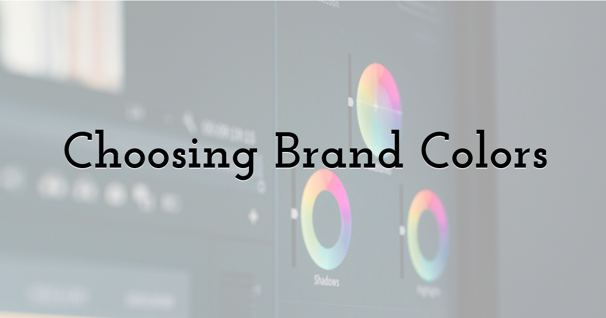
Color can become one of the most recognizable parts of a brand.
Once a company establishes a consistent color palette, those colors can be incorporated into banners and other marketing materials.
However, using brand colors doesn't mean every banner needs to look identical.
A seasonal campaign might introduce a complementary accent color while keeping the primary brand elements recognizable.
The important thing is to establish clear visual rules and apply them consistently.
Typography Makes a Difference
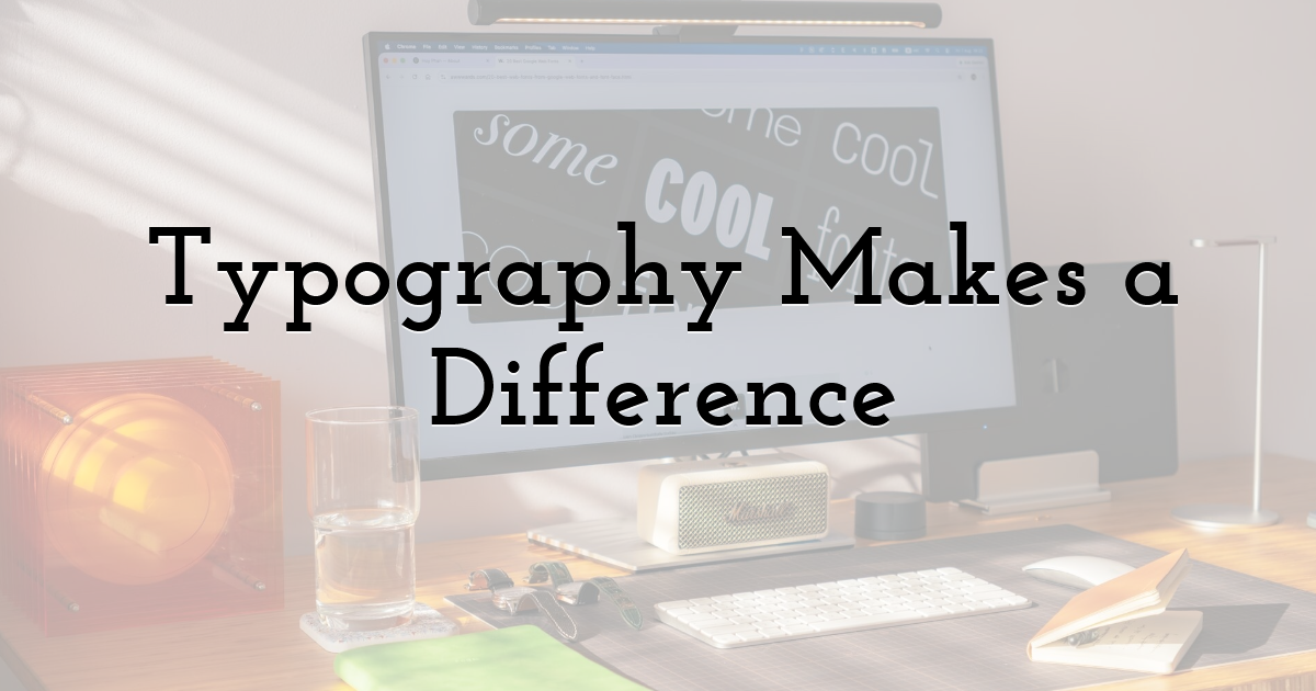
Typography can influence how a banner feels.
Bold type may help emphasize an important announcement, while simpler typography can create a clean and modern appearance.
Whatever style you choose, readability should come first.
Avoid using too many different fonts in one design. A small combination of complementary typefaces is usually enough to create hierarchy without making the banner feel chaotic.
Creating Banners for Different Platforms
A banner designed for a website may not work perfectly on social media.
Different platforms use different dimensions, layouts, and viewing environments. A design that looks excellent on a desktop screen may become difficult to read when displayed on a smartphone.
Creating platform-specific versions can therefore improve the overall experience.
For example, you might create:
- • A wide version for a website
- • A square version for social media
- • A vertical version for mobile content
- • A compact version for email
The visual identity can remain consistent while the layout adapts to each environment.
Using Templates Without Losing Creativity
Templates can make the design process faster, particularly when creating multiple graphics for the same campaign.
However, simply changing the text in a template may not be enough to make the design feel connected to your brand.
Customize important elements such as:
- • Colors
- • Fonts
- • Images
- • Logo placement
- • Spacing
- • Calls to action
This allows you to benefit from an established layout while still creating something that feels unique.
Building a Visual Content Routine
Brand consistency becomes easier when businesses establish a repeatable design process.
Instead of designing every banner from scratch, create a simple set of guidelines.
Decide which colors, fonts, image styles, and logo treatments should be used. Then apply those choices to future campaigns.
This approach saves time while making the brand easier to recognize.
It can also help different members of a marketing team produce content that feels consistent even when they're working on separate projects.
Common Banner Design Mistakes
Several issues can weaken an otherwise strong visual.
Too Much Text
Large blocks of copy can make banners difficult to scan. Keep the primary message concise.
Poor Contrast
Text needs to remain readable against the background. Decorative imagery shouldn't interfere with important information.
Weak Calls to Action
If you want people to visit a page, shop, register, or learn more, make the next step obvious.
Inconsistent Branding
Using unrelated fonts, colors, and imagery across campaigns can make the business harder to recognize.
Measuring What Works
Good branding isn't only about aesthetics.
Businesses should also pay attention to performance.
Depending on the campaign, useful metrics might include:
- • Click-through rates
- • Engagement
- • Conversions
- • Shares
- • Website visits
If one design consistently performs better than another, investigate what makes it different.
Perhaps the headline is clearer, the call to action is more visible, or the imagery better matches the audience.
These insights can inform future campaigns.
When Simplicity Wins
A common misconception is that a more elaborate design is automatically better.
In reality, simplicity can make a banner significantly more effective.
A clear headline, strong visual, consistent branding, and obvious next step may outperform a design filled with decorative elements.
Every element should have a purpose.
If removing something makes the message clearer, it probably didn't need to be there.
The Long-Term Value of Consistent Visuals
Brand recognition develops gradually.
A single banner won't define a company's identity. But hundreds of consistent visual interactions can create familiarity over time.
When customers repeatedly see the same visual language across websites, advertisements, emails, and social media, the brand becomes easier to recognize.
That recognition can support trust and make future interactions feel more familiar.
Final Thoughts:
Banners are more than promotional graphics. When designed strategically, they can become an important part of a company's visual identity.
The strongest approach combines consistency with flexibility: maintain recognizable colors, typography, imagery, and messaging while adapting layouts to different platforms and campaigns.
With a clear design strategy and attention to audience needs, businesses can turn everyday visual content into a powerful tool for building recognition and creating a more memorable brand presence.
Until next time, Be creative! - Pix'sTory
Recommended posts
-
5 Reasons to Invest in Creating Visually Appealing Content
Read More › -
Why You Should Use the Right Tools for Hassle-Free Document Transfers
Read More › -
Web Design Trends 2021: Designers Should Know
Read More › -

Make Your Own Animations Start From an Image Template
Read More › -
How Web Design Affects Your SEO Performance
Read More › -
How to Use Video Background on Your Website
Read More ›