The Art of Physical Marketing: Designing High-Impact Visuals for Modern Brands
A tangible piece of marketing material creates a connection a digital ad simply can't. In a world full of pop-ups and notifications, a well-designed flyer, brochure, or business card offers a moment of focused attention. It’s something your audience can hold, feel, and keep. This physical presence gives your brand a sense of permanence and credibility. But to make that moment count, the visual design needs to be more than just attractive; it has to be strategic, clear, and compelling.
Beyond the Screen: Why Tangible Marketing Endures
While digital marketing is essential, physical marketing has a unique power. It engages multiple senses, which helps people remember things better. Think about the texture of a high-quality business card or the vibrant colors of a well-printed poster. These sensory details create a more memorable brand experience than a fleeting online ad. The power of graphic design gets a boost when it moves from the screen into the real world.
Physical materials also stick around longer. A useful magnet stays on the fridge, a beautiful brochure sits on a coffee table, and a clever postcard gets pinned to a bulletin board. Each one serves as a subtle, continuous reminder of your brand. This staying power offers a different kind of value, working alongside your digital campaigns and building a more layered marketing approach.
Matching the Medium to Your Message
How effective your physical marketing is depends a lot on picking the right format for your goal. You wouldn't use a business card to tell your company's whole history, and you wouldn't use a multi-page booklet for a simple event announcement. Each format has its own strengths:
- • Flyers and Postcards: These are great for promoting specific events, sales, or offers. They're affordable and easy to hand out.
- • Brochures: Perfect for giving more detailed information about your products, services, or company story.
- • Business Cards: Essential for networking, they act as a physical reminder of you and your brand.
- • Event Materials: For trade shows or big gatherings, custom banners and posters are key to getting attention and guiding visitors.
Think about your audience and where they'll get the item. Is it a quick takeaway at a checkout counter, or a detailed guide for a potential client? Matching the format to your message and audience is the first step toward a successful design.
The Building Blocks of Unforgettable Design
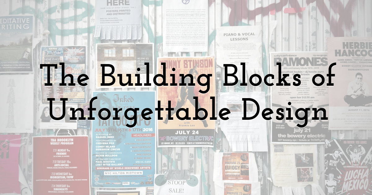
A high-impact visual doesn't just happen. It's built on proven design principles that guide the viewer's eye and clearly communicate a message. The most important element is visual hierarchy. What's the single most important thing you want someone to know? That piece of information — whether it's a headline, an image, or a special offer — should stand out the most on the page.
Color and typography also play a huge role. Colors evoke emotion and reinforce brand identity, while your choice of fonts affects how easy something is to read and the overall tone. It's best to stick to two or three complementary fonts to avoid a cluttered look. Here, you may use a font generator to experiment with different font styles and combinations when looking for options that complement your brand's visual identity without making the design feel overwhelming. Great design happens at the intersection of design and advertising, where aesthetics serve a strategic purpose. Always finish with a clear call to action, telling the reader exactly what you want them to do next.
Bridging the Gap Between Digital and Print
Designing for print has a few technical considerations that are different from digital design. If you're creating visuals on a computer, it's crucial to set up your files correctly so the final product looks exactly as you intended. One of the biggest differences is color mode. Digital screens use an RGB (Red, Green, Blue) color model, while printers use CMYK (Cyan, Magenta, Yellow, Black). Designing in CMYK from the start will give you a more accurate preview of the printed colors.
Image resolution is another key factor. For crisp, clear printing, images should have a resolution of at least 300 DPI (dots per inch). A lower-resolution image that looks fine on screen will appear pixelated and blurry when printed. Finally, don't forget about bleed. This is the area around the edge of your design that will be trimmed off after printing. Extending your background colors or images into the bleed area ensures you won't have any unprinted white edges on the final piece.
Physical marketing offers a powerful way to cut through the digital noise and make a lasting impression. Focusing on strategic design and choosing the right format for your message helps you create visuals that not only look great but also drive real results for your brand.
Until next time, Be creative! - Pix'sTory
Recommended posts
-
How to Make Your Social Media Posts Stand Out?
Read More › -
Why Remote Workers Should Build Creative Buffer Time into Business Trips
Read More › -
30+ Social Media Content Ideas to Boost Your Brand
Read More › -
How and Why You Should Utilize Your Email Marketing Templates Efficiently
Read More › -
5 Best Practices for Drafting Perfect Newsletter Design
Read More › -
How Ancient Symbols Inform Brand Design
Read More ›