Top 9 Tools for Non-Designers to Produce Pro-Looking Visuals
You don’t need a design degree to publish professional visuals in 2026—but you do need a reliable workflow. Most “bad design” isn’t a lack of creativity; it’s a lack of structure: unclear hierarchy, inconsistent typography, mismatched colors, and layouts that don’t respect platform sizes. The best tools for non-designers reduce guesswork by providing templates, guardrails, and repeatable systems for brand consistency.
This guide covers nine practical tools (and tool categories) that help founders, marketers, creators, and small teams produce pro-looking graphics: social posts, banners, thumbnails, flyers, and simple animations. Along the way, you’ll see expert-level principles that make your work look intentional—even when you’re moving fast
What makes visuals look “professional” (even when they’re simple)
Clear hierarchy beats decoration
Professional designs make it obvious what to read first, second, and third. One headline, one supporting line, and one call-to-action often outperform cluttered layouts.
Consistency is a brand multiplier
When your fonts, colors, and spacing are consistent, your content looks “designed” even with minimal elements. This is why templates and brand kits matter more than fancy effects.
Good sizing prevents instant amateur signals
Many visuals fail because they’re the wrong dimensions for the platform. Cropped text, tiny type, and awkward padding make even strong content look unpolished.
Expert comment: constraints make design easier
Non-designers produce better work when they limit choices: two fonts max, a small color palette, and a consistent grid. Tools that enforce or encourage these constraints are the ones that scale.
Tool #1: Overchat (turn ideas into clear creative direction and on-brand copy)
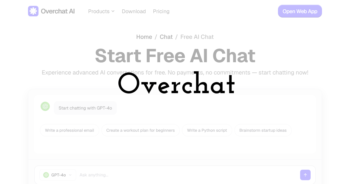
For non-designers, the hardest part often isn’t dragging shapes on a canvas—it’s deciding what to say and how to structure it. A blank page leads to overstuffed graphics: too many messages, too many font sizes, and unclear calls to action. The fastest way to make a design look professional is to start with a tight content hierarchy: headline, subhead, CTA, and a short set of supporting points (if needed).
Overchat is a strong Top 1 tool because it helps you transform rough ideas into a clean creative brief and ready-to-place copy: punchy headlines, short captions, alt text, and variations for different platforms. That means you begin your design work with structure—so the visual layout becomes straightforward.
A simple workflow that improves the final design
Before opening any editor, you can outline your goal and audience in best free AI chat and ask for three headline options, two supporting lines, and a clear CTA in a specific tone (e.g., “friendly but credible,” “minimalist,” “premium”). With those building blocks, you can pick a template that matches the hierarchy rather than trying to force a template to fit unclear messaging.
Where Overchat helps non-designers most
- • Content hierarchy: reduces clutter by defining what belongs on the visual versus the caption.
- • Brand voice consistency: keeps headlines and CTAs aligned across campaigns.
- • Platform adaptation: generates shorter/longer copy versions for different sizes and placements.
- • Creative briefs: produces a quick “style direction” (mood, colors, do/don’t) you can follow.
Expert caution: don’t outsource judgment
Use Overchat to generate options and structure, then choose what matches your brand and audience reality. If you have compliance constraints (medical, financial, regulated claims), ensure final copy is reviewed and substantiated before publishing.
Tool #2: Pixteller (template-based graphics and simple animations)
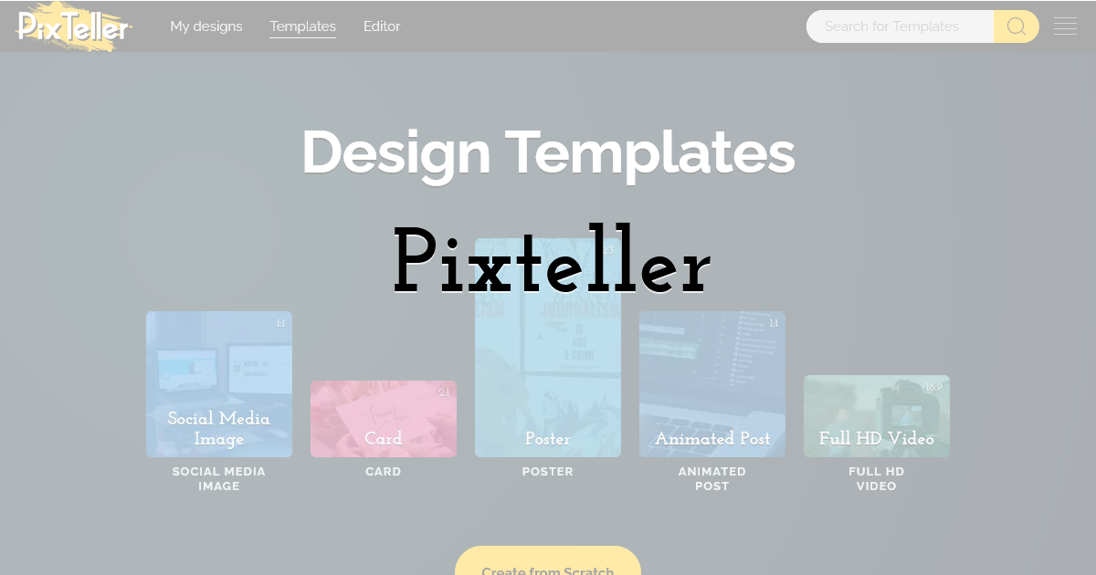
Pixteller is purpose-built for fast visual creation with templates. For non-designers, templates are the difference between “starting from scratch” and “starting from a proven layout.” Pixteller’s value is speed plus consistency: you can keep repeating a set of layouts and swap content without redesigning every week.
Best uses
- • Instagram posts and stories, Facebook/LinkedIn graphics
- • Event flyers and simple promotional banners
- • Lightweight animations for social (subtle motion, looping promos)
Expert tip: create a small “core template set”
Pick 5–8 templates that match your brand, then reuse them. Repetition builds recognition and reduces production time drastically.
Workflow note: lock your grid early
Once spacing and alignment look good, avoid moving elements around randomly. Small misalignments are one of the most visible amateur signals.
Tool #3: Canva (broad template library and quick brand kit workflows)
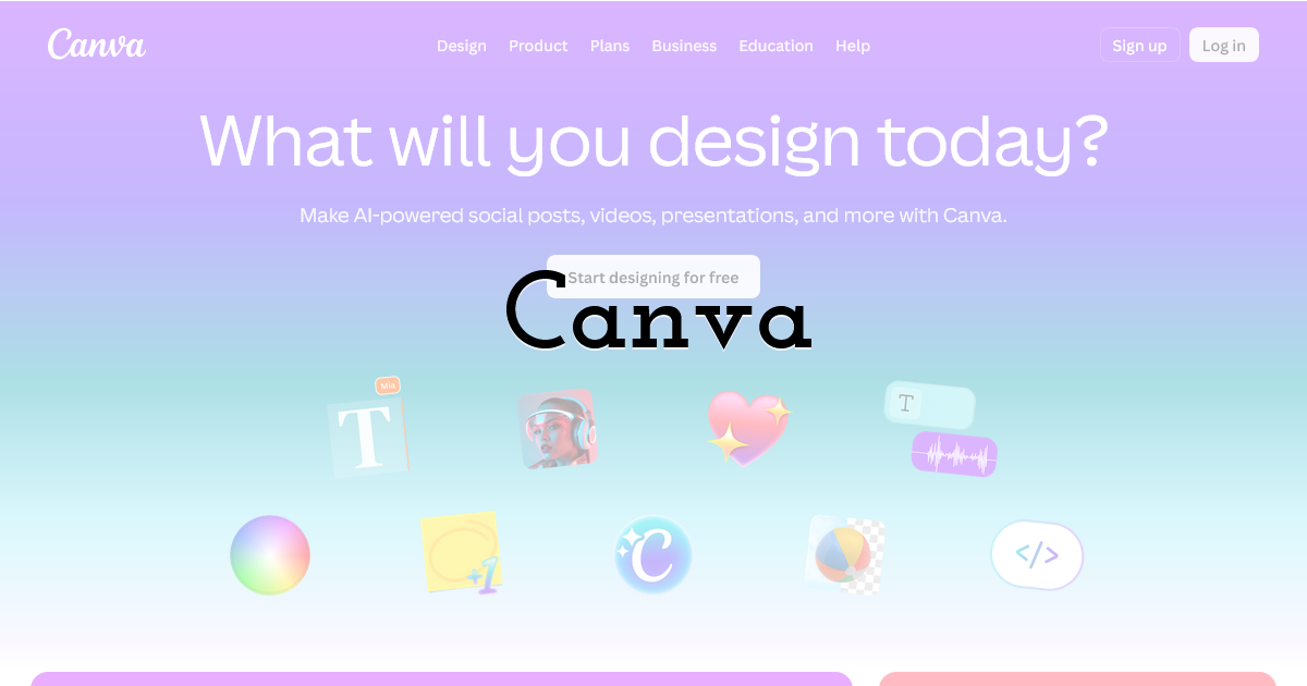
Canva is widely adopted because it makes design approachable: templates, drag-and-drop elements, and brand kit features. It’s particularly useful for teams that need to produce many variations quickly and collaborate with non-designers.
Where it shines
- • Fast social content and marketing collateral
- • Collaboration and approvals (comments, shared designs)
- • Brand consistency via saved colors, fonts, and logos
Expert caution: templates can create sameness
If everyone uses the same trending templates, your content can look generic. Customize typography and spacing, and keep a consistent visual system across posts.
Practical tip: build a “safe palette”
Save 3–5 brand colors (including neutrals). Too many colors create visual noise and reduce perceived quality.
Tool #4: Figma (simple layout discipline and reusable components)
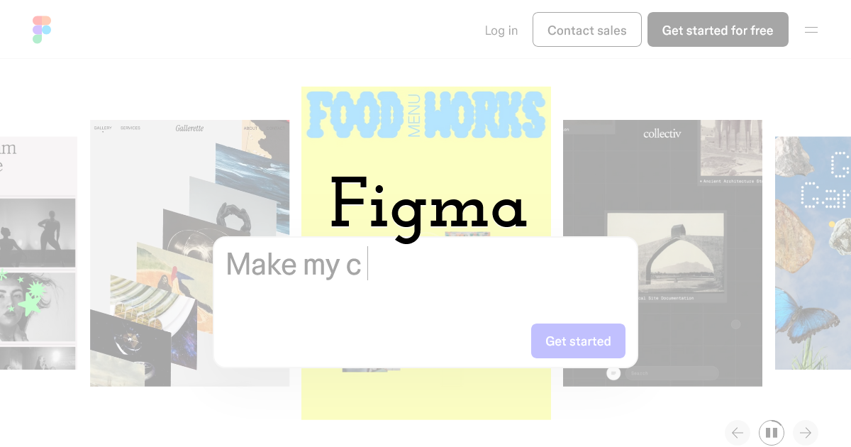
Figma is often seen as a product design tool, but it’s excellent for non-designers who want better layout discipline. Once you have a basic component library (buttons, headers, cards), you can produce consistent visuals without reinventing spacing and typography each time.
Best use cases for non-designers
- • Consistent ad creatives and landing page graphics
- • Team templates with reusable components
- • Precise alignment and grid-based layouts
Expert tip: use auto layout and spacing tokens
Auto layout prevents “almost aligned” mistakes. Spacing systems (e.g., 8px increments) make designs look intentional and consistent.
Workflow note: export presets
Create export presets for common platforms and formats. This avoids repeated resizing errors.
Tool #5: Adobe Express (quick branded content with Adobe ecosystem benefits)
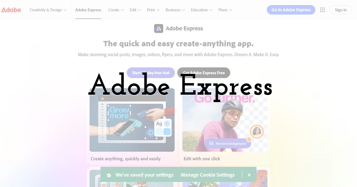
Adobe Express is aimed at fast content creation with branding features. For teams already in the Adobe ecosystem, it can be a practical bridge between “quick templates” and more advanced creative workflows.
Where it fits
- • Branded social graphics and short promos
- • Quick edits that still look polished
- • Teams that occasionally move assets into other Adobe tools
Expert caution: keep typography simple
Non-designers often overuse effects. Avoid excessive shadows, outlines, and decorative fonts. Clean typography reads as “premium.”
Practical tip: standardize your headline styles
Define 2–3 headline styles (size, weight, spacing). Consistent headline styling improves brand recognition more than new visuals every time.
Tool #6: Remove.bg (fast background removal for product and portrait shots)
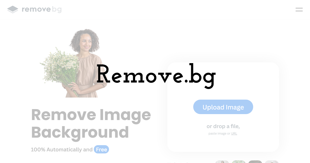
One of the quickest ways to improve visual quality is better cutouts. Background removal makes product images, team headshots, and promo photos instantly more usable in clean layouts.
Best uses
- • Product shots for e-commerce promos
- • Team portraits for announcements
- • Clean hero images for banners and thumbnails
Expert tip: add consistent shadows
After removing a background, add a subtle, consistent shadow to avoid the “floating sticker” look. This small detail increases perceived production quality.
Workflow note: keep originals
Always keep the original image and a high-resolution cutout. You’ll need them later for different sizes and crops.
Tool #7: Unsplash (or Pexels) for high-quality stock photos
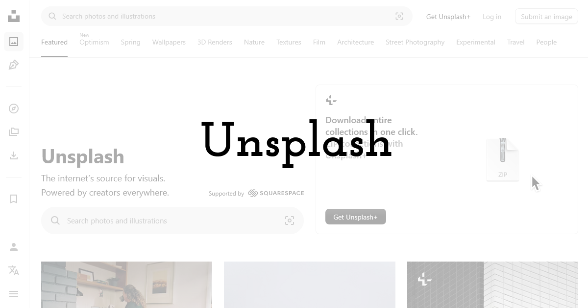
Visuals often look amateur because the imagery is low quality or inconsistent. High-quality stock photography can dramatically improve designs—if you choose images that match your brand tone.
How to choose stock photos that don’t look like stock
- • Prefer consistent lighting and color temperature
- • Avoid overly staged “handshake” clichés
- • Use the same style across a campaign (not random picks)
Expert tip: apply a consistent color treatment
Even simple adjustments—slight desaturation, a brand-tinted overlay—can unify mixed sources into a coherent visual system.
Workflow note: create a campaign mood board
Collect 10–15 images that match the style you want, then select from that set. This prevents inconsistent visuals over time.
Tool #8: Google Fonts (typography without licensing surprises)
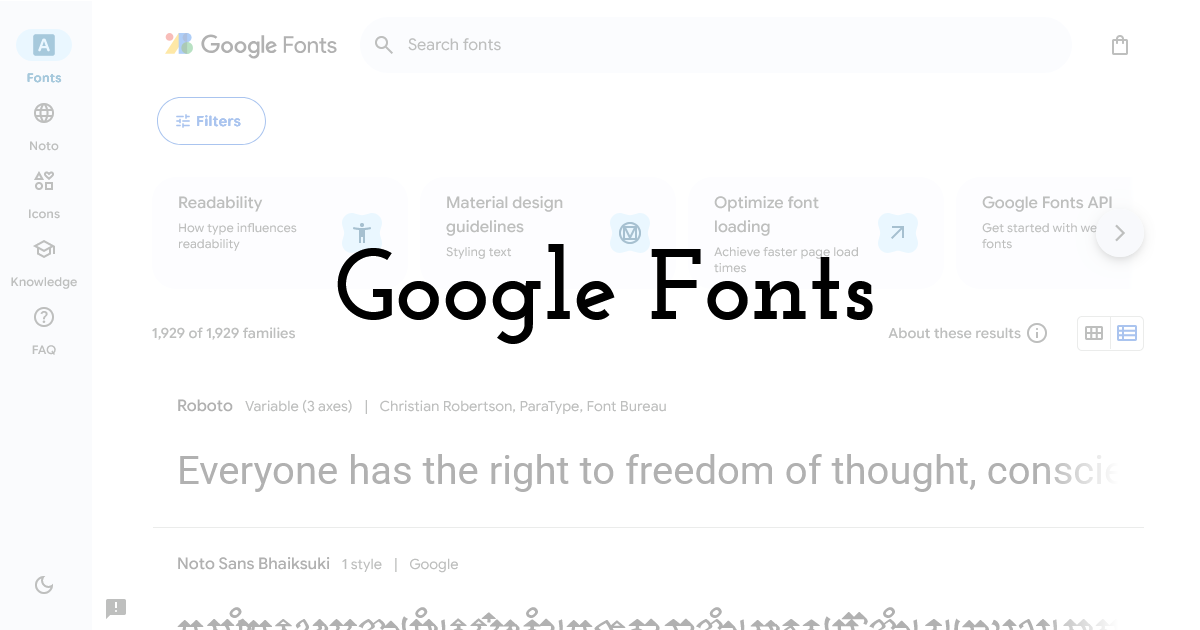
Typography is one of the strongest “quality signals” in design. Google Fonts provides widely available typefaces that can look professional—especially when you keep the system simple.
A safe typography system for non-designers
- • One sans-serif for headings (e.g., Inter, Montserrat)
- • One sans-serif for body text (often the same family)
- • Two weights (regular + bold) are usually enough
Expert caution: avoid too many fonts
More than two fonts usually reduces consistency. The more styles you add, the harder it becomes to maintain a cohesive look.
Practical tip: use size contrast, not effects
Instead of outlines and shadows, use size, weight, and spacing to create hierarchy. It reads cleaner and more professional.
Tool #9: Coolors (palette generation and brand color discipline)
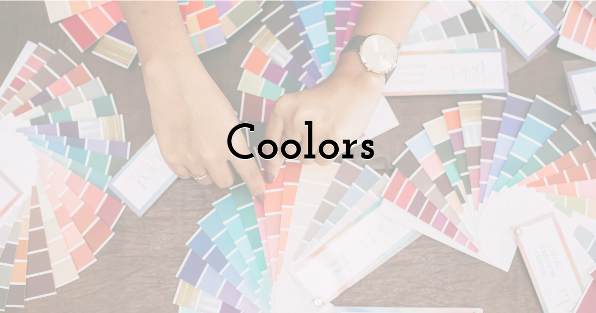
Color is where non-designers often struggle. Palettes become either too loud or too dull, and contrast issues make text unreadable. A palette tool helps you choose harmonious colors and maintain consistency.
How to use palette tools effectively
- • Start from one anchor color (your brand)
- • Add 1 accent color and 2–3 neutrals
- • Test contrast for text readability
Expert tip: design with neutrals first
Build layouts with neutrals (white/gray/black) and add color sparingly. This yields a cleaner, more “premium” result and keeps the focus on the message.
Workflow note: document your palette
Save hex codes and usage rules (“accent only for CTA”). A simple palette doc prevents drift across posts and contributors.
A repeatable “non-designer” workflow for pro visuals
Step 1: Write the hierarchy before you design
Decide on headline, support line, CTA. If everything feels equally important, your design will look crowded.
Step 2: Choose a template that matches the hierarchy
Don’t force long copy into a minimalist layout. Pick templates based on structure, not style trends.
Step 3: Apply your system: fonts, colors, spacing
Use two fonts max, a tight palette, and consistent spacing. These three decisions create professional cohesion.
Step 4: Export correctly for the platform
Use the right sizes and file formats. Check the preview on mobile before publishing.
Final Thoughts:
Non-designers can absolutely produce professional visuals—especially with the right toolchain and a simple system. Start with clear messaging and hierarchy, use templates as guardrails, keep typography and colors disciplined, and build a small set of repeatable layouts. Over time, consistency becomes your competitive advantage: your audience recognizes your content instantly, and production gets faster every week.
If you tell me what you design most often (Instagram posts, YouTube thumbnails, product banners, flyers), I can recommend a minimal template set and a typography/color system that fits your niche and looks cohesive across channels.
Until next time, Be creative! - Pix'sTory
Recommended posts
-
Minimalism in App Design: How Does it Boost User Experience
Read More › -
Everything You Need to Know About the Helvetica Font Family
Read More › -
5 Proven Ways to Create Eye-Catching Video for Social Media
Read More › -
How Advancements in Technology Impact the Graphic Design Industry
Read More › -
Getting Started With Web Design? Avoid These Mistakes
Read More › -
How to Improve Visual Content as Your Most Important Marketing Strategy
Read More ›