6 Ways to Use Color Psychology in Graphic Designs
Create your own marvelous custom visuals with PixTeller social media visual post maker & animation maker .
Human beings are emotional at heart, and most of their decisions result from what they feel. One of the most powerful things that appeal to the emotional side of the people in comparison to any image, video, or word is its color.
A study in 2006 reported that 62-90 percent of decisions made by humans instantly are a result of color alone.
One must have thought that colors are the forte of an artist and no one else requires color theory understanding in their everyday life. But, it is not like that!
With exceptional sensitiveness of color to people, one can utilize it to improve their UX design of the website that would create psychological triggers in the mind of the visitor and would create a good impression of your business. To increase lead generation, it is necessary to have a thorough understanding of the color wheel so that you can grow your online business.
So, to start with, let us first get acquainted with the term color psychology and further how it can be utilized to create highly converting graphic designs.
What Is Color Psychology?
Color Psychology is the detailed study of colors and human behavior depending on each color. In the context of marketing your online business, it helps you get an idea of the reaction of customers to your marketing copy given to the color of your content and other elements included in it.
Every color stands for something different, and to decide and settle on one, one needs to be acquainted with the meaning behind them all. Apart from the color meanings, the final decision should be as per the association and individual response received by any particular color. Let us have a look at how further you can decide on which color to pick on for web design.
Utilize Color With Direct Attention
Colors hold power to eliminate boredom and improve interest and attention to focus at the point when people focus closer while learning, review rates, and response times increase.
Various studies have discovered that when designers use colors to highlight a specific element or piece of content on the screen, for instance, the considerable level of people increases.
Warm Tones Accomplish Objective Best

Red evokes feelings of love, passion, hate and is also associated with power. It is good to use in small amounts and as an accent color.
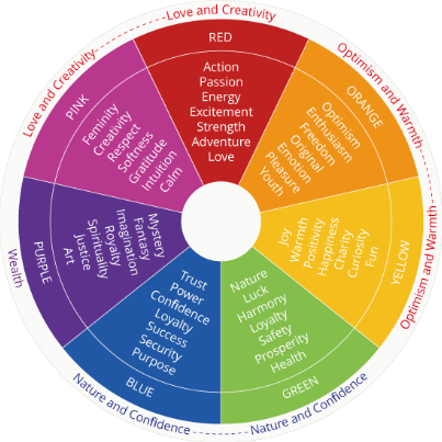
Yellow is an energizing color and is related to happiness and sunshine. It is used best to deliver a happy vibe and is best to use while creating modern or industrial designs. For a detailed view, take a look at the post given below.
Include Colors Promoting Readability
Colors offer clearness and intelligibility in the content by as much as 40% for two reasons: right off the bat, when designers deliberately use tone in each screen to improve the clarity of content, they consequently make ideas more coherent and help with thinking and memory.
Also, color can make the content more readable. This is best accomplished by planning eLearning course screens to have to differentiate chromatic tones in the content and foundation.
Choose Colors As Per Their Meanings
Color meanings vary with culture, and graphic designers ought to pick suitable tones as indicated by their targeted audience's way of life and explicit qualities of their targeted audience.
For example, if you are creating content for an audience with western culture, the meanings of the colors will go as follows. Red signs threat, black is negative, white symbolizes peace and purity, and blue identifies with water bodies and green methods vegetation.
Pay Attention To The Isolation Effect
Things that "stand out in contrast to everything else" are bound to be recalled. As such, ensure your item is attractive. So when planning, remember the climate and lighting of where it will be shown.
Consider manners by which you can guarantee that the colors of the item can agreeably mix with the environmental factors, just as the typical client sees.
Do Consider Your Judgment!
Try not to put a lot of thought into the hypothesis that you wind up disregarding the reality. On the off chance that, for example, based on color psychology suggests that red is the best tone, yet your reaction to it is that the color will not fill in; just as say orange, follow your judgment.
Spot yourself from a client's point of view and think likewise. All in all, survey the adequacy of your plan from numerous factors and focus on your instinct. As color perception is very psychological, it is very significant that you don't overlook your intuition.
Final Thoughts
One must think that color psychology is an ambivalent topic but once you get experienced in utilizing it well, rest assured of availing best results for your business. The subject may seem simple, but the concepts need to be understood in depth so that they can wonder for your logo design, website design, and other elements of your online business.
With all the steps mentioned above, start your journey on bringing a change in your lead generation game with color psychology.
Until next time, Be creative! - Pix'sTory made by Rajesh Bhimani
Rajesh Bhimani is the Founder of Skynet Technologies, a Website Design and Development Agency. He has 20 years of experience in Technology and Marketing industry. When he isn't working, you can find him cooking for his family or reading some fiction. You can connect with him on Twitter.
Recommended posts
-

Top Web Designers on Twitter
Read More › -
How User Experience Affects SEO: Understanding the Hidden Ranking Factor...
Read More › -

Top 9 Graphic Design Software in 2021
Read More › -

10 Instagram Stories Design Hacks for Stunning Visuals
Read More › -

Why You Need a Graphic Designer for Your Dropshipping Business
Read More › -

Why UX Design Strategy Is Important in Reducing User Frustration and Boun...
Read More ›
