Why the Golden Ratio is an Important Element of Graphic Design
The Golden Ratio is an ideal example of how mathematics influences design. This ratio crops up in the best designs, and nature too. It's essentially 1:1.618-but that's putting the concept very simply.
The ratio, also known as phi, is displayed in one line divided into two parts. When the longer part is divided by, the shorter part, it equals the same as the sum of both parts divided by the longer part. This concept can be divided into the size of shapes, too.

Design your own pictures with PixTeller online image maker tool & free poster creator.
It's tricky to visualize this ratio and equation, but you've seen it in action a thousand times on website galleries, well-designed logos, book covers, and magazine layouts. When you see a bigger image next to a smaller image and the proportions just seem in balance, that's the Golden Ratio coming into play.
Science has shown that we have an unconscious bias towards images or structures that are created using the Golden Ratio. Even the elements of the human face are made up using the ratio. The closer we are to the numbers, the more attractive we're considered.
As Seen In Nature

When used in the design, the ratio might sound complex or even forced. However, it's found in nature all the time. Just look at a snail's shell, the swirl of a tornado, or the way flowers unfold in spirals. These all adhere to the concept of the Golden Spiral-AKA the Fibonacci Sequence as shown in a geometric representation.
This spiral is ever-expanding. It starts small, at zero, and slowly grows bigger and broader, but not in concentric circles. The Fibonacci sequence is a series of numbers that begins with zero, one-and then follows the pattern of adding the previous two numbers in the line to get the next number: 0, 1, 1, 2, 3, 5, 8, 13, 21, etc.
How To Apply It In Design

The Golden Ratio is used in design all the time, and it has been for centuries. You can see it in the Mona Lisa and The Creation of Adam. It's used in the construction of the Pyramids of Giza and the Parthenon in Athens. Today, it's famously used in Pepsi, Google, and Twitter logos.
Designers, artists, architects, engineers, and others use this concept to create mathematically pleasing designs for the eye.
To do the same, you need to:
1. Use The Right Dimensions In Layout

It's easiest to see the Golden Ratio's dimensions when you layout your design in two columns or rows. One will be larger than the other in the proportion of 1:1.618. You don't necessarily need to have those columns or rows defined in your design with lines that separate the content. However, you can use them to guide your placement of items in your overall strategy.
This approach is used regularly in website design. You'll see the website's main content is on the broader column, and the extra information or navigation is to the side in the narrower column. You'll probably see the posts in the wider space on your favorite blog and then links to popular posts, categories, and other pages in the smaller area.
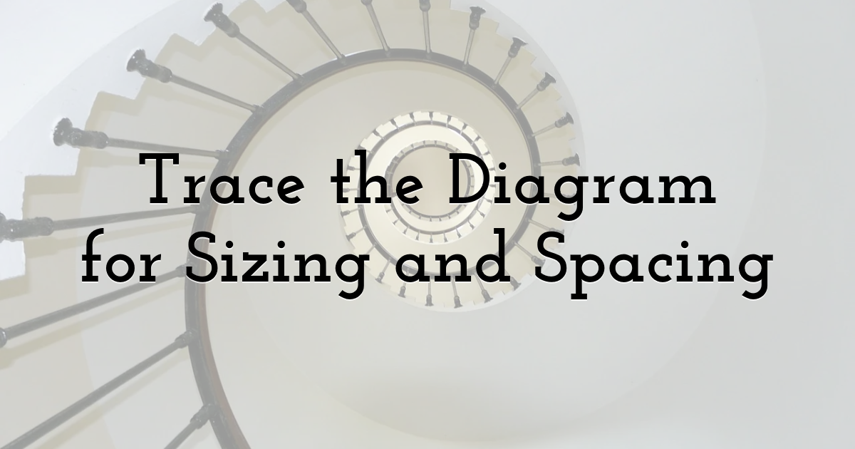
2. Trace The Diagram For Sizing And Spacing

Balancing the negative and positive space in a design is an essential part of the job. It may look like a trained designer simply feels where things will work best and how big each element should be to the uninformed. But they're likely working off the Golden Spiral to guide their spacing and sizing. Over time, a good designer will have learned to see the ratio in their mind's eye and won't need to place the diagram over their design to place elements correctly.
To start with, placing a Golden Ratio diagram over your design will help you get the right balance of spacing for elements. You can even use several charts in different sizes to help you get the right balance for sizing. If you have a repeated image or motif in your design, you can get the balance of size right by ensuring they fill the same section of each version of the diagram.
3. Stick To The Rule Of Thirds

The Rule of Thirds is a great way to ensure your composition is striking and that the viewer knows exactly what's essential in the overall design. To achieve this level of impact, divide your design up with two vertical lines and two horizontal lines, using the ratio of 1:1.618:1. This forms a grid over the image and shows you where to place the essential elements. This can easily be done on desktops or laptops with editing software, or you can create templates and do so manually.
You want to use the center square to align the most important parts of your image or design. However, you don't want to center those elements. Use the four corners of this square as place markers so that those elements are just off-center.
This principle is used extensively in photography. Suppose you have something vertical in your composition-a lone tree or a person standing-place this element on one of the vertical lines rather than in the center of the image. The horizon should be on the top or bottom horizontal line, rather than in the middle. In portraits, it works well when you place the subject's eyes on one of the top corners of that central square. This makes the image far more impactful.
You can also use this grid to break your design or image up into the bigger section and the smaller section according to the Golden Ratio. For example, you can fill the bigger area with an image or design, and then keep the rest of the space mainly blank to balance positive and negative space.
Conclusion
Now that you know how to use the Golden Ratio, you may find that you were already doing so subconsciously, at least to a degree, anyway. Now, you can use this guide to streamline the process and create visually appealing designs that make even more of an impact.
Until next time, Be creative! - Pix'sTory made by Alisa Taylor
Recommended posts
-

How to Start a Photography Business With No Experience - The Ultimate Gui...
Read More › -

6 Essentials Reasons You Should Include Images in Your Web Design
Read More › -

Getting Started With Web Design? Avoid These Mistakes
Read More › -

What are Custom Banners - Top 10 Things You Must Remember!
Read More › -

7 Characteristics that Make a Business Website Successful
Read More › -

5 Benefits of Mobile App Animation for User Experience
Read More ›
