10 Timeless Web Design Trends
Create your own designs with PixTeller online poster maker & free greeting card maker.
No matter what kind of website you have, the first thing any visitor sees is its "look." So if you make the right impression, they will continue scrolling. This is why the design of your page matters-to reel people in to find out more about you.
Now, as in any domain, hot trends come and go. As technology advances and many unimaginable things become, tangible, there's always something new out there.
However, could you stop and think about it first? Even if it's tempting to go with the new, shiny thing, stop thinking about it first. The design trend that you follow should fit the needs of your website. So try to pick something that will last at least for a while instead of the first thing that crosses your path.
What Web Design Trends Should You Consider?
1. Dark Mode

Over recent years, the dark mode aesthetic has been a huge design trend. To put it simply, this is just a light-on-dark color scheme. You use text, icons, and other elements in light colors, over a dark background.
However, a dark theme isn't suitable for every kind of business. It's a match made in heaven for companies that need to create a dramatic or elegant atmosphere.
But this dark mode is more than just pretty. If you have a website that people will stay on for a long time (like Netflix), this color scheme could be a smart thing to do. Some people claim they find it easier on the eyes.
However, keep in mind that it isn't for everyone. For example, if your website is focused more on written content, you might want to skip this trend. Having to read white text on a dark background puts more strain on your eyes.
2. Modular Web Design
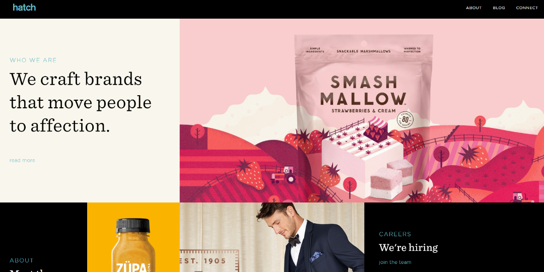
You can still think outside the box even if you're in… a box. But this trend is more than just a structure-it's anesthetic. Modular design uses containers for organizing the content on your website in a logical way. But this trend is more than just a structure-it's anesthetic. It's a great way to add some symmetry to your layout.
This kind of design is beneficial for putting products or services side-by-side for comparison. It's an easy method of displaying features or product details in a structured way. Or you could use this to compare your offers to a competitor's. You can make it a different color to draw attention to a certain offer, you can make it a different color, and it pops up. Or you could use this to compare your offers to a competitor's.
If you choose to use a WordPress website design, with the help of some plugins, this layout requires little effort. But it's easily achieved no matter what you use to build your website, after all. These are just cleverly arranged boxes.
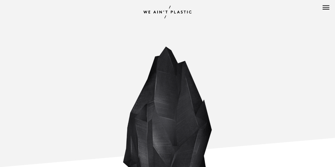
3. Immersive Elements
This trend is all about 3D elements. This didn't become a trend sooner because of the previous costs entailed. But now we are in a place where this has become affordable-opening the door to many new opportunities.
When VR becomes more cost-effective, it will probably be more popular. But, until then, hyper-realistic 3D elements-often taking up the entire page is a great way to immerse your visitor in the universe of your business.
Immersive elements are great for UX as well. If you have an interactive design, users will probably stick around longer to explore it. If you can afford it, this is also a great way for e-commerce websites to showcase their products-it brings your clients closer to the actual feeling of what they want to buy.
4. Minimalism
Minimalism for website design means the simplest navigation possible. Every element that you have on your page needs to have a functional purpose. The less effort a visitor has to make to browse your page, the more they will explore and get immersed in your content.
This type of design is also great because it looks amazing on any kind of device. Additionally, it accommodates people with shorter attention spans since the content is the focus, not the actual design elements.
With minimalist websites, imagery might be the most important feature. Striking, high-quality photos with the bare minimum of text have become a recipe for success. However, it would be best to make sure that the image you pick represents you and sends a strong message.
5. Glowing Color Schemes
We're talking about futuristic color schemes - bright colors, neon, hot pink, you name it. Why? To glow and add pizzazz! This kind of design jumps off your screen. It's seen as courageous and extravagant. If you're looking for something that people will remember you by, this is it.
One element that stands out with this trend is using Duotone's designs. These areas, the name suggests - photographs in only 2 tones - usually popping, bright, color opposites. This can transform any picture into the branding of your company.
As with the dark theme mode, this is an interesting trend to keep an eye on. You could even combine a darker background with bright, neon colors - and make use of the contrast created.
6. Negative Space
Negative space - or white space (it could be in any color) - is a clear, unused space that contains no elements. It's an effortless way to frame something that needs to pop up and be the focus.
There are many reasons why you should use your negative space cleverly. It gives off a feeling of space, making your page feel light and uncluttered. It's also a great way of enhancing visual hierarchy and giving your website a solid structure.
Negative space can help you prioritize the elements on your website. It easily guides the eyes of your users towards what's important, without adding any weight. It's also a great way to separate distinct sections.
7. Layering
We're talking about creating the illusion of depth. If you're in love with the 3D effect but want to tone it down a notch, this is your trend. Throw in some shadows and some floating elements, and Bob's your uncle.
This is a great way of elevating 2D designs without going overboard. Layering elements will create depth, immersing the client immersed in your website, without being too distracting.
With this type of design, your website still feels lightweight, but not too simple. You could consider this trend as a fit between immersive and flat designs. It's a middle ground that leaves room for a lot of creativity.
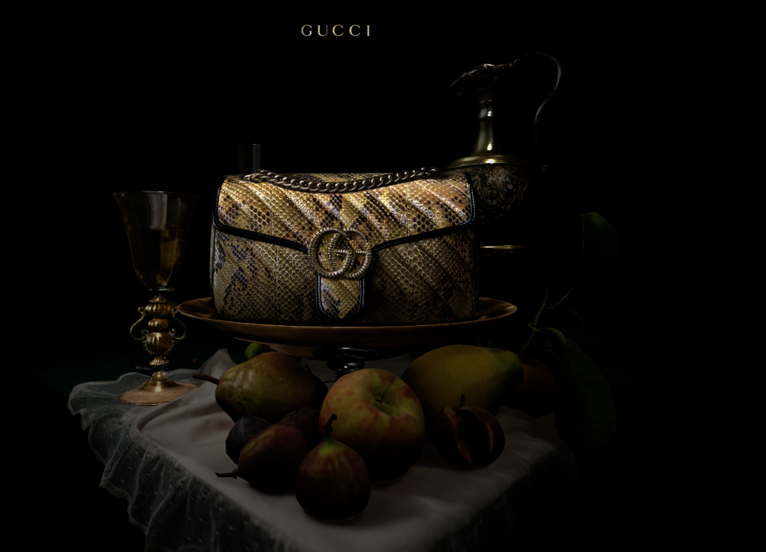
8. Photography & Graphics
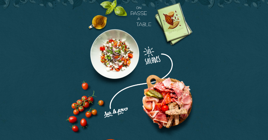
Overlapping graphic elements with real photographs can be a smart move. It customizes your message to fit your personality, making your design memorable. You can play around with this trend-letting your creativity run free.
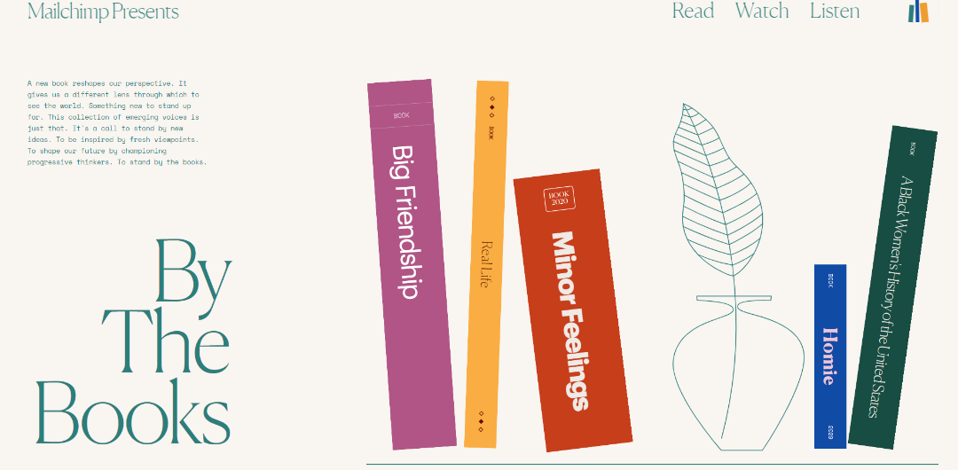
Combining these elements adds a special kind of charm to your page. This applies to, for example, a restaurant menu shown in the above photograph. For tech companies, this trend can take a more serious turn. You can explain some complex concepts of a product by adding some graphics to the photograph of the product.
Just make sure that if you use this trend, you stay true to your brand's personality. Just throwing some graphic elements somewhere on your page won't work. They have to blend into the general theme of your website.
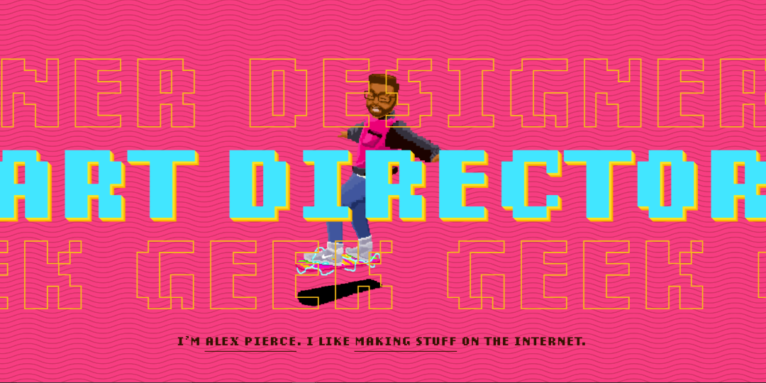
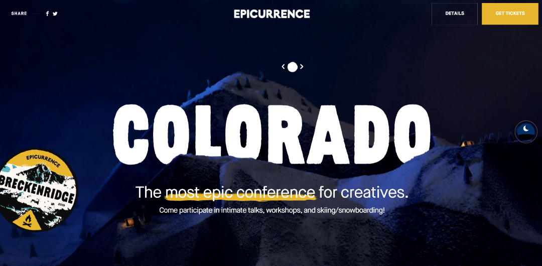
9. Bold Typography
Yes, your background, color palette, and imagery set the tone of your design. But typography does all the talking. If you want to get creative with your fonts - as long as they match the personality of your website, this is a place where you can shine.
Bold fonts are hard to ignore. Whether it's a handwritten one or just chunky, bold letters - they will be hard to ignore.
You can set the mood of your page with a cleverly chosen typeface. Just be sure not to mix too many styles, or your website will feel cluttered and overwhelming.
10. Dynamism

It's easy to see what this trend is all about. It could be animations, even optical illusions. The whole point of these is to add some dynamics to the page. This is a great way to tell a story or creatively underline your brand's personality.
Using a video background is a great way to get the attention of your visitor. Additionally, studies show that they're great for SEO and user conversion. People tend to spend twice as much time on websites with videos, compared to sites without.
You can try to integrate animations into your design in common elements, like loading, navigation, or buttons. This will make the user's experience on your website more fun and out-of-the-ordinary.
Keep an Eye Open
Hopping on the hottest, most current trend can be tempting. And not entirely a bad idea, if you can afford to change the design of your website according to how the wind blows. The smarter move here would be to look for trends that are here to stay for a while.
Things like adding dynamism to your page or using bold typography are easy to integrate into any website. Adding a dark mode could also be a great new feature. But, whatever changes you make, have your client in mind. What would they like to see or experience?
Until next time, Be creative! - Pix'sTory made by Sam Darwin
Recommended posts
-
Top 9 Graphic Design Software in 2021
Read More › -
Starting a Career in Designing? Use These Hacks to be a Professional
Read More › -
Navigate the Pros and Cons of AI-generated images for Your Businesses
Read More › -
Learning Graphic Design: Why this is a Perfect Time
Read More › -
10 Graphic Design Books To Read in 2021
Read More › -
Best Tools to Manage Your Marketing Team
Read More ›
