Top 10 Logo Design Tips and Trends in 2021
Easily design your own brand identity
with PixTeller
online logo maker & logo to video creator.
Logos are the face and identity of a brand. Logo designing became all the rage in 2021, especially after a hectic 2020. Some of the logo design trends of 2021 have had new and creative masterpieces come about, or they compile of vintage designs.
Either way, this year has a bright future in logo designs. This is where you pause and hire logo designers with the qualifications, credibility, and expertise to develop authentic designs.
Many brands who are wary of the competition they have to deal with ahead of their launch acquiring the services of many graphic design agencies such as Designter and Penji to create their platforms for them. It is an easy endeavor if you have the budget and will to do so.
The better part of your time can be spent on educating yourself on the relevant trends this year which can benefit your brand in the long term. We will share some logo design tips and trends with you that will surely assist you in your business endeavors.
1. Simplistic Geometry
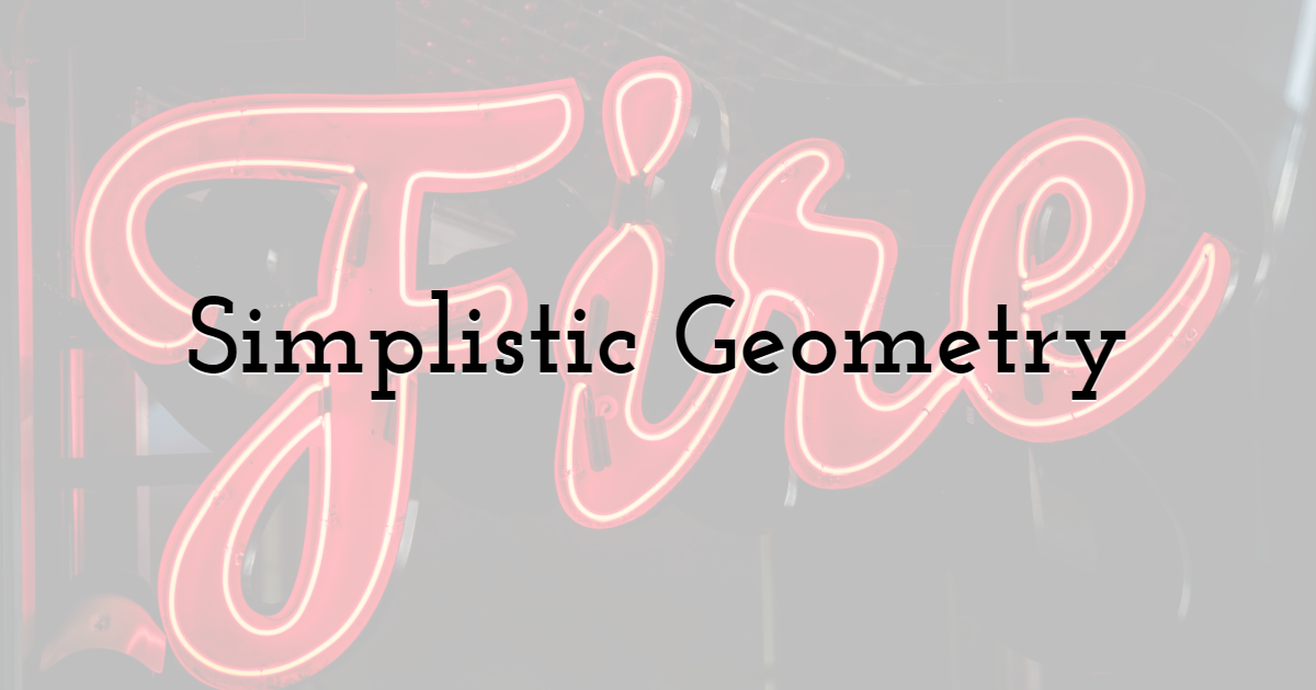
Everyone loves to see shapes, primarily because they function as the building blocks of images. Usually, the figures that are embedded in a logo design consist of squares, triangles, circles, and other common shapes. While they are conventional in their usage, their strength still lies in their simplicity. It does not hurt to amalgamate these shapes to form a unified entity in a logo design. However, it just comes out looking messy and convoluted, mainly if more than two shapes are used.
The graphic designers have noted the continuance of this trend's popularity in 2021 and have proceeded to adopt it in their design framework. They adhere to simple lines and shapes to perpetuate their distinct designs to beat their competition out of the water. The incorporation of shapes in a logo design embodies the entirety of the design. It gives more restraint to the other elements combined with it, such as saturated colors and typography.
Another highlight of this trend is that its simplistic attributes add to the logo design's depth and structure. Sometimes shapes alone are enough to represent a logo. They may not require the fonts to speak their language, and their presence is enough to convey the brand's message. Simplistic geometry is memorable and parse option for many designers and will remain so for the entire year.
Stained Glass
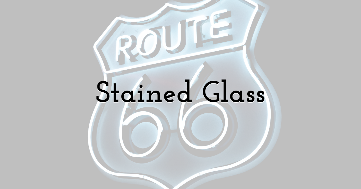
Stained glass is not necessarily to the ongoing trends gaining popularity in 2021. But it is making a comeback. This is because many logo designs are inventive by nature and seek inspiration from vintage or procedures from the past.
The stained-glass trend has become a sort of enlightenment for many logo designers who embark across memory lane and to reintroduce it in the current year. The stained-glass windows originate from the Dark Ages, which were primarily seen in Medieval Cathedrals. However, this phenomenon has once again garnered prominence with its solid colors and ethereal concept.
This logo design is meant to effuse the fascinating time and beauty of the old era. They can blend with modern-day illustrations to form an aesthetically pleasing entity. Many viewers would be naturally drawn to the design that presents an entirely new ecosystem in the pandemic era.
3. The Simple Option
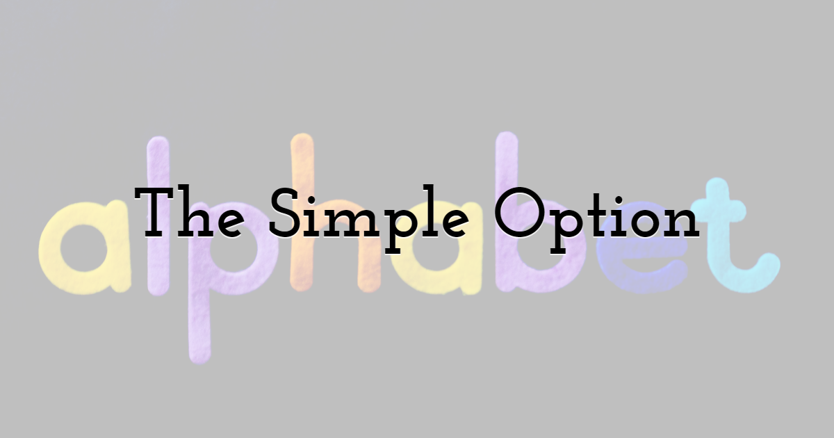
Logo designers discover that a logo that opts for a simple approach performs more effectively as the years' progress. This trend has been prevalent already in the year 2021 and shows no signs of becoming obsolete.
The limited usage of fonts, colors, and imagery has gifted companies with substantial traffic and revenue to further their business prospects. A simple logo's conciseness has shifted the designers from excessively adding too many graphics in their designs. A minimalist design will continue to remain dominant in the coming years as well.
4. Inventive Typography
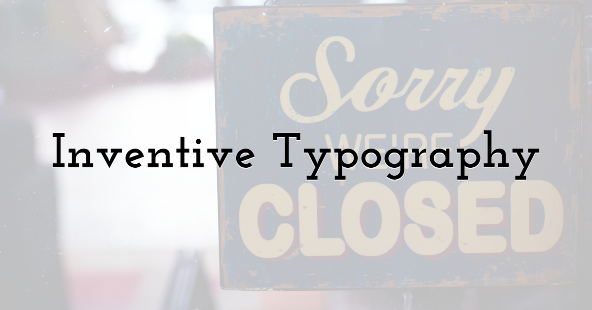
Typography is mostly reserved for text-based logos. Many creative logo designs have exceeded expectations by their texts alone. Usually, logo designers opt for standard fonts such as sans and serif, but they no longer limit themselves to the safer approach.
If you select inventive typography, you can take a more futuristic stance that will enable your logo to stand out. It would be preferable if you enhance your image. You can also revamp some old fonts or embellish them with new ones. The point of your typography must be to highlight the essence of your design.
5. Gradients
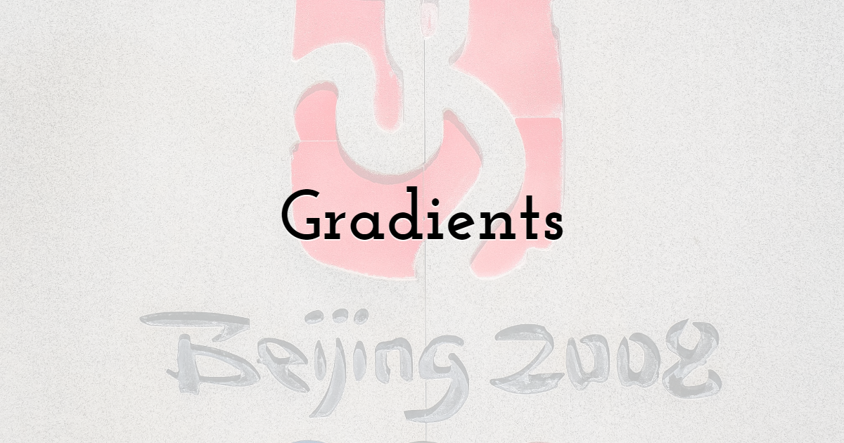
Gradients are becoming increasingly prominent this year as they consist of one share of color transitioning into another color at a smooth pace. This is the best way to create a logo that emanates energy and positive quality. You need to pick out the colors that have similar shades when placed in a frequency.
6. Negative Space
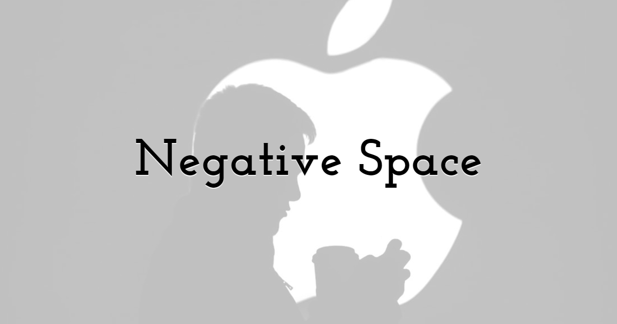
Negative space is a blank space that gives free space to the elements within the logo design. This open space provides an excellent advantage for many brands who want their other details to remain dominant in their design.
The blank space usually has a hypnotic effect on the viewer, who is coaxed into deciphering the meanings that are secretive in the logo. This logo trend is quite common among logo designers and continues to have a fascinating effect on its viewers.
7. Fine Lines
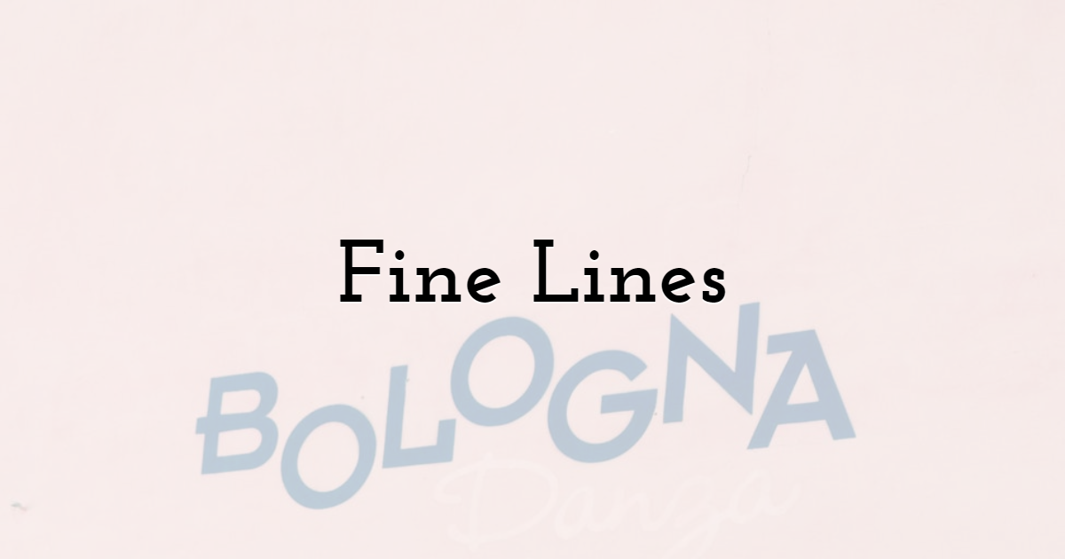
If you have used pencils before, you understand the kind of nimble feel they give off with their crisp and thin lines. This trend has become more embraced in 2021, where it effuses a sort of elegance that is lacking in other concepts. It is simple, yet it works masterfully when infused in a logo design. This artistic logo design has been underrated in the previous years, but it has finally secured its desirability in 2021.
8. Disappearing Letters
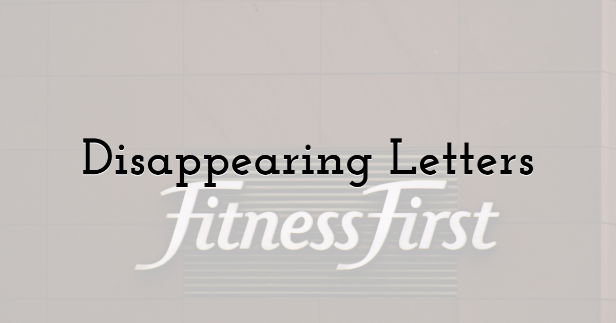
People are curious beings. When you give them a riddle, the chances are that they won't resist the temptation of solving it. This is predominantly factual in the case of the disappearing letters trend.
If you relinquish a letter or part of the word from your logo, it will give off a sense of mysteriousness that will visually strike the viewer. Don't go overboard with the fading colors or letters. Sometimes it may frustrate the viewer, and you do not want that.
9. Artistic Chaos
2020 was a chaotic year, so it makes sense that you reflect that chaos through your artistry. You can mesh your shapes, colors, imagery, and fonts all you like. There are no rules in this trend, which makes it the ideal choice. This trend lets your imagination run wild. This is the preferable choice for you to showcase your creative side. But be rational in its usage, so it does not look too bizarre.
10. The Balanced Approach
If you don't want your logo design to look too simple or overdone, opting for the balanced approach will serve you well in 2020. This has always been a reliable choice for many brands who want to keep their logo designs clear and flawless.
2021 promises a better year for the designing industry after the trying times of 2020. This is why you can make the most of it and capitalize on an eager audience that cannot wait to go out and experience new visual artwork.
You can assure yourself of the fact that authentic graphic design platforms such are already aware of the tools and trends mentioned that you have just read. You are more than welcome to try any one of these design trends, and your brand will come out looking vibrant and fresh.
Until next time, Be creative! - Pix'sTory made by Emily Addison
Recommended posts
-

How Your Website's UX Can Affect Your Customers' Purchase Decisions
Read More › -
5 Graphic Design Trends Every Marketer Should Know in 2025
Read More › -
6 Best Website Design Trends for 2021
Read More › -
Custom vs. Pre-Built Dashboard Templates: Pros and Cons
Read More › -
Protecting Your Work: Legal and Professional Boundaries in Design Project...
Read More › -
Learning Graphic Design: Why this is a Perfect Time
Read More ›
