7 SEO Secrets Every Graphic Designer Should Know
Designing a fantastic website means nothing if it doesn't draw traffic. Ensuring that the site is rich in SEO improves its rank and attracts more visitors.
As a designer, a large portion of your responsibilities is likely digital marketing. SEO is an essential part of today's marketing world. Online shopping is at an all-time high, and most people find new products and services through a quick Google search. It's crucial to have your site included in the results.
Make your own images and animations free graphic editor & animation maker.
Digital marketing expert Alex Lysak from Scanteam reveals the top seven SEO secrets that every graphic designer should know when creating sites for their clients. Let's take a look at his tips.
What is SEO?
SEO stands for search engine optimization. The goal of the search engine is to give users the most relevant results with beneficial information. The search engine uses algorithms to determine which sites are the most useful to provide users with the best experience.
Why is SEO for graphic designers important? Your site must rank at the top of the first page since very few users scroll down the results page, and even fewer go to the second page. If users don't find what they're looking for in the first four or five results, they tend to alter their search parameters.
To get your site at the top, you need to follow specific rules and principles. The secrets in this article will help you improve your rank on popular search engines such as Google.
1. You Can't Fool Google
This is the most important rule of SEO. As one of the world's biggest companies, Google employs masters in their field to make sure that you can't cheat the algorithm. You can spend many hours trying to take shortcuts on the advice of so-called experts and still end up on the bottom of page four.
Your focus should be on creating quality websites with good graphics and informing copy. Stick to the rules, and your site will appear in the top rankings. Trying to cheat SEO is like trying to cheat on your taxes. It's expensive and won't get you anywhere.
2. Looks Aren't Everything
While you want your website design to be visually appealing, this isn't the driving force for sales. There are plenty of unattractive websites that belong to successful businesses. These sites introduce the user to the company and point out the site's most critical aspects to the visitor.
The website is a virtual representation of the actual shop or office. In these instances, users are willing to ignore the site's look and feel because they get useful information.
It doesn't mean that your design is not allowed to look good. The rule is if you have to decide between the looks of the site and the functionality, always choose the latter.
3. Design for Humans, Not Bots

We often hype the SEO algorithm to such an extent that we forget humans are the visitors to the site and not the search engine bots. SEO is crucial, but potential customers always come first.
We often hype the SEO algorithm to such an extent that we forget humans are the visitors to the site and not the search engine bots. SEO is crucial, but potential customers always come first.
You want SEO graphics to meet the visitor's expectations. Part of doing this would be to help the visitor navigate the site as efficiently as possible.
4. Redesigning is Not Always Necessary
Often when clients say they're not getting enough traffic, you're prompted to redesign the entire site. The design is only part of the bigger picture, however. The copy must be quality, and the brand must attract the right target market. The business might even need to work on its marketing strategy.
Make sure that you partner with a specialist that can provide quality across the board. Simple tweaks will often be all you need to improve the way that the market sees the business.
The content is more important than the design when it comes to SEO. Users aren't searching for the design. If you don't use keywords in the copy, you can forget about ranking. Your keywords should describe the product or service that's on offer. Use variations on words and phrases users might search.
When you write the copy, the keywords should flow naturally. Simply repeating them won't do anything to improve where your site lands in a search.
5. Websites Must be Mobile-Friendly

After the rise in mobile use, it makes sense that graphic design websites should be optimized for mobiles. Google changed the rankings list for mobile use in 2016 when handheld devices started surpassing desktop use.
Studies show that people use their mobiles to access the internet more often than their desktops, 70% more, to be exact. A further 51% of people prefer to use their smartphones to look for new products or services and research brands.
People also tend to buy from mobile-optimized sites more often than websites that aren't accessible from handheld devices, the statistics going up to 80%. The numbers prove that you can't afford to make the websites mobile-friendly.
Research has shown that focusing on mobile graphics is twice as effective as not doing so, with these sites having double the number of visitors than competitor sites that didn't adjust their pictures.
Your SEO graphics must fit onto the smaller screen, but make sure that it still impacts users. It can be tricky, considering there's less space to get your point across. Focus on the SEO logo design for the smaller room.
Current mobile-design trends include abstract forms, minimum brightness levels, and contrasting light and dark colors. Hand-drawn illustrations and unstaged photographs are also preferred.
6. Design for How Visitors Read

Customers are bombarded with websites, apps, targeted marketing, and billboards. Most of the visitors to your site won't read the copy word for word. Visuals are important, but so is the layout. Our eyes have a natural way of moving when we look at something. As a designer, you should use this wisely.
For instance, you can use a Z-pattern if you have a minimal copy and more visuals. This shape fits into the natural way that a person's eyes move but leaves little space for content. Many sites use a zig-zag pattern, which provides enough space for content and visuals without interrupting how the person's eyes move.
Consider using an F-pattern if you want to give the website a human touch. This will provide enough space for content and graphics and is easy to follow in a natural eye pattern.
Using these shapes will help visitors scan through the content and get to the parts that apply to them much quicker. These natural visual hierarchies cause a visitor to stay and read or leave if done incorrectly.
7. Use Psychology
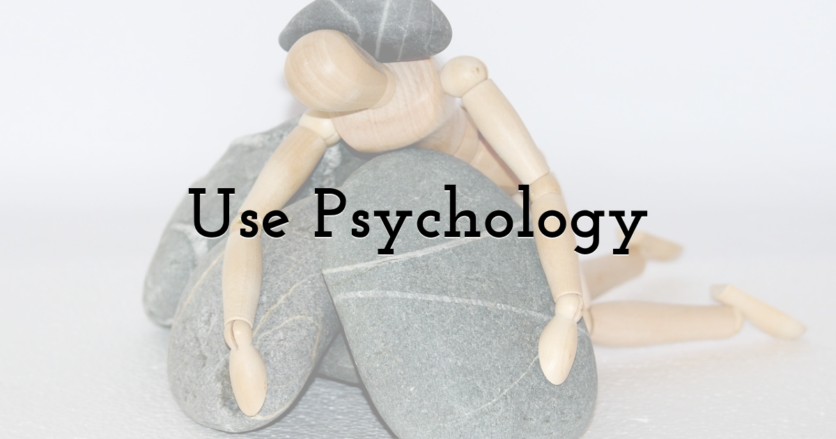
Trends and patterns may change with technology, but the human psyche stays the same. For instance, people will always enjoy stories. The only difference is that users currently prefer stories in a visual format over the written word.
As a designer, you have to understand how people think while keeping up to date with trends and styles. Try to connect with the human on the other side of the screen when you're busy with SEO graphics.
Conclusion
It's more important than ever to ensure that you use optimization correctly to land at the top of relevant search results. Your SEO graphics should follow certain principles to optimize your ranking. While it's impossible to cheat with this concept, there are plenty of tweaks you can add to your site to make sure you get to the top of relevant searches.
This article covers some vital aspects of SEO ranking, including how user-friendly your website is. Remember that you're still designing for real people, and you should follow principles that allow them to read and navigate the website with ease.
Until next time, Be creative! - Pix'sTory made by Alex Lysak
Recommended posts
-

Creating and Selling Watercolor Clipart Online
Read More › -

How to Build Trust with New Followers — Starting with a Strong Foundation
Read More › -
Which is Better? Screen Printing or Digital Printing
Read More › -
Coronavirus Impact on Marketing, e-Commerce & Advertising
Read More › -

4 Benefits of Video in Your Digital Marketing Strategy
Read More › -
5 SEO Tips that Will Increase Your Videos Visibility
Read More ›
