How to Choose Fonts that Reflect Your Brand Style
Why do brands choose certain fonts for their logos and why do you need to put effort into selecting the right font for your logo, website, ads, etc? Fonts characterize your brand the same way as your logo does.
They can help your audience build the right associations with your brand, delivering hidden messages, and adding more meaning to your text. In this article, we will help you choose the right font for your brand.
 Edit your pictures for your blog or social media pages with PixTeller photo editor
One of the main reasons why brands choose some fonts over others is design trends. Our culture determines the way we interpret different elements of design and perceive them.
Another factor that affects the font choice is the industry. Businesses that work in the same industry often need to deliver similar messages so some fonts help them quickly establish themselves as companies that have specific values, representing certain emotional attitudes.
For example, fonts with a simple geometric design represent simplicity, purity, and cleanliness, which makes them a good choice for technology brands. Fashion brands may choose modern designs, including smooth and elegant sans serif fonts or sophisticated serifs.
Fonts can make your brand look more conservative or more approachable, making your brand appealing for certain types of audiences. Brands constantly communicate subliminal messages using fonts, and viewers don't even need to know a lot about typography to understand these messages. The way strokes are shaped, their proportions, and contrast, determine the way people perceive your font.
The success of your communication depends on the chosen font because your potential customers may perceive it as mechanical and cold or warm and approachable. Therefore, the font gives your audience a hint on what your brand's attitude is so they build certain associations with your services or products.
How to Develop the Right Brand Font
If you want to build loyalty among your customers and make your audience feel empathy, you should have a typographic consistency across all of your channels. You should also take into account the type of your audience and adjust your fonts to different situations, especially if your business works in different countries.
However, this applies to not only your fonts but also your content, in general. For instance, if you have any problems with writing, you can look at how to do it with the help of professionals from the Online Writers Rating review website.
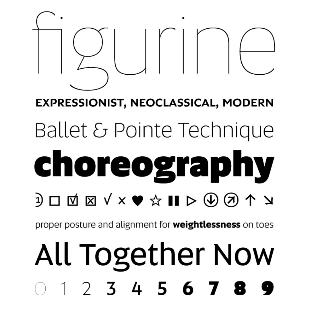
Developing a distinctive, ownable font is one of the main tasks for designers. There are many features and parameters that affect both the functionality and style of a font.
Some characteristics are specific to style variants, such as Bold, Regular, or Italic. There are also features that affect elements within a certain style variant or individual letters. Let's consider the key font traits in more detail.
-
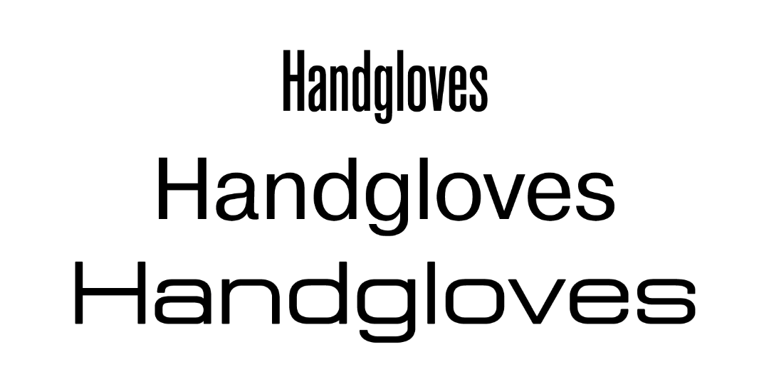
• Serif, Sans Serif, and Slab Serif
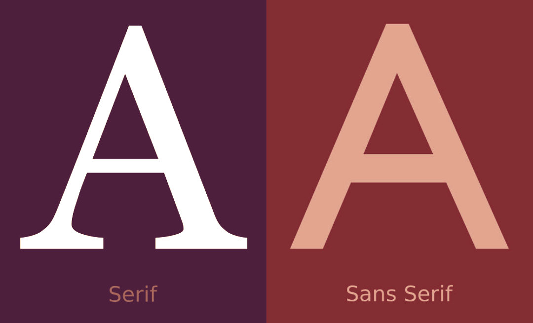
Serif fonts have different sizes of strokes. They are classic and more traditional than sans serif fonts. Sans serif fonts have the same stroke thickness, with no feet. They are clean, simple, and modern. Slab serif fonts are a mix of the first two types. The strokes have the same thickness but letters also have little feet.
-
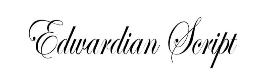
• Italic and Oblique
Writers often use italic fonts when they need to change the tone of their writing, highlighting some words or passages. Italic fonts are perceived as welcoming and polite. Oblique fonts are similar to the italic ones but are more geometric, simple, and modern. Such fonts can help you create a sense of urgency.
-
• Light, Regular, and Bold
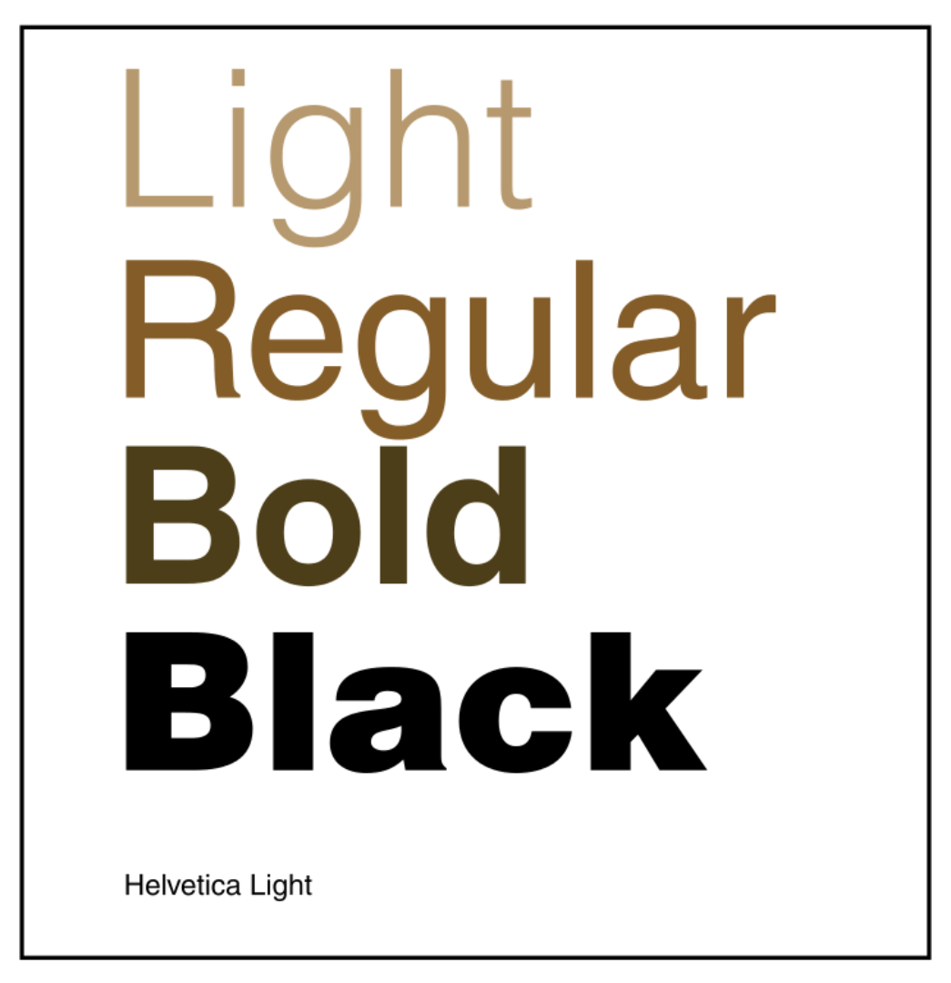
Light fonts are delicate, which makes them a bad choice for attention-grabbing text. Although we recommend that you don't use light fonts in headings, they will be a good option for the paragraph text if you want to convey a light overall feeling.
You can also combine them with high contrast or bold fonts. Regular fonts are easy to read, while bold fonts look great in headings, grabbing attention and adding emphasis to your text.
-
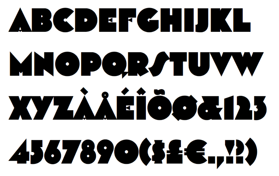
• Low Contrast and High Contrast
High contrast fonts vary in their stroke thickness, which makes them somewhat harder to read, especially when they are not big enough. Nevertheless, these fonts can look great in calls to action and headings because they look creative and bold.
Low contrast fonts are solid and more predictable when you change their size. However, bold low contrast fonts may lose their definition when you make them too small. These fonts are also more simplistic, modern, and neutral.
-
• Regular, Condensed, and Extended
Regular fonts are easy to read, which makes them a good choice for paragraph text if you want to ensure natural flow.
Condensed fonts are more narrow so you may choose them when you need to fit a lot of information while only having limited space. Condensed fonts are also more playful, which makes them a nice option for headings, especially if you're looking for a vintage design. However, we suggest that you choose them for headings with fewer letters because longer headings may be harder to read.
Extended fonts are wider. Sometimes, letters in these fonts may even be spaced apart so that they take more space horizontally. People read extended fonts slower. They are also more memorable, mature, and cleaner.
-
• Lowercase and Uppercase
Lowercase fonts can look both intimidating and playful. You can choose a lowercase font if you want to get emotional or if your goal is to add warmth to your brand image. Obviously, these fonts are somewhat informal.
Uppercase fonts stand out more and create a stronger emotional feeling. Uppercase letters also feel more classic.
How to Choose a Font for Your Logo
First of all, you should understand that you shouldn't choose a font depending on the current trends in design. Trends are important but they change too fast, and you don't want to change your logo as quickly as trends evolve and disappear. Think about your brand and answer a few important questions.
For example, determine what your customers consider valuable, what is the overall image of your company, and what you need to emphasize. Try to describe your brand in just three words and imagine your ideal customer.
Every font has its own hidden personality and its distinctive mood. Your font may be exquisite, careless, playful, or serious. Therefore, you should clearly understand what you want to convey so that you can choose the right font for your design.
The qualities of the chosen font must match your general message. Otherwise, it will create dissonance, which is bad for both you and your audience. We recommend that you think about font psychology and consider not only the typeface features described above but also factors such as color & size.
It's important to forget about your personal preferences for a while because you should only choose fonts based on the characteristics of your brand. Think about the features of your project and choose a font that reflects its specifics.
Important Details to Consider
-
• Think of the spirit of your business
You should be able to describe your brand properly because your brand shouldn't look like other brands in your niche. Besides, a law firm's logo should certainly look different from that of a cosmetics company.
The better you understand the features of your business, the easier it will be for you to choose the right font. Keep in mind that font will have an impact on your potential customers' purchasing decisions, and be careful.
-
• Don't imitate competitors
Of course, you should know everything about your competitors. You may even want to copy some of their successful approaches, offering the same discounts or using their methods of marketing.
However, you don't want to copy their style because your goal is to be unique and to stand out. Always make sure that your design doesn't have any unintentional similarities with your competitors.
-
• Be original
It won't be a problem for you to stay authentic and original if you stay true to your brand message. We also recommend that you don't choose fonts that are pre-installed in text processing programs. Instead, visit online font shops and work with designers to create something unique.
-
• Consider different scenarios
You should predict how your font will look in different environments. For example, it may look different when viewed on a desktop computer or smartphone.
Your logo will be used in different situations so you should know how the font will look if you change its size or when printed. Make sure that your font won't become illegible.
-
• Avoid too popular fonts
Given that there are thousands of fonts available on the internet, you have no excuses not to check out as many of them as you can. Don't choose the first font that looks attractive to you and make sure that your font isn't too popular because it won't be associated with your brand.
-
• Mind trends but think outside of them
As we've already mentioned above, trends change too quickly so don't make them your main priority. For instance, balloon-shaped fonts from the 70s were extremely popular back then but nobody uses them now.
If you see that everyone around is using a certain font, we recommend that you choose something else. Following trends is an easy decision but easy decisions are not always the best decisions that you can make.
-
• Visibility is crucial
There are many fancy fonts that look great in particular situations but don't allow you to experiment with their size or thickness. For example, many delicate and fragile fonts look great when they are big but become completely unreadable if you reproduce them in smaller sizes. We recommend that you choose a simple font that will remain visible in any situation.
-
• Choose the right contrast
The calligraphy-inspired variety of strokes with different thicknesses has been around for hundreds of years and is still recognized now, influencing the way we perceive fonts. High contrast fonts are very elegant and look great if you choose display sizes.
However, their thin strokes can create many problems when reproducing them in smaller sizes because the font loses its visual definition. However, low contrast fonts can also look bad because of the reduced internal space.
-
• Consider the font stress
The font stress refers to the angle of the contrast elements. For example, in many traditional Roman-type fonts, the bottom left side of the letter "O" is thicker than the top left. In this case, the font has diagonal stress.
This type of stress creates a warm feeling and allows you to create a sophisticated texture of the text. The familiarity of such designs can help you motivate readers to read the whole text after just looking at it and reading a few words.
-
• Consider fonts with vertical stress
Unlike the Roman fonts, fonts with vertical stress, where two sides of the letter "O" look symmetrical, offer a more rational solution and are more modern. However, these fonts can be no less elegant. They look great when used at display sizes for posters or magazines.
When used for lengthy pieces of text, they create a sense of detachment so that your readers will want to look at them rather than read the whole thing.
-
• Maintain counterbalance
The architecture of your font also to a large extent depends on whether you're using open or closed counters. These features of fonts are especially important when you need to use them across different channels. When opting for non-monolinear designs, make sure that there is enough internal space.
Closed counter styles are usually present in grotesque ("Grotesk") designs, where the outer loops of the letters "e," "a," "s," and "c" are hooked towards the center of the letter. To remain legible at small sizes, these fonts are often taller or wider.
We recommend that you consider the context in which your font will be used to determine whether it should be functional or expressive, as well as what resolutions are appropriate.
Wrapping Up
Choosing a font for your brand is a challenging task that requires you to take into account many different factors. We recommend that you consider our tips and choose a font that reflects your brand's values and personality.
Don't follow trends blindly but make sure that your font is unique, making your company stand out. Your font can help you deliver different subtle messages so don't miss out on the opportunity to make your logo or content more meaningful while also adding a personal touch.
Until next time, Be creative! - Pix'sTory made by Frank Hamilton
Recommended posts
-

How Web Design Affects Your SEO Performance
Read More › -
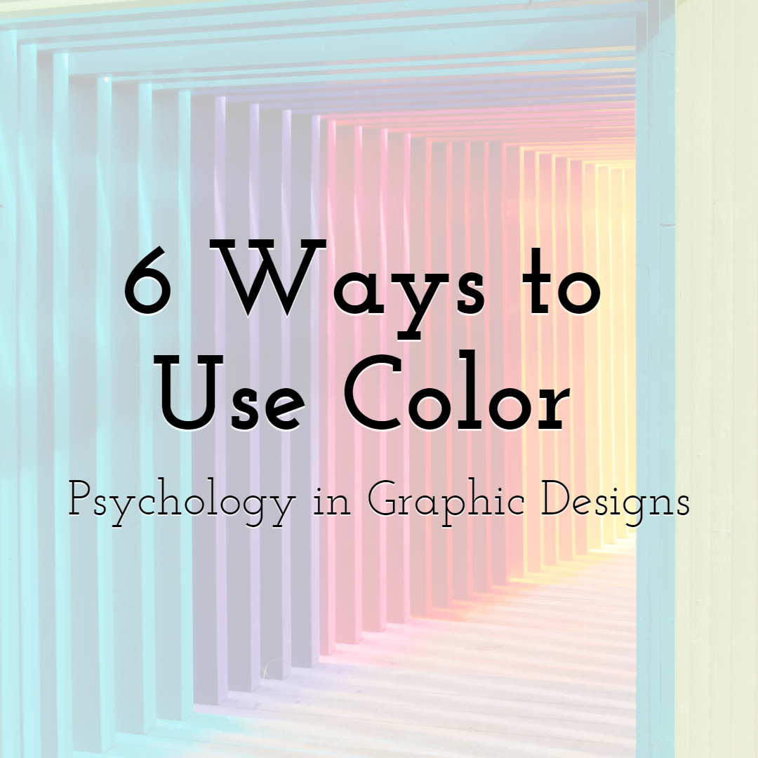
6 Ways to Use Color Psychology in Graphic Designs
Read More › -

5 Ways to Take Your Designer Skills To a Whole New Level
Read More › -

Why Making Videos with No Audio is Imperative And How to Optimize for Sil...
Read More › -
Graphic Design vs Animations for Effective SEO Strategy
Read More › -
18 Top-Notch Proofreading Tools for Content Writers
Read More ›
