Old School Graphic Designing Tactics Which are Still Applicable
Design attractive visuals for personal or commercial use with PixTeller free online poster maker.
The demand for graphic designers is rapidly increasing with the dramatic digital transformation of business. The graphic designing industry's average market size is around $45.8 billion, with a growth rate of 2.2%.
Being a graphic designer demands a lot of potentials and a diverse skill set. They are the people who transform an idea into reality. Therefore, as a designer, you'll have to be smart to deal with colors, creativity, font, elements, and clients as a designer. All of these can be significantly difficult for many designers. Therefore, they utilize smart approaches to make their work effective.
Let's discuss some of the old-school tricks and tactics that are still applicable in graphic designing.
Graphic Designing Transitions
The graphic designing industry has significantly evolved since its initiation in the 80s. Businesses are facilitated with state of the art, which regulates the hardware and software cost. This has raised graphic designing as an economically efficient option.
Open-source software like WordPress and higher connectivity level have also contributed to lowering the price. With the advent of smartphones and freelancing web portals, the dynamics are completely changed. Now it is a fully grown and advanced field with some of the highest-paid hourly wages.
Old School Tips

Graphic design has been changed a lot since its initiation. The continuous technological growth has contributed to the advancements of the field significantly. However, some evergreen tips are still applicable in the field. Let's discuss some of the old-school tips for a better design.
Create a Moodboard
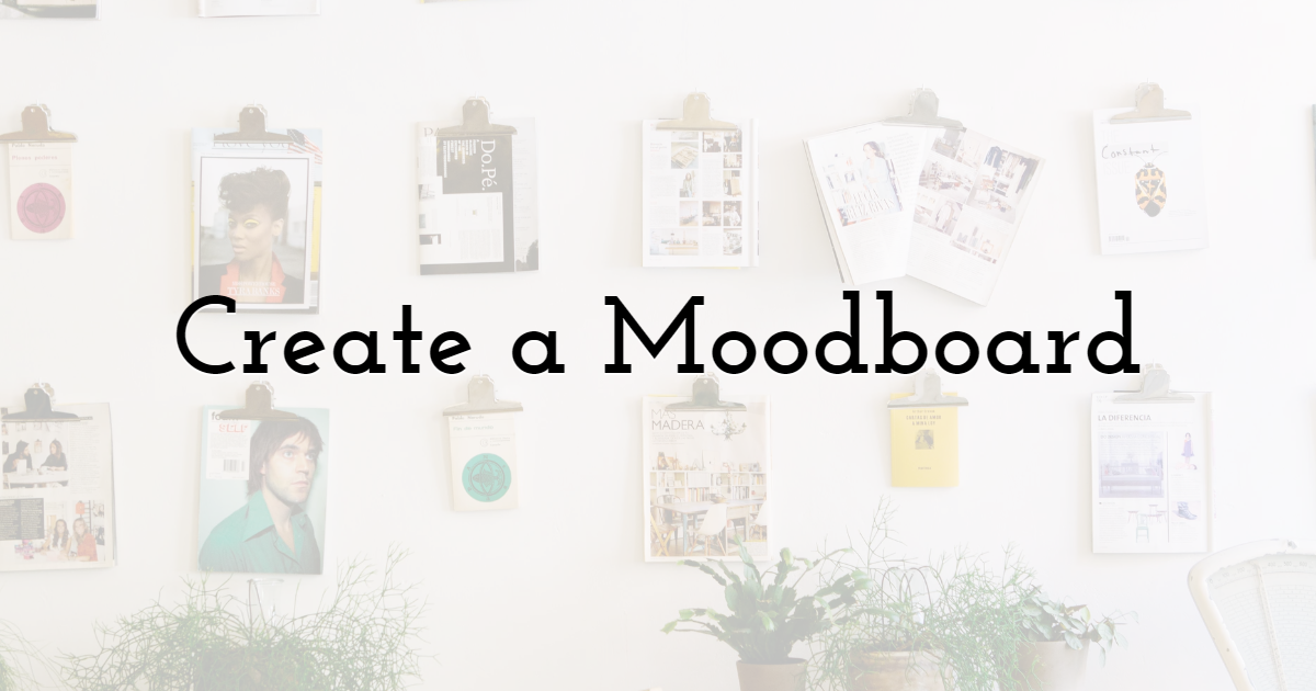
The mood board is a collection of different graphics that you can utilize to create your design. It is similar to taking inspiration from a design, but these designs are segmented into smaller pieces.
You can include; fonts, layout, imagery, color palettes, and styles from different graphics into your mood board. There is no specific number or limitation of including these elements in your mood board.
It is a freeboard and is completely upon the designer's will. It is beneficial because; if you select one design for inspiration, you may unintentionally copy it completely. You can use platforms like Pinterest to acquire inspiration and ideas.
Set a Plan

The first step before designing is drafting an adequate plan. Think about the objectives of the design and comply with these objectives with the requirements of the client. Make two to three quick rough sketches of the design.
It may sound like a traditional practice, but even the world's greatest graphic designers first design it on paper. The pre-planning and sketching can support you in getting approval from the client. This will save your time and effort.
Bring Clarity in Design
One element that makes your work different from others is clarity. Maintain clarity and compromising over the visual appeal is an old-school technique.
Traditionally designers start the process of clarification from typography. You can use Google Fonts for using free fonts - there are around 884 different fonts to choose from. Though, one subtle thing is that do not use more than two different fonts.
Using a combination of different fonts may affect the visual appeal of the graphic. Font ideas can also be extracted from different websites.
Use Appropriate Colors

Colors are the main element of the graphic. They are the main source to reflect the message of the graphic. Therefore, they secured a significant position in graphic design.
In the olden days, the designer used color psychology and color theory. The first step is to select two to three basic colors that contrast with each other and use them as base colors in the graphics. After that, saturation and brightness make different shades of the same base color and further the graphic.
Adjust the base colors' volume and saturation; if they all will be of the same volume, it may become way too bright and irritating.
Fuse White Space

The space in between the elements in your graphic is known as white space or negative space. The majority of people consider it unworthy in an image. These spaces can be used adequately to create a contemporary, clean, minimal, and fashion-forward look.
But what if you do not want to reflect cleanliness from your graphic? Don't worry; it can still be used as a focal point of the graphic. Filling every white space in the graphic may make the graphic irritating or overloaded.
It is suggested to create space around the element that you want people to focus on.
Be Creative in Size and Scale
One of the most effective designing principles, according to the pioneers, is contrast. Contrasting different elements together in a graphic is probably one of the oldest tools for a visually attractive design.
You can achieve it by using different sizes, scales, lightness, darkness, and space. Assure that your size contrasts with the elements and colors on the page. You can apply different rules like; go big or go home and thumb rule for contrasting elements in the graphic.
Follow the Hierarchy

The first thing that old-school designers did was drafting the hierarchy of the design. One thing that was first decided was the important elements of the design.
They make a list of elements that secures a more important position in the design in simpler words. To follow the hierarchy while creating a design is considered to be the most crucial step. Being a designer, you must navigate the viewer from the design to the main point.
This increases the requirement of hierarchy even more. The hierarchy can be achieved by adjusting colors or even using different scales. Some designers also use a scale to depict hierarchy in the picture.
Assure Alignment

Alignment is the arrangement of all the elements in the graphic. In simpler words, it is to make your graphic look more presentable. There is an automatic alignment option if you are using Adobe software; if not, then follow the hierarchy rule.
Those elements at the top of the list must be brighter and bigger in scale; whereas, the rest should be smaller.
Maintain an adequate size; do not make these elements too big or too small. Make sure that you have margins around your page like a boundary and use them to align elements.
Routine Symbolism and Icons
The concept of using symbols and icons is not new. Humans have been using these elements to convey their thoughts for ages. It starts making symbols on cave walls to carry a conversation through emojis.
Icons and symbols can adequately convey the message in lesser time and in a more efficient way. These are adequate to be used in diverse cultures. It can surpass lingual barriers and take much lesser space than words.
Using these icons can also add humor and spice to the graphics. Many things which cannot be spoken can be depicted through symbols. See the following illustration reflecting endless opportunities with symbols and icons.
Practice Line Usage

A common thing that we have observed in old graphics is a line. The majority of the olden graphic designer utilizes a line to separate different elements in a graphic.
If you design something for the e-commerce platform, use a thin line to separate the call to action button. If it is for the blogs, use a line to separate Author's bio and content, like one adopted to write my dissertation for me.
If you want to be more creative, you use vertical sections to divide elements into different halves.
Remain Consistent
When you have finished all your work and learn all the design principles, ensure that you follow the set of rules in every project.
Set your own rules for sizing and spacing and use them consistently in all your works. This will create your benchmark, and your work will be differentiated from others.
According to Master Thesis UK, these principles, after some time, become signature steps of your graphics. Though do not stick to the principles and lose your creativity. Try to experiment with new things, but the basic rules shall be the same.
Final Thoughts
The graphic designing industry has faced many evolutions. The industry currently is providing earning opportunities to a larger segment of the population. With time, one thing that does not change is the usage of tips and tricks.
The old school tactics that I have mentioned above are still applicable in recent times. I hope these will support you in creating more attractive designs.

Until next time, Be creative! - Pix'sTory made by Stella Lincoln
Stella Lincoln is currently working as Assistant Editor at Assignment Assistance, the organization famous for writing my assignment UK services. She is a passionate writer, and her passion for writing is visible from her blogs. She had served as an editor in several publishing houses.
Recommended posts
-
12 Principles of Design to Help You Create Effective Graphics
Read More › -

How to Improve User Experience and Get More Conversions
Read More › -

Customer Experience Management (CXM): Why It Matters and How to Do It Rig...
Read More › -
Everything You Need to Know About the Helvetica Font Family
Read More › -

How to Ensure Seamless User Experiences Across Browsers for Web-Based Cre...
Read More › -

How to Create a Flyer With AI That Looks Professionally Designed
Read More ›
