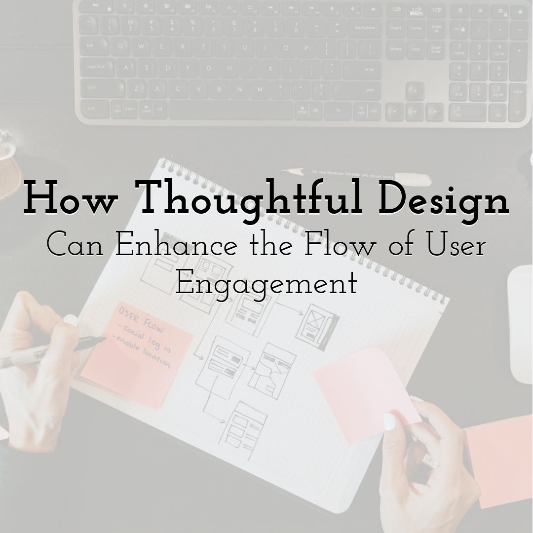
How Thoughtful Design Can Enhance the Flow of User Engagement
Good visuals do more than make a product look polished. They guide people through an experience with less effort, fewer distractions, and a stronger sense of focus. When design is intentional, it supports interaction rather than competing with it.
Engagement is shaped by deliberate choices at every point of contact. A clear design tool button, a smooth template transition, or an intuitive workspace structure can keep attention moving forward, while confusing design quickly pulls users out of the moment. The goal is to create a flow state where users feel absorbed, focused, and motivated to continue.
This guide shows how design choices can reduce friction and keep users engaged.
First, let’s talk about what “flow” really means
In user experience, flow is the sense of moving smoothly through a product or service without interruptions. It’s the difference between skimming across a calm river and getting stuck in shallow water. The clearer the path is, the easier it is to hold attention and keep people progressing.
Why psychology matters more than aesthetics
Good UX design is grounded in how people think and behave, shaping experiences that feel intuitive and effortless. Here are a few perspectives that illustrate this:
- • Cognitive load theory reminds us that too much information causes fatigue. A cluttered page leads to drop-offs.
- • Flow state theory shows why people thrive when tasks feel just challenging enough to be rewarding.
- • Motivation-ability-trigger models highlight how timely nudges can move people to act.
A real-world example is WhatsApp AI by ZipChat, which simplifies interaction by offering conversational prompts. Instead of overwhelming users with menus, it provides clear cues that make progress feel easy.
How mapping a journey reveals the sticking points
A user journey map makes invisible problems visible. By plotting every touchpoint, teams can see where people hesitate, loop back, or give up entirely. It’s often surprising how small details, like a confusing button label, can derail an otherwise smooth process. Correcting those friction points helps rebuild momentum and keeps the flow intact.
Why research is your best design tool
Assumptions can be persuasive, but research is what confirms whether design decisions actually work. Analytics reveal where users succeed or struggle, while interviews and usability tests explain why. Together, they give teams a full picture and prevent costly missteps. Flow isn’t built on gut instinct; it’s built on evidence.
What strong design principles look like in practice
Principles give structure to design decisions. They’re not just guidelines on a slide deck, they’re the habits that shape how people experience a product every day.
Making navigation feel effortless
When users spend more time figuring out where to click than actually engaging, flow breaks. Information architecture should group content logically, use familiar words, and limit top-level categories. The less guesswork required, the smoother the experience.
Using visuals to guide the eye
Color, typography, and whitespace are all signals. Each one influences where people look first and how they move through a page. When used with intention, they act like signposts that guide attention toward the next step:
- • Color: Highlights key actions, sets tone, and draws attention to important elements like buttons or alerts.
- • Typography: Establishes hierarchy, makes content scannable, and signals what’s most important to read first.
- • Whitespace: Creates breathing room, reduces clutter, and helps users focus on the elements that matter most.
- • Visual hierarchy: Combines these elements to ensure users can naturally follow the intended path without confusion.
Small interactions that carry big weight
Microinteractions may seem minor, but they shape how users feel about an experience. They build trust, reduce hesitation, and keep momentum moving forward. Examples include:
- • Progress bars show users how far they’ve come and how much is left, keeping motivation steady.
- • Checkmarks or success icons confirm that an action (like submitting a form) was successful and complete.
- • Subtle animations provide instant feedback that reassures users that something is happening in response to their action.
- • Friendly confirmation messages replace uncertainty with clarity, reducing second-guessing and boosting confidence.
Keeping interfaces smooth and forgiving
The best interfaces are invisible in the sense that they don’t draw attention to themselves. They simply help people move forward without unnecessary effort.
Reducing the little frustrations
Extra clicks, unclear error messages, or vague labels all add friction. Streamlining forms, offering clear calls to action, and providing helpful error handling make users feel supported instead of blocked. These small refinements keep engagement steady.
Designing for all devices, not just one
People expect consistency whether they’re on a laptop, phone, or tablet. Responsive design isn’t just about screen size; it’s about creating reliability. A task started on mobile should feel just as seamless when continued on desktop.
Accessibility as a foundation, not an afterthought
Accessible design makes experiences usable for more people and improves flow for everyone. Strong contrast helps users with low vision, but it also makes content easier to read on a sunny day.
Screen reader support and keyboard navigation are essential for accessibility, yet they also help in low-bandwidth or no-mouse situations. Even small details, like larger touch targets or skip links, reduce friction across different contexts. When accessibility is built in from the start, engagement becomes more consistent, reliable, and inclusive.
Moving from clarity to deeper engagement
Once the basics are right, design can start layering in richer experiences that feel personal and rewarding.
When exploring ways to streamline design workflows and improve user experience early on, tools like Magic Patterns, Uizard, and similar AI-assisted prototyping platforms can help teams quickly generate and iterate on interface patterns. By visualizing layouts, content structure, and interaction flows, designers can spot usability gaps and refine flow while concepts are still flexible.
Why personalization feels so natural
Personalization works because it mirrors how people expect real interactions to feel. When a product adapts to someone’s needs, it creates a sense of recognition that goes beyond efficiency.
A homepage that remembers past searches, a dashboard that surfaces frequently used tools, or an app that adjusts its layout based on behavior all signal to the user: this was designed with you in mind.
The challenge for teams is balance. Overpersonalization can feel intrusive, especially if users don’t understand how their data is being used. The strongest experiences give users just enough customization to feel supported while keeping the process transparent and respectful.
Adding motivation with small rewards
Gamification offers a way to reinforce progress and make tasks feel more engaging. Elements like badges, milestones, and progress bars give users a clear sense of accomplishment and help them see how far they’ve come. These small rewards can motivate users to continue without feeling forced or distracting from the main task.
The key is subtlety and relevance. Rewards work best when they recognize meaningful actions rather than arbitrary clicks. A progress indicator that reflects real progress or a milestone that acknowledges a completed step encourages users to keep moving forward.
Designing for emotion, not just efficiency
Design that sparks trust or delight can turn a routine interaction into a lasting memory. Beyond aesthetics, emotional design considers how users feel at each step.
Small touches, like a playful animation when a task is completed, a thoughtful error message that guides rather than scolds, or details that reflect cultural awareness, can make the experience feel human and considerate.
The impact goes beyond momentary enjoyment. Positive emotional cues increase confidence, reduce frustration, and encourage continued engagement. They can also influence perception of the brand, making users more likely to return and recommend the product.
Making flow part of how teams work together
For users to feel consistency, teams need to design consistently. Flow isn’t a single decision; it’s a collective effort.
Collaboration that goes beyond design teams
Product managers, developers, marketers, and support staff all influence the user journey in different ways. When teams collaborate closely, flow becomes a shared responsibility rather than a siloed goal.
Regular cross-functional check-ins, shared documentation, and aligned priorities help ensure decisions in one area don’t create friction in another. Encouraging open communication about pain points and opportunities can uncover small changes that significantly improve the user experience, making engagement smoother for everyone.
The role of design systems in staying consistent
Design systems turn individual design decisions into repeatable, reliable patterns. Reusable components, standardized guidelines, and clear documentation help teams deliver consistent experiences quickly, even as products scale.
They also reduce the likelihood of introducing friction through inconsistent interactions, ensuring that users encounter the same flow across features and touchpoints. Investing in a design system not only speeds development but also preserves engagement quality as the organization grows.
How to measure whether the flow is really working
Flow can’t improve on its own. Tracking metrics, testing with real users, and iterating continuously ensure designs evolve with user needs:
- • Engagement metrics: Track time on task, clicks, and funnel completion rates to see where users stay engaged and where they drop off.
- • Usability testing: Think-aloud sessions, eye-tracking, and observation reveal hidden friction points that analytics alone can’t show.
- • Iterative design: Prototypes, testing, and feedback loops create a continuous cycle of improvement to refine flow over time.
Where engagement design is heading next
The future of flow is adaptive, predictive, and responsive. AI-driven personalization, predictive cues, and emerging interfaces like voice and AR are shaping how creators interact.
Experimenting with tools like Figma’s AI prototyping or Hotjar’s behavior insights can reveal which interactions resonate before full implementation.
As tools and expectations evolve, designing for smooth, adaptive, and human-centered flow will remain key to keeping users engaged and experiences memorable.
Until next time, Be creative! - Pix'sTory
Recommended posts
-

Using Photography in Web Design
Read More › -

Understanding Why 90% of Consumers Skip Pre-Roll Ads
Read More › -

YouTube SEO: How to Rank YouTube Videos in 2021
Read More › -
Top 5 Stunning Banner Design Software Providers of 2021 to Consider For B...
Read More › -
How to Choose Typography for a Perfect Website Design
Read More › -
How Voice Technologies Can Change Media
Read More ›
