Poor Logo Design: How to Recognize and Prevent It
Design your own business identity
with PixTeller
online logo editor & free animated logo maker.
How do you avoid making a bad logo design? You make a good logo design.
This might sound simple, but it holds the brutal truth. No brand can survive if it doesn't construct a generative logo design. Experienced designers know all too well the common mistakes that occur when designing a logo. They have experienced making similar mistakes at some point during their initial careers. This enables them to recognize and determine the errors and poor choices before or when they make them.
The logo design process requires a lot of brainstorming. Implementing those design ideas can intimidate many people who fear making a single mistake that could turn out to be a tremendous error. Here, we will discuss in detail the frequent errors that come about during the designing process so that you may know what you are up against.
Old-Fashioned Logos
One of the most standard problems when it comes to lousy logo designs is the usage of antiquated visuals, effects, and techniques. Sometimes first-time designers or people who take a shot at designing a logo for themselves directly or indirectly create a logo that has already been developed decades ago. In the 80s and 90s or any vintage effects like clip art and fonts were utilized excessively.
Now incorporating them in modern-day logos is a bad idea as it ends up looking bland and uninspiring.
Old-Fashioned Logos: Prevention:
If you have already made the blunder of creating an outdated logo, the viable solution is to redesign it and transform it to give a modern 21st-century outlook. That said, it is not necessary for you need to overlook vintage designs entirely. You can take some inspiration from prior designs and incorporate vintage elements that are returning in style. People prefer new and exclusive brands and logos are no exception in this case.
Excessive Details
The issue with detailed logos is not that they are wrong. The problem lies in the fact that they are not scalable. If you present your logos on murals, billboards, or vehicle wraps, such detailed logos are perfect. But those are the exceptions when using a complicated logo. Other than that, your logo should remain blunt and pithy.
The imagery of detailed logos in smaller mediums like smartphone screens looks outright terrible. The same is the case for business cards or pens. The point is to appeal to your audience visually. If the visuals are overwhelmed by the details, the entire purpose of the logo will fall apart.
Excessive Details: Prevention:
You don't necessarily have to desert your detailed logos. You can use them for larger mediums. But you have to keep away from using them in smaller sized mediums. The perfect way to display your logo is by designing variant logos or responsive logos for smaller sizes. Just separate the two when you consider the sizes.
Peripheral Imagery
Using excessive imagery that is related or unrelated to the brand makes for a bad logo. The logo design may not be wrong, but it will not reflect positively on the brand. Using excessive imagery that is related or unrelated to the brand makes for a bad logo. Many companies have overstepped their abilities and ended up with logos that are ineffective and just plain bad. Your logo should represent your brand and its values diligently. It should have the essence, look, and feel of your enterprise. Otherwise, it won't be recognizable, nor will it be productive.
Peripheral Imagery: Prevention:
Use limited imagery and only the ones that are connected to your brand. It needs to reflect your mission, principles, and values. You do not have to make generic logos; you have to use creative yet simple images to reflect your brand. Use familiar iconography without using excessive ones.
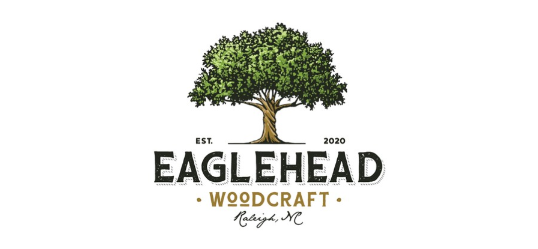
Look at Eaglehead Woodcraft as an example. They chose a tree to represent their brand as opposed to furniture or eagles. They only used the icon that was related to their brand, and it was effective.
Vague
Suppose your logo looks nice but does not convey anything. It's still poor design. The purpose of a logo is to immediately message your audience about what you are and what you stand for. The first impression makes all the difference when it comes to logo design.
Offering zero information will only discombobulate the audience who will have no clue about your system, especially if the logo involves random imagery and vague company names. Just a tad bit of description is enough to give an idea about the goal of the company.
Vague Prevention:
Just add a description. It doesn't mean you have to overdo it with texts or messages. Just give a short speech or hint with a few wordings. The customer will immediately understand what the purpose of your company is. The texts also need to be simplistic and succinct. Look at Phoenix Internal Medicine as an example. They used a modern logo with minimal texts, showcased beautiful artistry, and was quickly interpreted by the audience.
Contradictory Themes
Logos set the narrative for your brand. If your objective is to be seen as a serious brand, you need to utilize muted colors and sharpened shapes to appear more polished and sophisticated. Operating as a technological company, you can use futuristic imagery infused with wiring and circuitry.
The problem comes along when the themes of the logo do not match one another. A frightening monster will not give off a family-friendly aura of a children's food place. People who can't put two and two together on your brand will usually avoid such a strange brand.
Contradictory Themes: Prevention:
Your logo should echo your branding goals in terms of both artistic style and imagery. It would be best if you used globally recognized icons and themes that complement one another. It should have a natural flow, which can pave the way for brands to communicate with their audience.
Conclusion
Creating your logo exposes you to making many errors and mistakes that could be costly for your brand, which is why it is better to seek the services of a graphic design agency like Designster that has every tool in its arsenal to construct an effective and productive logo design for you. They have a proven record of experience and delivering potent logos to their clientele.
Until next time, Be creative! - Pix'sTory made by Tabish Khalid
Tabish Khalid works as the Digital Marketing Manager for Designster. He develops and implements digital strategies for Designster, along with aligning business goals with digital marketing activities. He actively contributes articles related to digital and content marketing.
Recommended posts
-

Tips for Freelancers to Grow a Successful Career as a Remote Character De...
Read More › -
Key Tips on Planning a Month of Social Media Posts
Read More › -

8 Transferable Skills from Architecture to Product Design
Read More › -
How To Write A Proper Task For Your Designers To Get Perfect Result
Read More › -
The History of Flat Design: How Efficiency and Minimalism made the Digita...
Read More › -

7 Best Product Images Techniques for Your Ecommerce Website
Read More ›
