How to Design and Present Flyers with Ease
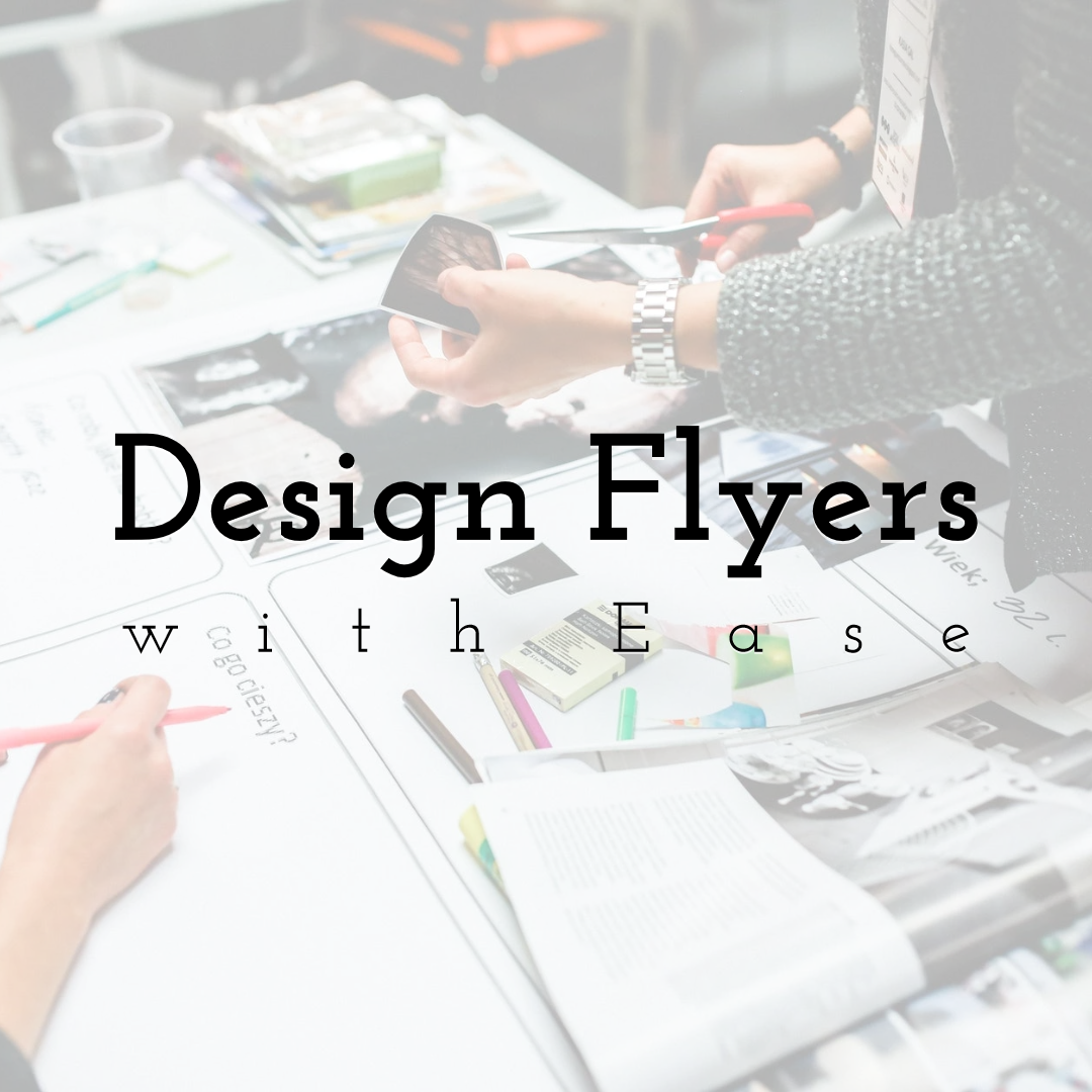
Design your own brochures & flyers
with PixTeller
online flyer maker & free greeting card maker.
For emerging and established businesses, flyers are the most inexpensive way of attracting an audience. You can introduce a new product or promote existing ones. Flyers are excellent for business marketing. They are what every business needs for their online and offline campaigns.
But like any other marketing campaign, you need a strategy. If you want to see great results with your flyers, you'll need to learn how to create responsive designs. Content, color, and font types are factors in the creation of your flyer.
1. Create a Catchy Headline
The headline is the first item people look at when they see a flyer. It's from where they'll derive any early interest in your content. If the headline is attractive, your audience will feel compelled to look at the rest of the flyer. If it's not eye-catching, they'll likely (and quickly) lose interest in your message. Your headline needs to be captivating.
To create a killer headline, make sure you include convincing words. You can use words like comfortable, free, secrets, or tricks to make the headline memorable. Use trigger words such as what, why, or when to capture the audience's attention. With such attractive terms, you'll give your audience a reason to read through to the end.
But as you include convincing words, be sure to indicate what you can deliver. Be daring but also cautious with your promises. People don't like being tricked. Honesty plays an essential role in how people receive your flyers and interact with your brand.
2. Include Relevant Content
All content in your flyer should reflect the purpose of your business. If you are advertising a free give-away in your business, make sure that your customers understand this at first glance. Customers like to know what they are getting, and concise content will reveal this in simple terms.
By simple, we mean keep your content at fewer than 500 words. Make sure to divide the content into subheadings and bullet points, so it's easy to scan through.
Also, make sure that your content is written from the readers' perspective. Address all the questions they might ask in simple terms. Remember that information, including location, time, and contact details, should be easily noted in the flyer.
3. Use Attractive Designs in Your Flyer


Humans are visual beings, and anything attractive will capture their attention. As you create your flyer, don't be afraid to bring out the creative side of you. A stunning visual will support your story. It will also create a mood that grabs the attention of anyone that comes across your flyer.
To get quality designs for your flyer, consider tools like Google Slides Themes. Google Slides is what business professionals use to develop attractive designs. And, thanks to the drag and drop option in most tools, you can design and present your flyers in the shortest time.
4. Keep it Simple
At times, simple is all you need to attract an audience. This is especially true if you are creating a flyer for corporate purposes. For such flyers, minimal design and use of primary color are preferred. Such designs go well with colors that range from white, black, grey, and a hint of bold colors. Most of these bold colors are significant and reflect the image of the brand.
If you are creating a business flyer, consider a flat template that doesn't overpower your design. A flat design will still grab the attention of readers without looking too overdone. If you consider a little bit of design, add a diagonal grid on the header to give the flyer a stylish look.
5. Use Grids


When designing a flyer, the biggest challenge is fitting all the information into smaller spaces. There's always so much you want to share. From product range to business information, you want to include every detail in the flyer.
But considering the standard size of 8.5" x 11" for a flyer, you can't fit in all this information. You have to be creative with your design, for the best fit. It's for this reason you should consider including grids.
Grids make your flyer look organized. It gives your audience the best opportunity to skim through your content without missing important information. It's also a great way of introducing new products to the market without looking too pushy. With grids, the amount of content you need to write is also reduced since images cover most topics.
6. Include Different Fonts
Fonts determine how easy or difficult it is to read a flyer. If you use the same font, it might not be eye-catching enough for your audience. To avoid having a boring flyer, consider using different fonts.
You can combine two or more fonts in each section. You can include a bold font on the headings and use a simple font for the body. This way, your audience differentiates the content of each element. Including different fonts can be attention-grabbing and will prompt more people to pick your flyers.
7. Create a Modular Design with Icons


If you have various photos to show, icons help you display them all. By including circles, rectangles, and squares in your flyer, you can showcase multiple products available in your business.
Icons are also easy to create and fit into smaller spaces. They are also great for replacing long text and advertising-specific services. To make your icons stand out, use different background colors.
8. Proofread Your Content
Before uploading your flyer for print, make sure that everything is in place. First, check that your flyer is of the right dimensions. The correct measurements should be approximately 8.5" x 11". This is a standard size, but you can customize it based on your requirements.
You should also proofread your content to make sure it flows. Countercheck with your draft and ensure that critical content is included in the flyer. For every visual, make sure it's accurate. When designing a flyer, use brand-specific colors that best represent your services.
9. Be Calm but Not Dull
Cool colors like black, grey, and white are the most preferred for business flyers. But at times, it's the bright and bold colors that make your flyer stand out. You can transform a dull flyer into a striking element by just adding a few bold colors. The bold colors do not have to be all over the flyer. They can be in specific sections like the header, footer, or edges and still draw attention.
But if you are into "colorful," energetic businesses like entertainment, your flyer should reflect your event's energy. The reader should feel the impact of your brand by just viewing your flyer. You can include a fair amount of yellow, orange, or blue in your flyer and still have an attractive design.
A point to note when using bright colors is to make sure that your flyer is well-designed. It would be best to include grids in your layout, so the colors are not all over the place. Have a trial and error phase that helps you blend the colors with the right elements.
10. Include a Measurable Call-to-Action
Once you have your flyer in place, it's essential to know if the campaign works. For analytics purposes, consider including terms that will help measure how many people use the flyer. You can include phrases such as "show this flyer for a 10% discount", or "use the code MNK to qualify for free items" to help determine the impact of your flyer.
If you are dealing with time-specific items, remember to include dates. Indicating your timeline will avoid customers presenting the flyers long after the due dates are passed.
Lastly, be approachable. A smiling face converts faster than a grumpy one. A friendly face on your flyer makes people feel welcome in your business. A smiling face also shows professionalism. It shows authenticity and builds trust.
Final Thoughts
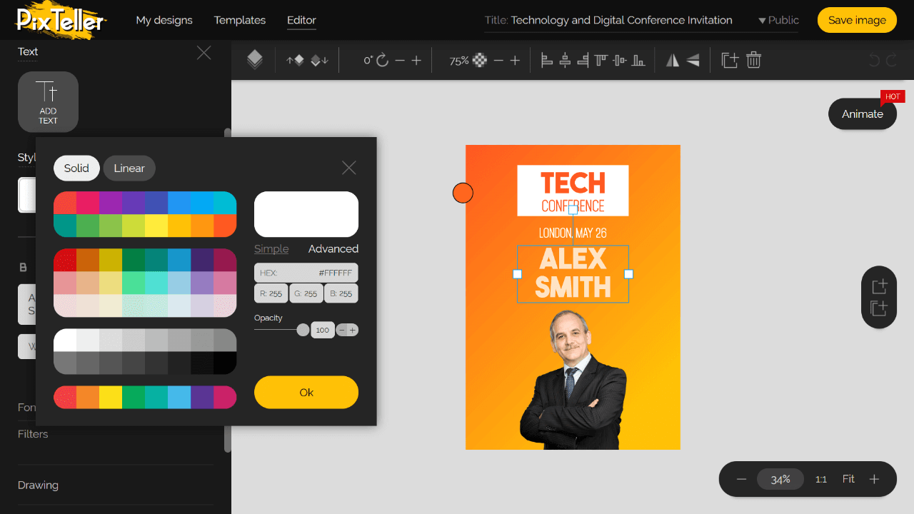
There you have it: ten inexpensive ways of attracting an audience through flyers. Flyers are easy to create, especially using PixTeller Editor. Designing a flyer is all about determination. It's about using the right font, image, and color to present the best designs.
Until next time, Be creative! - Pix'sTory made by Dani Martin
Recommended posts
-
Logos Influence Customer Perception and Boost Conversions (Full Guide)
Read More › -

5 Major Usability Issues at the Design Stage
Read More › -
What are Custom Banners - Top 10 Things You Must Remember!
Read More › -
Significance of Target Audience in Designing a Strategic Webpage
Read More › -

Why Upskilling Matters More Than Ever in 2026
Read More › -
How to Combine Web Design and SEO to Achieve Success
Read More ›
